10 Photoshop post-production tips
Automotive CGI artist Dave Cox takes you through his top 10 tips for post-production in Photoshop.
Post-production should be an asset in every artist’s arsenal when it comes to creating 3D scenes. How you use it within the scene however is entirely up to you.
It can be as dramatic or subtle as you want. Used correctly, post-production can drastically speed up your workflow and take your renders to the next level.
This tutorial has been written to give you some tips on how post-production can be used as a pipeline tool, rather than just using it as an app to add vignettes.
01 Make a selections set
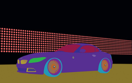
To me, the most important render element you could ever have (aside from the actual render itself) is a selection set. These may come under many names: MultiMatte, WireColour, ObjectID, Render Masks or Alpha for example. Whatever the name, it’s essential to help you make super-fast selections for editing or creating alphas.
02 Knowing where to start
Sometimes you might not know where to start when importing your render into Photoshop to tweak it. In terms of my own workflow, I find it extremely important to know what each pass does individually.
So after stacking the passes so that they equal my beauty pass, I turn each one off and on to see how they affect the image. Once you know how these all work together, you can start to look for areas of the image that are too dark, too bright or too reflective, etc.
03 Is my image too bright or too dark?
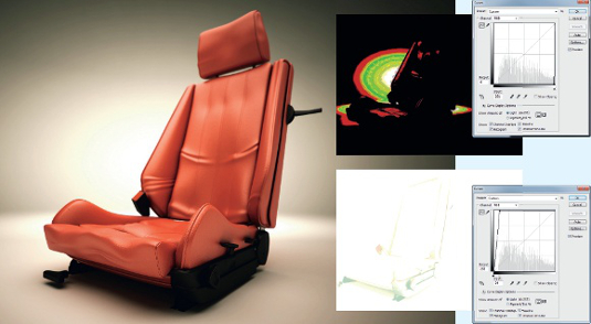
An easy way to see whether your image has areas where it goes beyond the accepted range of black or white is by using a curves adjustment level. By dragging the lower point on the histogram to the right, you will see if there are any areas that go beyond white. Conversely, if you drag the top point on the graph to the left, you’ll see any areas that go beyond black. If you do find that your image has some areas that exceed these clipping points, you may be able to rescue them by adding adjustment layers to your render passes to bring the blown-out areas back in.
Get the Creative Bloq Newsletter
Daily design news, reviews, how-tos and more, as picked by the editors.
04 Editing in small steps
Photoshop is a precision tool, so start off with small tweaks to your render passes (lighting, refraction, specular, reflection). Next, move on to colour corrections for specific areas of the image, then move onto general, overall adjustments.
05 Blend, don’t just mask
Learning how to use the Wand tool and select parts of your image using the WireColor pass to create masks is very handy, but sometimes just masking your adjustment layers isn’t enough. To make a more convincing image these masks need to blended in. Do this by using the Black Brush tool or the Gradient tool. This will help your adjustments sit naturally into the image.
06 Paint volumetric lights
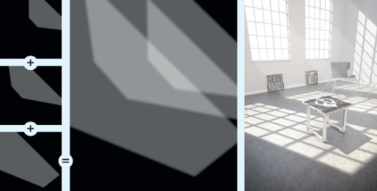
Purists may hate me for saying this, but sometimes you just need to paint things in rather than render them in. It has to be done subtly though, and you have to layer it to make it look convincing. I like volumetric lighting and I often paint it into a scene – providing it looks right. In this example image, I started with the window furthest away and worked towards the camera. This gave me full control over each ‘light’ as it entered the room. The image shows how these volumetric lights stack up; they are simply feathered shapes set to Overlay at about 20% opacity.
07 Separate your background
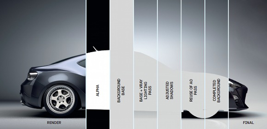
A common issue I have seen when artists make a studio render is trying to render the background into the scene. While this can work well, creating your background in Photoshop is much faster. Use your WireColor or Alpha to mask the car off from the background. You can then use your lighting or shadow information to affect the background.
08 Bring out your textures
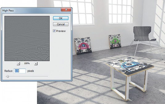
A way to make your textures come to life a little more is to use a High Pass filter to sharpen them up a bit. Create a new blank layer, then press [Alt]+[Ctrl]+[Shift]+[E] to make a flattened copy of your current image.
Desaturate this layer and set the blend mode to Linear Light. Go to Filter > Other > High Pass and use a low radius. Toggle the radius to see how changing the settings affects your image. To use it to full effect, mask it or change the opacity. Experiment!
09 Why you should stack render passes

Adding colour corrections will let you tweak how the image looks but it won’t really change the render itself. If you have stacked your render passes correctly you can reuse passes to enhance certain areas.
10 Top adjusts
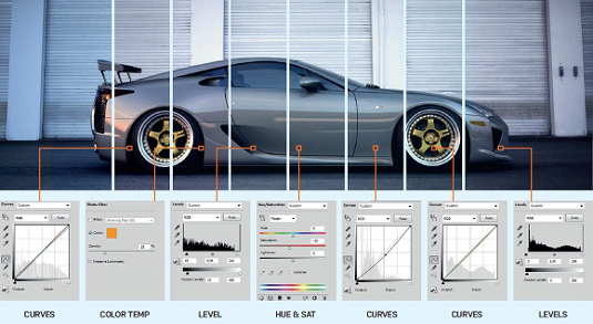
Adjustment layers must be at the top of the layer stack to affect the entire image. Use these final layers to change the overall quality of light in the image.
Dave Cox is a London-based automotive CGI artist working for the Burrows CGI studio in Essex
Discover Photoshop tutorials to boost your skills

Thank you for reading 5 articles this month* Join now for unlimited access
Enjoy your first month for just £1 / $1 / €1
*Read 5 free articles per month without a subscription

Join now for unlimited access
Try first month for just £1 / $1 / €1

The Creative Bloq team is made up of a group of art and design enthusiasts, and has changed and evolved since Creative Bloq began back in 2012. The current website team consists of eight full-time members of staff: Editor Georgia Coggan, Deputy Editor Rosie Hilder, Ecommerce Editor Beren Neale, Senior News Editor Daniel Piper, Editor, Digital Art and 3D Ian Dean, Tech Reviews Editor Erlingur Einarsson, Ecommerce Writer Beth Nicholls and Staff Writer Natalie Fear, as well as a roster of freelancers from around the world. The ImagineFX magazine team also pitch in, ensuring that content from leading digital art publication ImagineFX is represented on Creative Bloq.
