Wireframes aren't dead: they're just changing
UXPin's Jerry Cao explains the latest thinking on using wireframes in the UX design process.

Given the rise of Agile and Lean UX methodologies in digital design, many are calling into question the value of wireframing. They say the days of detailed throwaway deliverables are over, and that teams must prioritize interactive prototypes for their value in usability testing and living documentation.
Well, they're absolutely right.
What we want to clarify, though, is that wireframes are not what they used to be. Wireframing is not dead, it just changed. It's not about formalizing early-stage designs to soothe the panicky imaginations of stakeholders at the cost of setting unrealistic design expectations. It's about divergent exploration, creating a more structured sketch of concepts to bounce around with other product team members.
Wireframe for the sake of seeing intangible concepts take shape. With certain tools, you might even start building the foundation for a prototype. Don't wireframe for the sake of creating design artifacts that can easily dupe people into thinking it at all represents the final form.
This article is a celebration of wireframes. We'll explain what they are, why they're practical, the different methods of creation, and how they fit into different UX design processes.
What is a wireframe?
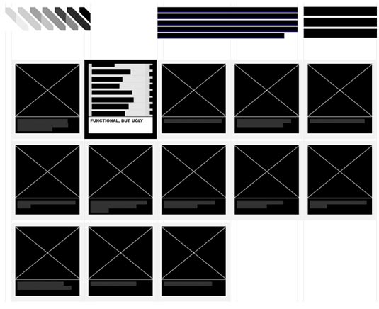
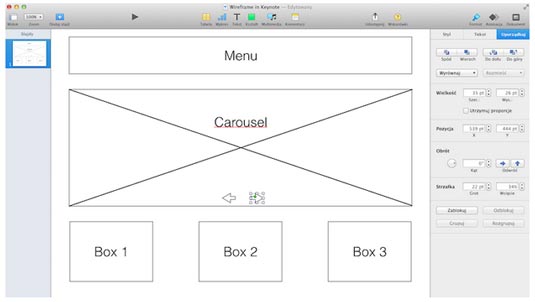
You know those black-and-white boxes with Xs and text that look like what was left over after someone scrubbed all the details off of a website or app? That's a wireframe.

Sometimes, you'll come across some confusion about terminology, with people interchangeably using terms like wireframes, sketches, and mockups to refer to rough design work. Let's clarify for a moment: sketches are the roughest, wireframes are bit more structured, while mockups are usually mid to low fidelity.
Get the Creative Bloq Newsletter
Daily design news, reviews, how-tos and more, as picked by the editors.
As described in the Guide to Wireframing, wireframes are a framework of simple, low-fidelity designs that explore content structure during the infancy of design projects. Wireframes can range in fidelity from nothing more than boxes drawn on a napkin to something more sophisticated with actual photos and crisp typography.
In general, though, wireframes should lean more towards the lower, more simplistic fidelity – it doesn't make much sense to worry about the paint when the concrete isn't even dry yet.
The purpose for wireframes, and why we still find them helpful, is that they help you focus on the structure and outline of a site so that you know what you're building. Designers who rush into higher fidelity might easily overlook some aspect of the overall information architecture, leading to a Jenga-like redesign process. By dedicating an early phase to planning with wireframes, designers can build a blueprint of the project without being distracting by pixel perfection.
The good and the bad
So why is wireframing on the chopping block?

In any competitive market, it's just good business to periodically reevaluate each phase of the process. And, like every other step, wireframing certainly has its disadvantages:
- Inaccurate depiction of final product – Their low fidelity means that viewers must use their imagination about what the final product will look like. This hurts stakeholder presentations, and also inhibits judging the "gut" reaction the final product will give. If you want to talk about anything interactive, you'll either need plenty of notes or wild gesturing to get the point across (if at all).
- Less suitable for usability testing – On a related note, the best usability testing is done with prototypes since users can actually react and play with something. While testing wireframes can hint at foundational UX issues (like if users can't find primary content), wireframes can just as easily feel like cold technical documentation.
- Over attachment – The more time you spend wireframing, the less willing you'll be to change any fundamental flaws in the page or site structure. It's just human nature to feel emotionally attached to work that you're proud of. More dangerously, wireframing can encourage a hand-off mentality in which you strive for greater detail so that it can be passed off better to developers (as if they're WYSIWIG machines).

In our opinion, the most valid complaints about wireframing pertain to lack of interactivity and slowing down the rapid prototyping method (which we described above).
Now, let's examine a few advantages:
- Structured outline – This is, beyond a doubt, the main advantage of wireframes, and reason on its own to do one. A wireframe is the blueprint of the site, showcasing what goes where so that everything can be built as parts of a whole with no guesswork or "figuring it out as you go." The alternative is steamrolling ahead into the later stages without a clear direction of where you're going… but like building a tower on unsolid ground, it's just a matter of time before everything comes crashing down.
- Express unexplainable Ideas – The design process isn't always so easy to explain with words, and sketches can be easily misinterpreted. Building a wireframe with a tool everyone's familiar makes communication a lot easier.
- Promote content-first design – All users want content, not design. When you wireframe, you need to think about how much space is required for design elements based upon the level and type of content. In fact, wireframing is best when you have some real content on hand (totally fine if it's rough) or you can even use competitor content like we recommended in free e-book Web UI Design for the Human Eye.
While the benefits of wireframing remain the same, you can circumvent a lot of the disadvantages by adapting your process to new technologies.
The new wireframes
The complaints in Bermon Painter's article were valid in the past – wireframes used to provide waste (especially as dead-end deliverables in Photoshop) and they used to be unable to test usability. But that view of wireframing is outdated.

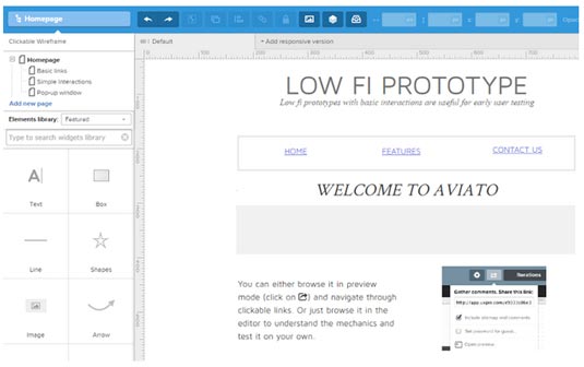
With the right wireframing and prototyping tools, wireframes easily accommodate interactivity. They become a kind of lo-fi prototype, able to test usability without taking up time in designing the details (yet). This, then, makes them perfect for rapid prototyping – the interactivity of a prototype allows them to be tested early on, but the low fidelity of a wireframe makes them easy to build.
Another common complaint is that wireframes are just another throwaway deliverable, but this, too, is no longer accurate. Again, when you use a specialized tool, your wireframes simply roll over into the next phase – evolve, if you will – into something capable of handling higher fidelity like a mockup or hi-fi prototype.

Lower fidelity wireframes are the most flexible. If you create them in a wireframing or prototyping tool, you can add fidelity later in the tool or move to Photoshop if you demand visual perfection. You get a better idea of the content structure without spending tons of time either way.
Next page: creating wireframes...

Thank you for reading 5 articles this month* Join now for unlimited access
Enjoy your first month for just £1 / $1 / €1
*Read 5 free articles per month without a subscription

Join now for unlimited access
Try first month for just £1 / $1 / €1

The Creative Bloq team is made up of a group of art and design enthusiasts, and has changed and evolved since Creative Bloq began back in 2012. The current website team consists of eight full-time members of staff: Editor Georgia Coggan, Deputy Editor Rosie Hilder, Ecommerce Editor Beren Neale, Senior News Editor Daniel Piper, Editor, Digital Art and 3D Ian Dean, Tech Reviews Editor Erlingur Einarsson, Ecommerce Writer Beth Nicholls and Staff Writer Natalie Fear, as well as a roster of freelancers from around the world. The ImagineFX magazine team also pitch in, ensuring that content from leading digital art publication ImagineFX is represented on Creative Bloq.
