Why designers should never skip prototyping
Wireframing and lo-fi prototyping are essential for great design, argues Ben Gremillion.
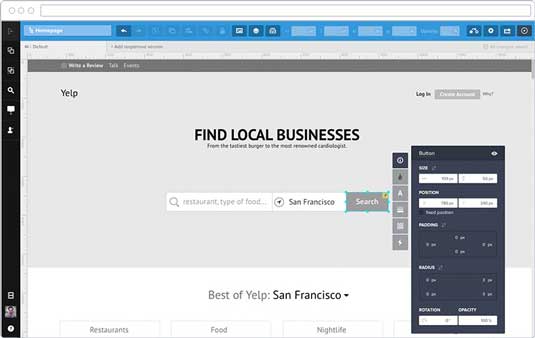
There are many reasons to skip wireframing and lo-fi prototyping. None of them are valid.
Well, maybe if you need it tomorrow and plan to revise later: build first, plan second, hope for the best all the while.
Prototyping is a critical step in product design. Final products are complicated, and therefore difficult to change. Prototypes are relatively cheap to build and rearrange. And while they take effort up front, planning and testing a prototype is well worth the effort.
Prototypes create a common design language. With them, designers can seek out problems while content people see how their work fits into the project. Meanwhile developers understand the interactions and clients can give approval or suggest changes.
In this post, we'll explore how prototyping helps you use smarter design patterns and collaborate better with developers.
Got a design pattern? Plan it out
As explained in the Web UI Pattern Handbook, design patterns aren't limited to the visual. There are accepted process patterns as well. Before we choose visual patterns, we need to seek these overall process patterns.
Take, for instance, the find-a-hotel process. At first glance it's not even worth mentioning. The pattern is so common, we take it for granted:
Get the Creative Bloq Newsletter
Daily design news, reviews, how-tos and more, as picked by the editors.
- Traveller arrives on the home page.
- Traveller searches for a hotel.
- Traveller compares options.
- Traveller chooses a hotel.
That could even be simplified to "search, compare, choose". A loose design pattern. But it's glossing over a few critical details — details that developers can't take for granted, and details that designers should carefully consider.
A more accurate process might include:
- Traveller arrives somewhere on the site, depending on how they found the site to begin with.
- The traveller uses the search tool — either the ever-present menu bar search field, or the home page's more prominent "find it!"
- The traveller taps through pages of options, somehow comparing promising hotels against each other.
- They choose a hotel by tapping "book this one" on either its detail page or the search results page.
- The site presents a form for their name, the number of people and nights, dates and credit card information.
- The traveller enters their information and clicks "book now."
- The site sends information to the appropriate hotel.
- They receive an email confirming their appointment.
All those "ifs" and "dependings" and "somehows" are open for interpretation. Within that, we find many design decisions to make.
Should the home page say "find it" or "search now"? How many results appear per page, and how are they spaced apart? By what parameters do they search to begin with? And on and on…
Prototypes communicate to developers what they're building. Removing ambiguity means they have less to decide themselves. In doing so, you also uncover missing critical steps. You won't discover what those steps are, much less find creative ways to stand apart from the competition, unless you put yourself in the user's shoes and try the design yourself.
Think through the process
A funny thing happens when you prototype: you start to use the design. Unlike static mockups, you'll find yourself working both visually and interactively at the same time.
This dual approach leads to all sorts of creative UI pattern decisions. Take 'shopping for hotels'. What if we invent a hybrid view (shown below in the prototyping tool UXPin) between search results and a detail page, on which the traveller can compare select hotels by price, location, amenities, etc?
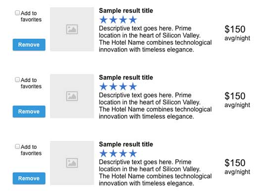
- Checkboxes and an "add this to your options" button.
- The ability to rank and sort favorite hotels, maybe by drag-and-drop
- The ability to say "nope" to certain options
- The ability to search for similar hotels based on their favorites
Now let's look at 'search by location'. What if our search results page was a map instead of a list?
- Developers would need to tap into a search, most likely Google's, API.
- Choosing multiple hotels for our hypothetical comparison view might become problematic, depending on the API's options.
- Mobile users would need a way to scroll through the page, avoiding the map.
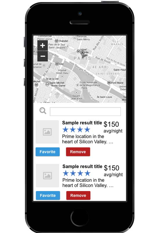
All of these design decisions come from questioning assumptions while walking through a prototype.
Design patterns remove guesswork
All of the descriptions so far are, obviously, text-based. Give this to a developer and he or she will get a rough idea of what to build.
But all too often, text conceals assumptions. "This page will have a search form" leaves too much to the imagination. Don't do that. It's your job as a designer to make those decisions and come up with as many possible exceptions as you can.
A hotel-finding home page has many possible configurations. It could showcase special deals, a search form, the most popular properties, or whatever else its designer feels will best serve travellers in search of a place to stay. Any of these solutions might work, depending on your priorities and restrictions.
But it's not enough to tell developers. You have to show them how the design works.

Coders code. Implementation is their job. They don't need to obsess over how a product should behave, scrutinizing user personas, or dealing with clients' requests and design restrictions.
Their concern with making a site mobile-friendly relates to media queries more than how many photos fit comfortably on a tablet. Prototyping makes their job easier by spelling out exactly how a product should work, leaving them free to dive into HTML/CSS/PHP/Ruby.
So prototypes also help designers flesh out patterns to their fullest extent. It's easier said than done, as planning a design requires much thought at the beginning of a project. That's where the decision-making should happen, however: early on, before we deliver a prototype to developers.
What happens, for example, if a hotel's description is extra-long? How should the search results trim the text? There are many ways (patterns, of course) to solve this particular problem. Maybe the full description deserves to appear on the results page. We might end with an ellipsis … or we might disregard text descriptions altogether.
Mockups aren't much better. Comping up pages doesn't give a sense of the site's flow, robbing developers of the spirit behind your decisions. They can't see how a site hangs together — and therefore can't help you question the assumptions. Developers are a clever crowd, and we discount their brainpower at our expense.
User testing: insights you can't ignore
Few things frustrate developers like learning they've built the wrong product. That's why seeking outside opinions before coding is critical. Possibly the most important reason to prototype with patterns is to give users the chance to point out flaws in the design — before you spend time building the final product.
For example, a keyword search in a hotel finder is pretty much useless. Real hotel finders let travellers search by availability, price and location. Users would point that out in a hurry, but not from static mockups.
Until they've tried it with a prototype, a user might easily gloss over such critical details.
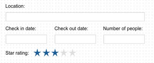
A user working through the hotel-finding app might find certain patterns are too simple. More likely they'll point out the need to search by availability on given dates, proximity to tourist attractions, smoking/non-smoking rooms, and other factors.
While those technically count as a search pattern, using a prototype would reveal necessary details. It's not enough to use lorem ipsum. Nothing beats testing the pattern in a real product.

Prepare yourself to test prototypes
There are other reasons to ask people not related to the project to test a prototype. Independently testing a product is a great chance to find out if we're using the most appropriate pattern to solve a design problem. The trick is to get out of their way and:
- Be prepared to abandon patterns. Sometimes things just don't work out. Users ignore or misinterpret your carefully-crafted paths through a product. Acknowledging and fixing that is easier if your prototype is simple and flexible enough to edit in a hurry (which is why you should always test your lo-fi prototype first).
- Watch for workarounds. Users are natural process finders. As they become familiar with a prototype, they'll discover ways to use it that you never considered. If you stay out of the way, they'll often point out patterns and workflows that you can emphasize and fine-tune for the next iteration.
- Consider alternatives. Users don't always directly point out which patterns confuse them. They'll usually ask why and how, as in "why can't I … ?" and "how do I … ?" Listening to their concerns and observations is a great way to identify which workflow patterns aren't working, and which visual patterns aren't clear. Pay attention, and ask smart follow-up questions.
Usability testing is critical because other people trust that you've made the best decisions possible. Let's say developers trust your choices and build a keyword search for, in this example, a hotel's name and maybe amenities. Placing those amenities on the main search page for users to choose from might be a great idea — one that comes from spending time with actual data, as developers are wont to do.
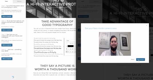
Developers are smart people. But giving them responsibility to figure out things like search parameters only occupies valuable development time. They have to stop and think about the things you should have considered before dropping the project on their desk.
And that's the power of prototyping your designs first: decision-making upfront saves time for everyone in the long run.
Next steps
If you found this post helpful, go ahead and check out the free Web UI Pattern Handbook.
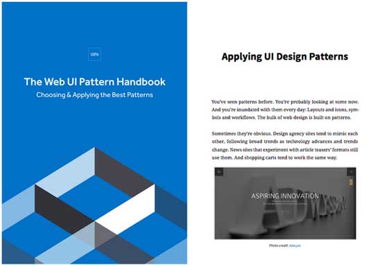
The book was written based on my experience designing websites for the past 20 years. The 104-page guide explains how to select and use the best design patterns with 100+ examples from ESPN, Adobe, AIGA, The Discovery Channel, and more.
Words: Ben Gremillion
Ben Gremillion is a content designer at the prototyping app UXPin where he writes for the free ebook library. He's been designing and coding for the web for nearly 20 years. He also builds and maintains a CMS for webcomic artists.
Liked this? Try these...

Thank you for reading 5 articles this month* Join now for unlimited access
Enjoy your first month for just £1 / $1 / €1
*Read 5 free articles per month without a subscription

Join now for unlimited access
Try first month for just £1 / $1 / €1

The Creative Bloq team is made up of a group of design fans, and has changed and evolved since Creative Bloq began back in 2012. The current website team consists of eight full-time members of staff: Editor Georgia Coggan, Deputy Editor Rosie Hilder, Ecommerce Editor Beren Neale, Senior News Editor Daniel Piper, Editor, Digital Art and 3D Ian Dean, Tech Reviews Editor Erlingur Einarsson, Ecommerce Writer Beth Nicholls and Staff Writer Natalie Fear, as well as a roster of freelancers from around the world. The ImagineFX magazine team also pitch in, ensuring that content from leading digital art publication ImagineFX is represented on Creative Bloq.
