Why great web design needs great copywriting
Jerry Cao offers 4 reasons why web designers need to become good writers, and how to go about it.
"I'm no writer," says the designer, using questionable grammar, while handing off an assignment to the copywriter.
It's true, visuals are a key element of design…but no more so than the written word (or usability of the system, or technology, or any of the other elements that all work together to solve user problems).
Copywriting is just another design feature that influences the user's opinion of whether or not they like the site or app enough to return. And yet, this still sometimes an imaginary divide between copy and design because the skillsets are so different.
Tear down the walls
We're not advocating that designers fire their copywriting team and just do it themselves (although designers can certainly write copy, we've done it ourselves at times).
But the designer would do well to tear down the wall between the product's visual communication and its textual communication. At the end of the day, it's all part of the same interface that users experience.
...And here are four reasons why:
01. Copy communicates directly with users
A meaningful or emotional visual may figuratively "speak" to the user, but it falls on text to literally speak to the user. Whether issuing instructions, product details, form fields for a purchase, or a casual greeting, writing is the shortest distance between you and the person staring at the screen.
Get the Creative Bloq Newsletter
Daily design news, reviews, how-tos and more, as picked by the editors.
A site or app can survive and even succeed without stunning visuals or delightful usability (just look at Craigslist), but you'll never find a site that relies purely on visuals. We won't get into the hierarchy of elements, but we will say, as an instrument of communication, words are essential.
Aside from content, copywriting fulfills at least six main purposes in a design scheme:
- Greeting – Some text on the home page (or most popular landing page) helps to orient the user on where they are, explain what you can do with your best foot forward, and suggest the next action for them to take.
- Navigation – Most navigation bars use words accompanying icons because it can be difficult to communicate something abstract like "About Us" with symbols. The exception, of course, is when the icons represent unmistakable visual metaphors (e.g. magnifying glass = search).
- Instructions – Not every function can be expressed with a familiar pattern or visual cue, and there will likely come a time when you'll have to explain in broad terms how to perform a task.
- Feedback – When something goes wrong – or when something goes right – the user appreciates some notification.
- Calls-to-Action – Every salesperson knows the importance of language when closing. The snappier the call to action, the more likely the user will take the leap of faith and click.
- Data – At some point, you'll have to present the cold, hard facts. This could be your company's contact information, or the labels of a form field.
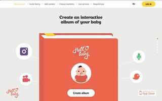
Hell'O Baby takes advantage of several of these uses right away on their homepage. Their header informs the user in plain English with product's purpose ("Create an interactive album of your baby").
Notice how the friendly presentation of the text through fun typography also makes the text feel like a casual greeting. If it was presented in a straightforward serif or sans-serif typeface (instead of its scriptish look), the statement would feel cold and possibly over-demanding when set against the cartoonish visuals.
Of course, the "create album" call-to-action shows you the next step before you figure out what the microphone, camera, and duck icons do. Notice how the visuals here are great – copy doesn't replace visuals, but works together with them.
Microcopy
As we recommended in Interaction Design Best Practices, never overlook the power of microcopy. Decisions like whether to use "proceed" or "go!" on a button all have subtle but substantial consequences on how the user perceives the product. Microcopy may seem negligible, but Jared Spool explains how the insertion of a line of text helped boost his client's profits by $300 million.
While you don't want to overburden your users by explaining every single function or over-commenting, sometimes additional information is exactly what your users want.
User research is the perfect way to determine if some features or elements of your design are being ignored or used improperly. Sometimes, you'll find that egregious usability issues from a confusing interface may be solved with a single, well-placed sentence.
02. Copy complements visuals
Design is about blending the different elements together to create something that is so intuitive it almost feels invisible. If a designer fancies themselves an artist, then one of their primary colors is text. An interface's copy shouldn't compete with the visuals – they should work in tandem to create the best experience possible.
This means the tones of the two should always match. Liberal use of teenager slang and emoticons obviously seem out of place against a conservative, professional site design for a bank. Likewise, serious content recommending treatment for depression shouldn't be offset by splays of color.
Aside from content, the block of text should visually fit inside the design – this alone is reason to work on them both at the same time. In this respect, placeholders like lorem ipsum can be deceptive.
Let's look at the following example.
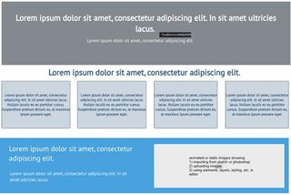
So far, so good, right? Looks like the final site will be perfectly on track, until…

… something got lost in translation. It's hard to predict how much or how little room the text will take up until it's right there in front of you. That, and properly matching tones, are why we suggest designing with the actual copy as early as possible.
Luckily, the difference isn't too dramatic in the above example. But, as product designer Rian van der Merwe shows us, ignoring a content-first approach can just as easily ruin your design.
Next page: copy is content and creating tone and personality...

Thank you for reading 5 articles this month* Join now for unlimited access
Enjoy your first month for just £1 / $1 / €1
*Read 5 free articles per month without a subscription

Join now for unlimited access
Try first month for just £1 / $1 / €1
The Creative Bloq team is made up of a group of design fans, and has changed and evolved since Creative Bloq began back in 2012. The current website team consists of eight full-time members of staff: Editor Georgia Coggan, Deputy Editor Rosie Hilder, Ecommerce Editor Beren Neale, Senior News Editor Daniel Piper, Editor, Digital Art and 3D Ian Dean, Tech Reviews Editor Erlingur Einarsson and Ecommerce Writer Beth Nicholls and Staff Writer Natalie Fear, as well as a roster of freelancers from around the world. The 3D World and ImagineFX magazine teams also pitch in, ensuring that content from 3D World and ImagineFX is represented on Creative Bloq.
