22 great examples of website navigation
Website navigation needs to be intuitive and easy to use - but it doesn't need to be boring. These sites all step outside the box to create something special...
Creating an effective website navigation system is a crucial part of ensuring usability, and the success of a web design. Good navigation should be intuitive, easy to use and most importantly help your visitors find the content they’re looking for quickly, without fuss.
For this reason, website navigation tends to err towards a homogenised standard that adopts current best-practice; the primary menu for a site is either at the left or along the top of a design, where users expect to find it.
There are obvious benefits to taking this approach, not least the fact that your visitors will immediately understand how to use your navigation.
Challenging assumptions
Good design means challenging assumptions, however, while still fulfilling the criteria of an easy-to-use and understand navigational structure, so we've gathered together 10 of our favourite alternatives to the standard website navigation approach below.
These websites don't take the obvious approach, and might be considered more memorable as a result. Check out our selection, and let us know in the comments if you've spotted a good example of unusual website navigation in the comments below...
- Read all our web design posts here
01. Nimbletank
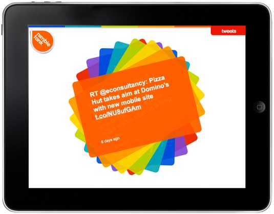
A good navigation system gets you the information you need quickly and easy. A great navigation makes you smile while you're doing it. That's just what London-based freelance creative developer Daniel Puhe and the team at mobile website agency Nimbletank have come up with.
This agency site offers an interactive and fun experience involving 360-degree movement and old school Tetris game references. Offering a multi-functional journey through what the agency has to offer, the site is aimed at touch devices but also works on desktop, where there's a 'Rotate' button in the corner to mimick the rotation of an iPad.
Get the Creative Bloq Newsletter
Daily design news, reviews, how-tos and more, as picked by the editors.
02. LBVD
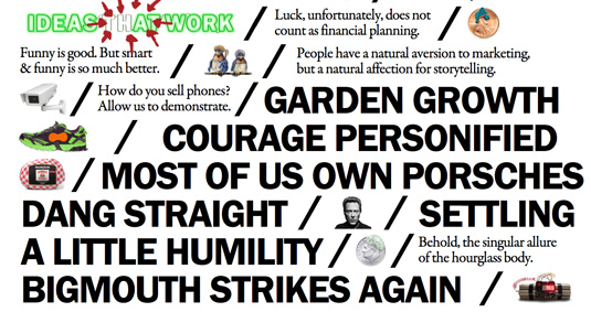
Creative agency LBVD's website really encourages users to click, with the bold, black Franklin Gothic text acting as navigation to modules and more information. "We wanted to ensure we stood out from other agency sites and allowed for easy exploration of our work and philosophy," says creative director Steve Saari. "With everything on a single scrolling page, it was designed to encourage discovery and ultimately (we hope anyway) to reward the curious."
The line items were very carefully designed to adhere to the resizing algorithm they created. Don’t let the heavy amount of text fool you: with images tossed in, bright splashes of colour and some pleasant layout surprises on screen resize, the site is never boring.
03. Dataveyes
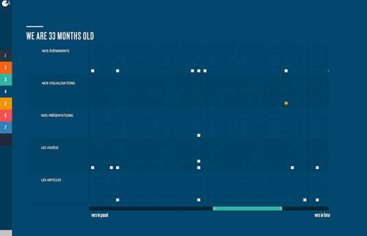
Dataveyes is a start-up designing interactive data visualization. Its website's clean design uses a reduced pop-out menu on the left hand edge of the window to allow movement between sections which are colourised to correspond with the navigation.
04. Big Apple Hot Dogs
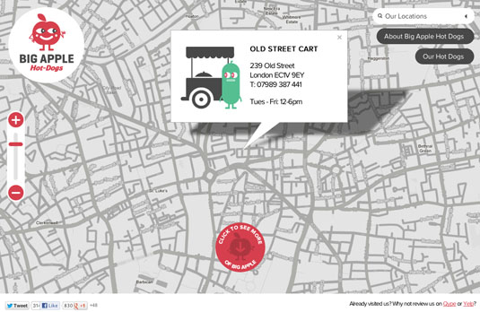
This quirky site for a hot dog business in London uses minimal navigation to create a clean, simple interface that showcases the content and product.
05. Acko
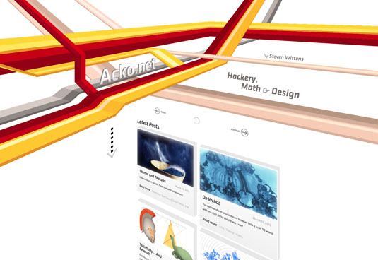
This portfolio site from designer developer Steven Wittens is unusual in its minimalist navigation, but even more so in the way the site sweeps from one section to the next with rich 3D effects rendered directly in the browser.
06. La Moulade
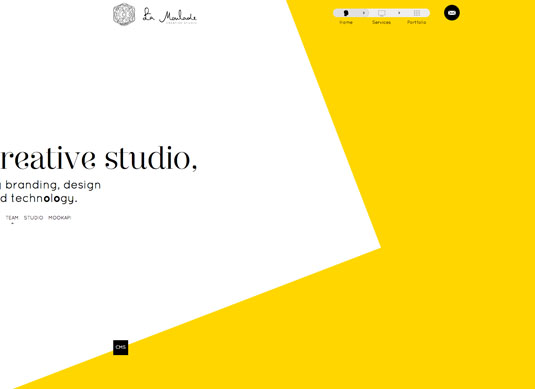
An example of the growing number of sites that use the scroll position of the page to generate animation and movement, this design for French agency La Moulade also features an unusual navigation widget that floats at the top, showing both where you are, and providing quick access to other areas.
07. Dangers of Fracking
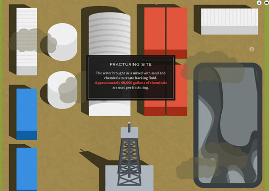
This is more of an interactive infographic than a traditional website, and consequently disposes of separate navigation elements altogether, instead relying purely on scrolling to lead the visitor through the infographic journey.
08. Walk Talk Azores 2012
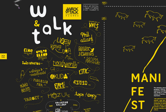
This website for a public art festival on São Miguel Island uses a central navigation bar to provide access to the different parts of the page, but this bar becomes almost unnecessary as moving around the site is gesture controlled; move your cursor to the edge of the window and the page scrolls to reveal new areas of content.
09. Bagigia
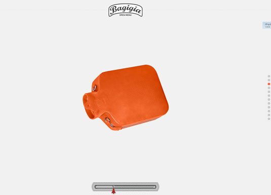
Although this site does have a traditional navigation bar, the entire site can also be accessed by manipulating a zip at the bottom of the window, allowing you to quickly access different parts of the content.
10. The Production Kitchen
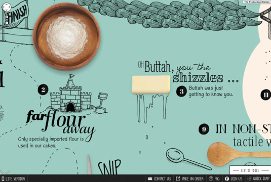
This site uses an animated, illustrative style to present content. What’s unusual about it is the method for getting around the site, which involves dragging (rather than scrolling). If you look carefully, you’ll notice that it’s using the Google Maps API to render tiles which make up the content. Page navigation therefore uses the same approach used to pan and zoom around regular maps.
11. Anet Design
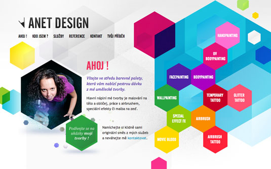
Anet Design offers a rich, colourful approach to website navigation. Although there is a traditional menu bar across the top of the page, the eye is immediately drawn to the collection of hexagonal buttons that appear site-wide.
12. Soleil Noir 2012 | We believe in...
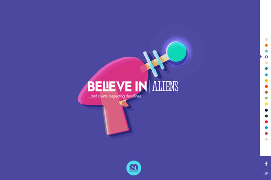
This wonderfully whimsical site from French interactive studio Soleil Noir was designed as a New Year’s card. It uses a simple set of coloured circles as the website navigation, along with some excellent parallax scrolling effects.
13. Stephen Vernon Clarke
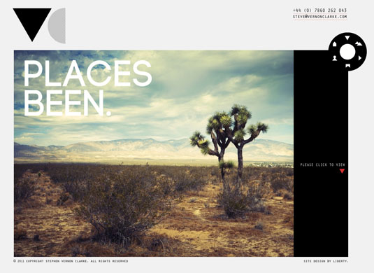
This simple site for a photographer uses a dial metaphor to provide the website navigation between sections, mirroring the functionality of a camera. The solution is appropriate to the subject matter, and allows the photographer’s work to take centre stage.
14. We are Unfold
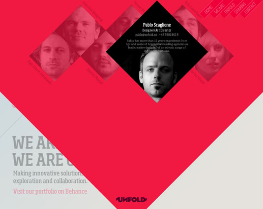
Here Norwegian agency Unfold uses a combination of endless scrolling and a small amount of parallax to create an unusual and effective website navigation scheme. The principal links between content areas appear at the top right of the window throughout, but when you reach the bottom of the single page design, the page continues to scroll, revealing the top of the page once more.
15. 75B
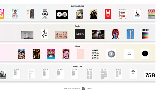
Dutch studio 75B uses a bird's-eye-view approach to website navigation, showing a preview of the content from a high level. Clicking on one of the sections reveals a horizontal scrolling page at full size.
16. Nick Jones
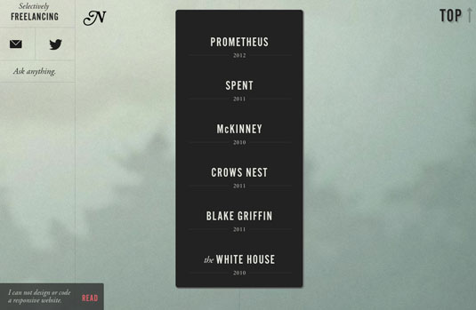
Occasional .net contributor Nick Jones has used a simple and minimalist approach to website navigation, displaying a linear menu of options in the centre of the page.
17. Racket
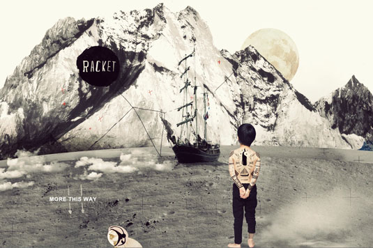
Australian agency Racket has eschewed the traditional idea of website navigation altogether for this temporary site, presenting all their content in a simple scrolling page. It’s a basic approach, but is an effective solution for communicating the core information.
18. Yes
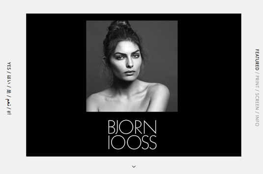
This site is interesting for its minimalist approach. The principal navigation sits in the vertical space on the right of the page, and scrolling through content provides a flip effect where there is no obvious movement of elements on the page at all.
19. Niketo
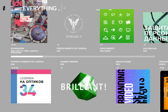
The Niketo website uses a timeline-like approach to showing content, with a simple-but-effective pop-up menu that allows you to filter the content shown.
20. Corporate Risk Watch
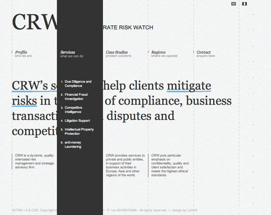
This site, designed by Italian agency Leftloft, uses an unusual approach to the dropdown menu. The initial navigation bar appears across the top of the content area, but on mouseover the page fills with a column that obscures the content, revealing navigational options.
21. Yodabaz

Although Flash sites are becoming less prevalent, there are still a few nice examples that challenge the normal approach. This example from 2009 that reduces the page to core elements, taking a minimalist approach with the website navigation sitting proudly up front.
22. Organic Grid
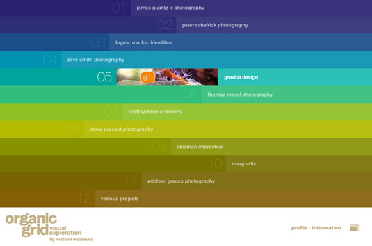
The Organic Grid website uses Flash to create a full-page design where the navigation is the content, and vice-versa. Striking for its use of colour and sound.
Words: Sam Hampton-Smith
Liked this? Read these!
- How to build an app
- Brilliant Wordpress tutorial selection
- Create a perfect mood board with these pro tips
Are there any examples of website navigation that you've found that should be included in our roundup? We'd love to hear what you’ve found in the comments.

Thank you for reading 5 articles this month* Join now for unlimited access
Enjoy your first month for just £1 / $1 / €1
*Read 5 free articles per month without a subscription

Join now for unlimited access
Try first month for just £1 / $1 / €1

The Creative Bloq team is made up of a group of design fans, and has changed and evolved since Creative Bloq began back in 2012. The current website team consists of eight full-time members of staff: Editor Georgia Coggan, Deputy Editor Rosie Hilder, Ecommerce Editor Beren Neale, Senior News Editor Daniel Piper, Editor, Digital Art and 3D Ian Dean, Tech Reviews Editor Erlingur Einarsson, Ecommerce Writer Beth Nicholls and Staff Writer Natalie Fear, as well as a roster of freelancers from around the world. The ImagineFX magazine team also pitch in, ensuring that content from leading digital art publication ImagineFX is represented on Creative Bloq.
