5 of this year's vertical scrolling trends
What trends are we seeing in parallax and vertical scrolling websites this year, and what does it mean for the future?
Vertical scrolling bubbled through from burgeoning fad to mainstream trend in 2014, and with awesome advertising, prime portfolios and crafted content all benefiting from single page scrolling, it's now certain that the technique is here to stay.
Be inspired by these 50 great parallax scrolling websites
That was the year designers took control of the technique, pushing the boundaries of what could be achieved. We've come a long way from Snow Fall – the New York Times microsite that kickstarted the trend in 2010.
What's left for vertical and parallax scrolling as we move through 2015? As it turns out, quite a lot. The maturity of the best work will be tempered by some of the perils that come with popularity – but this is a technique that won't be going away. Here are five vertical scrolling trends we are already seeing this year, and we expect to see more of...
01. Lots of really bad scrolling sites
From dancing bananas and the <BLINK> tag to Flash, every time the web gets animated it ends in tears. There's a danger that vertical scrolling could go the same way. Creating parallax sites is already much easier than it was just two years ago. There are libraries and tools that enable amateurs to assemble scrolling sites with the smallest amount of coding knowledge.

While that all helps to push innovation forward, it also opens up the floodgates for lots of annoying, amateur parallax design. We don't just mean badly executed work either – but work that uses vertical scrolling tropes simply because it can.
As Matter editor Bobbie Johnson said of the New York Times article that started it all: "Almost every example of 'snowfalling' that I've seen in action puts reading second to the razzle-dazzle... While the multimedia elements provided atmosphere, in all honesty they didn't mean much."
Get the Creative Bloq Newsletter
Daily design news, reviews, how-tos and more, as picked by the editors.
For a year or two we'll have to deal with a lot of web design content that puts style before substance. Does that mean vertical scrolling will have the same ultimate fate as blinking text? We think its more a case of 'it'll get worse before it gets better'.
02. A mobile-first approach
Vertical scrolling should work well on mobile by default, but that hasn't been the driving principle behind it to date. That has to, and will change in 2015 – not least because the way that users consume online content is changing.
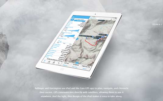
Year zero for this transition was 2010; the introduction of the iPad. While there were Android devices in 2009, the iPad defined this new space so immediately and completely that it now seems impossible to imagine a time before it or its smaller sibling, the smartphone.

Tablet PC ownership leapt from 30 per cent of the US population in 2013 to 44 per cent in 2014, with the curve predicted to continue its rise next year. Meanwhile, around 58 per cent of US adults now tote a smartphone. The UK loves its phones even more, with 61 per cent smartphone ownership – concentrated in the lucrative younger age groups.
And yet, most vertical design has – so far – been a showcase for websites. Partly, that could be explained away as waiting for CSS rules used for parallax effects to migrate to mobile. But designers can no longer ignore that mobile content consumption is a huge market. The metaphor works on mobile so well that the best stuff going forward will be mobile first; responsive, simple and chock-full of content rather than bells and whistles.
Next page: three more vertical scrolling trends

Thank you for reading 5 articles this month* Join now for unlimited access
Enjoy your first month for just £1 / $1 / €1
*Read 5 free articles per month without a subscription

Join now for unlimited access
Try first month for just £1 / $1 / €1

The Creative Bloq team is made up of a group of art and design enthusiasts, and has changed and evolved since Creative Bloq began back in 2012. The current website team consists of eight full-time members of staff: Editor Georgia Coggan, Deputy Editor Rosie Hilder, Ecommerce Editor Beren Neale, Senior News Editor Daniel Piper, Editor, Digital Art and 3D Ian Dean, Tech Reviews Editor Erlingur Einarsson, Ecommerce Writer Beth Nicholls and Staff Writer Natalie Fear, as well as a roster of freelancers from around the world. The ImagineFX magazine team also pitch in, ensuring that content from leading digital art publication ImagineFX is represented on Creative Bloq.
