How to use mockups in the UX design process
Jerry Cao of UXPin explains how to adapt mockups for different projects and processes.
Traditionally, the process goes from wireframing to mockups to prototyping, with variation in fidelity for each stage depending on the team. But like most design practices, others have strayed from tradition and discovered new and helpful alternatives. We'll explore two such alternatives and give advice on each, then explain how mockups can make it easier to create style and brand guides.
Implementing mockups in the Process
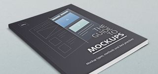
As discussed in The Guide to Mockups, mockups can be more than just a step between wireframes and prototypes. In fact, even this transitional function can vary in importance and implementation.
Before we get into the alternative processes for using mockups, we'd like to list some general advice to keep in mind when creating mockups, regardless of how you implement them.
Bima Arafah, Designer & Front-End Engineer at Nesia, believes in a KISS (Keep it Simple Stupid) approach when it comes to design processes involving mockups. Generally speaking, it helps to avoid overly fancy visually effects like high contrast font types, and keep it simple by using existing palettes like Adobe Kuler. Here's 5 more tips to keep even high-fidelity mockups grounded in simplicity:
- Design for the project's needs — If stakeholders have trouble articulating their needs and expectations, ask them to collaborate. You should start the discussion around images, logos, and visual hierarchy well before your mockup is done (but don't let them have the final say, otherwise that's design by committee).
- Don't skip wireframing — The wireframe is your guideline to your mockup. It allows you to answer broader questions about layout and content so that they don't distract you from visual decisions. Like this Priority Guide, a wireframe is naturally collaborative since the concepts are easily digestible.
- Focus on a centralized concept — Sketching and wireframing is great for early concepting, but you need to have a clear direction by mockup time. As the old Native American adage goes, "If you chase two rabbits, you will lose them both."
- Check out rival sites — In general, it's a helpful habit to be aware of what your competitors are doing, but in the wireframing and mockup phases it's especially helpful for thinking outside the company. A quick heuristic review shows where competitors succeed — and how you can improve your own site based on their mistakes.
- Don't neglect mockup presentation — One of the main functions of a mockup is its assistance in stakeholder presentation. If some elements don't come across in the mockup, include a few notes to explain their functions.
As we explained in The Guide to UX Design Process & Documentation, the design process is as diverse as the companies using them. With these guidelines in mind, let's take a look at two opposite ways mockups fit into the design process.
Wireframing => Mockups => Development
This design method skips UX prototyping and leaps straight from mockups into development. Proponents of this method claim that prototyping is useless, as the sooner development starts, the better.
In this case, the mockup gets added importance, as it is the most prominent "blueprint" referred to throughout development.
Get the Creative Bloq Newsletter
Daily design news, reviews, how-tos and more, as picked by the editors.
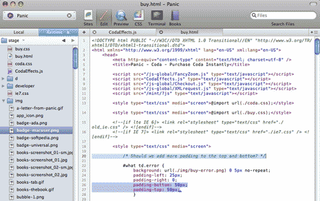
Steven Bradley of Vanseo Design is a follower of this method, and explains his personal process in a post for his site.
However, it's important to note that even he, a professional designer, confuses the terminology and that his hi-fi wireframes and design comps are technically mockups. (For this reason, we included that disclaimer about nomenclature at the beginning of the e-book.) Here's the overall process:
- Sketching/Wireframing — The first step of the process is sketching out the basic ideas and starting elements, plus a few rough design elements. Next comes wireframing, where these rough ideas are fleshed out and specified. Essentially, these early phases don't stray from the process described in The Guide to Wireframing.
- Hi-fi Mockups — Next comes a high-fidelity mockup, meant to be as "pixel perfect" as possible. Keep in mind this is the final outline before the development process, so most details and decisions should be finalized and the final version should be run by the client.
- Development — With the preliminary phases out of the way, it's time to start building the actual site. Bradley starts with a single HTML file that includes CSS and Javascript. When visuals don't code properly, extra time is spent redesigning until the final product is workable. At that stage, the file is sent to a tool like WordPress, where further revisions are made if needed.
While we don't necessarily advise skipping the prototyping phase (since it can limit creativity), we understand its value in certain situations. However, even in such situations, we would recommend at least a rapid prototyping phase over none whatsoever. Smashing Magazine posted a great piece on how to conduct a highly efficient 3-step prototyping phase for situations like these.
Speaking of the importance of prototyping, let's take a look at the a design process that combines mockups and hi-fidelity prototypes. This is actually the process we follow at UXPin.
Wireframe => Lo-fi Prototype => Hi-fi Mockup/Prototype
Quite the opposite of the last method, this process places extra emphasis on the prototyping phase, initiating it as early as possible. This is the method that most closely relates to the coded mockup we discussed in The Guide to Mockups. This early integration with functionality works well with designers who know their code, or with a project that involves especially complex technicalities.
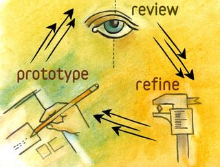
In our previous e-book User Testing & Design, we discuss this method at length; however, here we'll give a brief overview:
- Wireframing — This phase starts out as always — basic ideas, basic structuring.
- Lo-fi Prototype — The important factor here is "lo-fi", as you don't want to bite off more than you can design this early on. At this stage, you focus more on interaction and functionality. For example, when we reworked Yelp's website, we simply added interactions to our wireframe in UXPin, as you can see on this live version.
- Hi-fi Mockup/Prototype — When it comes time to focusing on visuals (the main purpose of mockups), you can just inject those details into the existing lo-fi prototype. As the visuals develop, add more and more interactive elements as well, merging the mockup with the lo-fi prototype to create a hi-fi prototype. Whatever visuals you can't create in your prototyping tool can be built in Photoshop or Sketch, then can be imported and dragged-and-dropped into UXPin or redrawn in other tools.
- Usability Testing and Iterating — One of the big advantages of this method is that functionality can be tested, refined, and perfected early on when it's still (relatively) easy. By conducting usability tests between each stage of design, you can start addressing problems before they're even problems.
If you're curious about a variation of this process, Bhavin Parikh, Founder and CEO of Magoosh, explains how to turn web requirements into mockups. Like we described before, he also emphasizes thinking about interaction design before working on the visual design (although he incorrectly uses the terms mockup and prototype interchangeably).
Really, though, there are any number of methods and strategies for the design process, from obsessive and meticulous planning to jumping head-first into development. While we've discussed several approaches, feel free to mix-and-match depending on your own needs, strengths, and weaknesses.
Chop up your mockup for lean style guides
We've spent a lot of time talking about how beneficial mockups are for visual design and client relations. But there is a third, lesser-but-no-less-important use for mockups, and that's in helping to compile a style guide. It makes sense when you think about it — the mockup is visual documentation of the product's style, so you can cut and paste elements to create a fast style guide.
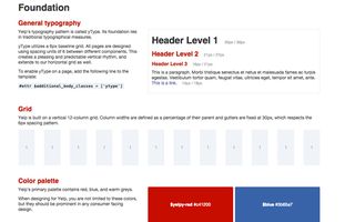
In the e-book Web UI Design Best Practices, we discuss style guides and how to create them, listing out expert suggestions on what to include and how to format them.
To highlight the most relevant points, a style guide is simply a formalized compilation of the look and feel for your site, so that designers and developers have a quick reference guide. For some professional examples, the UX Bookmark lists some useful online samples including Apple, Android, and even Heineken.
Style guides contain information like the proper layout standards, margin sizes, which fonts are used where and what size, branding rules, and so on. Because these are choices commonly made while building a mockup, the correlation between the two is easy to see.
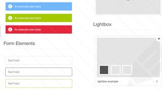
When you make these stylistic decisions, you can simultaneously record them with quick notes in a style guide and some screenshots of the mockup.
This will save you the trouble of building one later since you won't have to go digging up the information. Since we move pretty quickly in our design sprints, this is exactly how we build and update our style guides at UXPin.
For even more convenience, Medialoot offers a free UI Style Guide template — fill out what works and tweak the rest.
Takeaway
No matter where they appear in the design process, how much fidelity they have, or how much time you spend on them, mockups are quite helpful as visual documentation, quick spec sheets for developers, and a canvas for exploring visual details.
Often ignored (or confused with wireframes), mockups can be overlooked because they're seen as extra work. But as we've discussed in The Guide to Mockups, the key to minimizing double duty is collaboration. You'll get much more value from a mockup if you treat it as a medium to explore the technical feasibility of design rather than just a deliverable handed off to developers.
Remember that design requires content and form: wireframes outline the content, and mockups add finesse to the form. If nothing else, mockups at least help you better avoid these dreaded words from clients and stakeholders: "I'll know it when I see it."
Words: Jerry Cao
Jerry Cao is a content strategist at UXPin — the wireframing and prototyping app — where he develops in-app and online content for the wireframing and prototyping platform. To learn how to use mockups of all types and fidelities, check out The Guide to Mockups.

Thank you for reading 5 articles this month* Join now for unlimited access
Enjoy your first month for just £1 / $1 / €1
*Read 5 free articles per month without a subscription

Join now for unlimited access
Try first month for just £1 / $1 / €1
The Creative Bloq team is made up of a group of design fans, and has changed and evolved since Creative Bloq began back in 2012. The current website team consists of eight full-time members of staff: Editor Georgia Coggan, Deputy Editor Rosie Hilder, Ecommerce Editor Beren Neale, Senior News Editor Daniel Piper, Editor, Digital Art and 3D Ian Dean, Tech Reviews Editor Erlingur Einarsson and Ecommerce Writer Beth Nicholls and Staff Writer Natalie Fear, as well as a roster of freelancers from around the world. The 3D World and ImagineFX magazine teams also pitch in, ensuring that content from 3D World and ImagineFX is represented on Creative Bloq.

