Top web design trends for 2016
We round up the hottest web design trends set to dominate 2016.
Just like any other field of design, web design trends come and go with the passing of time. Unlike many other fields, however, web design has a relentless driver to change: technology. Because the basis of the platform is ever changing, some of the trends in design for the web are as a result of improvements to what's possible as much as a reflection on changing taste.
2015 has been an interesting year in terms of web design. The visual landscape for web designers has remained largely as it was in 2014, with only a refinement of the minimalist approach that has become popular over the past few years. Underneath the aesthetic treatment of pages, however, the web has been quietly progressing.
The technological platforms that underpin much of what is produced have been evolving. Part of this has been in the form of improvements to web browsers themselves, and the further migration from desktop browsing to mobile devices as the principle method of consumption, but there has also been a fundamental coming of age for some of the most popular libraries and frameworks found in the majority of web destinations.
The likes of Modernizr, for example, have completed an evolution to the next stage of their existence, effectively stepping back and reinventing themselves to remain useful and relevant to the web designer and developer as browsers improve and develop.
Discover how to design apps for all of Apple's new screen sizes
All of this means that now, more than ever before, the web is a playground for designers to push the boundaries of what is possible, experimenting with novel user interfaces, and leveraging the power of all the possibilities in creative, exciting ways.
So here's what we're tipping to be the major trends in web design for 2016. Do you agree? Have we missed any upcoming fashions or technologies? Let us know what you think in the comments below!
Get the Creative Bloq Newsletter
Daily design news, reviews, how-tos and more, as picked by the editors.
01. CSS3 will finally impact layouts
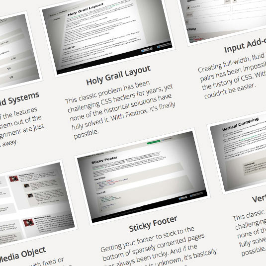
Browser support for CSS3 has been growing over the past couple of years, and we're finally reaching a stage where some of the fancy new CSS3 layout modules can be safely used in the wild. Of course there's still a place for polyfills and fallbacks, but the likes of CSS3 Flexbox (Flexible Box Layout) can be handled by the latest releases of all the popular browsers.
It is safe to say that the likes of Flexbox wont be revolutionising the aesthetics of layout in any dramatic sense – Flexbox offers an easier solution to a layout paradigm that's been in use on the web for a long time now – but it will make for faster-rendering pages that are easier to maintain, and a lot fewer hacks, so it is quite possible that we'll see more creativity in layout as a result.
On Trend: Layouts may not substantially alter (although see trend 05!) but the code underpinning them will become simpler and more reliable
02. Material Design will dominate
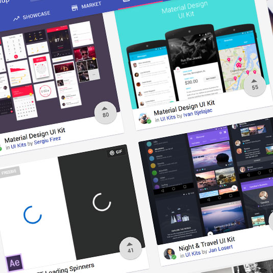
There has been a bit of a revolution over the past twelve months in the form of the adoption of Google's Material design as a basis for UI presentation and development. This trend reflects the move toward smartphones as the principle and first device used to access the web, over and above the desktop or laptop computer. While it's no longer "new", Material Design is coming of age with wide-spread adoption and a raft of extensions and kits cropping up.
On Trend: Expect to see the tell-tale signs of Material appearing in user interface design across the web, much as happened with Bootstrap in the past.
03. Cinemagraphs will come of age
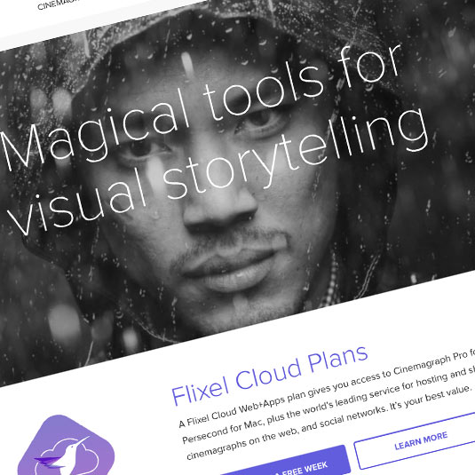
Cinemagraphs are nothing new; they've been around for several years in their current form, but there have been a couple events during 2015 that has brought them to the forefront of designers' minds, and the consumer's appetite. The main thing that has happened is the arrival of "live photos" on Apple's latest iPhone models. These Harry-Potter-esque images capture a little movement in a photo, so that when viewed the static photo appears to come to life. Cinemagraphs offer a similar visual effect, so as social media starts to flood with home-made live photos, so advertisers and content producers have started to recognise the arresting power such images can have.
The second change that has facilitated a renewed interest is that the technology underpinning the effect has improved. With HTML5 Canvas now being useable in the wild, effects can be rendered in real time without the huge overhead or colour limitations of loading a traditional animated GIF. Indeed, there are now a range of commercial tools available for exactly the sole purpose of producing cinemagraphs, such as the handy flixel.com.
On Trend: Expect to see a lot of photos that have movement while continuing to offer the benefits of a static image.
04. Fewer photos, more illustration
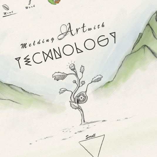
We're coming to the end of a period where a good proportion of websites feature a photo header that stretches across the viewport. This might seem to be in direct contrast to our predicted trend #3, but the two things are actually reflecting the same progression from a shiny, polished but unapproachable utopia, toward imagery that engages the user in a more personal, connected way.
We're expecting this to be in the form of illustration over photography, because with illustration it's often easier to place yourself in a scene than it might be when a photo features horribly well-dressed, perfectly manicured models. I can hear you protesting that that's exactly what your life is like, but for the majority of people it's a falsehood that doesn't align with their own experiences, and they're wise to the differences!
On Trend: Photos will be replaced with more relatable illustrations that connect to the viewer in a more personal manner. Website designs may revert to a fixed-width layout at the same time.
05. Colour and typography will get bolder
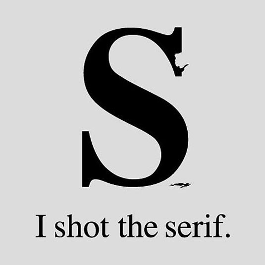
Use of colour as a branding device is an important marketing tool, as is the effective use of typography to reinforce values and convey important messages. Every designer knows this, but choices have often been constrained by what's technically possible (in the case of fonts and typographical layout), and by what's corporately "safe". We expect this to change!
The past couple of years has seen a total transformation in the typographical landscape online as web fonts have become accessible to all, and as a result we've already seen a dramatic shift in the way type is rendered online. Colours have remained muted on the whole, and a combination of designers and brands becoming bolder, alongside refinements to fonts and a resurgence in appreciation of good typography leads us to conclude that 2016 will be marked by a lot of colour, and a whole lot of type!
On Trend: Look out for creative typographical treatments appearing throughout the web, not just in occasional headlines, and big, bold and brash colour!
Words: Sam Hampton-Smith
Sam Hampton-Smith is a freelance author and front-end designer/developer based in Scotland.
Liked this? Read these!

Thank you for reading 5 articles this month* Join now for unlimited access
Enjoy your first month for just £1 / $1 / €1
*Read 5 free articles per month without a subscription

Join now for unlimited access
Try first month for just £1 / $1 / €1

The Creative Bloq team is made up of a group of art and design enthusiasts, and has changed and evolved since Creative Bloq began back in 2012. The current website team consists of eight full-time members of staff: Editor Georgia Coggan, Deputy Editor Rosie Hilder, Ecommerce Editor Beren Neale, Senior News Editor Daniel Piper, Editor, Digital Art and 3D Ian Dean, Tech Reviews Editor Erlingur Einarsson, Ecommerce Writer Beth Nicholls and Staff Writer Natalie Fear, as well as a roster of freelancers from around the world. The ImagineFX magazine team also pitch in, ensuring that content from leading digital art publication ImagineFX is represented on Creative Bloq.
