30 web design tips to make your life easier
Leading experts in web design reveal the secrets that save them time and speed up their workflow.
Every web designer has a secret or two. Hard-won workflows, hidden hacks, and insider knowledge that are the mark of true experience and the stuff that separates great web design training from good.
Here, we've managed to persuade some of the web's busiest devs and designers to part with their most closely guarded tricks and tips. It's quite a collection.
Packed with professional know-how, you'll discover secret features of well known tools, the beta services that the design industry is buzzing about and CSS tricks that make page design for multiple platforms easy. So whether you're a beginner at online design or a web veteran, you're bound to uncover one or two tips here that will change the way you work.
Faster coding
01. CodeKit for browser reloading
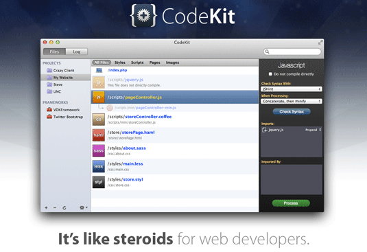
"If you're on a Mac then CodeKit is a must," says Keir Whitaker, co-founder of Viewport Industries. "The browser reloading feature is worth the small cost alone. The days of hard refreshing your browser to make changes take effect are long gone."
02. Apply global changes
Here's a coding tip from musician, producer and web dev Elliott Fienberg that can help speed things up at the early stages of your design work. Use the wildcard CSS rule - using an asterisk as the selector - and you can globally apply changes to an entire page. For example, to change all the fonts on a page to sans-serif, you just need: *{font-family:arial, helvetica, sans-serif;}
This is a great designer's trick to have in your pocket while you're going through the design process. Of course, it's not such a great idea to leave it in your live code, so use this trick carefully and sparingly!
03. Set garish outlines
File this in the "simple acts of genius" folder - a tip from Christopher Murphy of Web Standardistas that makes cross-platform design so much easier. "When working with media queries, set an outline in a garish colour," says Murphy. "For example: {outline:10px solid green/red/yellow/blue;}. This enables you to instantly see which exact rules are being applied to what you're currently looking at."
Get the Creative Bloq Newsletter
Daily design news, reviews, how-tos and more, as picked by the editors.
04. Check your character count
"45-75 characters per line is generally accepted as safe for comfortable reading," says Trent Walton, founder and designer with Paravel. "There's a quick trick to ensure your responsive or fluid design supports this. Place a line of dummy text on your page with an asterisk at character 45 and an asterisk at character 75. Now test the site to make sure it resizes within these parameters."
05. Use FitVids for video embedding
HTML5 has simplified video embedding, but designers still have two problems. The first is getting video to resize responsively, the second is to ensure resizing degrades gracefully for Flash when HTML5 embedding isn't supported. Enter FitVids, a jQuery plugin that takes care of all that for you.
Dealing with images
06. Smushit for image size reduction
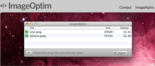
Sites with highly optimised images load faster and work better on more devices. "SmushIt is a great option to reduce image file sizes," says web developer and Microsoft evangelist Martin Beeby, and we agree. You may also want to give Trent Walton's fave ImageOptim a try.
07. Export images as 8bit PNG
Martin Beeby makes an old-school suggestion for handling PNG image files. "If you're exporting an image from Photoshop to PNG, and it doesn't need to be transparent, try exporting it as an 8bit PNG," he explains. "In most cases the image quality won't be affected but you will massively reduce the file size."
08. PNGQuant for image conversion
If you want to maintain transparency and minimise file size, there's a service that can help. PNGQuant can convert 24/32bit PNGs to 8bit PNGS and still maintain transparency. There's fancy for you.
Layouts
09. Use GuideGuide
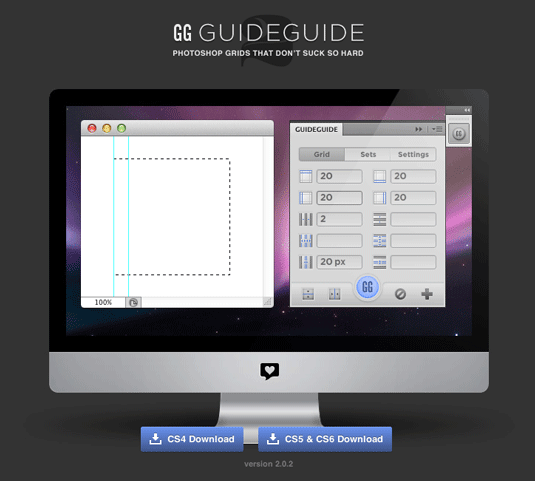
"The best websites are designed to a grid," says Rhys Little, director of digital marketing agency Plug and Play. Setting up grids everytime in Photoshop can be tedious, though. He recommends Guide Guide: "It makes the process a breeze and save you a lot of time creating custom grids."
10. Use a 12-column grid
Another tip from Rhys Little: "Typically it is a good idea to use a grid with columns nicely divisible by 2, 3 and 4. Therefore, a 12 column grid is one of the most popular and versatile grids to use." Check out 960grid for more web design-friendly grid templates for a host of apps.
11. Find colour inspiration
We’re already fans of Adobe Kuler; Martin Beeby has uncovered a use we hadn't thought of: "I'm colour blind and so when I'm putting colour palettes together for a project I always reach for Kuler," he explains. He also recommends Colour Lovers - a creative community where members share colour schemes, designs and ideas.
Web typography
12. Typecast for typographic palettes
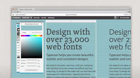
Typecast, an app produced by the talented team at Belfast-based design agency Front, makes designing typographically rich sites a breeze. "It enables you to rapidly build and compare typographic palettes," enthuses Christopher Murphy.
13. Use Typecast with Google Fonts
Monotype recently teamed up with Google to release a new, free public version of Typecast which can be accessed through Google Fonts. It enables you to select any font on the Google Fonts website and then follow the link to the Typecast app.
From there, you can work with that font on text of any length and use a wide range of type controls to build clear, readable type systems through adjustments such as font size, weight and line spacing. Your work can be exported as production-ready HTML and CSS, or PNG files, to share with others or merge with comps.
14. Font Squirrel for free web fonts
Free web fonts have really come of age. With Font Squirrel, Google Web Fonts and the @font-face attribute of CSS3, there's no need to put up with the typography troubles the last generation of web designers struggled so much with. Here's our round up of some of the best free web fonts around.
Plan the perfect site
15 Use Dropbox for version control
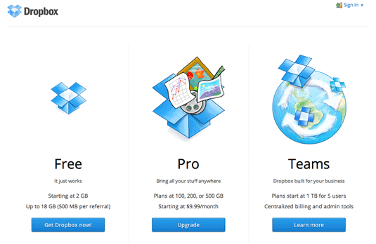
Keir Whitaker suggests using Dropbox Pro as a simple versioning system. As well as having 100GB of storage, you'll get versioning of your files for 30 days rolling. "More than enough to help you out with those 'accidental' deletes," says Whitaker.
16. Slow down
Visual creatives have a habit of whipping out their sketchbook first. Aidan Martin, senior designer at Alienation Digital, says we all need to slow down. "Don't start with a design: take a scenario-based approach," says Aidan. "Firmly establish the user's goals, map out their journey and then build the design around this."
17. Put your site on a Post-it
Does your design idea fit on a Post-it note, asks Elliott Fienberg? "One exercise I like to do is to write down your core content on a small piece of paper like a Post-it note," he says. "This will help you figure out what is really important and what can be omitted. The small piece of paper simulates the attention span of most users these days."
18. Plan your user flow
Want to know what to do with the rest of those Post-its? "You can expand this exercise by planning out your user flow on a series of Post-it notes," adds Elliott Fienberg. "I guarantee your project will be far more focused." Other sticky notes are available, of course, including virtual Sticky Notes on Windows and Stickies on OS X.
Photoshop workflow
19. Name your layers wisely
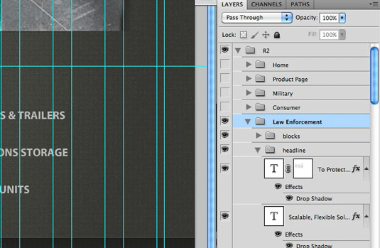
Rhys Little offers a clutch of tips on sharing Photoshop layouts within your team. His first suggestion: "Be as descriptive as possible when you name your Photoshop layers. It takes a second when creating a new layer to give it a simple name that others will be able to understand. This will save hours of forensic work later on."
20. Bin spare layers
Throw away any extra layers in Photoshop designs, adds Rhys Little. "If you like to save those extra layers 'just in case' then just archive a version with the layers you want to save," he says. Your main file will only contain the layers developers and other designers need access to, minimising confusion.
21. Label your folders
"Make sure you create an ASSETS Folder containing all fonts, images, logos, etc used in your project," continues Rhys Little. "And ensure that those individual folders are labelled accordingly."
22. Keep names consistent
Rhys Little also suggests that you maintain a consistent naming scheme, where the current site design file is always has the same name, rather than incrementally naming files. Older files should then be banished to an archive folder. For example:
ARCHIVE
WEBSITE.PSD
23. Save everything to server
"Remember to save your work to the server," adds Rhys Little. Even when you're taking an afternoon to tweak a file; "if you are sharing files, you need to ensure that your most recent work is readily available even if you are not."
Keep clients happy
24. Use Pinterest for moodboards
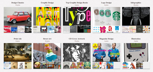
While we’re talking about keeping clients on your side, we all know that clients love moodboards. They’re a great way to collect elements together quickly and clue your client in - or even get them involved in the initial design process. The easiest way to get started? Create a shared board on Pinterest and invite your client to pin away.
25. Involve clients from the start
"Get the client involved as early as possible and throughout the design process," says Aidan Martin. "Always remember that they know their business best and only by combining this knowledge with your own will you be able to develop a truly successful digital solution."
26. Focus on prototyping
Use prototyping tools to get early versions of your designs in front of clients as soon as possible. This could be as simple as a Fireworks prototype or as complex as a functioning wireframe made in Balsamiq. "Get those signed off before jumping in with Photoshop and it will make your job a lot easier," urges freelance web designer Gavin Elliott.
Boost your career
27. Ask for help
If a job calls for an advanced skill you don't yet have, don't be afraid to ask for help. With free collaboration tools like Trello and Redbooth you don't even need to be in the same country!
28. Work on your portfolio during downtime
"Don't wait for other people to ask you to try something new or to challenge you," says Ben Howdle, developer at Wapple.net. "In the downtime between jobs, when you’ve finished pitching, you should always be creating new portfolio work. The more inventive, the better."
29. Say yes to new challenges
Ben Howdle has another strategy for keeping the work flowing: say yes to work even if it's outside your comfort zone. "Taking on jobs that challenge you helps you to develop and expand your skills much more than any tutorial. And deadlines are a powerful motivator to learn on the job."
30. Get feedback from Dribbble
Remember how helpful those crit sessions were at college? "Check places like Dribbble for inspiration," urges Ben Howdle. It's a social network for designers, where you can share work in progress and get comments from your peers. Sometimes it takes another designer to tell you where you're going wrong - or right.
Words: Karl Hodge
Like this? Read these!
Do you have a secret to your web design success? Don't be selfish, share it with others in the comments below!

Thank you for reading 5 articles this month* Join now for unlimited access
Enjoy your first month for just £1 / $1 / €1
*Read 5 free articles per month without a subscription

Join now for unlimited access
Try first month for just £1 / $1 / €1

The Creative Bloq team is made up of a group of design fans, and has changed and evolved since Creative Bloq began back in 2012. The current website team consists of eight full-time members of staff: Editor Georgia Coggan, Deputy Editor Rosie Hilder, Ecommerce Editor Beren Neale, Senior News Editor Daniel Piper, Editor, Digital Art and 3D Ian Dean, Tech Reviews Editor Erlingur Einarsson, Ecommerce Writer Beth Nicholls and Staff Writer Natalie Fear, as well as a roster of freelancers from around the world. The ImagineFX magazine team also pitch in, ensuring that content from leading digital art publication ImagineFX is represented on Creative Bloq.
