Stop thinking in pixels: improving web layout
HiDPI displays are enabling users to experience a more beautiful web, but also exposing the crutch that is thinking in pixels. Let’s take some lessons from the print world and improve our layouts
I just finished converting my personal website from pixel-based layout measurement to percentages and ems. For the last year or so I’ve been advocating that others do likewise. I’ve read the articles, listened to the arguments and toyed with the techniques. And I’ve forcefully stood by the opinion that we should be working this way in every debate I’ve been a part of. All the while hoping that nobody was opening the web inspector on my personal site, checking on my dirty little secret. I was publicly advocating for a solid best practice while privately enjoying the ease and speed of pixel-based layouts. For crying out loud, I could run for public office with that kind of duplicitousness.
First of all, why?
If you’re not familiar with this debate, or you haven’t looked into it at all, here’s the gist of it: using pixels as a measurement unit messes up zooming for users who require it because it declares your font-size in units that are locked to a physical property of your screen. In addition, it’s more theoretically pure to use ems for measuring type because it’s a typographic measurement, and if you’re already defining your content parameters in a typographic unit of measurement and proportion, it makes sense to apply the same idea across the rest of your layout as well. The problem is, using pixels is comfortable. Everything always looks the way you want it to, at least at the default zoom level on a desktop device. All the other devices or zoom levels have a problem with it, but at least your one ideal case doesn’t, right?

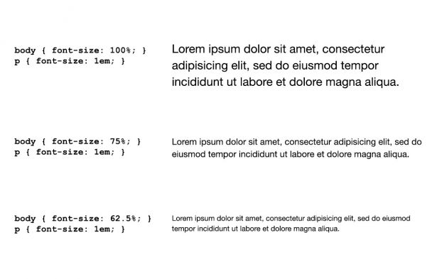
I suspect the real reason a lot of people avoid ems is this: they’re scary, because the maths get a little weird. The idea of a unit of measurement that is equal to the current font-size seems weird because by that description you’ve essentially defined nothing. Things come into focus a bit when you consider that in most browsers if you set the font-size on the body to 100% then 1em will be equal to 16px. You can adjust your math from there. Another common technique is to set the font-size on the body to 62.5%, which is usually equivalent to 10px. Then a paragraph font-size of 1.2em would be equal to 12 points. This method makes the math easier to stomach, and if it helps you then by all means use it.
The turning point
So, what changed my mind enough to make me jump past the comfort and ease of pixels and embrace the barely controlled chaos that is thinking in non-precise, loosely defined measurements? It was the purchase of a new MacBook Pro with Retina display. When I loaded up my website on that thing for the first time I was in awe. The typography was crisp and beautiful. It had nice hard edges, the subtlety of variation in stroke width was not only visible but clean and clear, kerning and tracking was improved (at this point it should be clear that I am an utterly hopeless typophile). I immediately started thinking of ways that we as designers could make our sites even better on a HiDPI display.
The first step was obvious, and something that I think most of the designers and developers I’ve worked with, including myself, have been doing for some time now. By leaning on CSS3 properties to generate our stylistic affectations we’re already making sure they’ll render beautifully on devices with high pixel-density. The next step, also obvious, would be to start planning for serving images optimised for the display they’re being viewed on. This is slightly more difficult, but not beyond the reach of any reasonably skilled developer. Images prepared using the @2x naming scheme (or @1.5x or any other ratio that you determine is reasonable) can be applied using things like the Picturefill project, a polyfill for a potential future HTML <picture> element that will accept multiple sources and attributes for applying those sources.

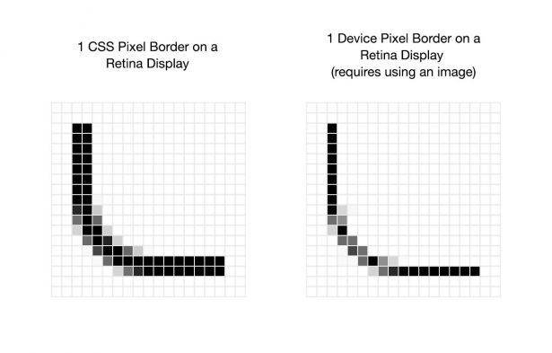
This led me to another thought: what if I want to take advantage of all those extra pixels to make more subtle effects? If I make a button using an image, I can give it a 1 device pixel border because I’m in full control of what’s rendered, but I can only give it a 1 CSS pixel border, or 2 device pixels on a Retina display, if I do the right thing and style my button with CSS. As the adoption of HiDPI displays picks up and the variety of pixel densities increases, it would become increasingly unmaintainable to prepare image assets for everything just to latch onto the desired subtlety and control. In light of that fact it seems clear to me that the death of the pixel as a measurement unit is approaching.
So, how do we think beyond pixels?
As someone who was educated in print design, I am constantly seeking the ability to get more subtle details into my web design projects. Going from the absurdly fine detail of most print resolutions to the clunkiness of 72ppi for screens was probably the most painful part of the transition to web for me, and some people I know have never truly embraced that you have to give up a certain degree of control to be a successful web designer.
In this case, my print background got me thinking about the potential of true resolution independence in screen layout. The Retina display has a pixel density of 326ppi, slightly above the resolution of 300ppi that many print designers think is the threshold for high-quality imagery. The human eye can’t distinguish its pixels at average viewing distances, so measuring a layout using an artificial construct like CSS pixels seems to no longer be relevant. If we can no longer see the occasional fuzzy edge created by vector elements that aren’t pixel-fitted, then they effectively don’t exist. So, instead of thinking in an abstract measurement system of device pixels, why don’t we just fall back to real-world measurements? And as luck would have it, we already have a basis for this system: points and ems. Adding picas into the mix would give us a full set of real-world measurements to use for defining high-resolution web layouts.
In order for this to work, browser and hardware makers would have to standardise the display of points to align with actual inches instead of pixel-based device inches and add picas. This would mean that if you measured a real inch on your screen it would fit 6 picas inside of it, and 12 points inside of each pica, for a total of 72 points per inch. To remain backwards compatible these values would still have to adjust to a percentage declared on the body element, but for the most part implementation could be easily standardised. Ems would continue to work as advertised, changing themselves based on the value declared on the body. And that’s the beauty of the idea. It wouldn’t break the experience on a single old device, but it would standardise it across newer ones.
I swear I’m not crazy
Hold on a second though. Haven’t I just brought us back to the same lousy resolution that I want us to stop thinking in? Not if we adjust the implementation of points to include the ability to declare them in non-whole number amounts.
On a device with a pixel density above 300ppi, using a real-world value implementation of picas and points, if I declare a border to have a width of 0.5pt then I should get a nice thin line without the fuzzy edges that anti-aliasing would create on a device with lower pixel density. Hell, even with the same exact implementation of anti-aliasing that we already have it will look clean because the fuzzy edge is too small to be seen by the human eye. Remember, if you can’t see it then it effectively isn’t there. This would even allow us to borrow another concept from print design, the zero-width line. By declaring a line with a value 0pt in most print software you actually get a line that is the smallest line capable of being produced by the printing hardware in use. You could apply the same concept on the web and get a border that is always 1 device pixel wide, giving you the most subtlety possible on the device your site is being viewed upon. Need to declare an actual 0 to override a style rule? Just declare it without any unit of measurement and you get the same old 0 you were used to.
These ideas open us up a degree of precision that was previously unachievable in web design, precision that’s the driving force behind so much of the beauty in print design.
Get the Creative Bloq Newsletter
Daily design news, reviews, how-tos and more, as picked by the editors.
So, let me get this straight...
To summarise, I’m suggesting a few things. First, that browser makers help us shift an existing unit of measurement, points, to better align with real-world values, as well as adding picas as a unit. Second, that developers make the adjustment to declaring layouts and typographic rules using a combination of ems, points and picas. And third, that the makers of HiDPI devices design their software to render according to real-world standards: an inch on a ruler would equal an inch on screen.
I don’t think I’m advocating for anything too loopy here. Browser makers would have to put some thought into implementing these changes in a manner that maintains backwards compatibility, but I leave that exercise to better minds than my own.
Words: Steve Hickey
Steve Hickey is a User Interface Designer and Front-End Developer at Fresh Tilled Soil - a team of designers, coders and UX experts that helps entrepreneurs and businesses create bloody brilliant user experiences for web and mobile applications through consulting, education, training, and events. Since 2005 they've helped 300+ clients including General Electric, Microsoft, MIT, Harvard, TEDx, Time Warner Cable, Walgreens, Hubspot among many others.

Thank you for reading 5 articles this month* Join now for unlimited access
Enjoy your first month for just £1 / $1 / €1
*Read 5 free articles per month without a subscription

Join now for unlimited access
Try first month for just £1 / $1 / €1

The Creative Bloq team is made up of a group of art and design enthusiasts, and has changed and evolved since Creative Bloq began back in 2012. The current website team consists of eight full-time members of staff: Editor Georgia Coggan, Deputy Editor Rosie Hilder, Ecommerce Editor Beren Neale, Senior News Editor Daniel Piper, Editor, Digital Art and 3D Ian Dean, Tech Reviews Editor Erlingur Einarsson, Ecommerce Writer Beth Nicholls and Staff Writer Natalie Fear, as well as a roster of freelancers from around the world. The ImagineFX magazine team also pitch in, ensuring that content from leading digital art publication ImagineFX is represented on Creative Bloq.
