Start web projects faster with Sassaparilla
Sassaparilla uses Sass and Compass to help projects start more quickly. Peter Coles and Adam Robertson show you how to get started – fast.
If you're anything like us, you'll agree that starting a new frontend build is often a repetitive task. Between setting up your HTML, JavaScript and CSS (as well as adding tried and tested defaults to your setup) you'll probably spend a large part of those early few hours doing things you've done a hundred times before. We made Sassaparilla to save us (and hopefully you) from having to do this.
Of course, there are plenty of tools out there that do this too. The wonderful HTML5 Boilerplate or Zurb's Foundation spring to mind. However, we often spent just as much time removing elements from these boilerplates as when we were adding elements to each new project.
The solution? Combine only the necessary elements for starting a project and make them as flexible as possible. Through trial and error, and a lot of refinement, we decided on the following goals for Sassaparilla:
- Make accessible and scalable code as easy and as fast as possible to write
- Focus on typography and vertical rhythm, and make this easy to implement
- Prepare a system that can adapt easily to changes when working on a project
- Include only what we need and use as few elements as possible
And so, Sassaparilla was born. It's not a boilerplate, it's more of a starting point for your projects.
- Download the source files for this tutorial
Installation
As its name may suggest, Sassaparilla relies on the preprocesser Sass and its best friend Compass to keep things flexible. You'll need to install Compass in order to use Sassaparilla in your projects.
This is pretty straightforward if you're on a Mac:
- Simply open terminal
- Type gem update --system to update your Ruby environment
- Type gem install compass to install the latest version of Compass
Full installation details are on the Compass website.
Get the Creative Bloq Newsletter
Daily design news, reviews, how-tos and more, as picked by the editors.
Getting up and running
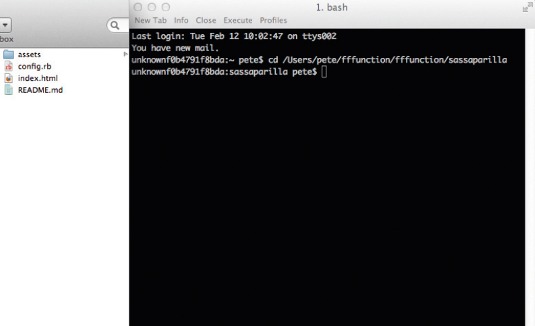
Getting Sassaparilla up and running is really easy. You can use a GUI like Codekit but we're going to assume for this tutorial that you're on a Mac, you're going to use terminal and you've downloaded Sassaparilla from the website, rather than it being forked from GitHub.
- Create a new folder called Demo
- Copy the files from Sassaparilla into the Demo folder
- Open a new window in terminal
- Type cd and then drag the folder Demo into the terminal window and press return. You have now changed directory into that folder
- Now type compass watch and press return
- You should see the message 'Compass is polling for changes'. This means, each time you save a SCSS file, it will update your CSS
- That's it
A look at config.rb
The config file contains paths to your assets. In the case of Sassaparilla we keep the config file at the root of the project and then keep all our CSS, JavaScript, images etc in an assets folder, with each element having a sub folder. This keeps everything nice and neat.
However, you can change paths to your assets in the config file if you prefer to work with a different setup. You may have to stop and re-run the compass watch command to see the changes.
Sassaparilla follows a specific CSS cascade, and makes use of several SCSS files, each of which serves a different purpose. This allows you to include (or not include) separate parts, depending on what you need.
The CSS setup
All SCSS files for the Demo site live in the assets/CSS folder. This is where all CSS compiles too. In our case, to one CSS file called screen.css.
This file contains the bulk of your styles, as well as pulling together the other partial stylesheets into one CSS file. By and large, you will be doing most of your work within this stylesheet once you've written your global settings.
As a default, it includes some default styles for the header element, links and media queries. These are mainly left in as an example of how to use some of the syntax that we'll cover later. You can remove these if you like.
The libs folder
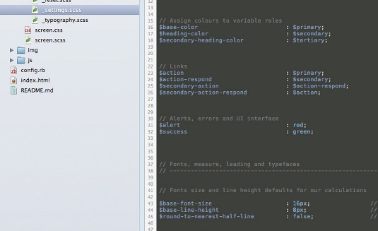
You'll also notice a sub-folder called libs. This is where the following five SCSS files live. You notice they all start with an underscore. This simply means, when we tell Compass to compile our project, these files will not compile to their own CSS file. Therefore, files prefixed with an underscore include:
- _reset.scss This file contains a simple reset for HTML elements. It assumes your webpage will have forms, so reset these too. If your site doesn't use forms, you can remove these resets.
- settings.scss This file contains all the variables for the site. Things such as colours and font sizing live here. This file is for defining your core setup and makes use of Compass's baseline and font-size measures. More on that later.
- mixins.scss Mixins are any user-made mixins for the project (Compass has many predefined ones already, that are well worth checking out). As a default, we've included some simple ones to get you started. Add more as needed.
- typography.scss This file contains the core typesetting for the site. It relies on variables setup in the settings.scss file, which we'll cover next. Again, this file by default contains some example syntax to get you started.
- forms.scss This file contains default form elements and standard styling. If you're not using forms, or you'd rather style them yourself, you can safely leave this file out.
Better rhythm and leading
Sassaparilla tries to make leading and spacing as easy as possible while writing accessible code. We're not keen on tricky maths, but like to work in ems. Luckily, Compass can handle this with a few smart defaults and tricks and a few commands.
Here's how we go about it:
Stage 1
In settings.scss set up your base-font-size: by default this is set to 16px and, generally, this works well in your calculations so you shouldn't need to change this (you can if you like).
Set up your base-line-height: to prevent oddly-spaced leading and large gaps between lines, we like to use a smaller measure, as you might do in print design. Something like 6px works well. It's well worth playing around with this value, depending on which fonts you're using. Later, you'll use multiples of this baseline to create your leading and spacing.
Stage 2
In typography.scss, set your default typography. How you apply your styles is up to you, but, for this example, we're using global settings (for H1, P, UL etc).
To keep a nice vertical rhythm, whenever you set a font size, you'll use the adjust-font-size-to command. This simply tells the element to become this size in pixels and then convert to ems, relative to the base-font-size that we set-up in stage one. This value (eg 26px) also becomes your base unit to work out how many lines of spacing you need above and below the element.
For example:
@include adjust-font-size-to(26px);Adjust font size to 26px and return em equivalent.
margin: 0 0 rhythm(2, 26px) 0;Add two lines of our base-line-height (6x2 = 12px) below the element, base those two lines on our font size and covert to ems equivalent.
Therefore:
@include adjust-font-size-to(26px);
margin: 0 0 rhythm(2, 26px) 0;
Gives us:
font-size: 1.625em;
line-height: 1.15385em;
margin: 0 0 0.46154em 0;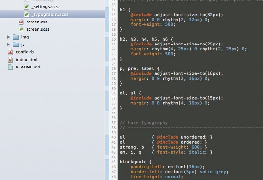
Spacing blocks and other elements
In order to keep a consistent vertical rhythm, you'll need to vertically space other elements on the page (sections etc) too. As luck would have it, the Compass leader and trailer functions are built just for this occasion.
You use them as so:
@include padding-leader(x);Adds x lines of padding based on the base-line-height above the element.
@include padding-trailer(x);Adds x lines of padding based on the base-line-height below the element.
@include leader(x);Adds x lines of margin based on the base-line-height above the element.
@include trailer(x);Adds x lines of margin based on the base-line-height below the element.
One final trick
Say, for example, you'd like to add a pixel value to a media query, but you'd like to have that value convert to the relevant em value for the base-line-height or base-font-size. That may mean a few calculations. Sassaparilla includes two functions to help with this.
These come in handy for things like letter-spacing as well as making media-query breakpoints em values, rather than pixels. You can use the following syntax:
em-font(#px)Converts the value(#) to pixels based on the base-font-size.
em-base(#px)Converts the value(#) to pixels based on the base-line-height.
Final word
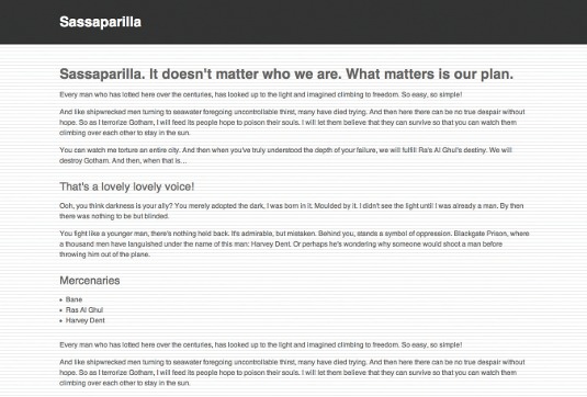
So there you have it. We hope you find Sassaparilla useful in your projects, and we'd love to hear from you do or if you have any questions. Lastly, if you feel like contributing, we welcome hearing from you.
Words: Peter Coles and Adam Robertson
Liked this? Read these!
- Create a perfect mood board with these pro tips
- Brilliant Wordpress tutorial selection
- Choose the best website builder
Any questions? Ask away in the comments!

Thank you for reading 5 articles this month* Join now for unlimited access
Enjoy your first month for just £1 / $1 / €1
*Read 5 free articles per month without a subscription

Join now for unlimited access
Try first month for just £1 / $1 / €1

The Creative Bloq team is made up of a group of art and design enthusiasts, and has changed and evolved since Creative Bloq began back in 2012. The current website team consists of eight full-time members of staff: Editor Georgia Coggan, Deputy Editor Rosie Hilder, Ecommerce Editor Beren Neale, Senior News Editor Daniel Piper, Editor, Digital Art and 3D Ian Dean, Tech Reviews Editor Erlingur Einarsson, Ecommerce Writer Beth Nicholls and Staff Writer Natalie Fear, as well as a roster of freelancers from around the world. The ImagineFX magazine team also pitch in, ensuring that content from leading digital art publication ImagineFX is represented on Creative Bloq.
