Slick site gives recycled paper the cool factor
This site makes it easy printers and designers engage with a recycled paper supplier. We chat to Mud and Arjowiggins Graphic about how they made it.
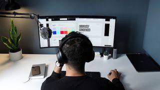
When Mud was asked to designed and develop a new website for environmental paper manufacturer Arjowiggins Graphic, the Bath-based agency jumped at the chance. The result is a slick, attractive and dynamic interface that's fully compatible with mobile devices.
Win clients & work smarter with our FREE ebook: get it now!
This means that printers, designers and corporates can easily order samples and calculate Environmental Benefit Statements on the go. A new 'paper finder’ feature helps users to select the perfect paper fit, providing detailed information on the environmental efficiency and technical specification of each paper manufactured by Arjowiggins Graphic.
In fact, we liked the site so much, we asked Will Green, digital marketing manager at Arjowiggins Graphic, and Mud's creative director Matt Powell to tell us how they put it together. Here's what they had to say...
What were the main aims behind this website's design?
Will Green: Redeveloping the site to make it mobile compatible was a driving factor behind the design. Conveying the properties of our papers in a visual and descriptive way was also key and we kept designers, corporate end-users and printers in mind throughout the process.
We wanted users of the site to be able to switch seamlessly between sections and get all of the information they required whether on the go or at their desk.
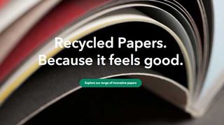
Matt Powell: In a nutshell, we wanted to show that there's no reason not to use recycled papers. By combining stunning imagery with a wealth of technical information we wanted to give designers and printers alike all the information and inspiration they would need.
Did you do any user research?
WG: Before making any decisions on the website we conducted a month long study. We spoke to a wide range of our customers to give a solid set of objectives and to ensure the site was designed in their best interests. Our research often validated what we knew but also gave a number of interesting insights we had not considered.
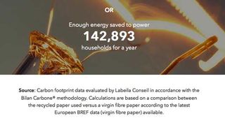
A fantastic example would be the prioritisation of some of our features; we had believed that the Environmental Calculator tool mainly appealed to corporate end-users and designers yet we found that it was also a priority for printers. We also discovered that all our customers were much more interested in the manufacturing process and lifecycle of recycled papers.
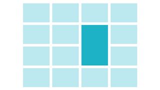
We even consulted our customers about the primary colour we used in our site, resulting in the teal colour you see today.
How did you implement the 'paper finder' feature?

WG: The aim of the paper finder was to take away the need for new users to trawl through specifications in order to find their perfect paper fit. We sourced data from our existing, detailed technical specifications and worked with our technical director. From this we developed a tool that recommends papers to site users based on intended use, required whiteness, certifications required and other categories.
MP: We then studied the data presented by the team at Arjowiggins Graphic and created an interface which quickly and easily allowed users of the site to define what they were looking for in the paper. Once this tool has selected the perfect paper, users can easily order samples from the site to try the product out.
How did you create the transitions?
MP: We used a mixture of Javascript and CSS3 transitions to create these effects. Creating smooth and seamless changes, these transitions enabled us to showcase Arjowiggins Graphic’s papers and emphasise their quality.
Why use original photography?
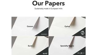
WG: Following our research, we learnt that customers wanted to see particular elements of our products, for example gloss and whiteness. We drew up a detailed list of what we wanted to showcase in each paper and then took close up images to show off each paper’s unique qualities.
Our photo shoot lasted a week and resulted in some excellent imagery, demonstrating the ways in which recycled papers can be used to produce stunning end products.
MP: We also used props where appropriate to give context to the products and ensured that the lighting created the correct composition to work within our layout designs for the site. It was a pleasure to shoot the printed pieces, as there was a real wealth of design skill on show. The beauty of Arjowiggins Graphic’s recycled papers was evident in the paper shoots and further emphasised by their end uses.
What have you learned from this project?
WG: Conducting relevant research was really important to the project. While we had a good idea of what our customers wanted form the site, this research ensured we were implementing relevant and useful changes. This was a learning curve and the needs of our customers will remain at the forefront of our future projects. We learnt a lot about Mud too, who constantly impressed us with excellent design and innovative solutions to the testing briefs we sent their way.
MP: That paper is a beautiful thing! More importantly, working with Will and Arjowiggins Graphic was a real treat as they were supportive and creative but also trusted the decisions we made while working closely with us to create the site. We learnt a lot about recycled papers too, as the website includes some interesting facts and videos that we found very educational.
Like this? Read these!
- New scrolling site presents the web's finest CSS puns beautifully
- How to build an app: try these great tutorials
- Brilliant Wordpress tutorial selection

Thank you for reading 5 articles this month* Join now for unlimited access
Enjoy your first month for just £1 / $1 / €1
*Read 5 free articles per month without a subscription

Join now for unlimited access
Try first month for just £1 / $1 / €1
Get the Creative Bloq Newsletter
Daily design news, reviews, how-tos and more, as picked by the editors.
The Creative Bloq team is made up of a group of design fans, and has changed and evolved since Creative Bloq began back in 2012. The current website team consists of eight full-time members of staff: Editor Georgia Coggan, Deputy Editor Rosie Hilder, Ecommerce Editor Beren Neale, Senior News Editor Daniel Piper, Editor, Digital Art and 3D Ian Dean, Tech Reviews Editor Erlingur Einarsson and Ecommerce Writer Beth Nicholls and Staff Writer Natalie Fear, as well as a roster of freelancers from around the world. The 3D World and ImagineFX magazine teams also pitch in, ensuring that content from 3D World and ImagineFX is represented on Creative Bloq.
