Design team creates incredible Pixar website concept
This fabulous design concept gives Pixar a much-needed digital makeover, complete with an Apple Watch app!
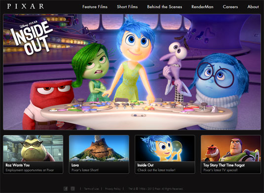
Pixar may well be the world's best animation studio, but you'd be hard pressed to come to that conclusion on the basis of its website design. With its dark background, disconcerting 2012 copyright date and old-fashioned carousels, it's a bit of a web design throwback that doesn't do the studio any favours.
Realising this, designers Martin Vlas, Yassine Boutaib and Melissa Kumaresan got together and came up with their own concept for a comprehensive Pixar redesign that encompasses a new site as well as a mobile app and, as a fun extra, an Apple Watch app too.
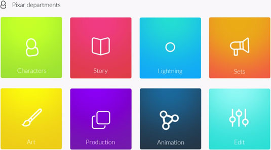
The site is the centrepiece of the new design. Boasting a fully responsive mobile-first approach, it does away with the sombre, static look of Pixar's website and brings in crisp, bright colours, clean typography and bold cutout imagery that breaks out the frame and gives the site an added dash of visual excitement.
The main business of the site, naturally, is to showcase Pixar's 25-year history at the cutting edge of animation, with brightly-coloured sections for every film from Toy Story to Monsters University, featuring plenty of clips, short films and behind-the-scenes details, plus everything you need to know about Pixar's in-house rendering software, Renderman. On top of that, however, is what Vlas, Boutaib and Kumaresan have called My Pixar.
My Pixar is envisaged as a fun space where you can enhance the movie experience. The big selling point is that you'll be able to buy and download films directly from the site, as well as high-quality still images and the facility to create your own wishlist. The massive interactive site would also be packed with reviews and features, as well as a monthly quiz with a special Pixar award as the prize.
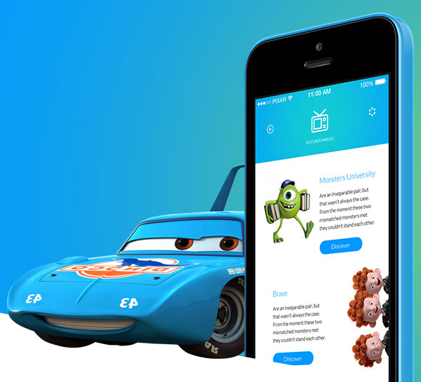
While the web experience is designed with mobile in mind, there's also a standalone app that takes its design cues from the site but pushes beyond the capabilities of the web with a sleek interface and custom navigation to enable you to explore the world of Pixar at your leisure.
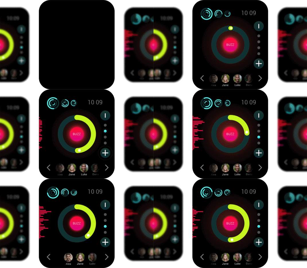
And finally, of course, there's the Lightyear app for Apple Watch that, say the designers, enables you to buzz your friends' wrists from miles away. We're not entirely sure what that means, but looking at it we definitely want one.

To get a closer look at this ambitious design concept, head over to Behance, and let us know what you think in our comments.
Words: Jim McCauley
Jim McCauley is a writer, editor and occasional podcaster, and is available for children's parties.
Like this? Read these:
- What colour is your favourite music?
- Retro pixel art Simpsons intro will charm you
- Free Photoshop brushes every creative must have

Thank you for reading 5 articles this month* Join now for unlimited access
Enjoy your first month for just £1 / $1 / €1
*Read 5 free articles per month without a subscription

Join now for unlimited access
Try first month for just £1 / $1 / €1
Get the Creative Bloq Newsletter
Daily design news, reviews, how-tos and more, as picked by the editors.

The Creative Bloq team is made up of a group of art and design enthusiasts, and has changed and evolved since Creative Bloq began back in 2012. The current website team consists of eight full-time members of staff: Editor Georgia Coggan, Deputy Editor Rosie Hilder, Ecommerce Editor Beren Neale, Senior News Editor Daniel Piper, Editor, Digital Art and 3D Ian Dean, Tech Reviews Editor Erlingur Einarsson, Ecommerce Writer Beth Nicholls and Staff Writer Natalie Fear, as well as a roster of freelancers from around the world. The ImagineFX magazine team also pitch in, ensuring that content from leading digital art publication ImagineFX is represented on Creative Bloq.
