Behind the scenes: how the new Firefox logo was designed
Popular web browser Firefox has redesigned its logo for the web world of 2013. We reveal the thinking and design process behind the new identity.

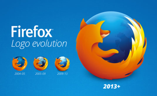
Following this week's release of Firefox 22, a new version of the browser that supports 3D gaming, video calls and file sharing, Firefox has released a new, simplified version of its logo (above).
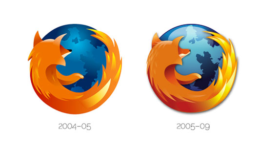
Everyone loves the visually literal logo for Firefox, based on Jon Hicks' original design back in 2004. So why mess with a classic?
New design for a new age
Well, the company points out on its official blog today, in the last nine years Firefox itself has changed enormously. Originally just a desktop browser, it's now a browser for Android, Mac, Windows and Linux as well as an apps marketplace and a brand new mobile operating system.
For this reason, they've updated the logo - which last saw a refresh in 2009 by Alex Faaborg - to bring it up to date with the web world of 2013. And the new version is specifically designed with mobile in mind.

The new logo was created by a team led by Firefox designer Sean Martell, who explains in a blog post that they were aiming to address usage concerns such as SVG compatibility and colour consistency.

"We’ve listened to feedback over the years and documented these examples," says Martell. "Now, with the desire to reshape the look to reflect our brand evolution, this is the perfect time to step back and solve these issues."
Removing detail
Martell aimed to simplify the design to provide greater clarity at smaller sizes. But he was keen to avoid a dumbing-down approach. "Simplifying a style doesn’t always mean bringing it down to basic geometric shapes and solid colours," he says. "You can in fact bring simplicity to a visual by better balancing colour, contrast, shape, and detail."
Get the Creative Bloq Newsletter
Daily design news, reviews, how-tos and more, as picked by the editors.
"To that last point, we removed quite a bit of detail in this latest revision but purposely added more detail where needed to accommodate today’s high resolution screens. The simplification process not only focused on the look but also the structure by making it SVG compatible and more accessible for the broader Mozilla community."

In practice, that meant stripping out all the detail that used blend mode layering such as multiply, screen and overlay, and beyond that, any detail that was thought "not critical to the overall image".
Enhancing detail
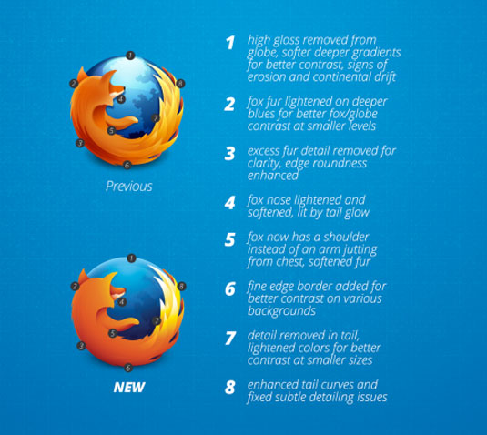
But that was far from the end of the process. "Once we had removed a fair amount of detail in the logo, it was time to look at introducing enhanced detail where it would be needed when scaled to larger sizes," Martel reveals.
"Steven Horlander recreated all the continents on the globe with high resolution displays in mind and we paired those with a removal of the high gloss to create a softer, deeper colour globe. Combining these deeper blues with now lighter oranges in softer detailed fur, we achieved that greater contrast that would create better separation of the elements at all sizes."

The new logo has now made its first appearance with the desktop release of the Firefox 23 beta, and will be rolled out across all other Firefox versions as well as websites and promotional materials in the coming weeks.
Liked this? Read these!
- The ultimate guide to logo design: 40 pro tips
- The biggest logo design trends
- The good, the bad and the ugly: typography in Olympics logo design
We'd love to know what you think of the new logo. Share your views in the comments below!

Thank you for reading 5 articles this month* Join now for unlimited access
Enjoy your first month for just £1 / $1 / €1
*Read 5 free articles per month without a subscription

Join now for unlimited access
Try first month for just £1 / $1 / €1

The Creative Bloq team is made up of a group of art and design enthusiasts, and has changed and evolved since Creative Bloq began back in 2012. The current website team consists of eight full-time members of staff: Editor Georgia Coggan, Deputy Editor Rosie Hilder, Ecommerce Editor Beren Neale, Senior News Editor Daniel Piper, Editor, Digital Art and 3D Ian Dean, Tech Reviews Editor Erlingur Einarsson, Ecommerce Writer Beth Nicholls and Staff Writer Natalie Fear, as well as a roster of freelancers from around the world. The ImagineFX magazine team also pitch in, ensuring that content from leading digital art publication ImagineFX is represented on Creative Bloq.
