How to master screen orientation with HTML5
Jérôme Lecomte covers techniques he uses to detect and control screen orientation changes while creating an HTML5 mobile game.
When reading an article on the web or using a native application, smartphones and tablets will flip the content on screen when you tilt them in landscape, so you don't have to twist your head. For web games with a fixed-size, rectangular playfield, this feature can actually be detrimental. In landscape mode, players may have to scroll down the page to reach the opponent's goal, or if the playfield is shrunk to fit, they have very little screen real estate to interact with.
When I was creating HTML5 mobile game Forex Hockey, I decided to always place the goals at the top and bottom of the device. I could have applied a 90-degree rotation to the playfield in landscape to avoid the scrolling issue, but all the touch input coordinates would have to be adjusted too, which would involve some complicated maths.
Instead I looked at the APIs available in HTML5 to detect or control screen orientation changes. In this tutorial, I'll go through each of the methods I tried, their benefits and drawbacks, and how you can combine them to achieve your desired result. Support varies significantly for some of these techniques, so I've included browser support widgets to help guide you.
CSS media queries
The first technique I explored was CSS media queries. You might know these from responsive design, where they are used to arrange the page's content differently to best fit specific browser windows or screen sizes.
In a nutshell, media queries allow you to apply styles conditionally. They work by wrapping the CSS rules within a @media section, followed by a list of features, combined with logical operators and, or and not. Browsers will only apply rules declared in this section when its conditions are met. Features range from width and height to aspect ratio, colour depth and resolution.
I will focus on the orientation feature, which can be set to either portrait or landscape:
@media (orientation: portrait) {
.playfield { display: block; }
.overlay { display: none; }
}
@media (orientation: landscape) {
.playfield { display: none; }
.overlay { display: block; }
}
In my game, the element with a playfield class is visible when the device is held up straight (or the desktop browser window is taller than it is wide), and hidden if it is held sideways (or the window is wider than it is tall). The element with an overlay class, enticing players to change their device orientation, is hidden when the device is held straight and visible when it isn't.
While these CSS rules achieve the visual design I was going for, there is a drawback. By using this method, the game would continue to unravel when the playfield was hidden. I concluded that I also needed to write code to pause or resume the game when the orientation changed.
Orientation change events
I discovered additional properties and events such as window.orientation and orientationchange. However, I later realised they had a major drawback. In theory, window.orientation provides the current device position expressed as a right angle (either -90°, 0°, 90° or 180°). By registering an event handler for orientationchange with the window object, you can be notified when this property changes value:
window.addEventListener("orientationchange", function() {
if (window.orientation == 90 || window.orientation == -90) {
game.pause(); // landscape mode
} else {
game.resume(); // portrait mode
}
});
So where is the catch? You are likely to assume that 0° means up, -90° left, 90° right and 180° upside down. This holds true on iPhone and iPad, as Apple expects you to use its devices primarily in portrait mode.
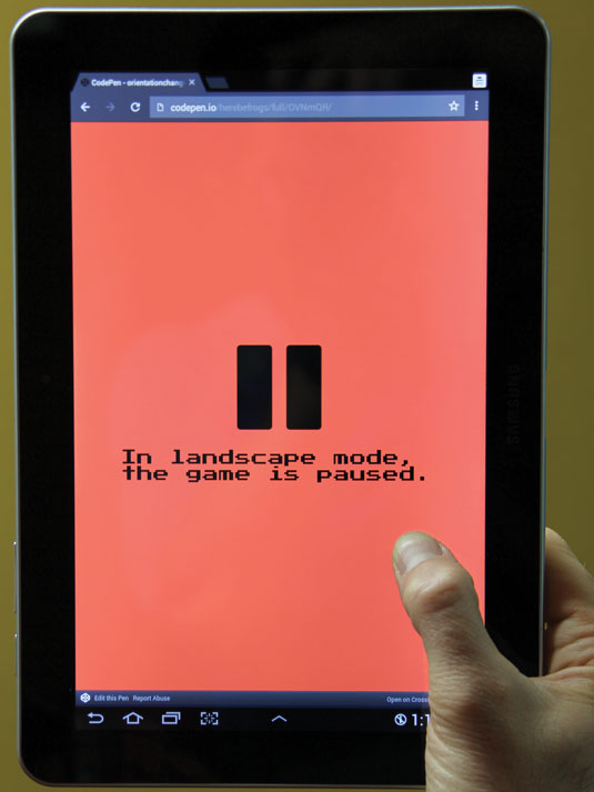
However, although Android phones fit the expected model, tablets reveal a different story. They report 0° when held sideways, because Google assumes tablets are used for different purposes than smartphones (such as watching a movie on the go).
So here is the inconvenient truth: window.orientation is relative to the primary orientation provided by the device's manufacturer, and therefore inconsistent across devices. For this specific reason, what looks like a very promising technique is actually unreliable. In my opinion, it's best avoided.
JavaScript matchMedia
Looking for a replacement to the orientationchange technique, I turned to JavaScript matchMedia. This lets you evaluate CSS media query conditions programmatically, at any given point in time. It can also be used to notify you when the state of these conditions changes via event handlers.
In my case, to check if a device is currently held in landscape mode, I pass the string "(orientation: landscape)" to the function window.matchMedia(), and then check the matches property of the MediaQueryList object returned as follows:
var query = window.matchMedia("(orientation:landscape)");
console.log("Device held " + (query.matches ? "horizontally" : "vertically"));
To be notified when the device orientation changes, I register an event handler by calling addListener() on the MediaQueryList object obtained in the code above. The callback function will receive this object as an argument when triggered.
var toggleGame = function(query) {
if (query.matches) {
game.pause(); // landscape mode
} else {
game.resume(); // portrait mode
}
}
query.addListener(toggleGame);
When I no longer need to be notified, I pass the same callback function to removeListener() on the MediaQueryList object:
query.removeListener(toggleGame);I find that JavaScript matchMedia complements CSS media queries nicely. Together, they help me achieve a separation of concern: layout versus code. CSS media queries handle the visual changes necessary when the orientation is modified, while JavaScript matchMedia handles the game logic changes.
Device Orientation API
I also evaluated the Device Orientation API. This is comprised of two events providing information from the hardware measuring a device's position and motion in space: gyroscope and digital compass for its orientation, and accelerometer for its velocity.
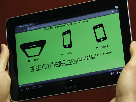
I left devicemotion events aside since my game doesn't require speed measurements. Instead, I focused solely on deviceorientation events. The orientation data is presented in a series of rotations around three axes: X, Y and Z. When a device lacks the hardware to measure an angle, it is set to null. The frame to interpret these rotations depends on whether DeviceOrientationEvent.absolute is true or false. When true, it uses Earth: X is pointing East, Y is North and Z is up. When false, it's relative to an arbitrary frame. For example, Macbook Pro laptops can report how much they're tipped forward or backward and how much they're tilted left or right. They lack any sense of compass heading.
- alpha is the rotation angle around Z, and varies clockwise from 0 to 359 degrees. It indicates the opposite direction of a compass heading
- beta is the rotation angle around X, and ranges from -180 to 179 degrees. It reports if the device is tipped forward or backward (screen faces you at 90° away from you at -90° , up at 0° and down at -180°)
- gamma is the rotation angle around Y, and ranges from -90 to 89 degrees. It reports whether the device is tilted left or right
if (window.DeviceOrientationEvent) {
window.addEventListener('deviceorientation', function(e) {
if (e.absolute) {
console.log('Compass heading:', Math.floor(e.alpha));
}
});
}
It's not always easy to properly interpret these values, because when an angle approaches a right angle value, the axes swap places (so when beta is 90°, Y points up and becomes Z, Z points South and becomes -Y), which affects the gyroscope and digital compass readings. The slightest gesture will send angles oscillating back and forth, with huge value swings.
Note that the Device Orientation API also generates a high number of events per second. This is useful when the web application needs to react in real time to every subtle move of the device. However, if the application just needs to react when the screen has flipped by 90 degrees (as is the case with my game), this API is an overkill. For that reason, I decided not to use this API in my game.
Let's recap: so far my game reacts to a player holding their devices in non-optimum positions, but what if it could proactively enforce its ideal orientation?
Screen Orientation API
The next technique I tried was the Screen Orientation API. This API enables you to do three things. You can query window.screen for the current screen orientation, be notified when orientation changes, and enforce a particular orientation or return orientation control to the operating system.
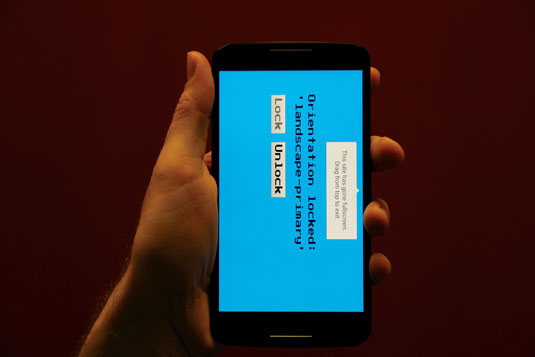
You interact with it through the window.screen.orientation property (screen also happens to be a global variable, and can be accessed directly). The ScreenOrientation object has a read-only property called type, and returns either:
- portrait-primary
- portrait-secondary (upside down)
- portrait (either straight or upside down)
- landscape-primary (device is sideways, with the bottom of device on the right)
- landscape-secondary (sideways with the bottom of device on the left)
- landscape (bottom of device either left or right)
- natural (device manufacturer's considered default orientation)
- any (unlocks orientation, allowing both portrait and landscape)
You can register an event handler for a change event on screen.orientation, to be notified of future orientation changes:
screen.orientation.addEventListener('change', function() {
console.log('new orientation is ', screen.orientation.type);
});
You can lock the screen in a particular orientation by calling lock() with one of the supported orientation types. lock() returns a promise object to which you can attach a success and an error handler. Note that you need to be in fullscreen mode for the call to be successful.
var onGameStart = function() {
document.documentElement.requestFullscreen();
screen.orientation.lock('portrait').then(null, function(error) {
document.exitFullscreen()
});
}
Similarly, you can unlock the screen to let the operating system rotate it as it deems appropriate:
document.exitFullscreen();
screen.orientation.unlock();
The Screen Orientation API is fairly new and still evolving. Yet it is the most all-encompassing option of the six techniques if you want complete programmatic control over the device's screen. When it is supported by the browser, I have used the Screen Orientation API to guarantee my game is played in portrait mode.
Web Application Manifest
The last option I considered was the Web Application Manifest. This is not to be confused with the Offline Web Application manifest, which focuses on caching assets for times where the network is unavailable.
The Web Application Manifest is meant to enhance web pages that have been added to a device's homescreen. It describes which icon and what name appear on the homescreen, whether the page opens in a regular browser or as a standalone application, and which orientation the screen is to be constrained to.
First, add a <link> tag pointing to a JSON file with a manifest relationship:
<link rel="manifest" href="manifest.json" />Second, create a JSON file containing, amongst others, the following entries:
{
"display": "standalone",
"orientation": "portrait"
}
display can be one of the values fullscreen, standalone, minimal-ui or browser. orientation can be any one of the orientation types described in the Screen Orientation API section.
Lastly, you open the page in a browser and add it to the homescreen (on Chrome for Android, 'Add to Homescreen' from the page menu).
display: fullscreen works independently from the Fullscreen API. It is possible to detect if fullscreen was triggered as a result of the Web Application Manifest by evaluating the CSS media query (display-mode: fullscreen) with JavaScript matchMedia.
if (window.matchMedia("(display-mode: fullscreen)").matches) {
console.log("page entered fullscreen mode through the Web Application Manifest");
} else if (document.fullscreenEnabled && document.fullscreenElement) {
console.log("page entered fullscreen mode through the Fullscreen API")
}
Launching from a device's homescreen, the Web Application Manifest is a very simple option if you want to control (but not so much to query) the orientation of web pages. Granted, getting the web page onto the device's homescreen is unfriendly on the user experience side of things, but browser manufacturers are bound to improve that (Google is working on offering the option to add regularly visited pages to the homescreen).
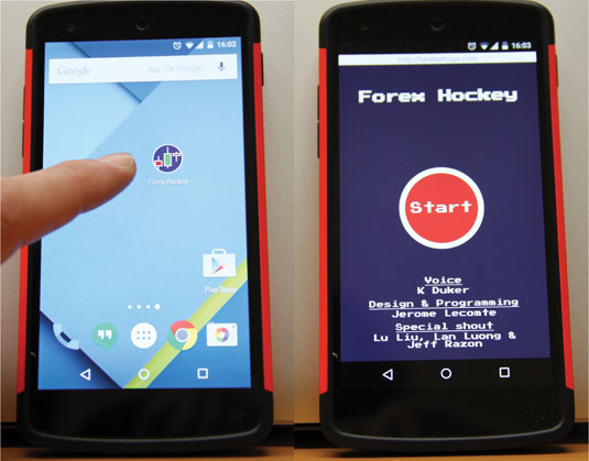
Using this technique, with very little work on my part, I could guarantee that my game would be played in portrait mode for players who saved it on their homescreen.
Conclusion
By now you should be familiar with these six techniques used to detect and control screen orientation in your mobile web application, and hopefully have some ideas about what each is best suited for. Combining them together also gives you greater coverage for the wildly disparate browser support. The code for my game handles support degradation gently:
- Best-case scenario is when Screen Orientation API is available: it locks the game in portrait mode and the CSS and JavaScript media queries never trigger
- Second-best case is when the game is launched from the homescreen: the Web Manifest API guarantees the same result
- Otherwise, CSS media queries encourage players to correct the orientation, while JavaScript matchMedia prevents them from missing when they pause the game
Check out my CodePen illustrating these techniques, and let me know how they work for you. I'm curious about alternatives, so give me a shout on Twitter if you know of any!
Words: Jérôme Lecomte
Jérôme Lecomte is a frontend developer at OANDA Canada. This article originally appeared in issue 270 of net magazine
Liked this? Read these!
- How to build an app: try these great tutorials
- Free graphic design software available to you right now!
- Download the best free fonts

Thank you for reading 5 articles this month* Join now for unlimited access
Enjoy your first month for just £1 / $1 / €1
*Read 5 free articles per month without a subscription

Join now for unlimited access
Try first month for just £1 / $1 / €1
Get the Creative Bloq Newsletter
Daily design news, reviews, how-tos and more, as picked by the editors.

The Creative Bloq team is made up of a group of design fans, and has changed and evolved since Creative Bloq began back in 2012. The current website team consists of eight full-time members of staff: Editor Georgia Coggan, Deputy Editor Rosie Hilder, Ecommerce Editor Beren Neale, Senior News Editor Daniel Piper, Editor, Digital Art and 3D Ian Dean, Tech Reviews Editor Erlingur Einarsson, Ecommerce Writer Beth Nicholls and Staff Writer Natalie Fear, as well as a roster of freelancers from around the world. The ImagineFX magazine team also pitch in, ensuring that content from leading digital art publication ImagineFX is represented on Creative Bloq.
