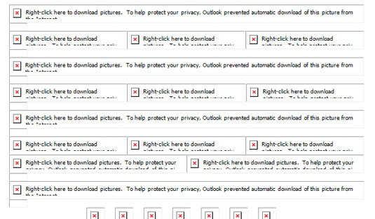
Open an HTML email in Microsoft Outlook and you'll notice the images are conspicuous by their absence. Instead, they're replaced with a lengthy and obscure security message.
This image blocking quirk is not unique to Outlook. There are a number of other email and webmail clients, such as Lotus Notes 8.5 and Yahoo Mail that fail to display the emails' images until the subscriber manually 'requests' them. Even those that do, such as Apple Mail on OS X and Mail on iOS, rely on Wi-Fi or a strong enough data connection to display images on the go.

Images, therefore, just cannot be relied on to communicate an email's message. As such, I would argue that email is dependent on HTML typography. The tips in this tutorial – taken from my book, A Type of Email – will help you to implement robust HTML typography in email, and overcome some of the quirks and idiosyncrasies of the email and webmail clients.
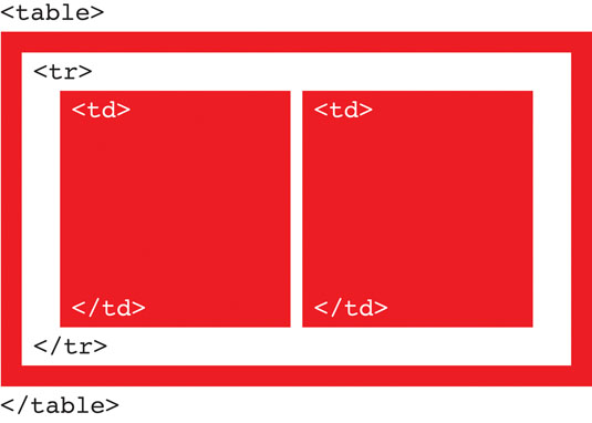
01. Use <table>, <tr> and <td>
Construct HTML emails using the <table>, <tr> and <td> elements. These are the building blocks of HTML email, and will help you when working with typography – the table cell (<td>), in particular.
02. Use pixels to style font-size
The pixel unit has good support across the email and webmail clients on both font-size and line-height:
font-size:14px; line-height:21px;03. Apply CSS inline
Apply CSS inline to ensure all the essential styling renders, even if the CSS in the <head> is stripped out – as it will be in Gmail.
Headings and paragraphs
Get the Creative Bloq Newsletter
Daily design news, reviews, how-tos and more, as picked by the editors.
Semantic tags (<h1>, <h2> and <h3>) can be used for headings in email. I recommend you use a <span> if they're on a single line, or a <td> within their own table if they're on multiple lines, applying the heading styling inside the opening tag. This will help you achieve trouble-free rendering across the email and webmail clients.
In this example, the CSS mso-line-height-rule:exactly has also been applied, to maintain the line-height on Microsoft Outlook.
<td class="h1" style="font-family:Arial, sans-serif; font-size:20px; line-height:25px; color:#ff0000; mso-line-height-rule:exactly;">Multiple Line Heading</td>On larger text sizes, ensure you apply enough line-height in proportion to the font-size, or they may be cropped in Microsoft Outlook.
Once again, the semantic tag <p> can be used for paragraphs, though you'll need to apply CSS to each and every paragraph, inside the opening <p> tag. Therefore, there is a distinct advantage to the alternative method: leaving paragraphs 'loose' in a table cell, and applying the paragraph text styling inside the opening <td> tag.
<td style="font-family:Arial, sans-serif; font-size:14px; line-height:21px; color:#666666;">Paragraph of text.</td>Any styling applied to the <td> becomes the default for its content. You can add as many paragraphs of text as you like inside the table cell, and you'll only need to style them once.
With this approach you do sacrifice the paragraph spacing that's automatically added when you use the <p> tag. This can be fixed by inserting two <br> tags after each paragraph of text. However, this isn't the most elegant solution – particularly when you need more control over the spacing between headings, subheadings and paragraphs. Fortunately, there is a hack to help with this:
<div style="display:block; height:10px; font-size:10px; line-height:10px;"> </div>Here we have a non-breaking space wrapped in a pair of <div> tags, styled with height, font-size and line-height at consistent values, pertaining to the amount of space (in pixels) required – in this case 10px. To create a larger or smaller paragraph space, simply change the values accordingly.
Text links
On text links, the color and text-decoration typically need to be styled inside the opening <a> tag.
<a href="http://www.beyondtheenvelope.co.uk" target="_blank" style="color:#ff0000; text-decoration:underline;">text link</a>04. Apply background colours

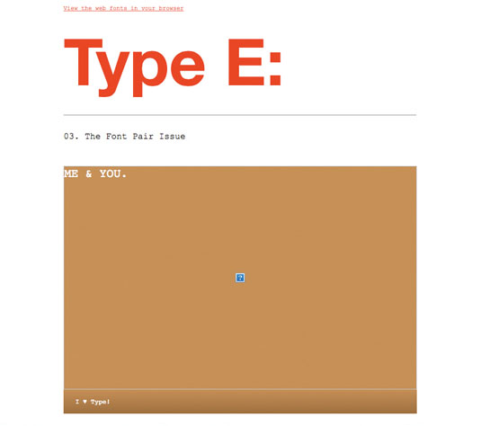
When an email is opened in a client that doesn't display images automatically, a background colour, applied to each of the <table>s containing images, can help the subscriber make sense of the structure of the email, and encourage them to 'request' the images. The HTML attribute bgcolor is the most reliable method of applying colour to a <table>. Here, the colours are specified using six-digit hexadecimal, rather than shorthand.
<table bgcolor="#ff0000">
<td>
// Image //
</td>
</table>
Once you've applied background colours, style the image alt text in a larger size and contrasting colour, so it can be read easily.
<img src="http://www.beyondtheenvelope.co.uk/Image.png" width="600px" height="350px" alt="Image Description" style="font-family:Courier, monospace; font-size:20px; line-height:25px; color:#ffffff; text-decoration:none; display:block; border:0;">05. Fix Blue Links
A quirk of iOS Mail is that it renders certain content as 'blue links' and applies functionality to them that it assumes will be helpful to the subscriber. These might be telephone numbers (allowing the subscriber to call the number or add it to their contacts), dates (allowing the subscriber to add it to their calendar), or addresses (allowing the subscriber to locate the address in Maps). In spite of its best intentions, iOS Mail sometimes makes mistakes, resulting in blue links being applied to inappropriate content. It may, for instance, mistake an order number for a telephone number, and allow the subscriber to call it (or at least attempt to)!
It's worth noting that this behaviour will not manifest itself in a browser, but only in situ; in iOS on an iPhone or an iPad, for example. It's necessary, therefore, to send a test of your email to both these devices, to identify any blue links.
Restyle the link
Fortunately, iOS Mail is capable of handling HTML and CSS in a conventional manner, applying CSS from internal style sheets within the <head> of an HTML email document to elements marked up with corresponding classes in its <body>. You can use these conventional web development techniques to fix the blue links.
First create a new style for the link – one that is in-keeping with your email's colour palette – and assign a class name for it. To 'hide' the link, style it with the same colour applied to the paragraph of text that surrounds it, along with text-decoration:none.
Ensure you apply the !important declaration to override the existing styling.
<style type="text/css">
.appleBlackLink a {color:#666666 !important; text-decoration: none !important;}
</style>
Once you've created the style and assigned a class name for it, apply it to the affected text, wrapping it in a pair of <span> tags and inserting the class name you've created inside the opening <span>. Make sure you include associated words, such as 'from' and 'until' inside the <span>, as the blue links may be applied to those also.
<span class="appleBlackLink">from 1 January</span>Disable the link's functionality
While the link has been restyled, it may remain active, making it possible for the subscriber to accidentally activate the link. You need to disable its functionality to prevent this.
This is achieved by adding some additional styling to the class you've created in the <head>.
.appleBlackLink a {color:#666666 !important; text-decoration:none !important; pointer-events:none !important;}The CSS pointer-events:none !important; disables the rogue blue link.
Summing up
So there you have it; five tips to help you on your way to implementing HTML typography in email. Finally, to see how the email and webmail clients render your typography, make sure you test using your own desktop and mobile email clients, and a tool, such as Litmus.
This article was originally published in issue 275 of net magazine.
Related articles:
- How to master responsive email
- Free graffiti font selection
- Illustrator tutorials: amazing ideas to try today!

Thank you for reading 5 articles this month* Join now for unlimited access
Enjoy your first month for just £1 / $1 / €1
*Read 5 free articles per month without a subscription

Join now for unlimited access
Try first month for just £1 / $1 / €1
