Design jargon explained: the F-Pattern
People use the web in predictable ways. Jerry Cao explains how to take advantage of that when designing your website.
The internet is a magical place, where simple gestures like clicking a mouse or sliding a finger become modes of interacting with breathtaking visual… or even sites like Craigslist.
When a site feels natural even the first time you use it, it's because of exemplary design, not magic. By studying user behavior trends, you're able to anticipate – and influence – their decisions, designing an interface that feels almost invisible.
One such predictable user behaviour is the eye scanning pattern. With the ever-increasing speed of browsing, users usually scan pages for interesting points before reading in detail, whether that's a keyword, image, or function.
Thanks to eye tracking reports from the Nielsen Norman Group, designers can create visual hierarchies that place important content right where users want it most.

This article explains one of the most common of these scanning patterns, the F-pattern (the other most popular is the Z-pattern). We'll explain how it works, and show some effective examples in action.
To learn more about clever visual design techniques, check out the free ebooks Web Design for the Human Eye and Web UI Best Practices.
Explaining the F-pattern
The F-pattern gets its name simply because of the directions the user's eye travels. The lines go horizontally across by rows, and vertically down across the far-left side. Just take a look at the results of the Nielsen Norman Group's eyetracking studies:
Get the Creative Bloq Newsletter
Daily design news, reviews, how-tos and more, as picked by the editors.

The F-pattern is common because of the reading habits of Western cultures, reading left to right and up to down. This also explains why the F-pattern is especially common on content-heavy pages.
In the case of textual content, the user is scanning for specific words or points of interest. An article on Slate.com, appropriately named “You Won't Finish This Article,” analyzes the amount of content a user reads versus scrolls through, and it's typically about half and half. That means your users – the ones that stay at least, the total average is cited as less than 20% – are going to scan through 50% of a page into order to get straight to the 50% that they want to see.
It also means that, chances are, you yourself are skimming through this very article in an F-Pattern, and you probably won't read every word I'm writing. That's fine – it's just the way the web works.
Applying the F-pattern
If you're displaying a page with lots of text, you can make the F-pattern work for you. Let's take a look at this graphic from Specky Boy to see how it works:
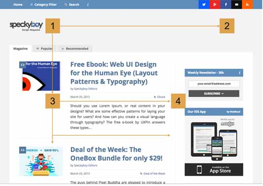
As with all site patterns, the first place users (in Western cultures) look is somewhere between point 1 and 3, an instinct influenced by our hardwired reading patterns. This area is one of the most valuable plots of screen real estate, which is why it's often occupied by company logos, top-level navigation, and featured content.
The user then almost always scans vertically to the right to the opposing top corner (point #2). Again, this is from our hard-wired reading patterns, and explains the popularity of sidebar navigation.
Here's where the F-pattern deviates from other scanning patterns. The user returns their gaze to the left hand side, and begins to scan downward (point #3). When they come across a new paragraph or row, they will begin to read horizontally (point #4) until they understand the meaning of the new row.
What happens next
If they are intrigued, they will stop scanning and start actually reading.
If they have not found what they are looking for, they will return to the left side again and scan downwards to the next paragraph or row, continuing this over and over until they find something of interest, or abandon the page.
Writing for Tuts+, Brandon Jones suggests incorporating an interesting visual element to break up this routine every two or three rows, just to avoid a sort of monotony.
With the F-pattern, the best places for calls-to-action, ads, or unrelated content (tag cloud, “popular posts” menu, etc.) are along the right edge, especially punctuating the ends of rows or text lines. The user's eyes tend to pause briefly before continuing down to the next row, giving the right side a few extra moments of attention.
Seeing the F-Pattern in Action
As previously state, the F-pattern is most effective when used with text-heavy sites. So it's no surprise that Vox, the self-proclaimed “news site for the 21st century,” takes advantage of it for listing its articles.

It follows tradition with its logo in the upper left corner, and encourages the F-pattern with a horizontal yellow line leading to its social media options on the far right, where the eye pauses for a moment before scanning again.
Of course, some users might skip that part (Point 2 of the F-Pattern) and just browse the list of articles. That's totally fine since users just engage directly with the content.
Rows of interest
Along the left side, each row begins with picture, facilitating scanning so that the user can find rows of interest more easily. When the user finds a photo they like, they only have to scan horizontally in order to find more information. By using the F-pattern's row format, Vox makes it easy for their users to scan through many different articles in order to find one they like – a UI choice their users appreciate.
Also notice how the lines, particularly the headlines, don't extend very far to the right. This further encourages the F-pattern eye flow, and streamlines the entire scanning purpose.
The Internet juggernaut itself, Google, also takes advantage of the F-pattern.
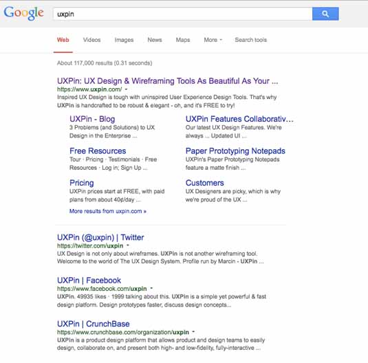
Their logo is in the upper left again, and again, you'll see a top navigation right where users can easily find it.
Their use of the F-pattern works for scanning down a long list of items – users can quickly scan entry headings, and either click or move on to the next one.
Normally, you'll also find ads on the right (which again follows the F-pattern by placing calls-to-action at the end of a content row). For broad searches, such as a country or big company, the right bar will also fill with an infographic card – a self-contained entity in a place that's both easily seen and easily ignored.
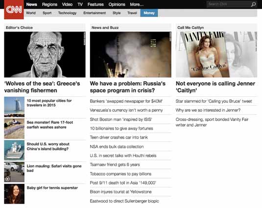
CNN takes a more interesting approach to the F-pattern, presenting side-by-side individual columns of rows.
Users first scan the top row of broad headings and pictures (“Editor's Choice,” “News and Buzz,” “Call Me Caitlyn”) and, finding one they like, they can continue down the column in a second F-pattern to scan for articles of interest in that particular category, such as the rows of stories marked as “Editor's Choice.”
What this tells us is that there's no single way to execute the F-Pattern. Feel free to get a bit creative, but make sure you understand the usability fundamentals behind the scanning pattern.
More Examples of the F-pattern

Conclusion
From these examples, we see that the F-pattern works best at facilitating scanning across a lot of content, especially words. If users must navigate a lot of content – as with a list of news articles descriptions, search engine results, or even videos on YouTube – the F-patterns hastens an otherwise lengthy and unpleasant process.
It makes navigating more convenient for the user, and allows your to promote whatever elements you choose. That's a win-win.
If you're interested in other techniques that help make the right first impression on users, check out the free ebook Web Design for the Human Eye (includes visual case studies from 33 companies like Google, Tumblr, and Etsy).
Words: Jerry Cao
Jerry Cao is a content strategist at UXPin – the wireframing and prototyping app.
Like this? Read these!
- How to use UI patterns in 5 easy steps
- Brilliant Wordpress tutorial selection
- The ultimate guide to logo design

Thank you for reading 5 articles this month* Join now for unlimited access
Enjoy your first month for just £1 / $1 / €1
*Read 5 free articles per month without a subscription

Join now for unlimited access
Try first month for just £1 / $1 / €1

The Creative Bloq team is made up of a group of art and design enthusiasts, and has changed and evolved since Creative Bloq began back in 2012. The current website team consists of eight full-time members of staff: Editor Georgia Coggan, Deputy Editor Rosie Hilder, Ecommerce Editor Beren Neale, Senior News Editor Daniel Piper, Editor, Digital Art and 3D Ian Dean, Tech Reviews Editor Erlingur Einarsson, Ecommerce Writer Beth Nicholls and Staff Writer Natalie Fear, as well as a roster of freelancers from around the world. The ImagineFX magazine team also pitch in, ensuring that content from leading digital art publication ImagineFX is represented on Creative Bloq.
