How to mock up a website with Sketch
Rafael Conde walks you through how to sidestep Photoshop and use vector-based Sketch to quickly create a website mockup.
You want to create a simple website mockup, but Photoshop sounds just a little daunting to you? You're after something quick and easy, that will effectively show off your idea? Well, Bohemian Coding has heard your prayers and delivered a tool with web and UI designers at heart. It's called Sketch, and version 3 has just been released.
Sketch is completely vector-based, meaning that everything that you do will be scalable and your processes will be non-destructive. This feature is absolute gold in this day and age, with all the different devices and all the different screen sizes and resolutions you need to consider.
I've been using Sketch exclusively for all my design work for two years now, and I haven’t felt the need to switch to anything else for a long time.
In this tutorial I'll be creating a website mockup for a digital studio called Think Orange. I’ll walk you through some of Sketch's basic concepts and tools – including some exciting new features that have been introduced in version 3 – and take you from the first text block to exporting our final design and assets.
We will learn how to create headers and buttons, work with grids, use shapes to mask elements, export all of the assets in different resolutions – Retina and non-Retina – and a lot more. If you don't have a copy of Sketch, grab a free trial and follow along.
01. Make a new file
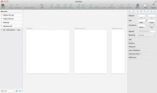
Let’s start by creating a new file. In the menu bar go to File > New from Template > Web Design. Here we have some artboards already set up for us, like Web, Tablet and Smartphone (think of an artboard as a dedicated canvas), as well as some Text Styles and UI elements.
02. Insert symbols
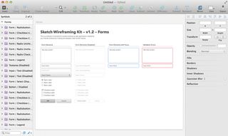
Jump to page two and you'll find all of the symbols and text styles built in on this template. From forms to buttons, headers to quotes, you can insert a symbol just by clicking on Insert > Symbol.
Get the Creative Bloq Newsletter
Daily design news, reviews, how-tos and more, as picked by the editors.
03. Making changes

Every change that you make to a symbol will be carried across every instance of that symbol. So if, somewhere down the line, you want to change the colour of the Submit button across every page, you just have to do it once. The same goes for text styles.
Text Styles work just like HTML tags – you can create your headers, body and links Text Styles, and when you change one, it spreads across every element. Handy.
04. Background for the header
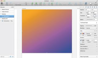
For the sake of this tutorial, we'll head back to our first page and work on the Desktop artboard. Let's start by creating a simple background for our header. Insert a rectangle by clicking Insert > Shape > Rectangle (or hitting the keyboard shortcut R).
Let's make it fill the whole width of the page, and make it something like 900px high. On the right of the Inspector, you have access to fills, borders, shadows – you name it.
05. Insert the title
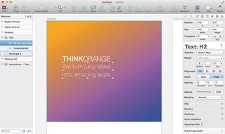
Now to add the title. Let's insert a text block ( T ), and then we can just type it in. In the Inspector we have control over the font, size, colour and everything else you would expect.
06. Create a text box
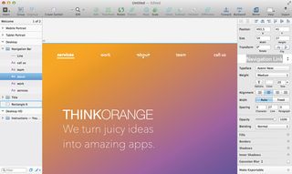
For the navigation bar at the top, I'll create text blocks for the different links. Then, after selecting all of the links, I'll use the Align tools at the top of the Inspector to align them horizontally and space them evenly. We can create a new text style and call it 'Navigation Links'.
07. Insert an image
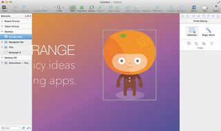
Maybe you have a logo, or a background photo that you want to use. To insert an image, it's as simple as drag-and-drop. Just drag the image from the Finder to the Sketch window and there it is. If you double-click on it, you can crop, fill or even vectorise it.
08. The call to action
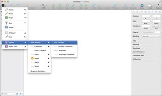
For the Call to Action button I'll insert the button symbol, and change the text to 'Ask us for a quote' (see step 2 for a guide on how to do this).
09. Unique colours
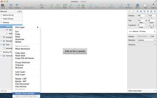
I want this specific button to be a different colour. If we simply change the colour, all of the buttons on this documents will change as well. So first we need to detach it from the symbol.
As you would expect, just right-click on the symbol (make sure you're selecting the symbol folder and not an element inside it) and choose the option Detach Form Symbol.
10. Get blurring

To replicate the now-famous blur that you find on iOS and the new OS X Yosemite just create a rectangle to use as the blur layer, select Background Blur from the blur's drop-down list on the Inspector, tweak the amount of blur from the slider below to your taste, and don't forget to change its opacity so you can actually see what's behind it.
11. Adding a label
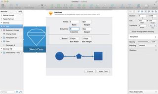
Now I want to make a simple 4x3 grid of objects – let's say an image and a simple label. I group the elements and select the option Arrange > Make Grid . Here you can set the number of columns, rows, and margins between. Click on Make Grid and voilà!
12. Shapes for the team
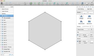
It's time to introduce our handsome team. I want to mask the photos of the people with a hexagonal shape, like a little badge. Let's go to Insert > Shape > Polygon , change the number of points to six on the Inspector, and maybe change its border radius.
To do this, simply double-click on the shape to enter editing mode. Select all of the corners (by clicking on the small circles while pressing Shift) and change the corners slider on the Inspector to your taste. Finally select the shape and the image you would like to mask, group them (Cmd+G), make sure the image is on top of the shape, right-click on the shape in the object list and select Use as Mask.
13. Artboard exports
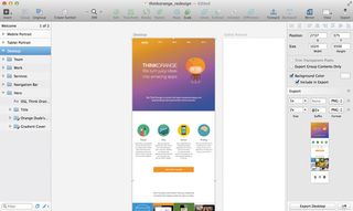
When you're happy with the result and you want to export it, simply select the artboard and in the Inspector you'll see Export and a little plus sign on the right. Click it and you can add as many different resolutions and formats as you like. When you're done just click Export on the bottom of the sidebar.
14. Exporting individual assets
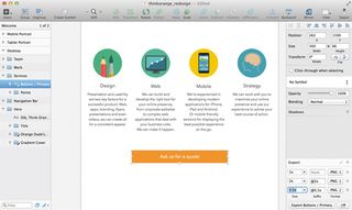
When it comes to exporting individual assets, it's just the same as above. Maybe you want to export this button. Select it and click on Make Exportable below, on the Inspector. Add a 1x and 2x version for retina screens and click Export .
You can even drag the element directly out of the object list to your desktop and it'll create a PNG out of it. Magic!
Words: Rafael Conde
Rafael Conde is an expert in design, music and coffee. Follow him on Twitter at @rafahari. This article originally appeared in net magazine issue 258.
Like this? Read these!
- Create a perfect mood board with these pro tips and tools
- The ultimate guide to logo design
- Our favourite web fonts – and they don't cost a penny
Have you found a great Sketch tutorials or do you have any creative tips? Let us know in the Comments below!

Thank you for reading 5 articles this month* Join now for unlimited access
Enjoy your first month for just £1 / $1 / €1
*Read 5 free articles per month without a subscription

Join now for unlimited access
Try first month for just £1 / $1 / €1
The Creative Bloq team is made up of a group of design fans, and has changed and evolved since Creative Bloq began back in 2012. The current website team consists of eight full-time members of staff: Editor Georgia Coggan, Deputy Editor Rosie Hilder, Ecommerce Editor Beren Neale, Senior News Editor Daniel Piper, Editor, Digital Art and 3D Ian Dean, Tech Reviews Editor Erlingur Einarsson and Ecommerce Writer Beth Nicholls and Staff Writer Natalie Fear, as well as a roster of freelancers from around the world. The 3D World and ImagineFX magazine teams also pitch in, ensuring that content from 3D World and ImagineFX is represented on Creative Bloq.
