4 features transforming how we use CSS
Dan Cork introduces some of the features and tooling revolutionising our style sheets.

Frontend development has been through a transformation in the past decade. The skillset required to work in the browser now includes accessibility, performance and a range of JavaScript application frameworks such as AngularJS, Ember.js, Backbone.js and most recently React. However, the CSS side of website layout had sadly been a little neglected.
In 2006 Sass was born, and three years later along came Less. With their proprietary syntax, these preprocessors attempted to haul our style sheets into the future, but they were merely bandages on an otherwise ailing technology that didn't conform to our idea of what modern web development should look like.
Fast-forward to today and things are looking much rosier for CSS. The once-stagnant language has undergone a revolution, in both the browser and the tooling available to us.
01. Maintainable code
As the websites and applications we built increased in size and complexity, the many pains of working with CSS at scale were highlighted – most notoriously the singular, global namespace that makes code maintainability impractical for frontend developers. Regardless of whether we applied a naming convention such as BEM, this lack of encapsulation still meant selectors could alter UI elements unintentionally. More troubling is that, in certain situations, our styles could fall foul of the cascade and never be applied at all.

In his talk on CSS and React, Facebook's Christopher Chedeau highlighted the absurdity that for JavaScript (and indeed many other programming languages), it is considered best practice to avoid the global scope. So why have we become so accepting of it in CSS?
02. Modular CSS
Unfortunately there is still no method of creating a genuine local scope in browsers, but projects like CSS Modules have sprung up that allow us to write modular-like style sheets and import them into our JavaScript components.
There's no need to make your selectors obscure as they're already self-contained in a file (e.g. components/input.css). The hard work required to transform these into selectors that are unique in the global scope will be done by your module loaders. Take a look at how a React input component may look.
Get the Creative Bloq Newsletter
Daily design news, reviews, how-tos and more, as picked by the editors.
/* components/input.css */
.base { /* base styles */ }
.error {
composes: base;
/* custom styles */
}

/* components/input.jsx */
import React from 'react';
import styles from './input.css';

export default class Input extends React.Component {
render() {
return <input className={styles.error}>} />
}
}

/* rendered html */
<input class="components_input__base__37495f components_input__error__a8g3kd" />
Our classes are obfuscated into strings that should survive the cascade. Notice how we actually end up with two classes; this is the result of composition. In our CSS file we added composes: base; as a property of the error class. The usage is similar to extends for Sass, but instead of duplicating the properties, it references the two classes in the export to our JavaScript module.
Interoperable CSS
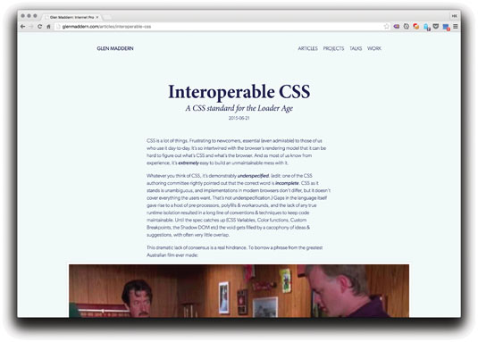
This interchange between JavaScript and CSS is made possible as CSS Modules compile to a low-level file format known as Interoperable CSS (ICSS). It allows us to declare our style sheets as dependencies of our JS, meaning only the required styles are loaded. For more on ICSS, take a look at Glen Maddern's blog post.
03. CSS Shapes
The elegance of print layouts has always been just out of reach for the frontend developer. Since its inception, CSS has limited us to a choice of two shapes: square or rectangle. Though we can give the illusion of other shapes by manipulating borders or applying background-images, our content will still only ever sit within a box.
As progressive enhancements go, the new CSS Shapes specification is one of the best examples. We can use it to create simple or complex shapes for our content to flow around. Browser support is growing and for older browsers that don't support it, our layouts will look as they always did.
The circle function
With the circle function you can create a circle path based on the dimensions of an element, or pass custom properties to the function to customise it. The arguments it accepts are circle(radius at originX originY), and these can be absolute or proportional units (e.g. circle(50% at 100px 150px)). The origin is where the centre of the circle sits relative to the top-left point of the element (see a CodePen example here.
.shape {
width:150px;
height:150px;
background: #f90;
float: left;
margin: 0 30px 10px 0;
}
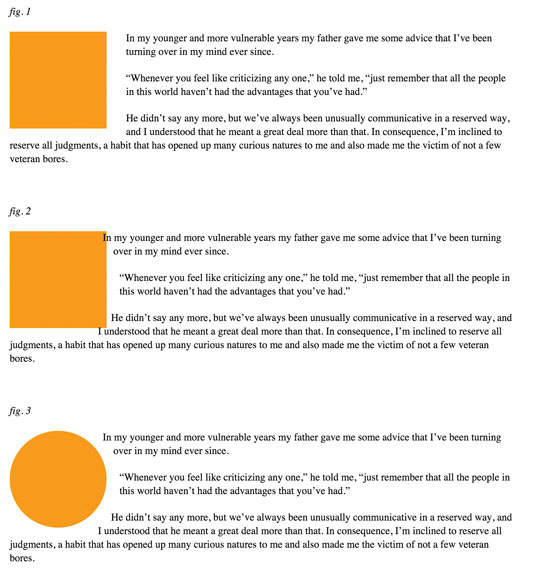
In the CSS above, we have a floated element such as an image within our text. In browsers that don't yet support CSS shapes, users would see a layout that looks like fig 1, above. We can enhance this with the circle function.
shape-outside: circle();By adding the shape-outside property (fig 2, above), we tell the browser to format the surrounding content around the path we have defined, rather than the linear box. In this instance, as we're not passing any arguments to the function, it defaults to a circle with a radius of 50 per cent and an origin matching the centre of the element.
As you can see from the example, the background of the element is still a square, causing the text to overlap. One option to fix this would be to apply a border radius of 50 per cent. However, the circle function can take care of this too.
-webkit-clip-path: circle();
clip-path: circle();
With clip-path (currently only supported in Chrome with a prefix) we can apply the path as a mask (fig 3, above). Now our content is wrapped around the floated element, rather than over the top of it.
More shapes
For elements with irregular dimensions we can use the ellipse function. This accepts similar arguments to the circle function, with radius split into two: ellipse(radiusX radiusY at originX originY).
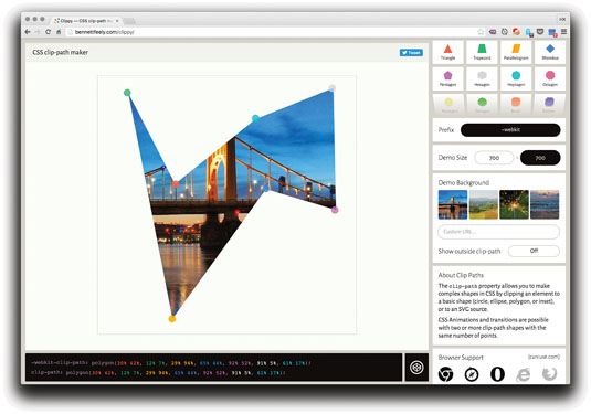
If you want extra customisation, the polygon function allows us to build our path using pairs of X and Y coordinates to create unique shapes. There are some great tools available, like the CSS Shapes Editor extension for Chrome and Clippy, that we can use to visually build shapes and auto-generate the polygon code for us.
Images
Any images with a transparency can be used to automatically create a path, by passing the URL to the shape-outside property.
/* html */
<img src="/path/to/img.png" />
<p>Lorem ipsum….</p>

/* css */
img {
float: left;
shape-outside: url(/path/to/img.png);
}
For a great talk on this and other layout woes, I recommend 'Modern Layouts' by Jen Simmons.
04. Media queries
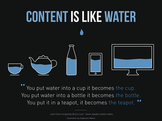
When media queries first hit our browsers, the variety of devices on the market with the capability of delivering the full web experience was limited. For many, mobile was very much an afterthought, or in many cases not a consideration at all.
This led to the creation of the 'mobile first' methodology. This paradigm was easily the best approach to get designers and developers in the right mindset to create immersive experiences for our shiny new pocket computers.
Responsive web design went from being a pipe dream to the norm, and the web became a lot more accessible. Is this methodology still appropriate today though?
/* Mobile */
@media only screen and (min-width : 480px) {}

/* Tablet */
@media only screen and (min-width : 768px) {}

/* Desktop */
@media only screen and (min-width : 992px) {}

/* Large Desktop */
@media only screen and (min-width : 1200px) {}
At the time, it was appropriate to distinguish between mobile, desktop and – later on – tablet as that is all there was. Our stylesheets would look something like the previous example, with explicit breakpoints for each type of device.
There are a few fundamental problems with this approach in the modern day though. The number of devices on the market has exploded in recent years, and Android's rise in popularity has created excessive fragmentation of device size and resolution. Couple this with other devices like iPhones and iPads, as well as the huge range of laptops and desktop computers available, and it has become simply impractical to target an individual device based on its screen.
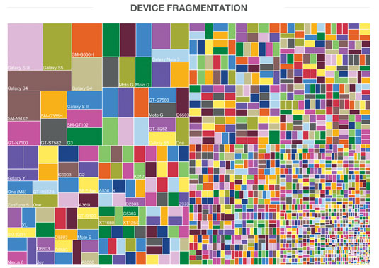
Herein lies the problem with this methodology: targeting devices. Paul Adams wrote a great post on the subject in which he proposes a different approach: "Focus on jobs, then screens, but never devices". Regardless of which methodology we talk of, there is a general agreement in the web community on one golden rule: content is king. Content is the meat of your site or application and it should be the primary consideration.
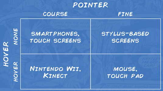
This is why from a UX perspective I am intrigued by the concept put forward by Adams. He suggests we make our first focus the jobs (actions) our user is trying to perform, then the screen. Never the device though. This way we can "[service] those jobs where they happen". The Level 4 specs in Media Queries can take us some way to achieving this without relying on JavaScript.
Hover
The hover feature gives us the ability to detect whether the main input for a device can relay a hover state. For a mobile or tablet, this would be the touch screen, for a laptop the trackpad, for a desktop the mouse, and so on. The feature will accept one of three values:
- None: Applicable when the input can't hover or there is no pointer
- On-demand: The input can hover but it requires a significant user action (e.g. a long press)
- Hover: The input can easily relay hover states for the page
A potential use case for this would be tooltips. Let's take a look at how this might work:
.element .tooltip {
/* hide tooltip */
}

@media (hover) {
.element .inline-tooltip {
/* hide inline tooltip */
}
.element:hover .tooltip {
/* show tooltip */
}
}
By default we could display an inline tooltip. If we detect that the primary input supports a hover state, we will hide this and display a pop-up tooltip when the user interacts with the element. When using the hover value we can use the shorthand @media (hover) rather than @media (hover:hover).
Pointer
The pointer media query is used to target the accuracy of a device's main input. As with hover, this accepts one of three discrete values, each of which indicates a different level of accuracy:
- None: The input is not a pointing device
- Coarse: Pointing device with limited accuracy
- Fine: Accurate pointing device
Use cases for this are less obvious. If we consider accessibility, we could potentially use it to detect greater accuracy, and decrease the click target on an element by slimming down the proportions:
.link {
padding 1em;
}

@media (pointer:fine) {
.link {
padding: 0.25em;
}
}
Conclusion
With so many things happening in the world of stylesheets, now is an exciting time to be a UI engineer. In the age of JavaScript component libraries, the most promising thing to come out of the working group is possibly Houdini, a task-force that aims to expose some of the magic of CSS via APIs. A project well worth keeping an eye on.
Words: Dan Cork
Dan Cork is a developer at Hungry Geek, the engineering team at Holiday Extras. This article originally appeared in issue 277 of net magazine
Liked this? Read these!
- Eric Meyer on the past, present and future of CSS
- Choose a website builder with these top tools
- Behold the very best in website templates
- These free WordPress theme are better than beer
- Check out these beautiful blocks of pixel art perfection

Thank you for reading 5 articles this month* Join now for unlimited access
Enjoy your first month for just £1 / $1 / €1
*Read 5 free articles per month without a subscription

Join now for unlimited access
Try first month for just £1 / $1 / €1

The Creative Bloq team is made up of a group of art and design enthusiasts, and has changed and evolved since Creative Bloq began back in 2012. The current website team consists of eight full-time members of staff: Editor Georgia Coggan, Deputy Editor Rosie Hilder, Ecommerce Editor Beren Neale, Senior News Editor Daniel Piper, Editor, Digital Art and 3D Ian Dean, Tech Reviews Editor Erlingur Einarsson, Ecommerce Writer Beth Nicholls and Staff Writer Natalie Fear, as well as a roster of freelancers from around the world. The ImagineFX magazine team also pitch in, ensuring that content from leading digital art publication ImagineFX is represented on Creative Bloq.
