9 great UI designs and what we can learn from them
UI design can make or break a website or app. Here are nine examples that got things right.
Great user interface design, or UI design, means helping the user complete a given task as simply and efficiently as possible. Aesthetics are undeniably important, but at the core of great UI design is function.
This means that navigation should ideally be so clear and intuitive that it feels invisible. If a user gets lost, or can't work out how to achieve what they want to do, the UI's not doing its job (there are lots of examples of painful UI fails to demonstrate that. But below, we focus on examples of UI design done right.
The websites and apps below aren't particularly new, so we're not talking about trends. But even after a couple of years, they do their job well in that they satisfy the user's needs. Read on to find out why they're so successful and what we can learn from them. To learn more, sign up for our online course, UX Design Foundations.
Article continues below01. Montreux Jazz Festival
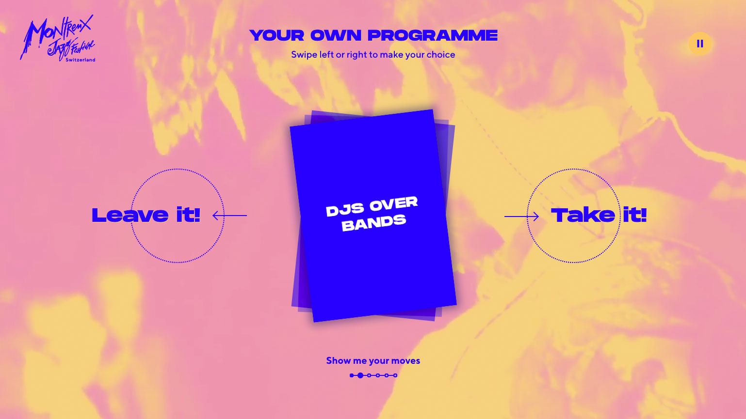
There's nothing like being at a festival to send your FOMO levels through the roof; it's all too easy to miss some real gems no matter how many times you comb through the list of performers. But this great piece of UI design for the Montreux Jazz Festival aimed to help you ensure that you get the most out of your time at the event.
It kept things beautifully simple, presenting you with six binary choices that you can swipe left or right to enable it to build up an impression of your musical preference – for example, do you prefer DJs over bands? Once you're done, it presents you with your own personalised programme based on what it thinks you'll enjoy, complete with links to buy tickets.
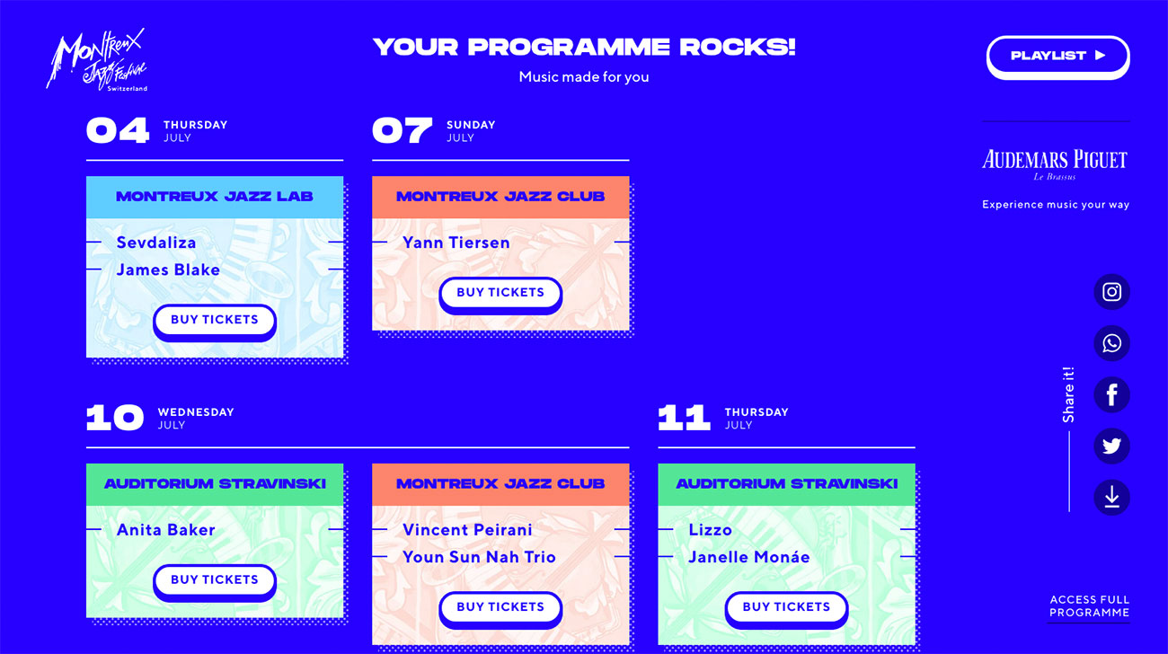
It's easy and intuitive and, while you'll doubtless want to double-check the full programme anyway to make certain there's definitely nothing you've missed, it's a brilliant way to help you drill quickly through a lot of information to find results, getting to the core of how simple a UI should feel.
02. Tilt Brush
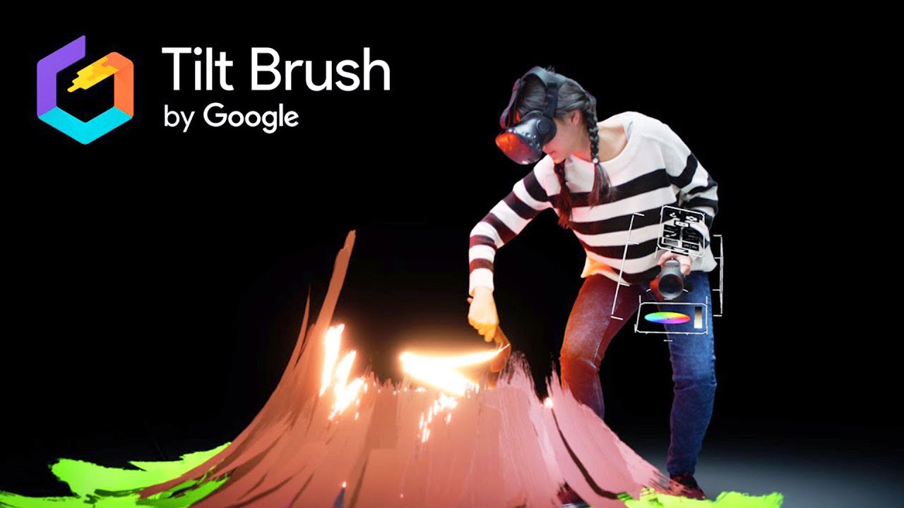
VR in UI and UX is a frontier territory right now. What works on a flat screen doesn't necessarily work so well in VR, and building an effective and useful VR app that you can use for hours without getting motion sickness can be quite a challenge.
Sign up to Creative Bloq's daily newsletter, which brings you the latest news and inspiration from the worlds of art, design and technology.
So it's great to see a VR product like Google's Tilt Brush – which lets you build up 3D paintings in a virtual environment – that not only works, but is so intuitive to use, and with such great results that artists are already incorporating it into their creative workflows. Head this way for some excellent pro tips on getting started with this game-changing creative app, which shows how UI can be applied to new fields.
03. Patterning
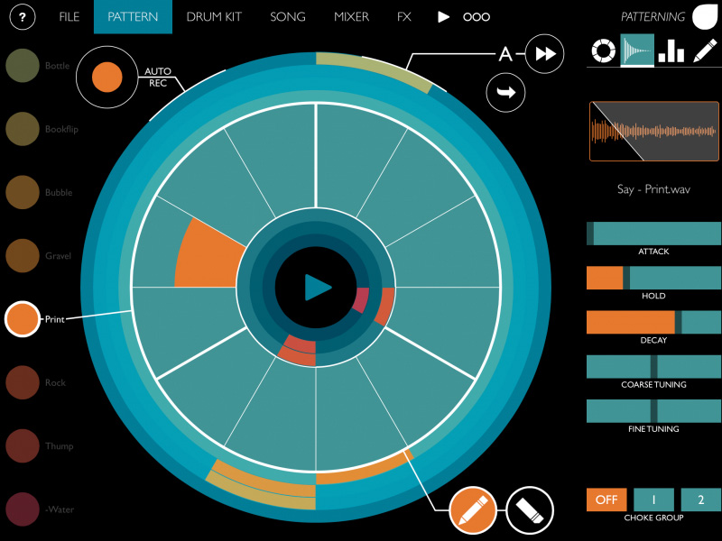
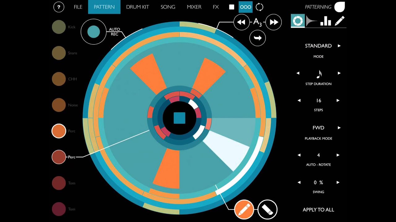
Olympia Noise Co's iOS drum machine, Patterning, was unlike any we'd seen before. Rather than sequence your rhythm on a grid like every other music app, Patterning uses a circular interface for the basic business of laying out your beats, with colour-coded drums so that you can easily see what's what.
Beyond the basics, Patterning's smart but minimal UI makes the more complicated business of sequencing longer songs out of individual patterns a lot less challenging, enabling you to easily create variations on patterns and then fit everything together.
It takes a similarly straightforward approach to making everything sound better, too; both its mixer and FX interface are thoughtfully laid out with bold visual cues that help you get the sound you want without getting bogged down among inscrutable controls. The app shows that while many UI conventions exist for a reason, sometimes a radical departure can be completely justified when it helps the user.
04. MailChimp
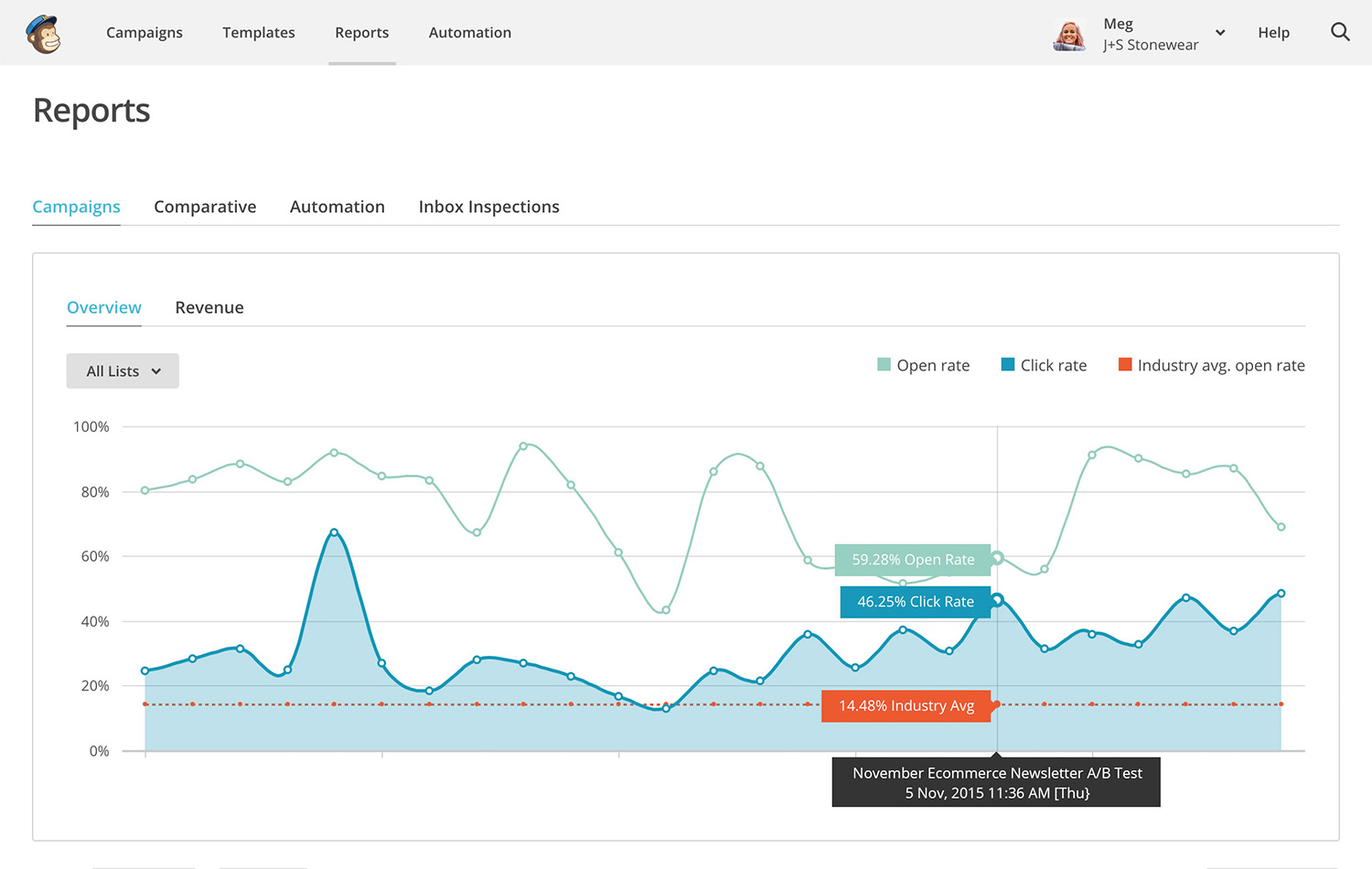
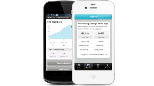
Newsletter creation and management may not be the most exciting task in the world, but the beautifully designed, intuitive user interface design of MailChimp makes it that much more palatable. Since its recent redesign, the web UI is clean, flat and primarily typographical.
When your account is first set up, the classic 'empty account' problem before your first campaign gets off the ground is balanced out by helpful, visually pleasing user guides. There's plenty of white space, and clear calls to action walk new users through every step of the process - in some cases even incorporating a subtly-animated pointer to indicate where to click.
05. Paper for iPad
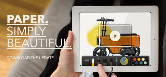
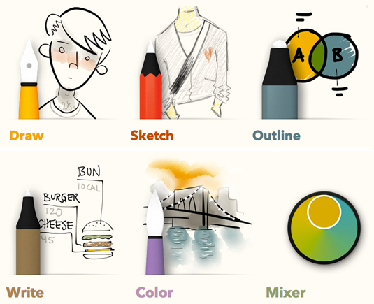
A multi-award-winning app designed to help users be creative in a more intuitive, natural way, Paper lets you draw with your fingertips with a surprising level of detail - although it also works with a stylus if more precision is required.
Designed exclusively for touch, Paper's UI design has no buttons or settings to worry about – just a series of specialised tools. This is another example that highlights how simply well-conceived UI can make things feel.
06. Things
Things is a popular task management app with an award-winning design that's intuitive and easy to pick up. It's all based around a familiar to-do list concept. The slick, clean user interface design comes pre-divided into lists to help you categorise your tasks: urgent things go in 'Today', slightly less urgent can wait until 'Next', while 'Schedule' plans further ahead.
Each entry captures important information in one go – title, notes and due date, as well as tags if required to help categorise everything. Best of all, the Quick Entry window is accessible from anywhere using a simple keyboard shortcut – and it's all synced automatically across desktop, iPhone and iPad.
07. Campaign Monitor: Worldview
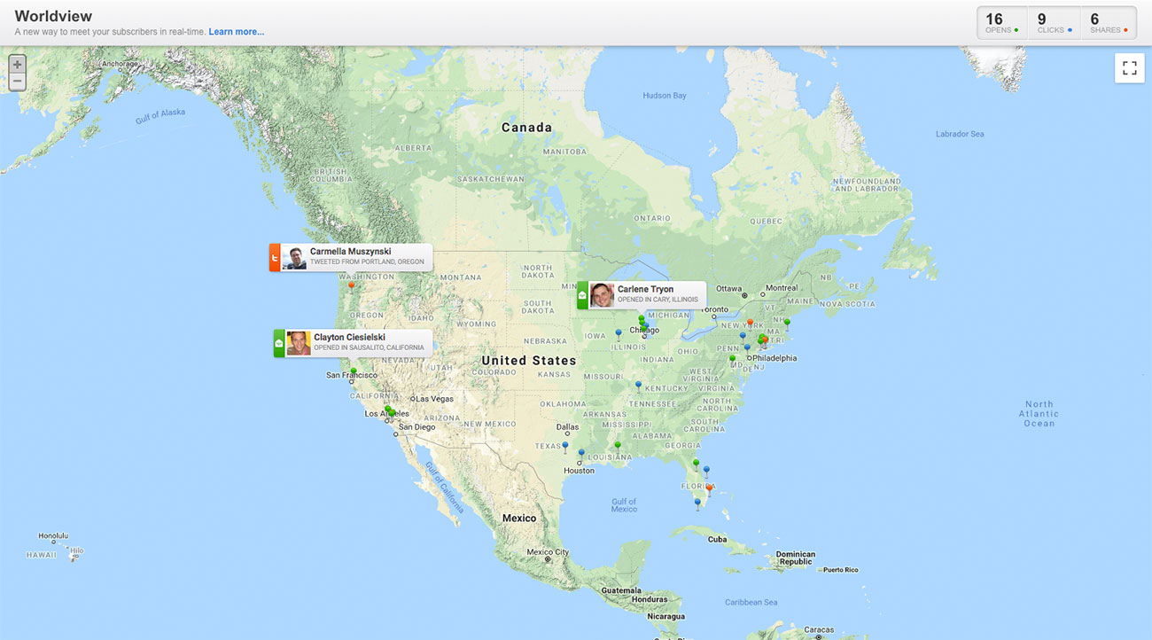
A wonderfully original idea that puts an engaging twist on email subscription data, Campaign Monitor: Worldview overlays information about individuals who are opening, clicking and sharing your communications on a Google Map in real-time for both geographical and personal insights.
The landing page introduces the concept in an immediate visual way, with example pins dropping onto a world map – and the application interface itself is refreshingly clean, revolving around the map and a few basic menus for controlling settings. A great example of UI design, this shows how simple iconography and colour coding can identify different categories of information at a glance.
08. Figure

Yet another example of flat design making a potentially very complicated UI design look very clean and intuitive, Figure is a synthesiser and drum machine for iOS from Swedish developer Propellerhead, which is also behind desktop music production software Reason.
You can tap the touch-screen pads, hold your finger down and scroll the rhythm wheels for a range of different sounds, or swipe across the screen to play different notes in the scale. There are also wheels to control the range of notes you have to work with, the number of notes in melodies and bass lines, and various tabs to tweak the sound in a variety of ways.
09. Kennedy
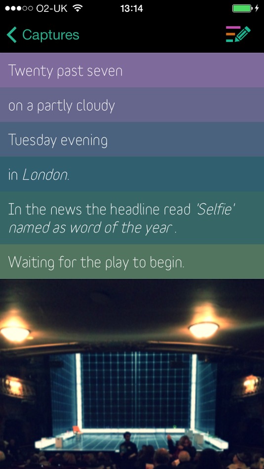
There's nothing quite like scrolling through a load of your old Twitter updates and wondering what in the hell you were thinking of when you posted that thing six months ago. Lack of context can often mean that something that made perfect sense at the time can be rendered meaningless months or years down the line.
Kennedy, a diary app from the ever-excellent Brendan Dawes, is designed to add context to your memories. You can use it to create text notes of what you're up to, just like you might type into Facebook or Twitter, and maybe add photos to the notes while you're at it. The clever touch, though, is that Kennedy then adds an extra layer of context by adding your location, the date and time, the current weather conditions, a news headline and, if you're listening to music on your phone at the time, the name of the track you're listening to.
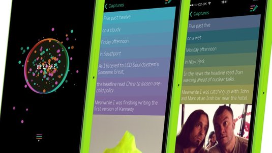
The result is that instead of a dry note that won't really mean much down the line, you capture a particular moment with fuller context, complete with plenty of prompts that can help bring back a memory in much more detail. And Dawes' clean design and smart UI keeps everything simple and good-looking.
Related articles:
Learn from experts and gain the skills you need to develop in the burgeoning field of UX design. Sign up for our UX Design Foundations course today.

Nick has worked with world-class agencies including Wolff Olins, Taxi Studio and Vault49 on brand storytelling, tone of voice and verbal strategy for global brands such as Virgin, TikTok, and Bite Back 2030. Nick launched the Brand Impact Awards in 2013 while editor of Computer Arts, and remains chair of judges. He's written for Creative Bloq on design and branding matters since the site's launch.
