28 outstanding examples of CSS
From bespoke agency sites to online shops, you'll find tons of web design inspiration in these great examples of CSS.
It's amazing what can be done with CSS these days. Support for the latest CSS3 properties is strong in the latest versions of all the major browsers – even Internet Explorer – and the possibilities for typography, animation and interactivity have never been greater. But finding web design inspiration can be tricky.
At its core the secret to a great website is not about showing off with slick visuals and whizz-bang features, but lies in creating a great experience for users through a layout and navigation that guide them to where they want to go quickly and effortlessly. That said, if it can look beautiful as well, that's the icing on the cake.
Here we list 28 great examples of CSS sites that will provide a burst of web design inspiration. CSS is also great for adding motion to your sites – take a look at our guide to CSS animation examples and how to recreate them for some pointers.
01. Type Terms
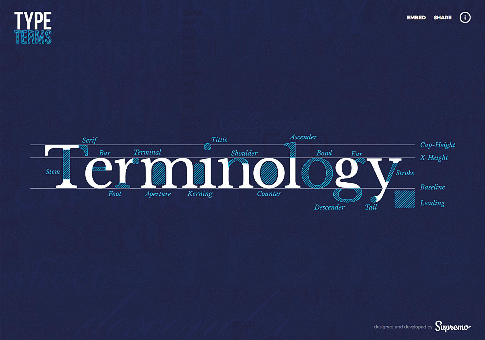
Type Terms is an animated cheatsheet created by the team at Supremo, a web design agency in Manchester. After doing some research, they found that most existing online information about typographic terminology used simple, static images. The team was looking for a reason to experiment with SVG and CSS animation, and this was the perfect opportunity.
"I decided to create something that was more visually engaging, which would help new designers learn all the key typographic terms in an instant," says designer Dan Heywood.
The team emphasise the importance of designers having a good grasp on typography. For those learning the rules for the first time, or for experienced designers needing a refresher, this cheatsheet is both educational and a delight to explore. The content is focused, the information is clear, and the animations are silky-smooth. Take a look and impress your designer friends with your typography vocabulary.
02. MIT Technology Review

The MIT Technology Review, a 117-year-old publication that covers technology in a way anyone can understand, was relaunched earlier this summer by Boston design studio Upstatement. "We're super-fans of Tech Review, so when Erik Pelletier [VP of product] approached us to work on the site, we were psyched," says Mike Swartz, partner at Upstatement.
Daily design news, reviews, how-tos and more, as picked by the editors.
These days it's unusual to see a publication's website not designed so heavily around imagery, so it's refreshing the first time you navigate to Tech Review's clean, seemingly Swiss-inspired design. "We really wanted to capture the spirit and soul of Tech Review with the site's design system, and create a canvas for their art directors to use creatively, " says Swartz. "Creative director Tito Bottitta and design lead Nathan Hass designed a system that is meant to showcase excellent art and be a delight to read."
Instead of using the system default version of Helvetica that we all know today, the site features Neue Haas Grotesk, the original version of Helvetica, which really drives the modern feel. Paired with Miller Text for body copy, the typography feels classic yet contemporary. The use of imagery is thoughtful, deliberate and allows the typography to shine.
03. BucketListly

BucketListly is a community that sets out to help users unlock achievements in real life while inspiring others to do the same. Built using Ruby on Rails with HTML5, SCSS, CoffeeScript and jQuery, the platform has the ability to let travellers and adventurers share their stories with their friends on the site as well as their connected social networks.
When a user shares a story on BucketListly, the platform automatically tracks what, when and where they've completed that life goal, letting them earn special badges and displaying all that data in a beautiful timeline and map.
04. 96 Elephants
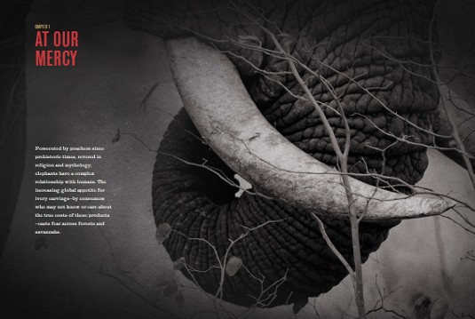
US-based Viget Labs has created an awareness-focused web experience to enlist support for the Wildlife Conservation Society's mission to protect African elephants. Its most recent campaign is 96 Elephants, so-called because that's how many elephants are killed every day in Africa.
The educational narrative is told through a series of single-page chapters, each detailing the very real complications at play in the ongoing effort to end the illegal act of killing elephants for their tusks. Despite the primary goal of driving sign-ups for a petition, the Viget team has done an artful job of balancing the immediacy that the omnipresent call-to-action presents against the more emotionally compelling, story-driven content.
Front and centre is the haunting art direction that compels you to stop and confront the emotional mission. The beautiful, edge-to-edge photography and magazine-like layout made the effort to build it responsively a challenge. Instead of starting with the desktop, the site was built mobile-first. That allowed the design decisions to be purposefully considered for small-screens instead of acting as a watered down proxy of the desktop experience.
05. Merge Records

With bands like Arcade Fire, Superchunk and The Mountain Goats on the roster, Merge Records in Durham, North Carolina, looked to local digital partner Newfangled to build a world-class ecommerce experience to match the quality of its artists.
Built on NewfangledCMS, Newfangled's proprietary PHP-based CMS, with HTML5 and CSS3, the site responds beautifully to different device sizes. The new system is now automated to ensure that the label's assets are all centrally managed and available. Newfangled COO Chris Butler says,
"Whenever a product is added, we have to figure out how this corresponds to a piece of physical inventory that sits in a different database, and how it accounts for a piece of digital inventory that sits in another system. We had to figure out those logistics." With numerous different database calls on each page, the order of priority of the data was important to get right.
06. Envoy

Envoy, a product that focuses on visitor registration at your office, offers an elegant iPad-based interface for collecting names, capturing signatures and printing visitor badges on the spot. For the website that promotes the app, the "primary goal was to allow our customers to visualise how their own visitors can experience Envoy at their offices," explains co-founder and designer Vítor Lourenço. "We decided an interactive demo would be the most visually engaging way to demonstrate this."
To achieve that, the site displays the app's functionality and screen states atop an iPad mockup. As you scroll through the one-page site, the states update in the demo. CSS transitions are used to help aid in the demonstration, enhancing the experience without ever getting in the way of the content.
"We spent many hours working on tiny details," co-founder and engineer Larry Gadea adds. "We love the way the visitor's signature draws itself when you scroll past the NDA screen, or how the visitor badge gets printed at the end of the flow."
07. MoreSleep
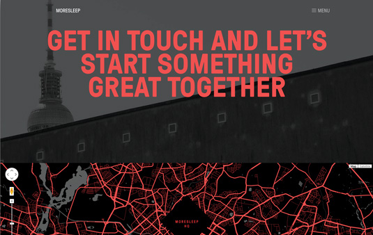
MoreSleep, a creative agency from Berlin, has a bold site. “Our goal was to showcase three projects that represent our expertise, instead of showing all the work we've done so far,” says technical director Torsten Bergler.
Large font-size values, neat scrolling effects and a red-heavy, contrasted colour scheme make this site stand out. “What's unique is the work's presentation: visualising the project process, guiding visitors through it and telling a story about the work we've done,” says art direction lead Stefan Schuster.
CSS transitions make it smoother to navigate through pages and content. Background-size properties are used to control the scaling of images at different sizes. Even the newsletter signup form is styled to match the clean look and feel.
08. Thankful Registry

Thankful Registry enables couples to create a unique, personalised wedding registry from any gifts they desire from anywhere on the internet. The site was created by Crush + Lovely; Jeff Schram and Michael Phillips from its frontend team wanted the CSS to be as beautiful as the design. They took time carefully planning their SCSS structure for this application.
"In a multi-developer environment, it's critical the code be organised, easily traversable and thoroughly commented," explains Phillips. The hard work shows in the site's aesthetic with strong typography and large, powerful images. The team didn't want to obscure these on any viewport and risk losing their significance.
"We created a responsive system that slides down the entire page to reveal the main nav options. This allowed us to keep focus on the gorgeous imagery and also give users a unique responsive experience," says Schram.
09. Life in my Shoes
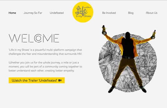
Life In My Shoes is a powerful multi-platform campaign aimed at
young people that challenges the fear and misunderstanding that surrounds HIV. London-based digital agency Traffic was briefed with developing a website that would appeal to a youth audience.
The brand font, Houshka Rounded Medium, was implemented using font-face to give the website a fresh look and feel. Decorative images and dramatic yellow accents throughout provide an alluring aesthetic.
The "About Us" page features a lively parallax effect that was adjusted for tablets and smartphones. "We wrote a media query for these devices that changes the background-attachment from fixed to scroll and sets the individual background-positions so that the images sit in the right place," explained the Traffic team.
10. Solo

Solo is an all-in-one project management tool geared towards use by freelancers. Cost effective and easy to use, the application combines great functionality, usability and beautiful design.
The site promoting the product is full of CSS3 awesomeness. "I decided to use HTML5 and CSS3 from the offset, catering only for modern web browsers," explains Jerome Iveson, designer of the app. "Only three per cent of the visitors to our site use Internet Explorer. Because our target market don't seem to use it, there seemed little reason for Solo to support it."
You'll see these CSS rules in action throughout this design, which makes project management more playful with a plethora of colourful CSS box shadows. Fonts like Clarendon and Bryant provide a nice balance of sophistication and fun.
Resizing the site or viewing it on a mobile phone allows you to see the layout adapt for different screen sizes and resolutions. "I quite liked getting stuck into the media queries side of things. I find that very interesting from a design perspective," says Iveson.
11. Form Follows Function

Form Follows Function (FFF) is a beautifully designed showcase of HTML5 and CSS experiments by Korean developer Jongmin Kim who works as an interactive developer at Firstborn Multimedia in New York.
Kim explains the name of his site reflects his aim to always pursue a "minus design rather than plus designs" and keep in mind that form follows function. He says his style is minimal and uses the golden ratio as well as interesting typography. FFF was made "for fun" and took Kim three weeks to create including spending his holiday working on it.
12. The Gently Mad
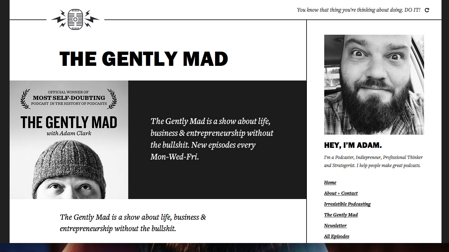
The Gently Mad is a topic-agnostic podcast about web creators. Adam Clark, the mind behind it, stepped away from a traditional blog layout when designing it to create something with a bit more impact.
The large header and well-designed episode list conveys that there's a personal touch to this design. Clark started with 'more crazy' CSS3 transitions and fades, but removed them, he tells us. "I felt the design choices I had made (colour, layout, typography) worked much better just left alone," he says.
13. Amazee Labs

Creating fresh websites and community solutions, Amazee Labs at bring your brand to the online world based on the modern open source framework Drupal. With competence and confidence, their own website is a beautiful example of CSS.
Already creating sites for television networks, digital agencies, charities and businesses, it's clear that their site has impressed almost everyone. We couldn't agree more.
14. A&W

The group at Cornett IMS wanted a site for A&W that was more than a logo, burgers and root beer.
"Our love for A&W had to do a lot with memories shared in the restaurants in our hometowns so we wanted to transcend the uniqueness of each store, connecting a new generation of fans with their local A&W," explains chief creative officer David Coomer on the site's purpose.
The use of @font-face to serve Metroscript and Century Gothic fonts creates a custom, enjoyable type system. CSS rotation transforms are used on header text, giving the site a fun print-menu feel.
25. Nolowene Nowak

Web designer and illustrator Nolowene Nowak has created a fun online portfolio – a great example of CSS being used to brilliant effect. If you scroll down and check out the timeline section, you will notice that the CSS-driven layout intelligently specifies basic rules to create a module that changes from a horizontal to vertical layout on smaller screens.
The site is as enjoyable to use as it was to create: "It was a really rich experience giving me the ability to create something unique that was simply me," says developer Christophe Dumont. "We wanted to offer the visitor the same experience as when he was a kid discovering a new toy."
During development, Dumont used Zurb's Foundation: a responsive CSS framework built with Sass. "Its support really makes the responsive design come to life," he says.
16. Caava Design

Design studio Caava has a beautiful new site. Users are drawn in by hints of scrolling animation and parallax functions, while the main focus stays on the portfolio. "We tried to provide a fresh and unique linear experience without beating people over the head with it," explains Caava owner Cody Small.
Scrolling through the site, arrows that tie the different sections together animate top and left positions, keeping the experience cohesive. "Since we have a lot of animated flare going on, it took some time to make it feel natural and supportive to the design," says developer Brandon Lavigne.
The arrows are consistent throughout the design, such as when exploring the work area. Looking closely, you'll see that they're created with CSS borders and transforms. This is super neat and useful, since projects have different colour schemes, and the arrow colours can then be easily changed with CSS properties to match.
17. Fitbit

Fitbit makes activity trackers and scales to record activity, monitor sleep, and document your body weight and fat. This information is wirelessly published to Fitbit, where users can see graphs, set goals, and compete and share their progress with others. "Our mission is nothing short of using technology to make the world a healthier place!" remarks developer Biagio Azzarelli.
The site design is bright and lively. Icons and colourful statistic graphics help bring informative snippets to life without boring the users. The well-used grid should make it easy to transform the site into a fluid layout in the future.
Azzarelli says he enjoyed developing the site based on user analytics. "As our user base continues to adopt A-grade browsers, we are able to take advantage of the enjoyable parts of CSS3 with acceptable degradation in IE7 and 8."
18. Mammothbooth
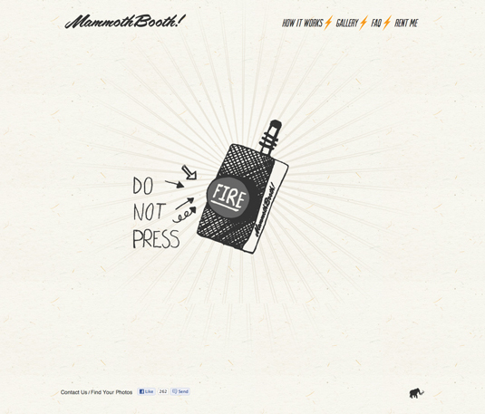
The Detroit based artists of MammothReach wanted to create the raddest photobooth the world has seen and with that, the MammothBooth website was born.
"We desired a site that was fluid, instant, and fun," remembers designer/developer Nick Keebaugh, "and that's exactly how our booth is. All in all, we wanted a completely custom feel throughout the site that mirrored who we are as a company and what our product does at its core. The website is the online extension of the MammothBooth through and through."
MammothReach utilised the rotate transform property with a large spiralling burst image that's in constant rotation. Fun content slides in as you visit the different sections of the site with animated style properties. The playful Arvil Sans font is a great fit for the aesthetic and is available as a 'name your price' font from the Lost Type Co-op.
19. Lab Partners
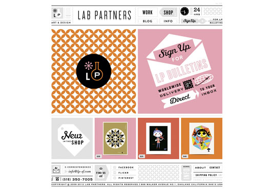
Art and design studio Lab Partners, run by husband and wife team Ryan Meis and Sarah Labieniec, has launched a colourful and decorative website which is one of the best examples of CSS around.
The attention to detail shines through for each page. The work section features a curated layout, which allows the portfolio to feel especially original. The project thumbnails have a large hover area that take advantage of the opacity property by clearly distinguishing the hover state. The Shop section is running on the Big Cartel shopping cart, but feels like an integrated part of the site with custom CSS applied to the elements.
"The web truly feels like one of the ultimate combinations of form and functionality," observes Meis. He goes on to explain that it was both enjoyable and challenging to find a balance between the two. "In the end every problem turned out to be an opportunity to create a solution that I hadn't originally thought of."
20. Pizza Brain

Examples of CSS don't get much better than this! Founded by Brian Dwyer, Pizza Brain is the world's first Pizza Museum and restaurant. The website promotes press releases and a blog describing the progress of the endeavour and features branding designed by Michael Almquist.
Fonts Pacifico Regular and Bebas Neue are paired with a warm, pizza-like colour palette creating a friendly aesthetic that's easy to read while still exciting and fun. "That orange, it's beautiful and it really sets the stage for the content," says the developer, Arjun Mehta.
A variety of rounded corners and opacity effects round out this clean look. “To have each post on its own rounded rectangle content section was actually borrowing from the visual language found on Pizza Brain's business cards,” adds Mehta. Fully responsive as well, the site looks great on smaller layouts.
One of the top examples of CSS in action – and keep your eye on the site as more is expected to come. "I'm excited about how the site might grow, and get further refined and built out as this amazing venture becomes realised over time," says Mehta.
21. Postable

Aimed primarily at visitors looking to send wedding invitations and holiday cards, or for those simply wanting an online address book, Postable provides an easy way to capture mailing addresses.
"Postable has an incredibly playful look to it, especially for a web application, and I wanted to stay true to those designs," says frontend developer, Kevin Kneife. From envelope-inspired striped borders, to fun background textures, to the robustly rounded Omnes Pro font, the site instantly makes gathering addresses less of a drag.
Fun and useful illustrations are used throughout. Rounded corners, ribbons and clever hover states keep the site engagement entertaining. It's one of the best examples of CSS transforms we've seen, with them being used to update the rotate value of a background image, drawing users in to the instructions on how easy the site is to use.
After creating an account, adding a contact is accomplished via a simple-to-use form that features pure CSS select boxes that Kneife fully crafted. He reveals, "This involved masking the select boxes on the forms with an outer div, adding transparency, and the use of -webkit-appearance. The result is a box that looks good on all browsers and degrades gracefully."
22. Robby Leonardi

Designer Robby Leonardi's home features colourful illustrations and cartoon styles, bringing a cheerful personality to the work. As Leonardi puts it, "It is always a good thing to make people smile, and I think this website will do just that."
It's one of the great examples of CSS being used to create amazing visuals. Background images are layered to create neat horizontal parallax effects in the header area. Down the page, CSS rotation transforms are used to move the gears on the sides of the viewing area. Portfolio pieces are framed within wooden windows that have animated hovers.
The wooden blocks were made from Leonardi's rendering of 3D models. He explains, "I combined all of those renderings into a single image, and change the CSS left property whenever the user scrolls the page. It's pretty surprising that a simple CSS trick can produce such a good effect!"
23. Libor Zezulka

The one-page website of Libor Zezulka is a clean and clever personal portfolio set among gradients that pop and text that begs to be read, thanks to the smart usage of CSS text-shadows.
Lead designer and frontend developer Martin Pospisil of Madeo enjoyed working on the site. "[We had] the freedom to play with the design and technology," he explains. This shows in the fun factor of the site. The design is simple, yet effective, in that the sections are clearly distinguishable. Pospisil reckons that "the power lies in the icons and colour combinations."
Another unique touch are the lightbox pop-ups. The buttons on this site are set apart as actionable by the shadow imaging underneath. The close button is offset a bit from the box, providing an easy-to-use interface.
34. Emporium Pies

"The Emporium Pies website has one job: to make you want to eat more pie," Kyle Turman, interactive director at Foundry Collective asserts. And boy, is he telling the truth. The well-designed responsive site of the Dallas-based pie and coffee shop will make you hungry. Really hungry.
"Operations director Paul Wilkes captured some really excellent shots of the pies, and we prioritised them in the hierarchy of the design as much as possible," Turman goes on. "We thought it was important to let the pies speak for themselves, and not fill the site with a ton of rambling copy."
Check out the hover effects on the Pies page. It uses CSS 3D transforms combined with the backface-visibility property on the images of the pies to reveal the name and more information about the dessert.
25. Future of Car Sharing

Future of Car Sharing, a collaboration between Collaborative Fund and Hyperakt with support from Startup America Partnership, is packed with information on the increasingly popular alternative to car ownership. Deciphering the differences of peer-to-peer, business-to- consumer and not-for-profit car sharing is made easy by this charming horizontal scrolling site.
"Right from the start a decision was made to push this piece as far as we could," advises Simon Corry, information architect at Hyperakt. "This meant that, while we were providing backwards compatibility for older browsers where possible, the emphasis was on testing the limits of CSS3 properties. I've always been a fan of video games and with the current level of browser support for CSS3 I was able to enjoy that level of animation and engineering through the CSS.
"The beauty of CSS3 is in its simplicity, making it a perfect language for any creative," says Corry.
26. Life in Greenville

Life in Greenville takes a look at living and working in Greenville, South Carolina. "All of us at CoWork love Greenville and wanted to create a website that would help people understand why," says lead developer Sean Gaffney.
The site greets you with Kulturista typeface at an attention-grabbing 53px font size on top of a full-width, responsive hero image. The clean design keeps you engaged and wanting to learn more with the easily, accessible content. The slightly animated logo on hover provides some joy as well.
The team took advantage of the Skeleton boilerplate to help build the styles. "Skeleton provides a really nice base set of widths to design for, so it just came down to tweaking a few items in the layout for each screen size," says Gaffney.
27. True Fish Tales

True Fish Tales really hooks you in. It plays on the idea that fishermen are famous for telling tall stories by bringing together some amazing 'true tales' of the monsters that lurk beneath the sea. What sets it apart is its smooth and user-friendly interactivity, which makes discovering the content a fun and entertaining experience.
The infographic was put together by Brian Maier and Mark Shelton of Kentucky agency DBS>Interactive as part of an ongoing effort to add fresh content to United Marine website.
Maier and Shelton used a combination of CSS3 and JavaScript to build the infographic. "Many of the animations and graphics are handled with CSS3," Lewis explains, "but they used JavaScript in some places to accommodate for older browsers that do not yet support this technology.
28. Station Four

Web agency Station Four has undergone a rebranding process and designed a new website to better its personality and brand. "We started conceiving the new website around the idea of showing, not telling, potential clients what we can do," explains Station Four creative director and co-owner Christopher Olberding.
Consequently the new homepage uses a large, featured work banner to show off Station Four's most recent work.
The 'Expertise' page has an interesting navigation design: it uses large circle imagery as links. These take advantage of border-radius properties to achieve the look, and apply animations on them as well.
Did we miss out your favourite example of CSS in action? Let us know about it in the comments below!
Contributors: Chris Cashdollar and Rich Clark
These reviews were originally published in net magazine, the world's best-selling magazine for web designers and developers.
