Do words matter anymore?
Writer Gemma Church investigates whether words have a place over images in web design.

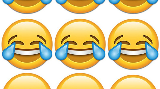
The Oxford Dictionary has chosen an emoji as its "word" of the year. The emoji is not a word, it's a cartoon face. I'm going to let that technicality pass, for now, as the wordsmiths over at the Oxford Dictionary had a somewhat convincing argument for this unconventional choice.
Wider opinion on the decision is divided. Critics declared the death of the written word and advocates argued emojis are now a part of our communicative fabric.
As a freelance writer and former web designer, I feel equally torn. I have met with clients who are more concerned with the imagery used on their website than the words. They are happy to leave copy decisions to the last minute, whilst hours are spent tweaking images to perfect the site design. This is a massive mistake – words are also a design issue.
Words vs images
In its most basic form, website design should provide a platform for users to consume and engage with content. Whether this is done through imagery or words depends on the product and target audience.
A website with no images would look out of place in today's world and the inventive use of imagery is a tried and tested method to improve the user experience. Just like our friendly emoji, visual information and images are used to convey a myriad of thoughts and emotions to make users engage with your content.
Images are also easier to memorise when compared with written text, attract the audience's attention and guide the user's line of sight. There;s also the age-old saying that "a picture is worth a thousand words".
Why do we still use words?
The textual world and the visual world work together, creating messages in a bimodal manner. Whether a person is looking at a wireframe or is just surfing the web, they are calling on more than one sense to analyse the information presented to them. In other words, an image can portray information and text can be considered an image.
Get the Creative Bloq Newsletter
Daily design news, reviews, how-tos and more, as picked by the editors.
When you first look at an image, you naturally begin to search for some sort of subject to focus your attention on. You want an explanation of the context behind the image. Once the text is added to an image, the user's inherent desire is being manipulated. Photos are often desaturated or blurred to present the text more clearly and emphasise the message.
There are also a handful of downsides to image-only sites, not least the lack of context, but also the load issues due to increased weight and the lack of SEO impact.

Images may make an impactful first impression, but the textual content is an equally important aspect of any website. Textual content gives the audience specific information. This is something that a single image just could not do.
Content tells users who you are, what you stand for, all about your business or product and what makes you different from the crowd. Keywords, descriptions, titles and phrases increase your site's SEO. Including high quality written content such as articles, tips, hints and blog posts means you add value to your site, build a brand and make individuals want to return by creating user retention. Quality text can educate, inform, entertain, persuade and add value to your images.
Likewise, quality images can educate, inform, entertain, persuade and add value to your text.
What's the right balance between imagery and text?
Trends and consistencies exist within website design, but there's no correct answer here. This is not an argument over the correct use of text or image, but it is crucial to consider both when communicating an intended message through your web design.
There needs to be an unobstructed and balanced visual path coupled with a prominent display of information. The doors for creativity should always remain open as text and images enhance the user experience when used together.
This maybe why I feel so uneasy that the "face with tears of joy" emoji was selected as the "word" that "best reflected the ethos, mood and preoccupation of 2015." It seems to suggest that we are too busy or disinterested to take the time to express ourselves with language. It suggests that the doors of creativity are firmly shut for the world of words.
It's an experience I saw time and time again as a web designer. Lorem ipsum always won through and was used throughout the design process. Meanwhile, imagery is top of the web design hierarchy.
Words without images do not engage users. Images without words confuse users. The two must coexist within the world of web design.
And, just as a single snippet of text would have no place in an art gallery, an emoji has no place in a dictionary.
Words: Gemma Church
Gemma Church is the freelance writer who gets tech, a Countdown finalist and lover of all things science.
Like this? Read these...
- Brilliant Wordpress tutorial selection
- The designer's guide to working from home
- How to start a blog

Thank you for reading 5 articles this month* Join now for unlimited access
Enjoy your first month for just £1 / $1 / €1
*Read 5 free articles per month without a subscription

Join now for unlimited access
Try first month for just £1 / $1 / €1

The Creative Bloq team is made up of a group of art and design enthusiasts, and has changed and evolved since Creative Bloq began back in 2012. The current website team consists of eight full-time members of staff: Editor Georgia Coggan, Deputy Editor Rosie Hilder, Ecommerce Editor Beren Neale, Senior News Editor Daniel Piper, Editor, Digital Art and 3D Ian Dean, Tech Reviews Editor Erlingur Einarsson, Ecommerce Writer Beth Nicholls and Staff Writer Natalie Fear, as well as a roster of freelancers from around the world. The ImagineFX magazine team also pitch in, ensuring that content from leading digital art publication ImagineFX is represented on Creative Bloq.
