11 web design trends I'd like to see in 2014
Not predictions so much as a wish list - Pete Sena explains what his agency Digital Surgeons hopes to see on the web in the year ahead.

January was the month packed with resolutions and trend-spotters to kick off the year. And while we love to read up on the latest predictions at my agency Digital Surgeons, we couldn't help asking ourselves, "What trends do we want to see this year?"
Here's a round up of what we came up with, covering both trends we want to continue and those we want to come to a swift and conclusive end. We'd love to hear your own thoughts in the comments below!
- Also read: 2013's biggest trends in web design
01. Progressive magazine layouts

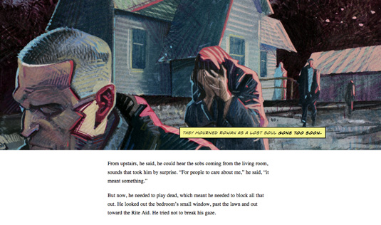
We're thrilled to say that there has been an impressive acceleration in HTML5 as well as cross-browser support for more progressive CSS and JavaScript. Compounded with the rise of tablets and continued growth of mobile browsing, the web will continue to give way to more 'storytelling' in web design.
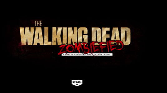
But even with these advancements, the publishing industry struggles to remain relevant in the digital age. What I hope to see this year is more scrolling sites with better photojournalism.
02. More varied typography
In 2014, publishers and bloggers alike will not only leverage magazine-like layouts with flexible multi-column grids that adapt and respond, but will also utilize services such as @fontface and TypeKit, and explore fresh font pairings to differentiate themselves.
The better the browser gets at typography, and it's already pretty tight right now, we're hopefully going to see more progressive usages of fonts in web design. For instance, the tail-end of last year started to show signs of a subtle departure from strictly sans-serif pairings in exchange for more personable and unique font choices.
03. Visual effects done in pure code

The frontend curious continue to push the bounds of the modern interface this year. Codepen is full of inspiring examples of people pushing the envelope of possibilities of combining HTML5/CSS and JavaScript. New additions to the CSS spec, such as blending modes and masking, will enable and encourage our developers to let loose at full creative capacity.
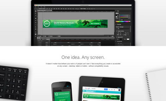
We are going to hopefully see both animation and performance come forth as a feature as well as a narrative device. Adobe Edge isn't there yet but it's quickly becoming what Flash once was to many of us. Google's even jumped on board with their Web Designer tool to make prototyping HTML5 powered animations a reality.
04. A step back from the flat UI
As much as we love the ease-of-use that flat UI can offer, there's many things we don't like about this most popular of recent trends.
We're coming across a world in which everything is all of a sudden being 'connected'. This boom in the digital world deprives new generations from growing up with form-factors beyond the screen, which ultimately annihilates skeuomorphism.
Flat screens aren't the same as touching cloth, turning a Rolodex, or having some other three-dimensional experience. What is more alarming is the potential effect this could have from a communication standpoint in the long run. For instance, what was once easily represented with a floppy disk is not so clearly translated now.
What do we use to clearly represent a concept as simple as 'save'? A hard drive? Cloud storage? No. Just the word 'Save'. A future filled with vague and abstracted visualizations and iconography is a very possible one. (Pardon the dramatization).
05. Video getting more impressive
Raise your hand if you've seen a video home page in the past week. As codecs are getting stronger, devices are becoming very comfortable with video. It is the most powerful visual storytelling device ever, as it uses visuals and sound to make connections. The only direction the video is going is up.
06. Natural language and context-driven interfaces

We're going beyond the list and grid view and into the 'you' view. Natural and conversational walkthroughs are already widespread (much to our approval), and, if companies are smart, context-driven interfaces will most definitely start to dominate.
You've probably already noticed many instances of this put into play. Things like screen dimming based on a user's light or battery conditions; location-aware actions like displaying night versus day depending on time and whereabouts; and customizing experiences by entering in your name and preferences are all going to create different ways to browse and connect with content.
- Also read: Discover context-driven design
07. People will get to the point faster
The targeted landing page has always been the biggest conversion vehicle for brands. In the past this was often because a homepage or subsequent areas of a site were all over the place - too much data, too much to read, too many choices.
Nowadays, everything is getting 'minimal' to reduce a user’s cognitive load. We're see simpler, clearer calls to action to get that 'first' interaction. Apps are the shining stars in this category. They reel you in with low effort requests and then progressively become more demanding the deeper you dive.
This 'frictionless experience' also helps to improve user happiness, which is an indirect contributor to a brand's net promoter score, another key metric that is used to measure how effective a brand is. Consider this: Would you rather go to Best Buy or the Apple Store? We're pretty sure you said the Apple store, but why? Best Buy sells Apple products! Need we say more?
08. Scroll and gesture-driven experiences

The future is no longer in our hands. It is our hands. Input modules have dictated our experiences since the dumb terminals in the late seventies.
The mouse, tablet, touch, and pinch will be the future for how we experience things. Things animating, appearing, and disappearing based on the users' interactions were already being leveraged on every site we all wowed over last year. And the things that will wow us in 2014 are likely to come from the minute, yet refined details.
Knowing your user well enough to provide moments of surprise and delight will be a game-changer if the industry gets it right.
- Also read: Great examples of parallax scrolling websites
09. Content-first
This goes further than the over-tweeted clichés. It's about getting a user to what they want and then getting every element of clutter out of their way so they can do the 'task' or accomplish the 'story' they are after. Where do you think the pinned and disappearing navigation concepts came from?
We're going to see more card-based designs running our experiences - and that's a good thing. It just seems obvious to only show a user what they want when they want it, and tuck it in any easy-to-follow-and-find place.
10. JavaScript immortalized

Flash used to be the 'cool' kid on the Internet block. Nothing gave you that wow factor like some snappy animation back in the day. But those days are gone. JavaScript is bleeding into both front and back-end now, its popularity boosted by the universally available bridges and libraries on practically every platform or API.
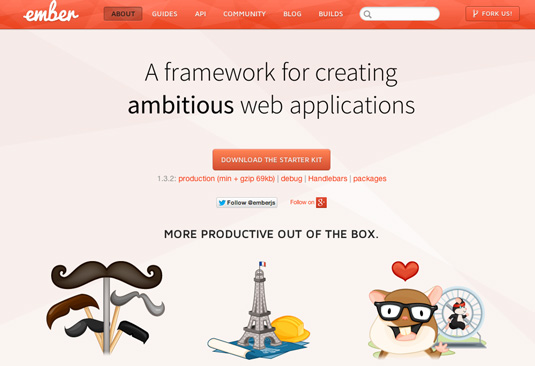
Entire platforms are now being powered by JS and its unwavering popularity makes it a language that will continue to grow. Frameworks will continue to pop out of the woodwork like hipsters with impossibly dense beards and reclaimed bicycles. If something can be built in JavaScript, it will be.
11. No return to site intros
Users' patience is evaporating like water droplets on asphalt on a hot summer day. We are seeing more interfaces and sites cut through the fog by utilizing loaders, transitions, and other 'state' driven elements that make everything feel like AJAX. If you are going to make them wait, make it worth their while. Just whatever happens please don’t bring back the site 'intro'.
Conclusions
So what does all this mean to my team at Digital Surgeons? Everything must be design driven; from the code we write (or don't write) to the tone we use and to the compositions and visuals we create. The industry is always on the move, and this year we plan to go beyond trend-spotting and help push digital in the right direction. Finally, this is the year that the fusion of designer and developer takes the web by storm. Hybrids are the future of the internet.
Words and illustrations: Pete Sena
Pete Sena is the founder of Digital Surgeons, a digital marketing agency in New Haven, CT. A hybrid designer/developer who lives to create unique and powerful experiences for brands, if Pete ever takes a break he's probably reading, teaching himself something, attacking Crossfit or snowboarding.
Liked this? Read these!
- Get started with responsive web design today
- How to build an app: try these great tutorials
- Free graphic design software available to you right now!
- Brilliant Wordpress tutorial selection
Which trends would you like to see the back of in 2014? Share your views in the comments.

Thank you for reading 5 articles this month* Join now for unlimited access
Enjoy your first month for just £1 / $1 / €1
*Read 5 free articles per month without a subscription

Join now for unlimited access
Try first month for just £1 / $1 / €1
Get the Creative Bloq Newsletter
Daily design news, reviews, how-tos and more, as picked by the editors.

The Creative Bloq team is made up of a group of art and design enthusiasts, and has changed and evolved since Creative Bloq began back in 2012. The current website team consists of eight full-time members of staff: Editor Georgia Coggan, Deputy Editor Rosie Hilder, Ecommerce Editor Beren Neale, Senior News Editor Daniel Piper, Editor, Digital Art and 3D Ian Dean, Tech Reviews Editor Erlingur Einarsson, Ecommerce Writer Beth Nicholls and Staff Writer Natalie Fear, as well as a roster of freelancers from around the world. The ImagineFX magazine team also pitch in, ensuring that content from leading digital art publication ImagineFX is represented on Creative Bloq.
