How to create a web design style guide
Frontend style guides are a hot web design topic. Stephen Hay explains what they are and how to create your own.
What are style guides? The name gives us a pretty good idea of what they're all about: guides to style. But web design style guides can be so much more than that.
At the least, they are simply documentation for frontend designers and developers. At best, style guides can help clients and other designers and developers understand how a site (or app) is visually put together.
Style guides can increase understanding, encourage co-operation and boost maintainability. Strangely enough, style guides are anything but new, and we're certainly not the first to use them. However, the creation of style guides in our industry is only starting to gain popularity. (For a comprehensive guide, check out our post on how to make your own style guide.)
Begin with identity guidelines
The web's current style guides are the result of a natural evolution of identity guidelines, which graphic designers frequently develop for their clients. Also called 'style manuals', 'house style guidelines', 'design standards' and other similar names, they have been used by designers, writers and technical people in various industries to help describe design (or writing, or technical) systems in an attempt to promote consistency.
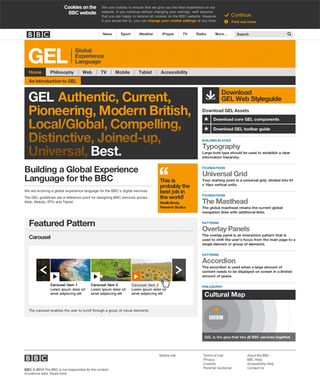
Visual consistency is critically important to a brand. Could you imagine Apple stores designed like Ikea stores? Or McDonald's arches in a warm magenta? The BBC site set in the Baskerville typeface? In a world where brand perception rules, guidelines provide consistency, and consistency can either save or earn money - or a combination of the two.
I was in college the first time I saw a set of identity guidelines; an entire book of them for Apple Computer. My jaw dropped. From how colours are built up on a four-colour printing press to how much space should surround the logo and the layout grid for printed materials, those guidelines got me wondering about creativity in design - and I understood for the first time that an identity is a system.
Websites are also systems, so the old identity guidelines map well to the new style guides. Although, web style guides may contain more technical content and we can simply publish them on the web as opposed to printing them in book form.
What's old is new
Just like layout grids before them, style guides have been serving print designers tirelessly for years. Web workers have rediscovered them and what was normal - and sometimes even boring - work for print designers has become the new web hotness.
Style guides really started attracted interest after Anna Debenham's article in 2011 for 24 Ways, which is a nice introduction for frontend designers and developers to the topic. (Also check out Debenham's style guide stash - a great resource.)
There are plenty of tools and frameworks to choose from. But before you go and grab the hottest new style guide framework, it's useful to nail down what a style guide really is - in order that you can choose the approach that works best for your situation.
A style guide (or style manual):
- Provides some general context and explains the purpose of the document
- Shows the various design elements
- Explains how and why these elements should be used, from a design perspective
- Explains when and where it is appropriate to use the elements
- Provides more explanations and context per element when necessary.
This premise distinguishes style guides from pattern libraries. Pattern libraries showcase a bunch of design elements or patterns, and sometimes they explain how elements can be implemented - but often not under what circumstances they should or should not be used. Pattern libraries offer the game pieces but not the rules to the game. However, style guides deliver those rules.
Examples
Many designers refer to the Starbucks style guide as an example of a great style guide. However, this is actually a very fine pattern and component library rather than a style guide. It contains a gallery of ways for designers to deal with things, and some of the code needed to implement correctly. But it's missing explanations of 'why'. Similarly, Twitter Bootstrap is in fact a really comprehensive pattern library rather than a style guide. (Although, in Bootstrap's defence, it can't provide context for you, since your own project becomes that context.)
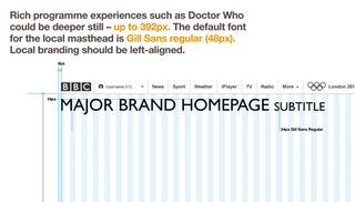
Another good example of a style guide is BBC's Global Experience Language (GEL). It's an expansive system that's based on more than visual style: the choices are guided by its well-explained philosophy and well-considered design principles. The foundation is documented - without being long-winded - as well as containing patterns and components. Using the GEL guide you could, in fact, create a page or component that fits perfectly within the BBC identity in a very short time, even if you are not familiar with the brand.
Pattern libraries
Pattern libraries serve a different purpose. The question 'Which buttons can I choose from?' can be handled by pattern libraries. However, 'Which button should I use for my particular situation, and how do I use it properly within a given context?' is usually answered by a style guide.
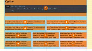
Ultimately, the big difference is the documentation part, which is writing about the when, how, where and why - and you may struggle to communicate all those in an Adobe Photoshop PSD file.
Style guides: the new Photoshop
Style guides, combined with web-based design comps, can replace static Photoshop comps as our main design deliverables.
This will enable us to create realistic and responsive designs from the very beginning, removing tedious manual labour from that process. Image editors such as Photoshop can be used for, wait for it... image editing, asset creation, and for sketching and experimentation. As designer Andy Clarke says: "We're making websites - not pictures of websites".
Relax: you don't need to give up Photoshop. But you may find, as you create more responsive designs, that you struggle to communicate the 'why', 'how', 'when' and 'where' of your various design choices in a PSD file. A style guide can help you out whether you design in Photoshop or not.
Tutorial: Make your own style guide
If you decide to create a pattern library rather than a style guide, there are lots of good tools to help you, such as Jeremy Keith's Pattern Primer. Kyle Neath's KSS is another great option. As many tools produce a mix of style guide and pattern library, start by considering the end result you'd like to achieve. This will help you weigh up pros and cons and choose the most appropriate tool.
Importantly, a tool should allow for free-form writing in a sane text format (rather than writing documentation in CSS comments, for example). Source code and rendered code should be pulled in to that documentation text at locations I choose. I would also like support for syntax highlighting of code, and much more.
An important part of my workflow now relies on Dexy, which is open source software for documentation and document automation. While Dexy isn't comprehensive, it does provide a plethora of filters, which utilise functionality of other software to help create documents.
For example, you can write a document in Markdown, pull code in from CSS, syntax highlight it and show the rendered HTML. This can then be sent through LaTeX to create a PDF, a web page or a Word document - or all of these. Follow the steps to create a simple style guide using Dexy.
01. Install Dexy
If you have Python installed on your system and can type some simple commands in your terminal emulator, then installing Dexy is very easy. Open the terminal, type the following and press enter:
pip install dexy
If you don't have pip, easy_install dexy should work as well. Depending on the system, you may have to write sudo at the beginning of that line. You'll be prompted for your password to install Dexy.
Now tell Dexy to create a project folder. Do this by navigating to where the directory will be installed and type this:
dexy gen --t dexy:default --d myproject
This tells Dexy to use its simple default (t)emplate and use it to (gen)erate the myproject (d)irectory. If all has gone as it should have done, you'll see the following confirmation that your project has been successfully created:
$ dexy gen --t dexy:default --d myproject
Success! Your new dexy project has been created in directory 'myproject'
Move into the myproject directory and you'll discover that Dexy has made some files and folders for you. Delete the file hello.txt and replace it with an empty file called index.html. This will be our sample style guide. We're writing it in HTML for simplicity.
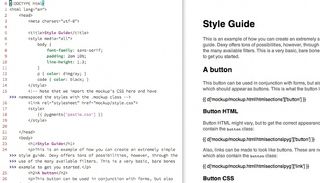
02. Make your web mockup
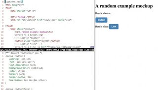
We'll make a really simple document in order to demonstrate Dexy's functionality. Create a folder in the myproject folder called mockup and put the following HTML document in that folder. Call it mockup.html:
<!DOCTYPE html><html lang="en"><head><meta charset="utf-8"><title>Mockup</title><link rel="stylesheet" href="style.css" media="all"></head><body class="mockup"> <h1>A random example mockup</h1> <p>Here is a button.</p> <!-- section "button" --> <button class="button">Button</button> <!-- section "link" --> <p>Here is a link: <a href="http://www. netmagazine.com" class="button">Link</a></p> <!-- section "end" --></body></html>Note the special comments - these tell Dexy which sections of HTML to use in our style guide. Also note the mockup class on the body element. We're going to need that to style things properly later on.
Now imagine that this document is the HTML mockup of a design for a website or app. You could also have more pages, such as home.html, form.html and so on. The important thing is that every snippet you want to show in your style guide is surrounded by Dexy's special comment lines. Save the file and create a style.css file in the same directory:
/*** @export "buttoncss" css */.mockup .button { padding: .5em 1em; font: 1em sans-serif; text-decoration: none; background-color: steelblue; color: white; border: none; border-radius: 5px; box-shadow: 1px 1px 2px silver;}.mockup .button:hover { cursor: pointer; background-color: olive;}The special export comment at the top again tells Dexy that we want to do things with that later (in this case, there is no end comment so we're going to import the whole file into our style guide). Save this file as well.
Open the HTML file in a browser to see what your mockup looks like.
03. Set up a Dexy configuration file
To make a really simple style guide describing the button style from this mockup, go up a directory (so you're in the myproject directory) and open up dexy.yaml. This YAML is the command centre of Dexy for your project. Replace the contents of the file with the following:
guide:
- index.html|jinja:
- sources
assets:
- "*/*.html"
- "*/*.css"
sources:
- mockup/mockup.html|htmlsections
- mockup/mockup.html|htmlsections|pyg:
- pyg: { lexer: html }
- mockup/style.css|idio
This file tells Dexy to find the style guide in the file index.html, containing Python-based Jinja templates, which need to be processed. Basically, the file will contain placeholder code that will be replaced with code from the mockup.
To do this, index.html is sent through the Jinja filter. The first line with sources means that index.html needs to utilise everything from the sources section below. The assets section here tells Dexy to simply copy the mockup files to the future output folder. And finally, the sources section takes the mockup HTML and CSS and pipes it through Dexy filters.
The filters split the files into sections, delineated by special comments, and apply syntax highlighting to them using Python's Pygments syntax highlighter. When Dexy is run, all these snippets will be available to place in your style guide via Jinja templates. (All will become clear in a moment.)
04. Write your style guide
The most important - and hardest - part of creating a good style guide is the actual writing. The following example simply provides an idea of how Dexy works (rather than being an example of appropriate content for a style guide). Type the following into the empty index.html file you created earlier:
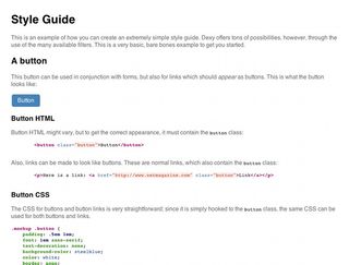
<!DOCTYPE html><html lang="en"> <head> <meta charset="utf-8"> <title>Style Guide</title> <style media="all"> body { font-family: sans-serif; padding: 2em 10%; line-height: 1.3; } p { color: dimgray; } code { color: black; } </style><!-- Note that we import the mockup's CSS hereand have namespaced the styles with the.mockup class --> <link rel="stylesheet" href="mockup/style.css"> <style> {{ pygments['pastie.css'] }} </style> </head> <body> <h1>Style Guide</h1> <p>This is an example of how you can create an extremely simple style guide. Dexy offers tons of possibilities, however, through the use of the many available filters. This is a very basic, bare bones example to get you started.</p> <h2>A button</h2> <p>This button may be used in conjunction with forms, but also for links that should <em>appear</em> as buttons. This is what the button looks like: </p> <!-- The "mockup" class here allows the mockup styles to be applied. --> <div class="mockup"> {{ d['mockup/mockup.html|htmlsections'] ['button'] }} </div> <h3>Button HTML</h3> <p>Button HTML might vary, but to get the correct appearance, it must contain the <code>button</code> class:</p> {{ d['mockup/mockup.html|htmlsections|pyg'] ['button'] }} <p>Also, links can be made to look like buttons. These are normal links, which also contain the <code>button</code> class:</p> {{ d['mockup/mockup.html|htmlsections|pyg'] ['link'] }} <h3>Button CSS</h3> <p>The CSS for buttons and button links is very straightforward - since it is simply hooked to the <code>button</code> class, the same CSS can be used for both buttons and links.</p> {{ d['mockup/style.css|idio']['buttoncss'] }} </body></html>The contents within curly brackets are Jinja templates, and are placeholders for the code delineated by the comments in the other files. Those snippets – which are described in the YAML configuration file – will become available when Dexy is run. In this case, we will show the button both as rendered HTML, and as syntax-highlighted code.
Save this file. Now run Dexy by simply typing dexy in your myproject directory and pressing Enter. If all went well, you should see something like this:
finished in 0.2339
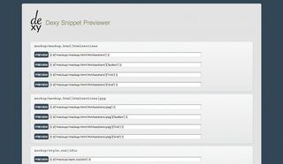
Running dexy serve from your project directory will start a web server, giving you a URL to view your style guide. Check it out. You should see some text with the button plus some syntax highlighted code.
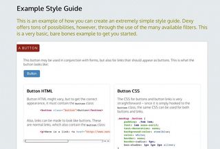
You can stop the Dexy server by pressing Ctrl+C in your terminal. Running dexy viewer will launch a server that provides a page based on your Dexy configuration, with all the Jinja templates available to use in your style guide code. As with dexy serve, Ctrl+C stops the server.
Ringing the changes
You may be thinking that this is a lot of work for a small file - and you'd be right. But most style guides are longer and more complex than this. It's tempting to do something like this by hand, updating code and perhaps using screenshots of the designed items.
Try this: open up style.css from your mockup and change the background colour of the button from steelblue to orange. Then go to your project directory in your terminal and run dexy -r. This resets Dexy and runs it again. Run dexy serve again and go to the URL in your browser. The example button is now orange and the CSS code has been updated as well. When you make lots of changes to the CSS and HTML in your mockups (Dexy is language-agnostic so other languages are OK, too), updating style guides in this way is no longer a chore.
Find your own way
My own Dexy workflow, as described in my upcoming book Responsive Design Workflow, is significantly more complex than this simple example. Among other things, I like to automate screenshots taken at various viewport widths. But this should be enough to get you started constructing your own style guides for (even small) projects.
Remember to use a tool to suit you: you may be happier constructing style guides in Word - and that's not a problem. Whatever you decide to use, style guides are valuable as a compendium of visual components and as a tool for communication between designers, developers and clients.
Words: Stephen Hay
Stephen Hay is a frontend design and development consultant focusing on multi-platform design. This article first appeared in issue 239 of .net magazine.

Thank you for reading 5 articles this month* Join now for unlimited access
Enjoy your first month for just £1 / $1 / €1
*Read 5 free articles per month without a subscription

Join now for unlimited access
Try first month for just £1 / $1 / €1
Get the Creative Bloq Newsletter
Daily design news, reviews, how-tos and more, as picked by the editors.
The Creative Bloq team is made up of a group of design fans, and has changed and evolved since Creative Bloq began back in 2012. The current website team consists of eight full-time members of staff: Editor Georgia Coggan, Deputy Editor Rosie Hilder, Ecommerce Editor Beren Neale, Senior News Editor Daniel Piper, Editor, Digital Art and 3D Ian Dean, Tech Reviews Editor Erlingur Einarsson and Ecommerce Writer Beth Nicholls and Staff Writer Natalie Fear, as well as a roster of freelancers from around the world. The 3D World and ImagineFX magazine teams also pitch in, ensuring that content from 3D World and ImagineFX is represented on Creative Bloq.


