Create a responsive Drupal theme
Drupal themes enable you to change the look and feel of your site. Tim Millwood explains how to create a theme that makes it appear differently on different screen sizes
- Knowledge needed: HTML, CSS, PHP
- Requires: Working installation of Drupal 7
- Project time: 1 hour+
Download the source files here
This article first appeared in issue 221 of .net magazine - the world's best-selling magazine for web designers and developers.
So, you missed DrupalCon London and Denver? Or went along and didn’t really get what this theming thing was that everyone was talking about? Well, this tutorial will set you along the right path.
I first want to cover the fact that I’m not a designer or a CSS expert, and have no interest in being either. I know Drupal pretty well, and want to show you the best way to get started with Drupal theming, and how to make use of media queries within the theme. In the Drupal community there’s a lot of talk right now about how best to integrate technologies such as HTML5, CSS3 and media queries. Both Jake Strawn and John Albin Wilkins discussed the use of responsive design in their DrupalCon London sessions.
Media queries aren’t always the best way to build sites for mobile devices, but they offer a good way of making your site work with different viewports. They also play nice with external caching such as Varnish. Many of the solutions that sniff the device then display the correct version of the site, or a different theme, end up getting cached and not showing the right version to the user.
To get started with Drupal theming, all you need is an info file to outline and describe your theme, and the CSS. Drupal will handle the rest for you. However, if you do want to edit any of the HTML, or even the content itself, you’re free to do so – and this article will show you how.
Info files
The first step is to write an info file. This file stores all of the information that Drupal needs in order to know what your theme is and how to use it. There are few required elements and many optional ones.
Get the Creative Bloq Newsletter
Daily design news, reviews, how-tos and more, as picked by the editors.
- name = Responsive
- description = An example of using Media Queries in Drupal7
- core = 7.x
- stylesheets[all][] = css/reset.css
- stylesheets[all][] = css/main.css
- stylesheets[(min-width: 480px)][] = css/480.css
- stylesheets[(min-width: 768px)][] = css/768.css
- stylesheets[(min-width: 1024px)][] = css/1024.css
- stylesheets[(min-width: 1280px)][] = css/1280.css
The above code can be added to a file called responsive.info. This file will need to go into a folder called responsive, which can then go into sites/all/themes of your Drupal 7 installation.
The first few lines of this file should be easy to understand: name is the name of your theme; description is the description of your theme; and core is the version of Drupal that your theme is written for – in this case, we’re using Drupal 7, therefore core is 7.x. Both name and description will be displayed on the Themes page within the Drupal interface.
The next few lines are all of the style sheets that you wish Drupal to load as part of your theme. The declaration of these style sheets is in a pseudo-PHP array. The first key in the array is the media elements of the style tag Drupal will generate. This key can contain any media query or HTML style tag media element you wish to use for your theme, such as print or screen. The second key in the array is left empty to allow multiple style sheets to be applied to a single media type. For these style sheets I’ve taken Andy Clarke’s ‘320 and up’ approach of starting with mobile and working up to full desktop size.

This way of thinking enables you to focus on adding functionality and features when the screen gets bigger, rather than taking them away. The first two style sheets are for all media types. Reset.css includes a CSS reset – in my case (and in the example files), this is Eric Meyer’s, but feel free to use your own.
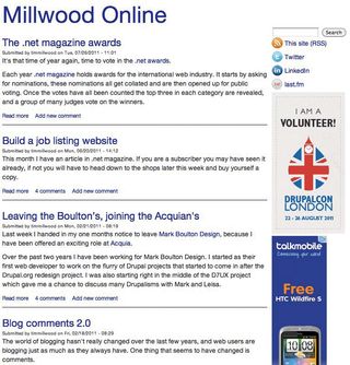
Main.css is the start of the ‘real’ CSS. This has all of the default CSS, which will be used across every viewport size, plus the formatting for the site when seen in a viewport less than 480px width. This is the ideal place to add portrait smartphone styles.
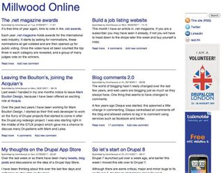
The final four lines of the info file define four CSS files using media queries. These media queries are set to switch the CSS at 480px, the size of a landscape iPhone:

768px, the size of a portrait iPad:

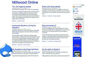
1,024px, the size of a landscape iPad ...

... and 1,280px, the size of a well-sized desktop browser:

You can now go ahead and create the CSS files defined in the info file. The path for the files used in the example uses a CSS folder for OCD’s sake. So you’ll need to create a folder called css within sites/all/themes/responsive then generate the CSS files in there, using the filenames set in the info file.
Grab a copy of Eric Meyer’s (or your favourite) CSS reset and put that in reset.css. Then in main.css start adding your CSS to design the site. Drupal has already generated the HTML for you, and you can even enable the ‘Responsive’ theme now to look at what HTML Drupal has created, and to see what your site looks like in its naked form.
Not happy with Drupal’s HTML? Well, that’s fine – you can change that. Check out the ‘Simplify and improve your HTML’ tutorial in issue 219, where Jen Simmons discussed how to alter Drupal’s generated HTML to aid the addition of HTML5 to your site.
Template files
There are many template files within Drupal. These are bundled with the core Drupal installation and with most contributed modules. These are where most of the HTML is defined and they’re easy to spot because they all end with the extension tpl.php. All of these template files can be overridden in your theme just by adding a file of the same name – for example, if you wanted to override the HTML for the nodes on your site you can copy node.tpl.php from the node module and add it to sites/all/themes/responsive.
It takes multiple template files to build up a page. The first is html.tpl.php. This features everything outside the body in the HTML. Then comes page.tpl.php, which is everything inside the body in the HTML. These two are loaded for all pages. All other template files depend on how your site is constructed. If you have blocks, it will load block.tpl.php for those. If you’re displaying nodes, either in full or teaser format, this will load node.tpl.php. Then, if you have contributed modules such as views or panels, there will be a whole set of different template files for each element that these modules generate.
Template files know what content to display based on PHP variables used within them. These variables are populated via theme functions within Drupal core and contributed modules. Theme functions are also just as easy to override as template files. The first step is to generate a file called template.php within sites/all/themes/responsive. Within this template PHP file you can add any theme function, but change the first word in the function name to the theme name, in this case ‘responsive’.
As an example, we’ll look at overriding the theme function, which is used to generate the pager. The pager is found on many pages and views across your Drupal site when you have a lot of content. Suppose we wanted the pager just to be very simple with previous and next links only, no page numbers. We’d use:
- <?php
- function responsive_pager($variables) {
- $tags = $variables['tags'];
- $element = $variables['element'];
- $parameters = $variables['parameters'];
- global $pager_total;
- $li_previous = theme('pager_previous', array('text' => (isset($tags[1]) ?
- $tags[1] : t('‹ previous')), 'element' => $element, 'interval' => 1, 'parameters' => $parameters));
- $li_next = theme('pager_next', array('text' => (isset($tags[3]) ? $tags[3] : t('next ›')), 'element' => $element, 'interval' => 1, 'parameters' => $parameters));
- if ($pager_total[$element] > 1) {
- if ($li_previous) {
- $items[] = array(
- 'class' => array('pager-previous'),
- 'data' => $li_previous,
- );
- }
- if ($li_next) {
- $items[] = array(
- 'class' => array('pager-next'),
- 'data' => $li_next,
- );
- }
- return '<h2 class="element-invisible">' . t('Pages') . '</h2>' . theme('item_ list', array(
- 'items' => $items,
- 'attributes' => array('class' => array('pager')),
- ));
- }
- }
This can be added to the template.php file of the theme. It will override the theme_pager function within pager.inc of Drupal core. This function is called responsive_pager. This shows the pattern in Drupal of changing the word ‘theme’ in a theme function to the theme name when overriding it in template.php. The original theme functions can be copied, then altered as needed. This example changes the default pager from ‘first, previous, 1, 2, 3, 4, 5, next, last’ to a basic ‘previous, next’. It uses all the default Drupal code to generate these pager buttons, but has just had all of the other logic removed. This can be altered to make the pager behave in whatever way is required.
JavaScript and jQuery
Often a site needs a little sparkle from JavaScript and, more specifically, from jQuery. Drupal ships with jQuery, so it can be used throughout your theme. JavaScript files can be added to your theme through the info file, just like CSS.
- scripts[] = sparkle.js
The line above can be added to responsive.info to include the file sparkle.js when the theme is loaded. For JavaScript, Drupal uses a ‘Behaviors’ system, which is employed to create a single mechanism for attaching JavaScript and is therefore applied consistently when a page is loaded and new content is added. As an example of how this works, let’s add a small amount of jQuery animation to the site title.
- (function ($) {
- Drupal.behaviors.responsiveAnimation = {
- attach: function (context, settings) {
- $('h1#site-name', context)
- .hover(function(){
- $(this)
- .animate({
- 'margin-left': '10px'
- },
- 'slow');
- });
- }
- }
- }(jQuery));
The above code can be added to the sparkle.js file in the responsive theme, and adds an animation effect to the site name when it’s hovered over. One thing to note here is that when a change is made to the theme’s info file, it won’t take effect until the theme has been re-enabled so you’ll need to go to the appearance page and do this before sparkle.js will work. The code starts by mapping jQuery to $: to avoid conflicts, this isn’t done by default. The function is then stored as a property of Drupal.behaviors and given a name relating to the theme and its functionality. The rest is what you’d find in standard jQuery.
If h1#site-name is hovered over, a slow animation is added to add a 10-pixel margin to the left of the site name. There’s some great documentation on using JavaScript and jQuery on the Drupal website, drupal.org/node/171213. This will give you more of an insight into how it works and how it can be used.
We’ve covered Drupal theming at a high level; the documentation goes into more depth. To get an idea of the context for what’s been discussed here, download the examples files. I’ve also installed the responsive theme from this article on millwoodonline.com. This will allow you to see how it looks and works with real site content.
Words: Tim Millwood
A client advisor at Acquia and freelance web developer, Tim is an active member of the Drupal community.

Thank you for reading 5 articles this month* Join now for unlimited access
Enjoy your first month for just £1 / $1 / €1
*Read 5 free articles per month without a subscription

Join now for unlimited access
Try first month for just £1 / $1 / €1
The Creative Bloq team is made up of a group of design fans, and has changed and evolved since Creative Bloq began back in 2012. The current website team consists of eight full-time members of staff: Editor Georgia Coggan, Deputy Editor Rosie Hilder, Ecommerce Editor Beren Neale, Senior News Editor Daniel Piper, Editor, Digital Art and 3D Ian Dean, Tech Reviews Editor Erlingur Einarsson and Ecommerce Writer Beth Nicholls and Staff Writer Natalie Fear, as well as a roster of freelancers from around the world. The 3D World and ImagineFX magazine teams also pitch in, ensuring that content from 3D World and ImagineFX is represented on Creative Bloq.
