Create a consistent set of icons in Sketch
How to create a neat collection of webmail icons using Sketch.
Nowadays, your typical web or desktop app looks sleek and tidy. And that's what the average user expects it to be, too. Think about Things by Cultured Code, Dropbox or Fantastical by Flexibits. What do they all have in common? A nice UI and a consistent and appealing icon set. A good icon set may often be taken for granted, but a bad one is immediately noticeable.
Creating an icon set may seem like an easy task, but it poses quite a few challenges. Many designers find it easier to design a unique icon rather than creating an icon set. That's because a set of items presents a different type of rules. All icons need to work together as a team: you need to consider the weight, the strokes and the shapes in order to achieve a consistent result. This process may take a few iterations to get to your desired result, but it's rewarding and interesting.
Although you can choose whichever vector programme you like, Sketch is a great option. It is primarily designed to be a graphic application for web and mobile designers, UX designers and icon designers, and is becoming a solid alternative to the most common screen design software. The application looks and feels great, is well designed, and easy to learn if you are used to other design tools like Illustrator, Fireworks or Flash.
01. Set up artboard and drawing area
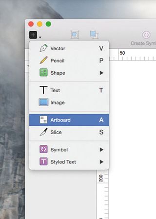
Launch Sketch and create an artboard (A). Draw an area with your mouse or Wacom pen on the canvas – you can tweak the dimensions afterwards in the inspector panel on the right-hand side. You can also change the position and the background colour and select the features you prefer.
In Sketch, you can work with multiple artboards. This is extremely handy for projects that have different views (for example a UI view and an icon view).
02. Insert a rectangle
This icon set is designed to fit a webmail UI, and we will be designing a set of six consistent icons. There will be the plus icon (indicating 'more'), a bin icon (delete), a bell icon (notification), a mail icon (refresh and get emails), a pen icon (write a message) and a back arrow icon (previous email).
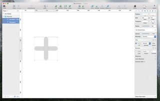
Let's start with the plus icon. Insert a rectangle (R) and draw a rectangle of 100 x 20px, then modify the radius to 40 so you have rounded corners.
Get the Creative Bloq Newsletter
Daily design news, reviews, how-tos and more, as picked by the editors.
03. Use the Inspector panel
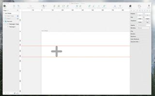
Now you can copy and paste the same rectangle with rounded corners, and change its rotation to a 90 degree angle. You can do that through the Inspector panel, under Transform. The icons we are creating are all vector-based, so we can adjust the size later by increasing or decreasing their dimensions.
If you are used to working with rulers, adding them in Sketch is simple (View > Canvas > Show Rulers). You can click anywhere on the ruler to add manual guides, and they'll stay visible as long as the rulers are visible.
04. Group the icon in a folder
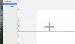
Let's group the first plus icon in a folder – this is how Sketch will display items when you hit Cmd+G. In the Layer panel, you will see a folder with two separate items (rectangles) that are still individually editable. This is handy if you want to tweak the shapes afterwards – for instance, to remove round corners or modify the radius.
05. Start bin icon
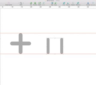
Let's move on to a more complex icon: the bin. The primary shapes are similar to the plus icon, which is the reason why we started with the plus. Draw a Rectangle (R), roughly 15 x 84px. Copy and paste the same shape and start building the body of the bin. We will have to set the radius to 40 here as well, to keep the set of icons consistent.
06. Build up bin
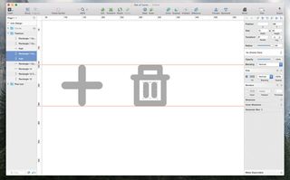
Keep going and use the same shape again for the body of the bin icon, simply by rotating it by 90 degrees. For the handle at the top, keep the same radius, and the angles will come out smooth and tidy. The rectangle at the top of the bin is 65 x 15px – basically 40px shorter in width than the base of the bin, which is 105px.
07. Add final details
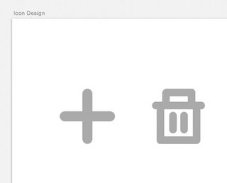
The bin icon is slightly more detailed than the others. If you want a more simplistic approach, you can leave the surface blank, but instead let's give it a final touch here by drawing 'dents' in the middle, to mimic the surface of a real bin. Part of this icon, as well as the plus icon, can be reused later on in the tutorial.
08. Begin bell icon
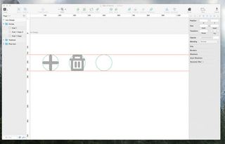
The second icon of our set is ready; let's move on to the bell icon, which is more complex again. We want the icon to fit into the same surface area on the screen. To ensure this will work, we can draw circles on top of each icon that will function as guides. We can position the circles a distance of 70px from each other. This way when we finish the set, we'll have a nice row of horizontally aligned icons, each of which occupies the same space on the screen.
Next page: Create more icons to add to your webmail icon set

Thank you for reading 5 articles this month* Join now for unlimited access
Enjoy your first month for just £1 / $1 / €1
*Read 5 free articles per month without a subscription

Join now for unlimited access
Try first month for just £1 / $1 / €1


