7 common mistakes made with responsive mockups
Jeremy Girard of Envision reviews the most common mockup mistakes when designing in RWD.
Responsive design is more than just a popular design trend, it's a practical response to the great browsing shift from desktop to mobile. To survive in the current state of the industry, web designers must support multiple screen sizes and devices, and a responsive approach (RWD) solves a lot of those problems.
As the transitionary phase that brings form to ideas, mockups hold a lot of weight in the design process. This piece reviews the most common mockup mistakes when designing in RWD, so you can make sure your step to responsive is a step forward, not back.
01. Designing for devices, not screens
According to data provided by OpenSignal, there are now 24,093 distinct Android devices on the market, up from 18,796 just last year — and that isn't even counting iOS and other devices.
This incredible diversity makes it impossible to target individual devices. A smarter strategy is to focus on the size of the screen.

Don't think in terms of wearables, phones, tablets, or desktop. Divide your mockups by:
- Micro-screens
- Small screens
- Mid-range
- Large
- Extra-large
Specific screen dimensions make a more reliable metric for determining size, since many devices vary. Think of all the different screen sizes for phones: some are larger than small tablets.
Focusing on screen size also prevents relying on device size for responsive breakpoints, another responsive mockup mistake that I'll describe now.
Get the Creative Bloq Newsletter
Daily design news, reviews, how-tos and more, as picked by the editors.
02. Relying only on device sizes for breakpoints
There's always a new device around the corner, and even if you account for every single available device's breakpoints, your responsive site will fall short when the next big one comes around.
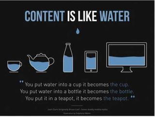
As explained in Web UI Best Practices by UXPin, "build to the design, not the device":
- Start with the Mobile First approach: build a mockup for the smallest screen, then scale up. For reference, the iPhone in portrait is 320 pixels wide.
- If a lot of your users have wearable devices, you need to consider micro-screens with even smaller resolutions. The Apple Watch — the smallest after the Pebble Time — has a width of 272 pixels.
- As your design starts to feel strained, add media queries to make any necessary layout changes so that your design is comfortable and works well every step of the way.
- Designing for a maximum width of 2000 pixels covers all but the largest displays available today. According to the latest browser statistics from W3Schools, 99 percent of visitors have resolutions that fall under that 2000 pixel size.
- Introduce responsive breakpoints based on the needs of the design to avoid that uncomfortable in-between state that falls in between common device sizes. Creating a design that "responds" to the screen size is the nature of RWD.
03. Ignoring touch controls
Touch controls are one of the great advantages of most mobile devices: they're fun, they're intuitive, and they save time. Don't neglect them on some devices because others can't use them. Here are some tips to including touch controls:
- Know the best practices for each device. On small screens, the lower left corner is the easiest place for thumb access, so place your most clicked elements there. However for tablets, because they're held differently, the top corners are prime touch real estate.
- Tap targets (like CTA buttons) must be adequately sized. A minimum of 44 points complies with fat-finger-friendly guidelines.
- Suggested spacing between elements is at least 23pt, to avoid clicking the wrong one.
- Adapt for the lack of hover states. You can substitute click-activated functions, or reveal the hover elements in the native state from the start.
- Don't reinvent the wheel. Common hand gestures like swiping work best for navigation and other features since they're already learned by the user.
04. Linking to content that isn't mobile-friendly
You can't design around linking visitors to other pages or content, either on your site or elsewhere. The problem for responsive experiences is when your device-agnostic site links to non-responsive webpages.
If your responsive website links to outside sites, there's really nothing you can do except consider an alternative site. However, when linking to sites and resources that you do control, including micro-sites or partner websites, you want to ensure that all of them provide a consistently positive responsive experience.
05. Poor planning for bigger screens
I suggest an approach that's mobile-first, not mobile-only. While smaller screens may be more popular, 42% of traffic still comes from desktop visitors. Both sides of the screen size spectrum must be considered.
Here's some advice from The Guide to Mockups for considering the "big picture":
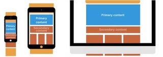
- You need to do more than simply enlarge smaller screen designs. Take advantage of the extra space by adding new elements or restructuring the visual hierarchy.
- Check the quality of images — they may appear blurrier on larger screens.
- Likewise, check the readability of line lengths. Between 45 and 75 characters is optimal. You can use a bookmarklet from Chris Coyer to test your design's line lengths.
- Don't enlarge fonts too much. Oversized fonts take up significant horizontal space, which can force readers to slow down or skip ahead in the content.
06. Using consistent navigation across screen-sizes
Consistent navigation within a device is most definitely a good thing. But don't get married to one layout and try to recreate it over and over on other devices. This goes against what responsive design is about.
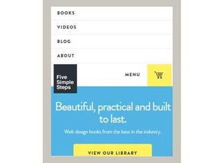
Some consistency is good, though, to maintain a consistent UX. Certain elements should remain the same to build a recognizable interface and suggest to users how to use the UI on a new device. These elements should remain consistent:
- Link or button labels
- Typefaces
- Color treatments
Yet, different screen sizes require different navigation systems. The following elements should not remain consistent as they accommodate the nuances of specific screen sizes:
- Button size
- Visual layout
- Navigation functionality — including touch controls
For example, a desktop navigation can sit static at the top of a screen. When you rework the layout for the mobile screen, you can make the navigation persistent and shrink in size to get out of the way (but keeping a similar color scheme, typography, and button labels).
07. Hiding content
A common misconception once ruled that mobile users are a rush and only want a smaller version of the "full site." Content like contact information and directions were prioritized while other content was hidden.
Now we know most mobile users aren't mobile at all, with 68% of usage occurring at home. Most users want the full site on a mobile device. Not abridged, but reformatted.
Knowing someone's preferred device is not the same as knowing their preferred content. If content is relevant to users on one device, chances are it's relevant to users on a different device.
Moreover, you have to consider multi-device task flows. Users often start a task on one device and finish it on another, switching between them in the process. Limiting content depending on devices also limits how the user interacts.
Present and prioritize content differently for different screen sizes according to progressive enhancement, but never hide or restrict the content itself.
Further reading
The tips here are just a preview of what's available in the free ebook UX Design Trends 2015 & 2016.
By analyzing 71 of today's best UX examples, this guide deconstructs useful trends into simple design tactics for everyday design.
Words: Jeremy Girard
Jeremy Girard is the head of web design/development for the Providence, Rhode Island-based Envision Technology Advisors. He also teaches website design and front-end development at the University of Rhode Island. He contributes content to the free design library by the collaborative prototyping app UXPin.
Like this? Read these!

Thank you for reading 5 articles this month* Join now for unlimited access
Enjoy your first month for just £1 / $1 / €1
*Read 5 free articles per month without a subscription

Join now for unlimited access
Try first month for just £1 / $1 / €1
The Creative Bloq team is made up of a group of design fans, and has changed and evolved since Creative Bloq began back in 2012. The current website team consists of eight full-time members of staff: Editor Georgia Coggan, Deputy Editor Rosie Hilder, Ecommerce Editor Beren Neale, Senior News Editor Daniel Piper, Editor, Digital Art and 3D Ian Dean, Tech Reviews Editor Erlingur Einarsson and Ecommerce Writer Beth Nicholls and Staff Writer Natalie Fear, as well as a roster of freelancers from around the world. The 3D World and ImagineFX magazine teams also pitch in, ensuring that content from 3D World and ImagineFX is represented on Creative Bloq.
