How to build a pattern library in Sketch
Designer Richard Child explains how to create a pattern library with Sketch, ensuring your site's design is consistent and reusable.
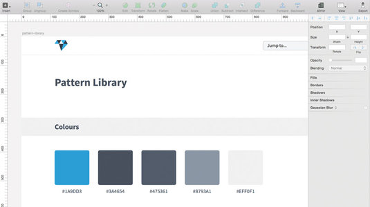
Have you ever struggled with consistency in web design? This happens all too often, especially when working at scale. Luckily for us, pattern libraries are here to help!
A pattern library is a collection of user interface design elements that can be reused to build pages. Examples include navigations, buttons, paragraphs, headings and forms. By designing individual elements instead of complete pages, we're actively encouraging reusability, resulting in designs that are consistent and easy to maintain.
Before implementing a pattern library, we must ensure that our design tools can handle reusable elements. For the past two years my go-to design tool has been Sketch: a lightweight, vector-based tool perfect for interfaces and pattern libraries. Why is it perfect? I'll give you an example.
Let's say you have a button element that is used multiple times throughout a website, then decide to change it. Normally you'd have to go through and manually change each instance of that button. Not with Sketch. The software includes a feature called Symbols: a special kind of layer group, in which any changes you make to a symbol are automatically applied to all its other instances. It's perfect for working with reusable elements.
OK, enough of me singing Sketch's praises. Let's dive into the tutorial! Don't have a copy of Sketch? Simply head over here to download the free trial.
Step 01
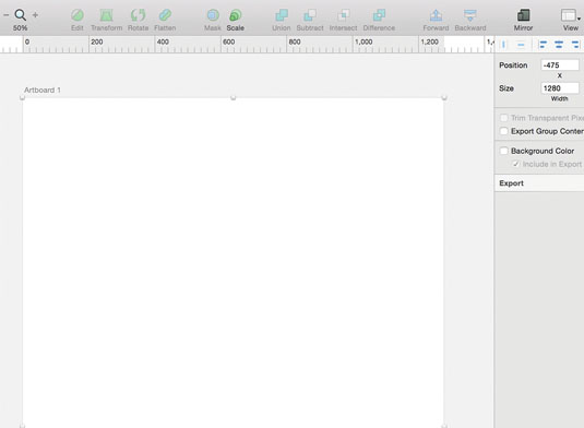
Before we begin, ensure you have the free Google font Source Sans Pro installed. Create a new document, then insert a new artboard by going to Insert > Artboard (keyboard shortcut: A). An artboard is a fixed canvas that we'll be using as our screen size. You'll notice ‘Artboard 1' has been added to the layer list on the left. In the Inspector panel on the right, set the Width to 1280px and the Height to 2000px.
Step 02
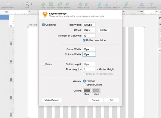
Now to create our grid. With Artboard 1 selected go to View > Canvas > Show Layout (keyboard shortcut: Ctrl+L). You will see a default grid appear. Now we just need to edit it. With Artboard 1 still selected, go to View > Canvas > Layout Settings. Set Total Width to 1080px, Number of Columns to 12, Gutter Width to 30px and Column Width as 60px. Make sure Gutter on outside is checked. Click the Center button.
Sign up to Creative Bloq's daily newsletter, which brings you the latest news and inspiration from the worlds of art, design and technology.
Step 03
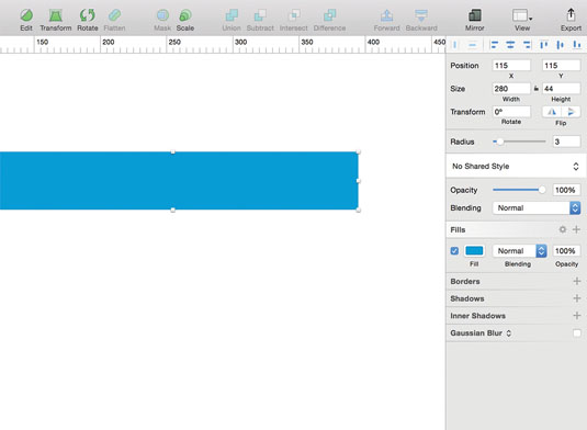
Now we have our artboard and grid set up, it's time to add some content. For this tutorial, we're going to be creating four different types of pattern library elements. Let's start with buttons. To create the button background, go to Insert > Shape > Rectangle (keyboard shortcut: R). In the Inspector, set the Width to 280px and the Height to 44px. Set the Radius to 3px and the fill colour to #1A9DD3.
Step 04
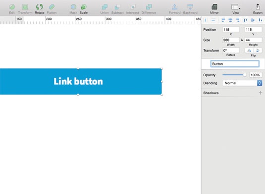
Now to add the text. Go to Insert > Text (shortcut: T). Change the Typeface to Source Sans Pro, Weight to Bold, Color to #FFFFFF, Size to 16pt and click the centre align icon. Position the text so it's centred inside the background. Select both layers and go to Arrange > Group Layers (keyboard shortcut: Cmd+G). With the group selected, go to Layer > Create Symbol. You'll notice that Sketch is prompting you to name the symbol, so enter Button. Symbols can be recognised by a purple layer icon.
Step 05
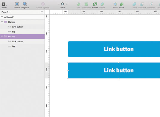
Any changes made to a Symbol, like the one we just created, will be applied to all other instances of that Symbol. The only problem is that if we change the button text inside the Symbol, it will alter the text of all other buttons. To prevent this from happening, select the text layer and check the box Exclude Text Value from Symbol in the Inspector. Now let's create a duplicate button. Go to Insert > Symbols > Button.
Step 06
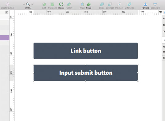
To see Symbols in action, change the background colour of one button. Notice how the colour changes for both. But if you change the text of one button, the text of the other doesn't change. Only the styles are in sync, not the text strings. This means, for example, we can create Sign up, Buy now and Contact me buttons that all share the same style.
Step 07
Before moving on, it's important to be aware of how measurement works in Sketch. Select one button, hold down Alt and hover over the second button to show the distance between them. This is not only a feature that designers will use all the time but one that's perfect for developers who regularly have to calculate exact pixel measurements.
Step 08
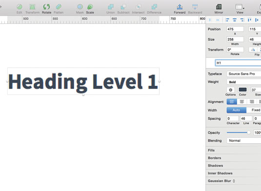
Next up, headings. As headings are reusable text elements, it's important to use the Text Styles feature instead of Symbols. Insert a text layer and type Heading Level 1. Change Typeface to Source Sans Pro, Weight to Bold, Color to #3A4654 and Size to 37pt. Go to Layer > Create Shared Style. In the Inspector, you will notice that there is text highlighted. Sketch is prompting you to name the text style, so enter H1.
Step 09
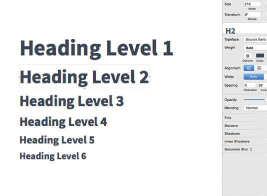
Repeat the last step to create your H1 to H6 elements. My heading font sizes are H1: 37pt, H2: 31pt, H3: 25pt, H4: 21pt, H5: 18pt and H6: 15pt. As each heading is a text style, any changes will be applied to all other instances of it. I've used Jeremy Church's Type Scale tool to determine the size of my headings. Type Scale uses the modular scale to choose proportionate font sizes, depending on the ratio you select.
Step 10
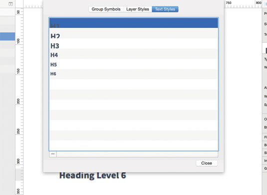
To organise the text styles we've just created, go to Insert > Styled Text > Organise Text Styles. Here you can delete and rename text styles but not reorder them. As text styles are ordered alphabetically, I name similar elements with the same first word: for example, List Unordered and List Ordered. Follow the same process for organising symbols. OK, we've tackled buttons and headings! But what about images?
Step 11
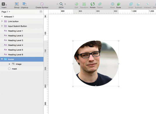
For avatars, insert an image and rectangle that both have a Width and Height of 130px. Give the rectangle a Radius of 65px. Group both layers and position the rectangle behind the image. Right-click on the rectangle layer and select Use as Mask. We now have a circular avatar. We've used a rectangle with a radius setting instead of an actual circle because if you want to make the avatar square, you can simply edit the radius instead of inserting a new shape.
Step 12
But what if I want to replace an image, I hear you ask? OK, maybe you weren't asking that, but it leads me onto a neat feature, appropriately named Image Replace. Select your avatar and go to Layer > Image > Replace. Choose a different photo. Sketch will automatically resize the new image and switch it with the existing one. You'll use this more often than you think: it's another great time-saver!
Step 13
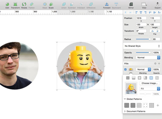
An alternative to inserting your own images is to use the Content Generator for Sketch plugin by Timur Carpeev. Simply create a shape and go to Plugins > Content Generator Sketch Plugin > Persona > Photos. It pulls the user photos from User Inter Faces, and inserts them as a shape fill. The Sketch plugin community is great.
Step 14
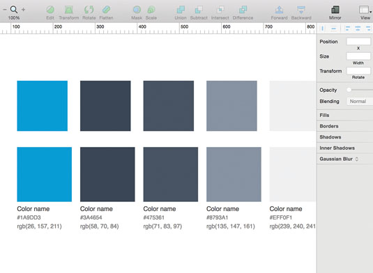
Next up, colour swatches! It's important to document commonly used colours in our pattern library. Insert a rectangle with Width and Height of 120px, and give it a fill colour of #1A9DD3. Repeat this step with the colours #3A4654, #475361, #8793A1 and #EFF0F1. There's also a plugin for creating colour swatches by Jody Heavener. Go to Plugins > Swatches and enter the five hex values above.
Step 15
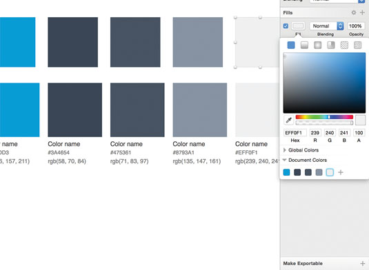
Select a swatch and click on the fill colour in the Inspector. At the bottom of the colour picker, you'll notice two sections: Global Colors and Document Colors. Global colours will be saved for all Sketch documents you create, whilst document colours are unique to, well, each document. By adding colours to the document colours section, you're building up your own colour library.
Step 16
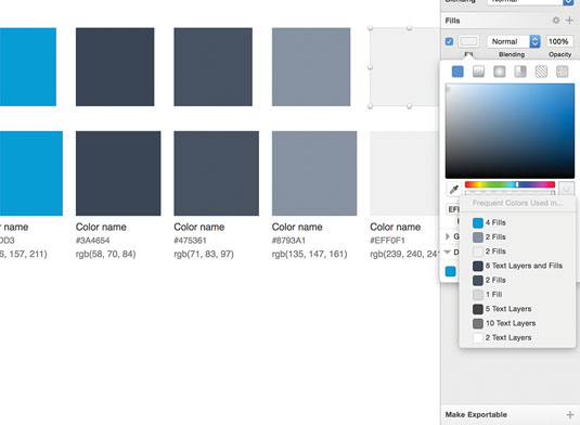
Aside from document colours, Sketch also automatically picks out common colours in your document and indicates how often they've been used! This feature is hidden from view, but can be accessed from the colour picker. Click on the area to the right of the hue and opacity sliders. You'll see a popup titled Frequent Colours Used in.... Not only does Sketch tell you how often the colour has been used but where.
Step 17
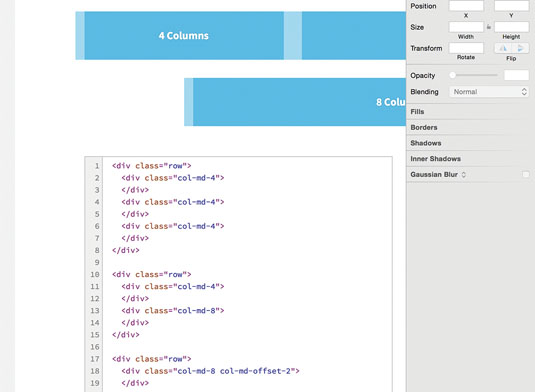
For the final steps, please download the resource that accompanies this tutorial and make sure you have the font Source Code Pro installed. In the resource, HTML is included alongside each element. This ensures that the correct HTML tags and class names are used for development. Usage notes can be provided where appropriate. A great example of this is in the grid system, where it's useful to have information on column classes, offsetting columns, and so on.
Step 18
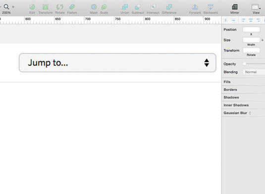
In the resource, you'll also notice that the header has a Jump to… selector. Pattern libraries can be long, so it's important that your team members are able to quickly jump to an element without having to scroll through the whole page. An example of this can be found on the A List Apart pattern library and Anna Debenham's pattern library.
That's it! You now know how to work with pattern libraries: all you need to do now is find inspiration for a library of your own. I highly recommend visiting Website Style Guide Resources by Anna Debenham and Brad Frost, where you can find lots of great articles, tools and examples.
Words: Richard Child
Richard Child is a design consultant. This article originally appeared in issue 272 of net magazine.
Liked this? Read these!
- Why you should manage your CSS with pattern libraries
- How to build an app: try these great tutorials
- Free graphic design software available to you right now!

The Creative Bloq team is made up of a group of art and design enthusiasts, and has changed and evolved since Creative Bloq began back in 2012. The current website team consists of eight full-time members of staff: Editor Georgia Coggan, Deputy Editor Rosie Hilder, Ecommerce Editor Beren Neale, Senior News Editor Daniel Piper, Editor, Digital Art and 3D Ian Dean, Tech Reviews Editor Erlingur Einarsson, Ecommerce Writer Beth Nicholls and Staff Writer Natalie Fear, as well as a roster of freelancers from around the world. The ImagineFX magazine team also pitch in, ensuring that content from leading digital art publication ImagineFX is represented on Creative Bloq.
