Animate icons with Sketch and SVG
Animated icons can bring your app or site to life. Peter Nowell shows you how to design them using Sketch, SVG and CSS.
Sign up to Creative Bloq's daily newsletter, which brings you the latest news and inspiration from the worlds of art, design and technology.
You are now subscribed
Your newsletter sign-up was successful
Want to add more newsletters?
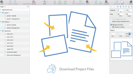
The digital world is increasingly dynamic, reactive and animated – from the whole layout of a webpage to the smallest icon in an app. In this tutorial, we're going to use Sketch to build an icon representing a collection of files for a download button on a website. We'll then export our icon as an SVG and animate it using CSS.
Even the most simple animated icon requires numerous technical considerations, so each step of this tutorial is designed to prepare you for far more complex projects. To follow along, readers should have a basic understanding of how to use Sketch, as well as CodePen, HTML and CSS transforms and transitions. No previous experience with SVG is necessary.
I've been blown away by how enthusiastic developers are about adopting Sketch – and it makes sense considering the software has been built specifically for screen-based design and development. Its simple UI and easy-to-use tools betray its considerable power under the hood.
And because everything created in Sketch uses vector shapes, it's the perfect tool for exporting designs as SVGs.
If you've been holding off on using SVG, wait no longer. The format is rock-solid, extremely well supported by browsers, and entirely vector-based (granting infinite resolution to graphics). What's more, each layer in an SVG can be manipulated with CSS or JavaScript, just like anything else in the DOM. Seriously – what more could you ask for?
Step 01
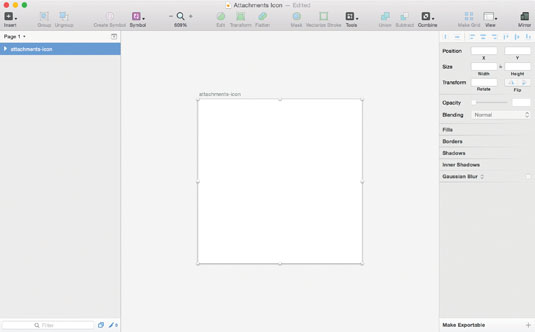
Start by firing up Sketch and creating a new project with a 60px by 60px artboard. This will contain the icon we're going to create.
Step 02
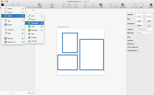
Our icon represents a collection of files for someone to download. It includes three objects – two photos and a document, all of which derive their shape from rectangles. First, insert rectangles for each of the objects using the R keyboard shortcut. Then give the shapes a fill colour of white and a 1px blue border.
Sign up to Creative Bloq's daily newsletter, which brings you the latest news and inspiration from the worlds of art, design and technology.
The border should be centred as opposed to inside or outside the shape, as the current version of SVG only supports centered borders (or 'strokes' as they're called). In the future, SVG 2 will support all three border types.
Step 03
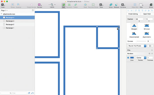
To create the triangular fold in the corner of the document, insert another rectangle (12px square) with the same blue border, but no fill colour. After positioning it at the top-right corner of the large document rectangle, enter Edit mode to reveal the vector points. Click on the upper-right vector point, then hit delete to remove it.
Step 04
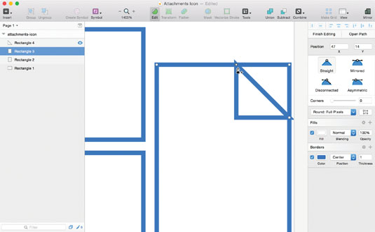
We'll do a similar thing on the large rectangle now. Select that shape and enter Edit mode, then make sure 'Round to Full Pixel Edges' has been selected in the Inspector. Add a vector point on the top and right sides of the shape by clicking on the borderlines.
All points should be straight (not one of the curved options with Bézier handles). Position these new points 12px from the top-right corner, so they line up with the triangular fold. Delete the top-right corner point.
Step 05
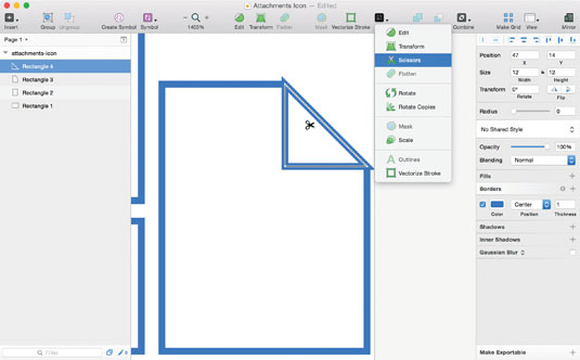
Click on the triangular fold shape, then use the Scissors tool (Layer > Paths > Scissors) to remove the 45-degree angled side. For more on the Scissors tool, see this article.
Step 06
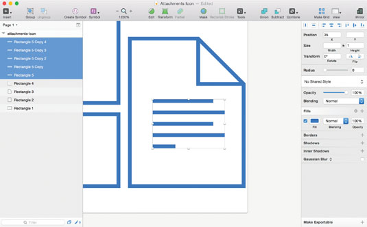
Insert several 1px-tall rectangles to represent lines of text on the document. I used varying widths to mimic the look of left-justified text.
Step 07
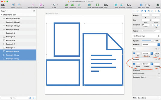
Notice how in the final icon design each object has some white space around it? Normally we could achieve that by adding a thick white border below the blue one on each object's base shape.
However, SVG only supports a single border per layer (until SVG 2), so instead we'll duplicate each object's base shape, then change the border on the bottom-most shapes to 4px white. Group each photo layer with its white background, and group all document layers together.
Step 08
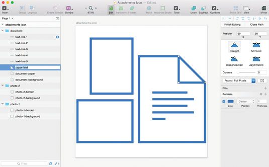
Title all of your layers. This is actually an important step, as it affects the SVG we're going to export. Sketch will use the name of each layer to give it an ID, and therefore each layer requires a unique name, and ideally one using hyphens instead of spaces (or in camelCase).
Step 09
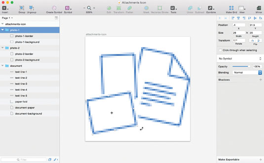
Position and rotate the groups to your liking. Then use Sketch's 'Show Pixels' feature (ctrl+P) to assess the clarity of the icon. Because we're rotating shapes with such thin borders, they'll never align perfectly with the pixel grid, but I like to fiddle with the positioning values in the Inspector so that the rotated shapes appear as crisp as possible. Full integers or half-pixel X and Y values are a great place to start.
Step 10
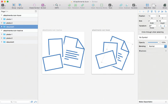
To design how the icon will appear during a hover state, simply duplicate the icon's artboard and arrange the objects so they are closer together and have slightly different rotations. Write down each object's rotation values for the normal (inactive) state and its hover state – we'll need those later.
Step 11
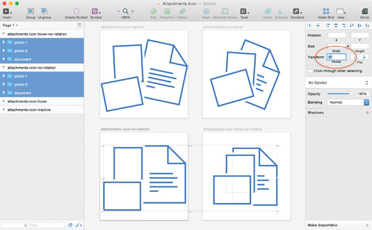
We've designed the icon, now it's time to prep it for export. Start by duplicating both the inactive and hover state artboards, then selecting each group and resetting the rotation values to 0 degrees. We're going to recreate those rotations with CSS later, using the values we wrote down.
Step 12
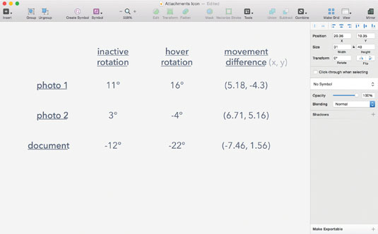
Looking at the X and Y values in the Inspector, calculate the difference between each object's inactive and hover state X, Y positions (how far the group moves in the X and Y directions between the two states). Write those numbers down.
Step 13
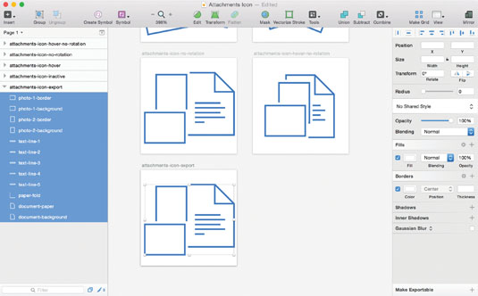
Of the two artboards with 0-degree rotation layers, duplicate the inactive state artboard. Select each group in the Layers list and ungroup them. We'll re-create those groups using SVG markup in a far more lightweight way than Sketch defaults to.
Step 14
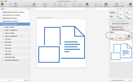
Click on the artboard's title in the Canvas or Layers list, and click the 'Make Exportable' button in the lower-right corner of the Inspector. Select 'SVG' and export the file.
Step 15
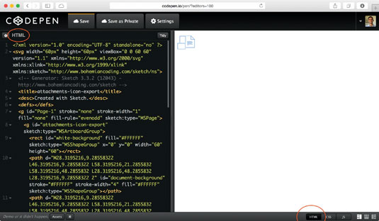
Now it's time to clean up our SVG file. Under the hood, SVG uses the same kind of markup as HTML, so any web developer will be right at home. Opening the SVG in your preferred code editor, you'll notice a lot of extraneous markup. I often remove the <g> containers associated with the Sketch file's page and artboard, shorten long decimal values to the hundredth place, and remove Sketch's custom attributes.
I suggest copying/pasting all of the SVG markup into a CodePen as HTML, so you can remove superfluous attributes and elements while being sure the result doesn't change. How much you clean up the markup is up to you, but the more you do, the easier it will be to read, and the smaller the file size will be.
Step 16
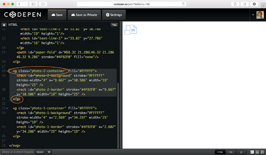
Now we'll recreate the groups for each object (photo-1, photo-2, document) by wrapping the appropriate elements with <g>…</g> tags, just as you're used to doing with <div>…</div> in HTML. Assign a class to each of the groups, for example: <g class="document-container">.
Step 17
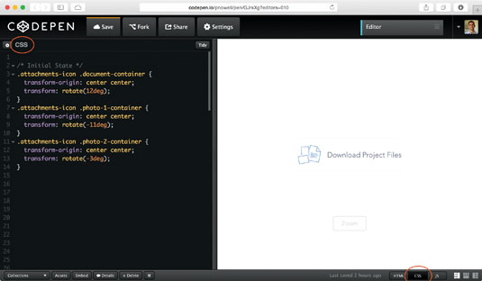
Enough prep work; it's time to bring the icon to life! Use the classes you assigned to each group to create a declaration in CSS. Referencing the inactive state rotation values you wrote down, recreate the rotation on each group using transform: rotate(__deg) and transform-origin: center center;.
Normally the transform and transition properties require vendor prefixes, but when playing around in CodePen, you can lean on one of the automatic vendor prefixing options accessible through the pen's settings.
Note: Firefox does not support the transform- origin property on SVG elements, so rotations always revolve around the element's top-left corner. You may consider designing a different animation without rotation transforms, specifically for Firefox.
Step 18
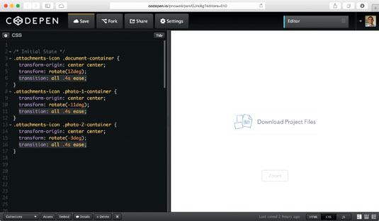
Add a transition property to each object's declaration (for example: transition: all .4s ease;). This allows the objects to animate when we change their styling on hover.
Step 19
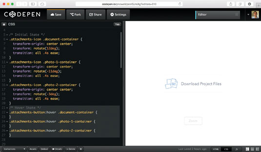
Now let's create the CSS declarations for each object in its hover state. If you're adding this icon to a larger button – as I have in the example CodePen – you'll want the :hover pseudo-selector to be attached to the button rather than the icon.
If you're constructing the icon independently, attach the :hover to the SVG icon itself. Your declaration should look something like: .attachments- button:hover .document-icon {} or .attachments-icon:hover .document-icon {}.
Step 20
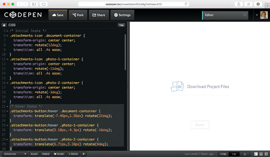
This is when the magic happens. Referencing the values you wrote down for how much the objects move and rotate in their hover state, recreate those using CSS transforms like we did before with the inactive states. The transform property can accept multiple functions (separated by a space), so we'll use translate(x,y) to move the groups and rotate(_deg) to rotate them. There are some important considerations as you write the CSS.
First, don't forget to write px after your X and Y values. Second, the order of transform functions will affect the result – here translate must come before rotate. Third, the differences in each group's X and Y positions (which you wrote down) may need to become positive or negative when using the translate function. Negative X values will move it left, and negative Y values will move it up. Lastly, you will need to tweak the rotation values you wrote down – negative rotate values in Sketch become positive when using CSS transforms, and vice versa.
After you're finished tweaking the transform values, you're finished! The icon is ready to delight visitors on your website.
Words: Peter Nowell
Peter Nowell designs apps, websites, books, brand identities and more. He's based in San Francisco. This article originally appeared in issue 270 of net magazine.
Liked this? Read these!
- Pro tips for using SVG
- Great examples of doodle art
- Brilliant Wordpress tutorial selection

The Creative Bloq team is made up of a group of art and design enthusiasts, and has changed and evolved since Creative Bloq began back in 2012. The current website team consists of eight full-time members of staff: Editor Georgia Coggan, Deputy Editor Rosie Hilder, Ecommerce Editor Beren Neale, Senior News Editor Daniel Piper, Editor, Digital Art and 3D Ian Dean, Tech Reviews Editor Erlingur Einarsson, Ecommerce Writer Beth Nicholls and Staff Writer Natalie Fear, as well as a roster of freelancers from around the world. The ImagineFX magazine team also pitch in, ensuring that content from leading digital art publication ImagineFX is represented on Creative Bloq.
