Accessibility - beyond the screen reader
Web accessibility expert Denis Boudreau explains why we need to design for impaired vision users as well as screen readers.

For most people, Web accessibility means making content compatible with screen readers. As a designer, what first comes to mind might be providing alt text for images. As a developer, it might be adding WAI-ARIA roles and properties to the source code. As a content strategist, it might be unambiguous link text that makes sense on its own. All of these are good starting points, but ultimately, who truly benefits from these things? Blind people using screen readers, but who else?
285 million people are estimated to be visually impaired worldwide. Of which, 39m are blind and 246m have low vision. I did the math: there are precisely 6.30769239 times as many people who have low vision than there are people who are blind. This ratio is staggering. Why, then, are designers and developers still focusing mostly on screen reader compatibility?
The needs of blind users are obviously important. But until we invest at least 6.3 times as much effort making content accessible to low vision users as we spend making content compatible to screen readers, it will be safe to say we are missing what it means to create content that is truly accessible to the widest possible range of users.
Thinking outside the (black) box
NVDA might be the most popular screen reader on the market, but with a daily count of less than 20,000 users worldwide, no one can we seriously claim it is the most relevant tool to focus on for accessibility. Considering how screen reader behaviours impact accessible development, and looking at the user base that benefits from these efforts, something seems awfully skewed.
People with low vision will usually either depend on browser features to resize text or zoom the page, magnification software, customized style sheets, built in high contrast themes, or a combination of the above. While screen readers may also be relied upon from time to time, the needs of low vision users have very little to do with the needs of blind users.
The Web Content Accessibility Guidelines (WCAG) are extremely limited when it comes to catering to the needs of people with low vision on the Web. Except for a Success Criterion that ensures text is still fully readable at 200% of its original size, not much is planned to address their needs.
So how do we account for low vision users' expectations in our design and in our code? How can we provide them with an experience that truly meets their needs and addresses their challenges? In this article, we'll explore two basic concepts you can start implementing today: word wrapping and proximity.
Get the Creative Bloq Newsletter
Daily design news, reviews, how-tos and more, as picked by the editors.
Word wrapping
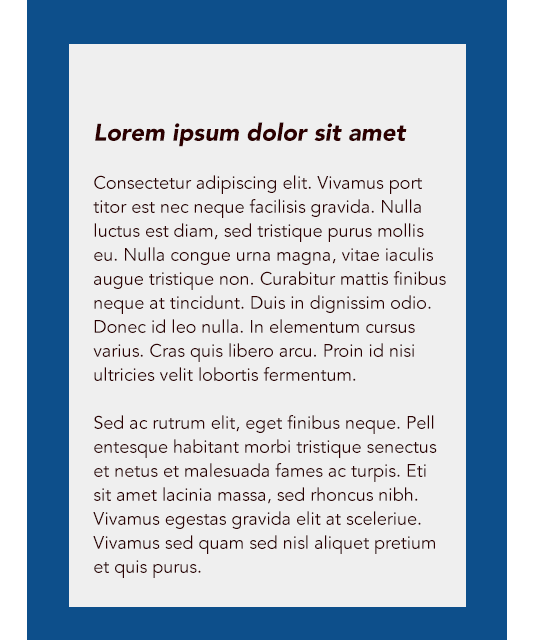
A recent survey conducted by WebAIM shows that 42 per cent of users require a minimum magnification level of at least 300% or higher in order to be able to read content comfortably on the Web, with one in four users actually needing at least 400% or more. This clearly demonstrates that WCAG has set the text-resizing bar too low to provide any real value. Even at the established bare minimum of 200%, simple text resizing – a feature available in most browsers today – often results in different parts of the content to overlap, be truncated, or overflow in ways that causes reading to become impossible. As such, text resizing is rarely a viable option, except on the most robust websites.
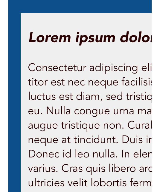
Likewise, another built in feature called 'browser zoom' might seem like a good solution available in most browsers today. But what user testing regularly reveals is that zooming in a page quickly makes content difficult to read for low vision users, due to content overflowing the viewport once the horizontal scrollbar forces users to pan left and right every time there is a need to jump to the next line of text. This constant interruption in reading breaks users' concentration, and essentially prevents anyone from fully engaging in content.
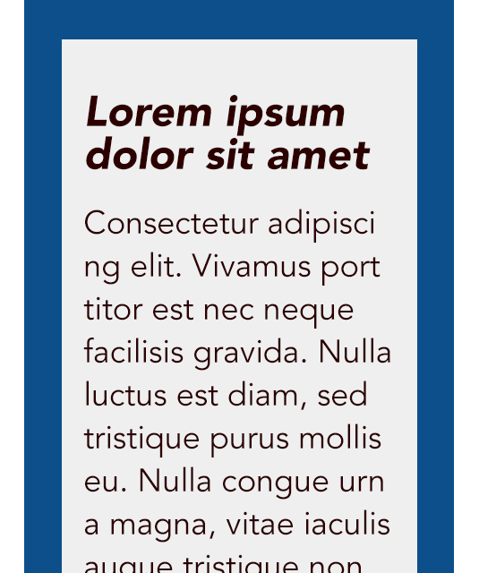
Word wrapping, where content naturally flows in a single column within the boundaries of the browser's current width, is something developers can implement naturally, by building a robust CSS structure that can adapt to the current width of the browser window, much like the behaviour experienced by default in responsive websites. When users increase font size to a level that forces a horizontal scrollbar, the whole content reflows naturally in a single column within the current width of the window instead, providing word wrapping that maintains readability. Larger type simply means fewer words per line, and a longer column of text. Win.
Proximity
User testing with low vision users also clearly demonstrates that lack of proximity between elements that are designed to work together is another huge problem. Users depending on screen magnification can only see a small part of the screen at once. This means they never get a full view of what is going on, and are more likely to miss important cues.
By definition, users who have low vision deal with viewports that are much more limited than ours. For example, users relying on a 400% magnification level will only see about 12.5% of the regular screen at once. In such a scenario, missing error messages displayed at the top of a page, or missing changes that occur in a sidebar as a result of interacting with the main section is not only likely. It's the norm.
As a general rule, designing content so that elements that are closely related are grouped in close proximity will always benefit the user and is a great way to prevent users from missing out on what's going on. For example, displaying validation messages next to the field that triggered them will prove tremendously helpful for a user to spot what needs their immediate attention.
Likewise, planning for large amounts of whitespace between related objects will also generate similar problems. It is not unusual to find forms that are designed to be left aligned, with a submit button positioned at the bottom of the form, but aligned to the right. When the whole screen can be seen, users notice the submit button easily, but when only a part of the screen is seen at once, the likelihood of missing the button increases exponentially. Stacking the form controls horizontally and positioning the submit button directly underneath will greatly contribute to making sure low vision users will never miss it. Another win.
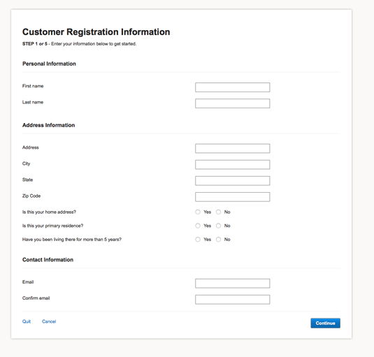

In the form above, there is a significant amount of white space between the form labels, the form controls, and ultimately, the submit button.
The probability that someone viewing this page with 400% magnification struggles to find the controls and completely misses the submit button are very likely because there is no indication that something else is displayed further right in the page.
The form on the right however, because it displays everything in a horizontal stack, ensures that users will not miss anything. It also turns out that it becomes easier for everyone to fill in!
Beyond the blind spot
Designing content so it is accessible to low vision users usually means going beyond simple accessibility requirements, and diving into the realm of accessible user experience and universal design. So forget about that screen reader for a while, and try to think about the accessibility of your website in a more holistic way. Given the overwhelming amount of people who will directly benefit from those efforts, it would be crazy not to!
Words: Denis Boudreau
Denis Boudreau is a senior Web Accessibility consultant and strategist working for Simply Accessible. He has been advocating social inclusion on the Web since 2001 and actively tweets about Web accessibility and digital inclusion.

Thank you for reading 5 articles this month* Join now for unlimited access
Enjoy your first month for just £1 / $1 / €1
*Read 5 free articles per month without a subscription

Join now for unlimited access
Try first month for just £1 / $1 / €1

The Creative Bloq team is made up of a group of art and design enthusiasts, and has changed and evolved since Creative Bloq began back in 2012. The current website team consists of eight full-time members of staff: Editor Georgia Coggan, Deputy Editor Rosie Hilder, Ecommerce Editor Beren Neale, Senior News Editor Daniel Piper, Editor, Digital Art and 3D Ian Dean, Tech Reviews Editor Erlingur Einarsson, Ecommerce Writer Beth Nicholls and Staff Writer Natalie Fear, as well as a roster of freelancers from around the world. The ImagineFX magazine team also pitch in, ensuring that content from leading digital art publication ImagineFX is represented on Creative Bloq.
