8 ways to design mockups that developers won't hate
How to portray your creative ideas to someone who thinks in terms of frameworks and systems.
Mockups help bridge the gap between the designer's creativity and the developer's sensibility. Developers aren't machines that can transform a mockup into a living interface pixel-by-pixel. To cover the technical restraints, mockups are often the centerpiece around regular discussions with developers.

Graphics, textures, typography, and other little tidbits all must be transferred from a simple graphic into a living interface. Knowing how to design great mockups is one thing, but putting them in terms a developer can understand is another.
Below, I've listed out some of the tips I've found helpful in translating digital interface design for someone who thinks in frameworks and systems. Looking for a new display? Try our pick of the best ultrawide monitors.
01. Predict problems
As recommended in the Designer's Guide to Collaborating With Developers, the first step is predicting what UI limitations might arise during development.
In the shadow of the advancement of HTML5 and CSS3, it's tempting to think anything a designer dreams up is transferrable to code. Obviously, this isn't true, and it pays off to look into the reasons why.
Starting in the wireframe/prototype stage, always keep in mind the limitations of your language of choice. This helps you plan what to design, and how to design ideas visually so that developers can actually build the interface.
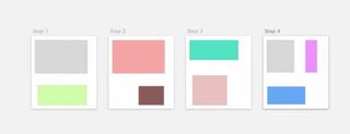
- Write a complete a checklist of the potential obstacles and false lead so you don't forget any.
- Keep the list near your workspace (or in Google Docs) so that you can simply go through them one by one with problematic design choices.
- Periodically review the list with the developers, so you don't find yourself high-fidelity nightmare down the road.
Later you can try some of the trickier features, but initially it's best to prioritize feasibility.
02. Create different mockups for different screen sizes
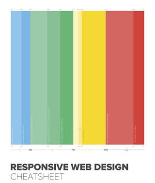
While mobile app mockups must consider landscape and portrait view, websites must support any view at any dimension, including smartphones and ultrawide monitors. If you're building a responsive design, create a separate mockup for each breakpoint to show developers how the layout adapts.
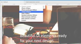
Some elements change more than others on different landscapes. Consider the following for each viewpoint:
- Do logos, graphics, or icons change size? Location?
- Should font size increase or decrease? What about line height?
- How does the main navigation system differ on smaller screens?
- Will sidebar columns drop below the main content or perhaps disappear entirely? What about footer content?
In this case and others, we recommend the mobile-first approach. As the name suggests, design sites for the mobile devices first, starting with the smallest, and scale up to bigger screens as you progress. This starts you off with only the bare essentials and allows you to add elements, not strip them away, as you move forward.

Don't forget to label your responsive mockups properly, to avoid mistakes. Filenames should include the responsive breakpoint in pixels, along with any other useful detail, like revision date, draft number, retina screen, etc.
The goal here is to plan for every possible situation, so your developer doesn't have to think as hard. They've got enough on their minds as it is.
03. Pay attention to inner page graphics
When designing mockups, treat all pages like homepages.
What we mean is, give alternative and secondary pages the same thorough treatment. As the portal to your entire site, the homepage may require extra effort — but extend that same precision to the inner pages as well.
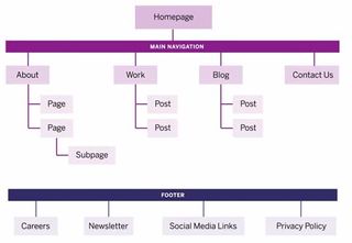
This is a common treatment for large companies, where project managers demand full mockups for every page due to strict internal processes. In other companies, some developers may have design experience, allowing them to build multiple similar pages from a single mockup (freeing up more time for you to work on unique pages). The level of detail in mockups should match the standards of company protocol.
This puts significance on inner page graphics. For example, even if two pages are distinguished only by differences in icons, it's still best to create two separate mockups, just to avoid any confusion and play it safe. Create all inner pages and then export icons separately – that way, developers can access the individual icon images and the page designs as reference material.

Here's a handy checklist to see to follow for graphics in general:
- Size graphics exactly as they need to appear.
- Account for differences in logged in & logged out states.
- Label form fields, buttons, and inputs.
- Illustrate different JavaScript interaction states, i.e., the dropdown menu open and closed. Even if it's demonstrated in the prototype, it never hurts to leave a paper trail.
- Illustrate any success or error messages.
- Include separate graphic files for all images like the favicon, animated loaders, 404 page photos, etc.
04. Test interactions with prototypes
Prototyping is the most efficient platform for exploring the feasibility of interactions, and a faster alternative to trial-and-error methods with coding.
Let developers use them at every iteration and use their feedback going forward. Even low-fidelity prototypes (a.k.a. interactive wireframes) show developers the dependencies between content as users click through the experience.
While the visual details won't be anywhere near polished, developers can still give early feedback on design infrastructure.
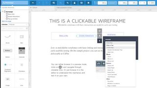
For example, you might be dead-set on an infinite scroll for a large blog design, until testing reveals the cards UI pattern as an elegant compromise between usability and site load times.
Prototyping also allows device-specific feedback: your navigation header might work beautifully in the prototype, but it may be completely hidden by the address bar in certain browsers and devices.
These setbacks could cause complete revamps if not caught early, so include developers in the early interaction design stages. Part of the reason our collaborative design platform integrated with Photoshop and Sketch was to encourage more designers to cross over into the IxD arena.
05. Create browser fallbacks
Web design involves different variables than mobile app design: different operating systems, different screen resolutions, and different browser, which also have different screen resolutions. And that doesn't even begin to cover accessing the site on mobile devices.
While the processes for designing UIs for a website and an mobile app may be similar, development between them is worlds apart. Even at the mockup phase, designers should consider the more technical problems.
Remember some of the newer CSS3 techniques are not supported in all browsers. Transforms, reflections, clip-path, and masking must be handled differently. These issues could be hammered out through back-and-forth notes in most design software, but there's no substitute for a quick feasibility discussion with developers in a real-time conversation.
Browser compatibility can get confusing, so below I've included some free open source scripts These may not help you directly when designing, but they're great conversation points when collaborating with developers.
- Fallback.js – Don't let its size fool you: this tiny JavaScript library is meant to control every possible fallback method and library. Centralizing all of your scripts makes it easy to check which files aren't working and provide alternate solutions.
- Modernizr – This customizable library for cross-browser HTML5/CSS3 support is a cherished asset for any project. Customize your own features on the download page, or just grab the whole library from GitHub.
- Detect Mobile Browsers – More like a code generator for mobile detection, here you'll find snippets in all languages from ASP to jQuery for detecting a mobile browser. The results let developers know which code to execute for mobile users.
- IE7.js – Internet Explorer just won't die. IE7.js forces older browsers like IE6-IE8 to support typical rendering methods like transparent PNGs and RGBa() colors.
- Selectivizr – Similar to Modernizr, but focusing more on CSS selectors. This JS library emulates CSS pseudo-classes and attribute selectors to improve support for older versions of Internet Explorer.
- Video.js – Embed any video format into an HTML5 player, with a Flash fallback for older browsers.
Your developers will understand how these resources work, even if you don't, so they're worth mentioning at your next meeting. At the very least, I've found that developers appreciate the proactive gesture and don't mind spending some time explaining any compatibility issues — neither of you want late nights further down the road.
06. Use version control systems
Familiarize your developer with version control systems, if they're not already. These are like digital archives that store previous versions of a script, database, or an entire website, so you can easily roll back changes or compare files.
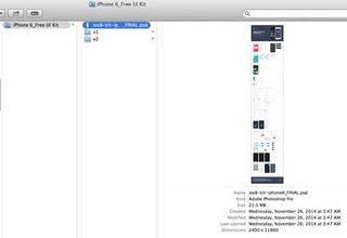
While mostly used in programming, version control has found small pockets in the design community. Even though design-based version control is new, there are still some great resources available:
- GitHub for PSDs – GitHub is primarily a code storage platform, but they've recently added support for PSD files. Designers to use GitHub as their own version control system for PSDs; however, the site is open source and is not recommended for private enterprise projects.
- Pixelapse – With both free open source accounts and paid accounts, Pixelapse can support small freelancers and large teams. Pixelapse runs across all operating systems and even includes a project dashboard for team collaboration.
- Cornerstone – A Subversion client for Mac, Cornerstone works great for localized work, despite the initial setup. This stack answer gives more details.
- PixelNovel – Adobe's own version control platform also runs on Subversion, but with less technical setup. Features include a Photoshop plugin and file-sharing among multiple users.
- Kaleidoscope – While this Mac OS X application doesn't offer traditional version control, it can instead be used for file comparison. If you just want to compare files/folders and don't need a full timeline archive, this is the one for you.
07. Take advantage of plugins
Photoshop and Sketch both support a wide assortment of plugins for automating tasks and improving workflows. Sketch was built specifically for web design, but Photoshop has wider range of plugins due to its broader spectrum of tasks (photo editing, print work, UI design, etc).

I chose the below plugins specifically for UI designers who create interfaces from scratch. They let you design the same pixel-perfect mockups without so much time and effort.
Photoshop Plugins:
- Cut&Slice Me – Cuts and export graphics to different devices, whether smartphones, tablets, or computers.
- GuideGuide – Sets up guides and grids according to columns and pixel values.
- CSS Hat – Exports any Photoshop layer into CSS code.
- PNG Hat – Streamlines slicing/exporting Photoshop mockups.
- Renamy – Lets you rename your Photoshop layers in seconds.
Sketch Plugins:
- Text Styles – Exports Sketch text styles into CSS code.
- Sketch Generator – Exports all of your design assets with a single keystroke.
- Measure – Obtains the exact dimensions and coordinates of any graphic in your mockup.
- Renamelt – A layer-renaming plugin for Sketch.
08. Extra tips
To cover everything that might have been missed above, here are some additional tips designing mockups for developers.
- Use in-app export tools – Photoshop can export graphics using the slice tool or by manually creating new documents. Sketch includes its own export options designed specifically for interface graphics.
- Organize and label your layers – Mockup content should be organized so that developers don't need to open your PSD/Sketch files. Give every layer a distinct name to differentiate them, and link similar layers together with layer groups.
- Compile an asset package of separate files – Asset preparation saves everyone a lot of time and stress. Once the mockups are finished, export graphics, icons, photos, and other assets into separate files. This saves the developer extra work that you know how to handle better anyway.
- Show animations and interactivity – Seeing these in action will be more descriptive than simply describing them. Convert your PSD/Sketch files into layered prototypes to remove the ambiguity around how they'll function.
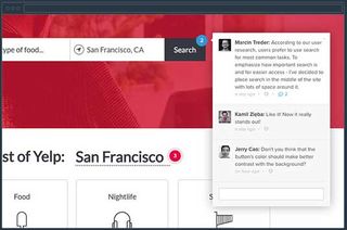
- Keep a note log — For larger projects, there will likely be a lot of notes. If you're working in UXPin, you can add a note to the design itself and while you're in Preview mode. If not, keep a short document for developer notes, and clarify which mockup, page sections, etc. they pertain to.
For more practical tips, Photoshop Etiquette gives advice for dozens of topics like effects, layer organization, and typography.
Conclusion
Mockups are among the last major tasks of the design team before developers take over. It's a transitional phase where clarity and mutual understanding are key, so I wanted to offer my help in making it as clear as possible. Remember, it's always better to over-clarify rather than under-clarify.

Designing mockups with developers in mind is a constant reality check. Altering your routine can definitely cause some discomfort at first, but compromising on your habits at the beginning is better than compromising on the final design at the end.
If you'd like more advice on creating collaborative UX mockups, check out the free 100+ page Guide to Mockups. You'll get tips on techniques, methods, processes, and best practices for Photoshop and Sketch.
Like this? Read these!

Thank you for reading 5 articles this month* Join now for unlimited access
Enjoy your first month for just £1 / $1 / €1
*Read 5 free articles per month without a subscription

Join now for unlimited access
Try first month for just £1 / $1 / €1
Get the Creative Bloq Newsletter
Daily design news, reviews, how-tos and more, as picked by the editors.
The Creative Bloq team is made up of a group of design fans, and has changed and evolved since Creative Bloq began back in 2012. The current website team consists of eight full-time members of staff: Editor Georgia Coggan, Deputy Editor Rosie Hilder, Ecommerce Editor Beren Neale, Senior News Editor Daniel Piper, Editor, Digital Art and 3D Ian Dean, Tech Reviews Editor Erlingur Einarsson and Ecommerce Writer Beth Nicholls and Staff Writer Natalie Fear, as well as a roster of freelancers from around the world. The 3D World and ImagineFX magazine teams also pitch in, ensuring that content from 3D World and ImagineFX is represented on Creative Bloq.
