5 brilliant microsites and why they're so effective
What makes a successful microsite? Luke Clum looks at five examples and discusses what makes them effective.
A microsite has the power to highlight a product, launch a promotion, or augment a marketing campaign in a way that full websites or more traditional marketing cannot. The single or small collection of pages these sites consist of is meant to engage user interaction while conveying information in a creative way. Microsites are separate from a company's full website and are dedicated to serving one purpose - thus eliminating the clutter and distractions that come with a full website.
When should you create one?
If you're looking to promote a specific campaign, then a microsite is a great solution. A microsite - being separate from your brand's website - can use different forms of branding to reach new target audiences. It can generate new leads for your business and create interest in your brand and website.
The first step in determining whether a microsite will give value to your brand is to evaluate your marketing needs. A microsite is a perfect solution for establishing an exclusive space for users to interact with your campaign or product. Instead of offering many navigational options like a full website, it drives users to one specific purpose or goal.
What makes a microsite successful?
There are certain characteristics that result in an effective microsite.
01. A focused topic
Since the many options of a full website are removed from a microsite, it has room to give in-depth information and focus on one topic or product. If users click on your microsite, they are likely to be interested in its content, so it's important to offer them quality information on that particular subject. Staying focused makes for an effective message and prevents confusion.

This site from AppDock features a specific product. It offers direct and relevant details, including what it is, when it will be available and how to get involved or subscribe to a newsletter.

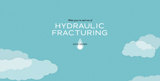
Likewise, the dangers of fracking are explained and illustrated in this microsite as a means of educating users about a specific topic and encouraging them to take action. Notice that both of these sites have one clear purpose, and direct all the user's focus to just one or two calls to action.
Get the Creative Bloq Newsletter
Daily design news, reviews, how-tos and more, as picked by the editors.
02. Quality information
When designing a microsite, consider the goal you are trying to achieve. You might want to bring awareness to a particular subject and create a call to action, get users to make a purchase, or launch a marketing campaign that ultimately drives users to convert by interacting with the brand.
Once your goal is established, tailor your information to be concise and intentional in achieving that goal. Users should be able to instantly understand the purpose of your microsite, as well as gain useful information from it. Information is really what drives a good microsite, because it enables the site to accomplish its single purpose.

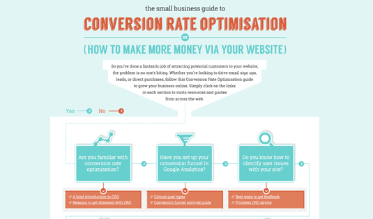
This CRO guide from Simply Business offers plenty of information, and users can choose which topics they want to learn more about; though all of it directly pertains to guiding them in getting more from their website.

This site gives ample information about its live social sharing app, though it is brief enough to avoid being overwhelming, and each step serves a purpose in leading to a conversion.
03. Creative design and engaging user interaction
A microsite is an excellent way to branch out from the design of your main site and show off your style and skills. It might portray your brand in a new light - one that connects more closely to users and makes a creative impact on them. And beyond the aesthetic design, an easy and engaging interaction will make the experience more enjoyable and beneficial for your users.

This home security guide uses a creative analogy and stylistic illustration to show users how to protect themselves. Its parallax scrolling provides an appealing and interactive visual sequence.
Takeaways
As you can see, there are endless possibilities for your microsite's design, style, content, and message. That's the beauty of these websites: because they're separate from larger more cumbersome brand sites, they remain flexible and focused. However, in order to have a successful microsite be sure to:
- Identify your target audience for this specific product or campaign
- Limit the site to one, very specific topic
- Include plenty of high quality, relevant information on that topic
- Use a creative design and craft an excellent user experience
Words: Luke Clum
Luke Clum is a designer and web developer from Seattle. Follow him on Twitter at @lukeclum.

Thank you for reading 5 articles this month* Join now for unlimited access
Enjoy your first month for just £1 / $1 / €1
*Read 5 free articles per month without a subscription

Join now for unlimited access
Try first month for just £1 / $1 / €1

The Creative Bloq team is made up of a group of design fans, and has changed and evolved since Creative Bloq began back in 2012. The current website team consists of eight full-time members of staff: Editor Georgia Coggan, Deputy Editor Rosie Hilder, Ecommerce Editor Beren Neale, Senior News Editor Daniel Piper, Editor, Digital Art and 3D Ian Dean, Tech Reviews Editor Erlingur Einarsson, Ecommerce Writer Beth Nicholls and Staff Writer Natalie Fear, as well as a roster of freelancers from around the world. The ImagineFX magazine team also pitch in, ensuring that content from leading digital art publication ImagineFX is represented on Creative Bloq.
