The 4 biggest myths about mockups
There's a number of popular misconceptions about creating mockups. Jerry Cao of UXPin puts us straight.
Considering the variety of design processes and deliverables, it's not surprising that a few myths have arisen regarding mockups. For us, mockups are an indispensable phase of the design process.
Mockups are about visuals the way wireframing is about organization (layout and structure) and prototyping is about usability. More-so than the final deliverable, the advantage of making mockups is making the crucial decisions made about the site's appearance.
The mockup phase sets aside time and focus specifically for visuals: graphics, icons, color schemes, typography, etc. These decisions are just as important as information architecture and usability – more so, even, considering looks are the basis for a site's first impression and credibility.

Mashing these visual choices into other phases like wireframing or prototyping (or waiting until development) means you're not giving them the attention they deserve. You'll likely be distracted by usability issues, navigational structure, or any number of things.
Before we get started, we first want to clarify that we are not referring to wireframes when we talk about mockups. In this context, mockups refer to fleshed out designs usually created in a visual design tool (although, as we explain, not necessarily always the case). Mockups help fill in the structure of wireframes with visual details.
Now that we've clarified the terminology, let's clear up the misconceptions.
01. Mockups must be high fidelity
Designers aren't the only ones who suffer from anxiety over starting a project they think must be perfect. Faced with the task of creating a pixel-perfect representation of a web-page is intimidating, and it's a whole lot easier to mutter that “mockups are a waste of time,” and skip ahead to the next step.
Get the Creative Bloq Newsletter
Daily design news, reviews, how-tos and more, as picked by the editors.
The truth is that mockups don't need to be perfect. They don't even need to be high fidelity. Mockups can include any level of detail that's most helpful to you at any given time (although they're usually mid to high fidelity).

Sure, hi-fi mockups are a huge help in finalizing visual decisions about a site's interface, and give you a firm destination to work towards in the later phases – plus their impressive appearance makes them perfect as a deliverable for getting stakeholders on board – but are they the only option?
If you're under a crushing time restraint, iterating multiple designs at once, or any number of reasons, hi-fi mockups aren't the only solution.
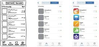
In these cases, something closer to middle fidelity might still work. This compromise allows you to answer some of the pivotal visual questions, but will have a faster turnaround with less effort. Of course, you should only follow the mid-fi design process if either you're also coding the site or you have a close relationship with a design-savvy developer.
You'll need to include the visual details directly in code (requiring some imaginative jump from mid-fi to hi-fi), so it's suitable for specific use cases.
02. Every design must begin with a mockup
The idea that every design must begin with a mockup (or wireframe) is a relic from a history long past, when the waterfall design process of linear progression ruled the earth. But in today's world of lean and agile methodologies, what was once the rule is now nothing more than a fossil.
Nowadays, design is driven by cycles of feedback: from other perspectives within the design time, from the specialized needs of the stakeholders, and from the practical input from real-world users.
Starting right away with a more later-stage level of visual details doesn't make much sense – chances are, the feedback will contradict a lot of these premature decisions, requiring a heavy dose of reediting. It's best to just wait until you have as much intel as possible before attempting those fine points.

In our opinion, information architecture makes a good starting point, with interactions and visual design coming later (even simultaneously). You can just as easily start your design process with something simple like a wireframe before diving into the visual details.
One of the latest strategies recently is the lo-fi prototype, or interactive wireframe. Using a prototyping tool, designers can add a degree of interactivity to low-fidelity wireframes, then test them on actual users for valuable input to inform the later processes – including the later mockup stage.
Next page: two more big myths about mockups

Thank you for reading 5 articles this month* Join now for unlimited access
Enjoy your first month for just £1 / $1 / €1
*Read 5 free articles per month without a subscription

Join now for unlimited access
Try first month for just £1 / $1 / €1
The Creative Bloq team is made up of a group of design fans, and has changed and evolved since Creative Bloq began back in 2012. The current website team consists of eight full-time members of staff: Editor Georgia Coggan, Deputy Editor Rosie Hilder, Ecommerce Editor Beren Neale, Senior News Editor Daniel Piper, Editor, Digital Art and 3D Ian Dean, Tech Reviews Editor Erlingur Einarsson and Ecommerce Writer Beth Nicholls and Staff Writer Natalie Fear, as well as a roster of freelancers from around the world. The 3D World and ImagineFX magazine teams also pitch in, ensuring that content from 3D World and ImagineFX is represented on Creative Bloq.


