20 great examples of website footer design
Designing your website's footer is as important as designing the header. We explain why, and reveal 20 websites that get it right.
When starting any website project, it's natural to want to concentrate your design efforts on the homepage and the header. As a result, the footer often becomes an afterthought - relegated to a poorly designed dumping ground for copyright information, legal disclaimers and spammy SEO links. But it shouldn't be this way.
The footer of a website is as important as the header, if not more so. Why? Because the footer is the last port of call for many visitors. The point at which they’ll sign up for service, want to read another article or simply require your contact details. Ask yourself - what do you want your visitors to do when they reach the bottom of the page? The answer you come up with will be a great starting point for designing your website footer.
Strategic approach
That answer will, of course, change from project to project, depending on the nature of the website and the desired outcome. For instance, if you’re designing a blog, then keeping users on the site is all-important, so it will be often be wise to place links to the most recent and popular posts within the footer. However if the site is intended to promote a product, then either a call-to-action or small signup form will usually be a better choice.
Carefully consider what content to place within the footer. While it's tempting to utilise it as a space to place various odds and ends, this will weaken its potential. Designing a great footer is not about finding the best way to layout a lot of unrelated content, but the ability to prioritise and disregard unnecessary or superfluous information.
Remember conventions
It’s important to remember however that some conventions exist and to be mindful of them when designing website footers. For instance, many users who are trying to obtain contact details for a business will scroll to the bottom of the page. However you can still prioritise more important information by using design elements such as scale to create a strong sense of hierarchy within your site’s footer.
The following showcase is intended to demonstrate different ways in which website footers can be utilised - we hope you find it useful.
01. Tapbots
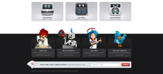
Tapbots are utility robots designed and engineered for iPhone and iPod touch. Created by Paul Haddad and Mark Jardine, these robots provide all the help you need in the website footer.
Get the Creative Bloq Newsletter
Daily design news, reviews, how-tos and more, as picked by the editors.
Four beautiful illustrations stand side-by-side, each relevant to the information they provide. We particularly like the manga-style characters offering help and further details about the company.
02. Mom & Popcorn
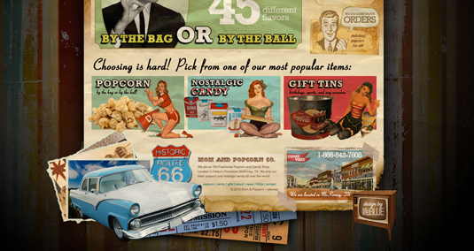
It's all about gourmet popcorn, old fashioned candy and sodas at Mom & Popcorn. This retro-style site provides shoppers with a convenient, quick and easy way to find their favourite sweet treats online.
Its footer is bright and vibrant, dominated by various, eye-catching 50s and 60s-inspired images. Amongst the nostalgia users can find all the information about the company they might need, including location, products, news, contact info and more.
03. Soho Fixed

Soho Fixed are a team of artists and bike technicians who build a unique custom-designed fixed wheel/single speed road bike every few weeks and put it up for sale on this site.
The retro-style site design includes a footer that features a second menu bar, making it easy for users to navigate their way around. There's also prominent social network buttons, as well as an email input element if you want to be informed when a new bike hits the site.
04. Urban Pie
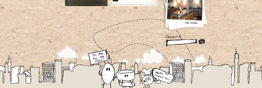
The Urban Pie company are dedicated to creating the best gourmet pies possible. The product being of the upmost importance, the company website keeps things simple and fun, featuring need-to-know information and a selection cartoon-style illustrations.
The website footer here holds no information or call-to-action elements, but simply a sketched skyline and some appealing illustrated pie characters welcoming visitors to the site. A lovely touch.
05. Jared Johnson
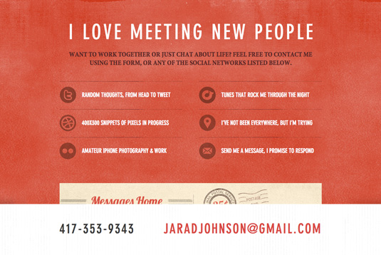
While including contact information in the footer has become something of a convention, there are many cases when this information is not only required, but should be prioritised. This is particularly true for service providers such as freelance designers and businesses who have a physical address.
Freelance designer Jared Johnson has prioritised the contact information on his single-page folio site. The way in which he utilises colour and scale to differentiate his email address and telephone number from the rest of the footer ensures they are easy to find, which is essential if you’re a freelance designer.
06. Cantilever Fish & Chips
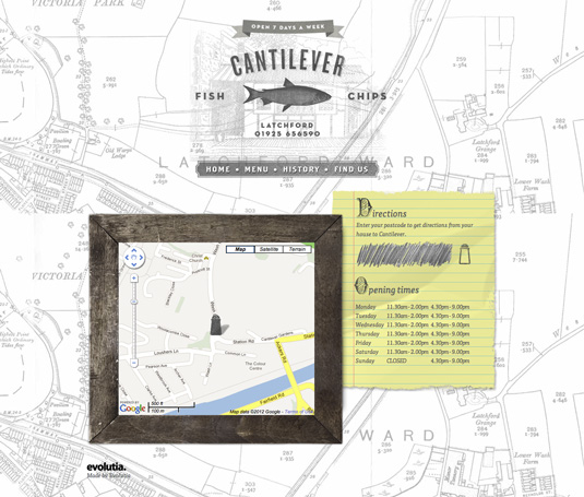
Cantilever Fish & Chips’ single page website uses the bottom of the page to display their location, contact details and opening hours. By doing so they’ve stuck to the convention of placing this information at the bottom of the page - but what makes this site stand out is the innovative and attractive way in which it is presented.
07. Jason Mayo
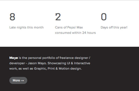
Placing a short piece of text-based information such as a profile, biography or testimonial in the footer is an effective way of providing an insight into the entity that the website represents. For many sites, placing the author’s profile in the footer is a great way of not only promoting them, but adding credibility to the site’s content too.
The statistics at the top of the footer on Jason Mayo’s website enhances his brief profile and provides an insight into his character and skills, while also adding a touch of individuality.
08. The Ministry Of Type

The footer on The Ministry Of Type includes a short profile about creator and author, Aegir Hallmundur. The presence of his profile adds credibility to the site’s content, as well as promoting the author’s portfolio and freelance activities to readers.
09. Monocle
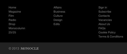
Placing secondary navigation to less important areas of a website is also a great way to utilise the footer, as it can help declutter the main navigation, which in turn aids usability. This is a particularly good approach for large websites.
Monocle place links to less important areas of their website within the footer, helping to reduce the complexity of their main navigation. A search bar is also included so users can search for additional information without having to scroll back to the top of the page.
10. Ditto

Eyewear retailer Ditto takes the idea further, moving its navigation from the top of the page to the footer. By doing so, they limit the options available to casual users, meaning they can easily lead customers through their product selection process. Users with specific goals, however, will naturally scroll to the bottom of the page to find the information they require.
11. Site Inspire
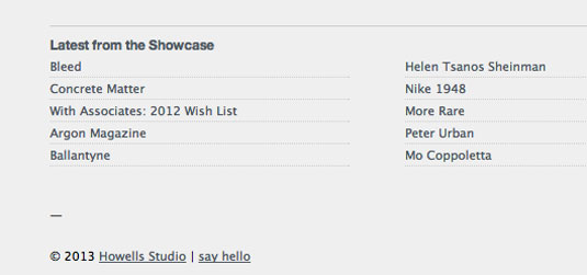
For blogs and news websites, keeping the user on the site is of primary importance, as many of these sites rely on maximising page views to generate revenue. Offering links to popular or recently posted content within the footer is a good way of achieving this.
The footer on Site Inspire is beautifully simple, containing only a short profile and links to recently posted content. Such an approach offers readers the option of accessing more content when reaching the bottom of page, meaning that they’re more likely to continue browsing the site.
12. Web Designer Wall

Web Designer Wall provides links to recent posts and user comments within their footer, in addition to a short profile. Linking to recent comments is a particularly good strategy if the blog has a strong community behind it who have intelligent, but varied opinions, which are likely to attract the interest of other readers.
13. Rdio
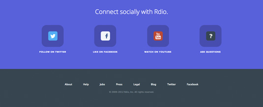
For many individuals and businesses developing a strong social media presence is a cornerstone of their digital strategy, so prioritising social media links within the footer is an effective way of driving users to their various social media outposts once they’re done browsing the site.
The footer on Rdio’s homepage prioritises their various social media services by leaving plenty of empty space around these elements to draw the attention of users.
14. Spark Box
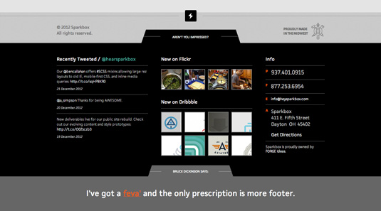
Ohio studio Spark Box takes this idea one step further by placing feeds from services such as Twitter, Dribbble and Flickr within its playful footer. This further advertises their presence on these social networks to potential followers.
15. Karma
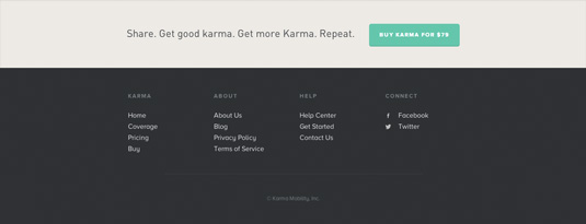
Websites for products or services tend to contain clear calls-to-action within the site’s header, but adding a secondary call-to-action within the footer is an effective way of enticing more cautious users who want to find out more before signing up.
'Social bandwidth' service Karma complements the primary call-to-action on its website with a secondary one located within the footer of each page. The call-to-action button is large, friendly and not likely to be missed.
16. Scriptogr.am
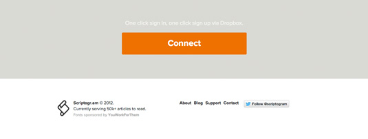
Web publishing app Scriptogr.am has adopted a similar approach. Like the call-to-action button on the Karma site, the call-to-action button contained within its footer is designed to ensure it definitely attracts the attention of users.
17. The Noun Project
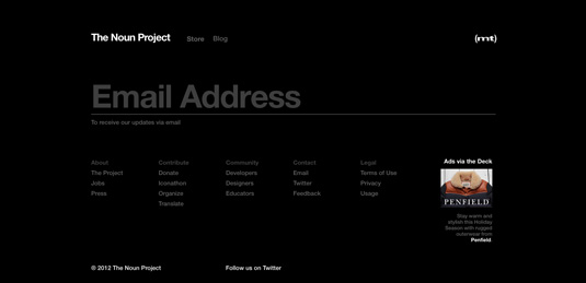
While placing large friendly call-to-action buttons in the footer is an effective strategy, many sites take this concept a step further by including forms within the footer, allowing users to perform a variety of tasks, such as subscribing to newsletters or initiating contact, on every page.
The footer for icon service The Noun Project prioritises its newsletter signup by a playful use of scale. Capturing user details in this way allows them to market themselves to potential customers long after they have visited the site.
18. The National LGBT Museum
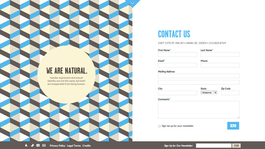
The footer on The LGBT Museum’s single-page website contains a large friendly contact form, which invites users to contact them. Such an approach minimises any hesitation users may have about contacting the organisation.
19. New Babylon
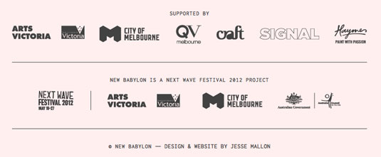
For websites promoting events displaying sponsors and supporters within the footer can help make the event appear credible, particularly if those sponsors are relevant and well-known.
Art festival New Babylon’s single-page website utilises the footer to display sponsorship information, clearly separating it from the main body of content by varying the background colour.
20. Kikk Festival
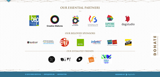
The footer on the Kikk Festival website is also very well designed and a great example of how the footer can be effectively utilised to display event sponsors and supporters.
Words: Nathan Leigh Davis and the Creative Bloq team
Nathan Leigh Davis is a designer and web-developer living and working in Melbourne, Australia. He works primarily as an interactive design and web developer, but is equally proficient at brand identity, design for print and creative direction.
Now read:
- The most creative online contact pages
- Web design training: the top 20 online resources
- Web design secrets to boost your skills!
Have you seen a great website footer? Tell us about it in the comments!

Thank you for reading 5 articles this month* Join now for unlimited access
Enjoy your first month for just £1 / $1 / €1
*Read 5 free articles per month without a subscription

Join now for unlimited access
Try first month for just £1 / $1 / €1

The Creative Bloq team is made up of a group of art and design enthusiasts, and has changed and evolved since Creative Bloq began back in 2012. The current website team consists of eight full-time members of staff: Editor Georgia Coggan, Deputy Editor Rosie Hilder, Ecommerce Editor Beren Neale, Senior News Editor Daniel Piper, Editor, Digital Art and 3D Ian Dean, Tech Reviews Editor Erlingur Einarsson, Ecommerce Writer Beth Nicholls and Staff Writer Natalie Fear, as well as a roster of freelancers from around the world. The ImagineFX magazine team also pitch in, ensuring that content from leading digital art publication ImagineFX is represented on Creative Bloq.
