4 key ways to create visual hierarchy
How do you guide your website visitors to the most important information? There are 4 main tools at your disposal, says Chris Bank of UXPin.
In this article, Chris Bank of UXPin – the wireframing & prototyping app – explains four key ways to create visual hierarchies in web UI design. For analysis of UI examples from over 33 companies, check out the free ebook Web UI Best Practices.
In my earlier post, How the human eye reads a website, I examined the importance of creating visual hierarchy in web UI design. Here I'll goes on to explain some key ways this can be achieved in practice.
I'll focus on some of the most powerful visual tools in your arsenal. As a good rule of thumb, Alex Bigman argues that colours and size manage attention, while spacing helps manage visual relationships. I'll look at all three of these in this article, but first let's start with another useful tool, contrast...
01. Contrast
Contrast is the occurrence of two different elements positioned close together. In web UI design, these elements can be colours, textures, shapes, direction, or size, to name the important ones.

Alternating between different sized fonts and colours creates an instant hierarchy to your interface.
For instance, as you can see in the screengrab below for Constant Contact, changing from a light background to dark background immediately separates the primary call to action ('Try it FREE') from the navigation menu and secondary ('Call Us') call to action.
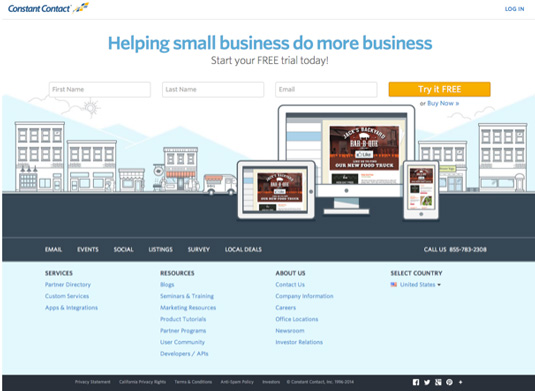
Combined with the Z-pattern of the site, the treatment provides a clear visual hierarchy that highlights the email submission form followed by the mid-page navigation menu.
Get the Creative Bloq Newsletter
Daily design news, reviews, how-tos and more, as picked by the editors.
In this article, Brandon Jones looks at how the use of colour and size affect first impressions of objects in an interface.
Using the below image as an example, most people won't just see two circles on first glance – instead, they'll likely see "a black circle and a smaller red circle".

In this sense, contrast in interface items is very powerful since differentiation is the default human response.
02. Colour
In a nutshell, bright colours stand out from muted colours. This may seem obvious, but the important takeaway is its application: you can exploit this to draw your user's attention where you want.
Additionally, certain colours can help set the mood of the entire site (blues are tranquil, reds are aggressive, etc.).
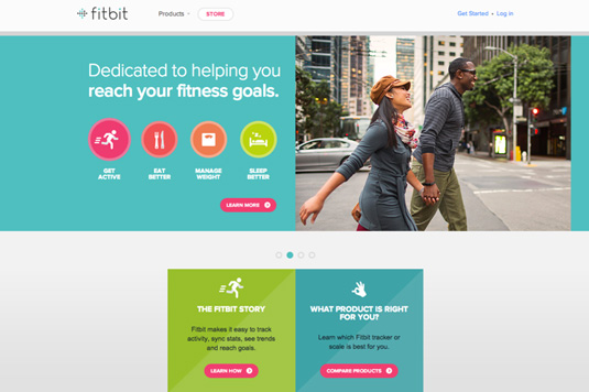
Fitbit's use of colour in their Z-pattern interface above is especially clever. The bright use of magenta immediately places the calls to action near the top of the visual hierarchy, but also matches the colour of the "Get Active" button – subconsciously signaling that the two concepts are related.
Similar shades of blue are also used in the fitness goals and product sections, which cleverly creates an association between the two (and draws clicks to the most valuable parts of the interface).
03. Size
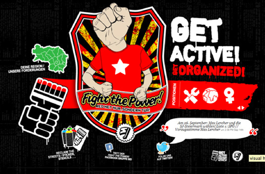
Size, particularly for text, is a powerful tool in that it circumvents the traditional rules of left-to-right and up-to-down reading. That means a large word or phrase in the bottom right-hand corner might be the first thing a person reads.
Moreover, size can add emphasis to the actual message or content, making it more significant.
When it comes to the size of text, a typography study conducted by Smashing Magazine on 50 popular website interfaces found that headings usually stay between 18 and 29 pixels with body copy ranging between 12 and 14 pixels.
Of course, this is just a guideline (and will apply more to content-heavy sites), but shows that you still want to maintain a sense of proportion.
04. Space
As discussed in Web UI Best Practices, one of the most important tricks in making something pretty is the absolute absence of something pretty. Cluttering too many attractive images together is a quick way to ruin them all.
It's important that your web interface has breathing room and that you space everything out. Reducing the amount of "visual noise" will make the points you want to keep even stronger.
In fact, Dmitry Fadeyev, founder of Usaura, advises that white space actually improves comprehension. A 2004 study found that strategic use of white space improved comprehension by almost 20 per cent.
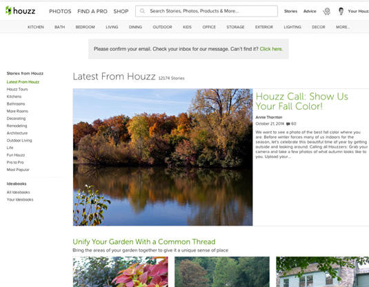
While spacing didn't affect how people performed on the website, it did affect user satisfaction and experience (which is equally, if not more, important). As you can see above, the large content margin, padding, and paragraph spacing used by Houzz makes the content easier to read (and encourages interaction with links and sidebars).
Words: Chris Bank
Chris Bank is the growth lead at UXPin, a UX design app that creates responsive interactive wireframes and prototypes.

Thank you for reading 5 articles this month* Join now for unlimited access
Enjoy your first month for just £1 / $1 / €1
*Read 5 free articles per month without a subscription

Join now for unlimited access
Try first month for just £1 / $1 / €1

The Creative Bloq team is made up of a group of art and design enthusiasts, and has changed and evolved since Creative Bloq began back in 2012. The current website team consists of eight full-time members of staff: Editor Georgia Coggan, Deputy Editor Rosie Hilder, Ecommerce Editor Beren Neale, Senior News Editor Daniel Piper, Editor, Digital Art and 3D Ian Dean, Tech Reviews Editor Erlingur Einarsson, Ecommerce Writer Beth Nicholls and Staff Writer Natalie Fear, as well as a roster of freelancers from around the world. The ImagineFX magazine team also pitch in, ensuring that content from leading digital art publication ImagineFX is represented on Creative Bloq.
