The UX of VR
Laura Cortes explores the birth of virtual reality, and considers how to design user experiences for this new medium.
User experience designers today are part of one of the most exciting moments of the past decade. The rise of a new medium: virtual reality (VR). And with this comes a new set of challenges that give UX designers the opportunity to build a new grammar and symbology.
This article will explore some of those challenges. It will also present the findings we have been able to collect from literature and insights from industry professionals, as well as personal experiences we have had at UNIT9 while experimenting with or building VR projects.
What is VR?
VR is a new audio-visual communication medium whose mission is to sell the idea of entering a computer-generated, three-dimensional environment where the experience is so immersive it tricks our brain into believing this virtual world is actually reality. Its ultimate goal is to allow us to experience sensations that we could never undergo in our daily lives otherwise. Things like getting out of our bodies and seeing ourselves from the outside, or being tele-transported to real and fictional places are now becoming possible with this new medium.
It's now been more than a year since Facebook purchased Oculus Rift, and around the same amount of time has passed since we started seeing VR campaigns, 3D movies, games and one-off experiences coming to life. However, for most people VR is still inaccessible, because the technology is not available yet as an off-the-shelf product.
Experience set-up

In order to outline the kind of challenges UX designers face when designing for this medium, we first need to understand the types of experiences that can be built. The majority consist of public installations or one-off stunts, used to sell a product or create brand awareness. They happen in public spaces, with semi-large set-ups, and their goal is to generate PR.
With this in mind, one of the first challenges is the set-up design. In collaboration with the creative and 3D architect, the UX designer needs to think of the spatial layout and how it will fit the experience. Is the user standing or sitting? Does the setup allow for full 360-degree movement or partial head movement? Does it include other tools, like sensorial gloves, joysticks or trackpads?
The set-up depends of course on the creative concept and emotional outcome we want to achieve. There are three main types of VR experiences:
Get the Creative Bloq Newsletter
Daily design news, reviews, how-tos and more, as picked by the editors.
- Hyper-immersive, emotion-based: These engage users by influencing and controlling their senses. For example, UNIT9's installation for 5Gum, which combined an Oculus Rift, Kinect, 3D graphics, sound design, scented air, a harness and a shipping container
- POV documentary: Live-action style experiences that transport users to places they could never reach in the immediate moment (or even at all). For example, UNIT9's Wild Within experience, which employed gaze interaction to enable participants to explore British Colombia's Great Bear Rainforest
- Gamified experiences/games: In these, users are given a task and usually have to compete against time, enemies or other external elements. For example, UNIT9's Chase the Thrill experience for Nissan Juke, in which users become a rollerblading android in a virtual city

The headset's design and capabilities will also influence the user's experience. Different experiences require distinct levels of immersion. The main three headsets on the market today are the Samsung Gear VR, Oculus Rift and Cardboard. These headsets all aim to provide typical users access to a portable and usable piece of hardware.
However, in all three cases the technology falls behind when it comes to providing haptic feedback. Since they're positioned on the user's head only, hyper-immersive experiences are hard to achieve, and the mesmerising moment quickly disappears.
Interaction challenges
Once we've understood the technical constraints, we can consider the interaction and interface challenges. The following best practices focus on how to build an immersive experience around the user's capabilities. Some learnings are taken from the video-game industry, others are based on IRL ('in real life') interactions (which can be contradictory to game learnings), and some are specific to VR.
Motion sickness
Movement is one of the most important things to consider when designing for VR. The rule is: give full control to users when it comes to moving around, otherwise they will likely suffer from motion sickness (the feeling caused by a lack of control of body motion). Visual and sound triggers – like reticles around objects and audio clues – should be used to catch users' attention and guide them to focus on what's important. Automated transitions like zooming in or out should not be used. See here for more on this.
Haptic and audio feedback
A disconnection between visual and physical experiences can also be a problem. Existing headsets should be paired with headphones so the senses of sight and hearing are both immersed. But when it comes to the sense of touch and providing haptic feedback, the existing tech falls behind.
Some companies like Gloveone and Hands Omni are working towards providing a more sensorial experience, but these are still at the crowdfunding stage and a long way from reaching a mass consumer audience.
Sound design
In order to replicate how we perceive sound in the real world, we need to implement a technique called binaural sound. Fundamentally, this is a combination of properties and levels that trick the brain into believing virtual objects are placed in different locations and distances from the user.
For example, one property might be the echo felt when speaking near a wall. To match this property, a bounce effect needs to be applied where sound is projected from the wall's location back to the user's location.
User abilities
The VR headsets currently available on the market entirely cover the user's field of view, preventing them from seeing the real world around them. This constraint needs to be taken into consideration when designing an experience – factors like not being able to physically see a keyboard or a remote control in their hands will effect the interactions a user is capable of. Consequently, controls have to be really easy to manage.
Experiences that rely on motion tracking require physical space for the user to move around freely. As users can't see the real world whilst wearing a headset, the area has to be safe and preferably empty.
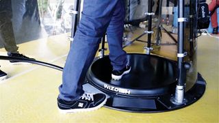
Some devices, such as the WizDish, allow the user to feel like they're in motion when they are actually enclosed in a safe area. These kinds of devices are currently the best solution to providing a good user experience and avoiding motion sickness.
UI learnings
Now let's take a look at some user interface challenges. These learnings focus on how the experience can be improved by not breaking the user's immersion, and ensuring there are no missing elements.
Interface
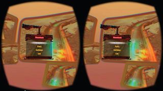
Game UI practices do not work on VR. Applying a HUD would require the user to consider a 3D environment with volumes and depth, and at the same time try to focus on extra information fixed on top of the 'screen'.
We have learnt that in VR experiences, menus, extra information about objects, and other UI elements have to be displayed at the same depth as the object they're targeting. Content like text has to be adapted to a 3D environment, as a 2D paragraph will be hardly legible in a 3D environment.
Environment
The quality of the animated environment is the key element in tricking the brain into believing the virtual world is real. The animation and transitions need to be smooth, and when the immersion has to be broken, it's better to drive the user outside of this virtual world by using a fade to black before tracking is interrupted.
Avatars
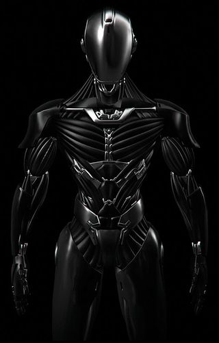
In terms of avatar design, VR has a lot to learn from FPS games. However, there is one major difference: games do not require visible arms or body. In VR, being able to see your body increases immersion. However, if done poorly – so the body you've been assigned doesn't match your real body's position – the results can be disorienting and even destroy the whole experience.
Next steps
From our learnings, we were able to realise the UX research we do needs to be in line with where the headsets technology and design is heading. From there, we can glean a few things about where the UX or VR is heading.
Follow technology
Is the technology heading towards Oculus Rift or Samsung Gear's approach, in which the user's field of view is covered 100 per cent? Or are we progressing towards a experiences centred around augmented reality (AR)? Consider, for example, Microsoft's design for HoloLens, where the user can choose to focus on the virtual world or on the real world. Some may argue VR and AR will follow separate paths and never come together, while others believe the solution for how to enhance virtual reality experiences is in bringing some AR learnings into it.
Apply UX principles
Like any other communication medium, UX needs to work in parallel with strategy, production, creative direction, art, copywriting and technical execution. However, it should follow a well-known UX principle: guidance and assistance. We can't expect people to know what to do and where to go, so assistance is key to help users get acquainted with the interface. To do this, we need to show visual clues and provide clear feedback after any interaction.
Build a new grammar
In order to test if we are building an intuitive experience, we need the appropriate tools that enable us to quickly prototype a 3D environment and allow UX designers to design the entire flow of interactions involving a 360-degree point of view.
These kinds of tools are also key in helping explain and sell a VR concept to clients. Storyboards, wireframes and 2D animatics are no longer enough. We need to define an entirely new grammar and prototyping process.
Introduce personalisation
We should be thinking of using personal information about the user, such as their music tastes, eating or exercising habits or even health stats, as variables to personalise an experience and create something that reads and interacts with the human interface.
This is essentially the ultimate goal of UX design: not having to teach users how to handle a device, but to teach the device how to read and adapt to each and every one of us.
Words: Laura Cortes
Laura is a digital creative lead and UX designer currently working at London-based innovation studio UNIT9. This article originally appeared in issue 275 of net magazine.
Liked this? Read these!
- 10 tips to get started in virtual reality
- Discover these mind bending examples of trompe l'oeil
- We reveal the best web fonts for your site
- Discover the best user testing software
- Read our step-by-step guide to user experience

Thank you for reading 5 articles this month* Join now for unlimited access
Enjoy your first month for just £1 / $1 / €1
*Read 5 free articles per month without a subscription

Join now for unlimited access
Try first month for just £1 / $1 / €1
The Creative Bloq team is made up of a group of design fans, and has changed and evolved since Creative Bloq began back in 2012. The current website team consists of eight full-time members of staff: Editor Georgia Coggan, Deputy Editor Rosie Hilder, Ecommerce Editor Beren Neale, Senior News Editor Daniel Piper, Editor, Digital Art and 3D Ian Dean, Tech Reviews Editor Erlingur Einarsson and Ecommerce Writer Beth Nicholls and Staff Writer Natalie Fear, as well as a roster of freelancers from around the world. The 3D World and ImagineFX magazine teams also pitch in, ensuring that content from 3D World and ImagineFX is represented on Creative Bloq.
