5 ways to take advantage of website user behaviour
Richard Howe takes a looks at how you can learn from web visitor interaction and utilise it well.
The behaviour of visitors to your website holds the key to how you should serve up the user experience, so it is madness not to discover how users are behaving and using that knowledge to improve your site.
In this article, I'll investigate how you can learn from website visitor interaction, and use the findings to provide an enhanced user experience.
01. Follow the F pattern
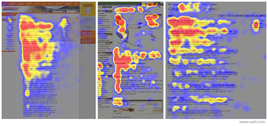
The theory from usability expert Jakob Nielsen sums up how users read on the web: they don't.
Although it could be seen as generalisation, 79 per cent of website users will just scan your content heavy pages, usually in an F-shaped pattern.
Visitors will first read the top line or two of your text, then they will read a little further down but not so far across the page (the second, shorter horizontal line of the 'F' shape).
Finally, they will scan down the left-hand side of your web page, looking at the start of each paragraph until they find what they're looking for.
Taking this reading pattern into consideration, it's possible to increase a layout's effectiveness by:
Get the Creative Bloq Newsletter
Daily design news, reviews, how-tos and more, as picked by the editors.
- Ensuring that your most important information is carried in a compelling headline and in the top couple of paragraphs.
- Beginning each paragraph, heading, subheading or bullet point with content-specific words that will help users in their search.
- Considering a Call To Action along the 'short horizontal bar'. This is where visitors are likely to stop scrolling and start reading, so a prompt at this point could increase conversions.
02. Counteract banner blindness
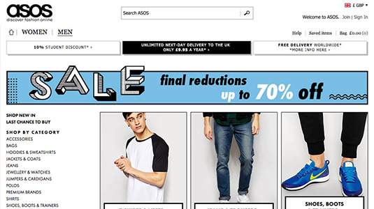
According to Infolinks, 86 per cent of website users suffer from 'banner blindness', an effect first discovered by Jan Panero in 1997.
Users have become so used to seeing advertising that they pay no attention to banners. However, Eyetrack's observations back in 2004 offer some excellent methods of counteracting this trend, that are still very valid today:
- Place your banner towards the top left of the page where the ad is seen within the first few seconds. Avoid placing directly at the top or at the bottom of the page where it could be seen by fewer than 10 per cent of visitors.
- Avoid advertising slogans, pictures and bright colours. Banners that blend in with a site's colour scheme and style are more often read than banners that contrast.
- Include plenty of text – this helps to draw the eye when positioned close to the page copy. Don't disguise your ads, instead ensure they remain prominent, even surrounded by other content, and visitors will take the time to read.
03. Evolve gradually

People are creatures of habit and once you attract a community of regular website users, you'll find that they tend to behave in a certain way, following the same route through the site.
If you're making updates, creating new sections or revamping things totally, your existing users may become irritated if they cannot navigate in the way that they could before.
Think about the occasional negative comments that followed the layout changes rolled out by Twitter or Facebook in the past. The updates break user expectations and attract temporary negativity until the latest refinements become familiar once again.
If your site is already clear and simple, consider gradual updates rather than wholesale changes. Using paper-based prototyping is advisable to ensure the proposed update will be a genuine enhancement to usability. Leaving this to chance can sometimes be a risky move, as you could end up releasing a site version that people not only dislike initially but also in the long term.
04. Split test inner pages
Whilst a lot of time (and a big chunk of your budget) may have been spent designing a wonderful homepage for your website, remember that Google and many of your visitors will simply see it as a portal to get to the nitty-gritty content of your site.
Your homepage should be unique and enticing, however focusing on the deeper pages of your site is equally important, if not more. These are the pages that visitors spend the most time on to learn about a product or service and are therefore most vital to sales.
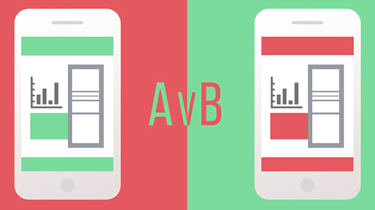
To achieve an increase in landing page conversions, split testing software such as AB Tasty can be a powerful way to see what works and what doesn't. For example, two different page titles, images or calls to action could be created with 50 per cent of your visitors seeing each version to gauge which refinement is most effective in reaching your page goals.
A good alternative may be to enlist help from the 800-plus professionals that make up inbound.org's The Pit: Landing Page Critiques who can make suggestions to improve your landing pages.
05. Collect user feedback
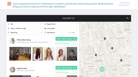
Another point to bear in mind is that to create a great experience, you need to understand the mindset of your visitor. Your target market's thinking could be very separate to your own so the way they interact with your website could also be very different.
On top of this, you will know your website inside-out, having spent countless hours on the development. New visitors will have been on your website a fraction of this time, and this factor is of huge importance.
Simply put, talk to real people. Look to gain the feedback of visitors who are completely new to your site before rolling out any major version releases.
If your website is pre-existing, speak to a diverse group of customers or frequent visitors that can trial your site updates a few times before a public release.
The free service from usabilityhub.com is a great starting point to gain feedback on different interactions for specific site sections, from navigation flows to design preference tests.
Conclusion
By paying attention to how users interact with your site, you can learn a lot about the way in which it works best. Carrying out usability tests and talking to your visitors will provide you with even further information and allow you to refine and create a site that is truly engaging.
Words: Richard Howe
Richard Howe is a front-end web designer at Colour Rich in Oxford, UK where he's focused on the user experience, CSS and responsive interfaces. See what he is currently crafting, enjoying or writing about on Facebook and Twitter.
Liked this? Read these!

Thank you for reading 5 articles this month* Join now for unlimited access
Enjoy your first month for just £1 / $1 / €1
*Read 5 free articles per month without a subscription

Join now for unlimited access
Try first month for just £1 / $1 / €1

The Creative Bloq team is made up of a group of art and design enthusiasts, and has changed and evolved since Creative Bloq began back in 2012. The current website team consists of eight full-time members of staff: Editor Georgia Coggan, Deputy Editor Rosie Hilder, Ecommerce Editor Beren Neale, Senior News Editor Daniel Piper, Editor, Digital Art and 3D Ian Dean, Tech Reviews Editor Erlingur Einarsson, Ecommerce Writer Beth Nicholls and Staff Writer Natalie Fear, as well as a roster of freelancers from around the world. The ImagineFX magazine team also pitch in, ensuring that content from leading digital art publication ImagineFX is represented on Creative Bloq.
