10 UX portfolios done right
We explain what it takes to make a stellar portfolio, and highlight 10 solid examples to learn from.
A vast amount of effort goes into creating a simple, elegant design portfolio that hits all the right notes for any prospective client. It's more than a creative resume and you definitely do not limit yourself to one page. Think of it as your own personal proof of concept.
Here, I've highlighted the main characteristics of a solid portfolio. And the team at UXPin – the UX design app – have scoured the internet for some of the best examples that illustrate these points below.
First and foremost, what makes a winning portfolio is the same thing behind a winning design: a riveting visual story. Remember, someone wants you to solve their problems and needs to know how you'll do that – quickly.
Someone wants you
The best way to tell a story with your work is to start with your audience. What is their biggest challenge and what kind of story would address that?
The story of each portfolio will change over time. It depends on what kind of design role you will fill, your level of proficiency, the nature of the task at hand and the environment where you will be operating. The quintessential kernel of your story will revolve around how you have been a problem-solver.
A great deal of UX design work is going to be done in wireframes and prototypes using a variety of tools like Photoshop, Illustrator, and UXPin. But wireframes are not going to be pretty, so emphasize your structural ability. Simple and clean can look amazingly beautiful but in the end, it has to take a back seat to a demonstration of your architectural ability.
Start with a teaser
An example of a great story is a portfolio that starts with a teaser for a phone screen, raises the stakes with a formal hour-long presentation to interrogative sessions, then reaches a crescendo with a deep dive into specific visual and behavioral details.
Get the Creative Bloq Newsletter
Daily design news, reviews, how-tos and more, as picked by the editors.
The 10 essential elements that any UI or UX design portfolio really needs to showcase are your:
- Tool mastery
- Process focus
- Key concept communication
- Cross-functional collaboration
- Applied perceptiveness
- Projects less than three years old
- Writing on UI and UX design
- Visual syntax and grammar
- Toughest challenges
- Range of expertise
- Dealing With NDAs
The sad truth, though, is that you may not be able to post examples of your best work due to issues with NDAs. In most companies these days, your work and process are proprietary to them. One option is to use unrecognizable wireframes and sketches and discuss the process in the interview. But often you can persuade clients to gain permission for limited views of the final work.
Here are 10 portfolios that have been singled out for excellence in the field...
01. Erica Firment
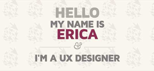
On her site, Erica Firment presents a no-nonsense approach that is all about her tool mastery. She presents the tools she is comfortable using and drives the point home by leading directly into her press clippings. It takes an additional level of professionalism to be able to speak intelligently about your tools and what they can do.
02. Edmund Yu
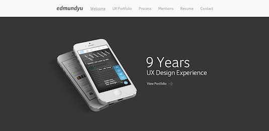
Take a closer look at Edward Yu's process on focus. There are examples of work, but they are presented by the process each used to get there. Each client is different and maybe you haven't worked on something similar, but you can sell them on the "how" with showing your toolbox, your approach, the way you research and what kind of deliverables they can expect.
03. Marc Thomas
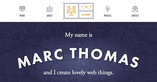
Every one of Marc Thomas's pieces breaks down the project into a key concept communication brief. The entire purpose of clean functional design is not to impress the end-user, but to communicate the core functionality in the most efficient way possible - and that's just what Thomas has done here.
04. Justin Edmund
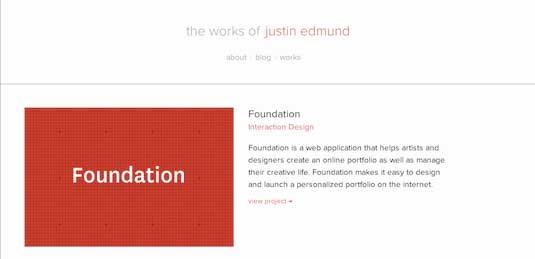
This one is deceptive. At first glance, Justin Edmund's site is a standard online enhanced resume. A few big names draw you in and once inside the individual projects, the story becomes his success with cross-functional collaboration.
Designers can't work alone and no product design team can function with a difficult artist. Consensus building is a core skill right up there alongside rapid prototyping.
05. Simon Pan
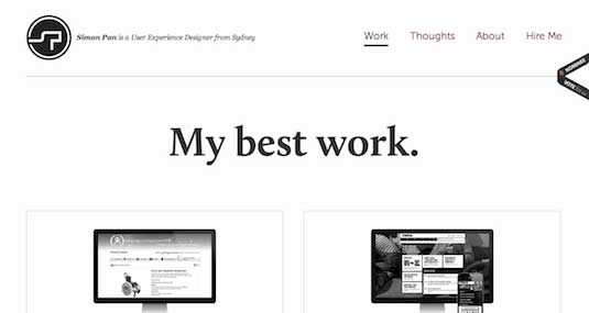
There's not a lot here, but there doesn't need to be. Simon Pan presents each piece as a dramatic case study that spotlights his applied perceptiveness.
The administrative end of UX design is being handled by software now. Tools like UXPin can provide all the important infrastructure of design, like a collaborative space built by designers and an innovative wireframing and prototyping editor. What companies are looking for are designers who can fully understand what they are trying to achieve and break it down in a new way.
06. Mariusz Cieśla
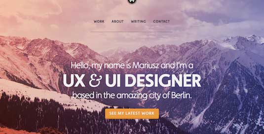
Mariusz Cieśla's site is a great example of holding the best back and only showing you his most recent work. The point is that they should be interested enough to want to learn more about you. Projects should be less than three years old or it looks like the technology has passed you by.
07. Eva-Lotta Lamm
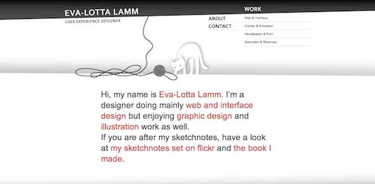
Eva-Lotta Lamm's genius is in presenting her sketch notes that lead you through her development process. These are even better than her blog for getting an idea of her writing on UI and UX design.
Talking about UX and what it means in the big picture makes you a better designer, even if the client doesn't read it. This generates better critical thinking skills, more articulate presentations and a testing area for the outer reaches of your creativity.
08. Brett Victor
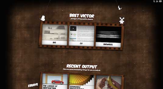
Brett Victor clearly recognises that UX and UI design represents simply a different type of communication. Designers speak to users with a visual syntax and grammar. Value and function must be explained without words, and that requires a mastery of the tools beyond simple proficiency.
09. Whitney Hess
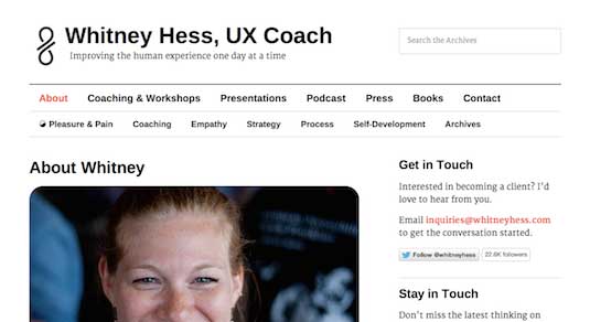
This portfolio is very different from the others on this list: it's text heavy and not beautiful at all. But it is still effective because it details Whitney Hess's toughest challenges in a straightforward and intriguing way.
10. Jeremiah Shaw
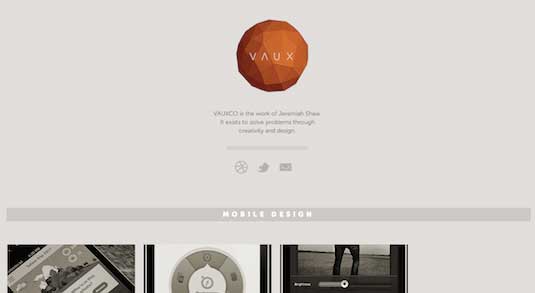
You don't have to be an expert in everything, but you should demonstrate a natural curiosity by the breadth of your experience. From mobile to web to print, these pieces show just enough of his range of expertise that a client could feel confident about breaking new ground.
The final presentation
As you can see, there are many ways to address these 10 critical areas. It pays to begin with your strength rather than trying to stretch into areas that really don't fit. Imagine joining a new team of designers.
What would you want to see in their portfolios that could inform you on their strengths and weaknesses? Your personality is every bit as important as the tools you use, so make sure you present that aspect in the best light.
Take a presentation class or even try some stand-up comedy. Building better communication skills will go a long way in making your technical skills stand out.

Thank you for reading 5 articles this month* Join now for unlimited access
Enjoy your first month for just £1 / $1 / €1
*Read 5 free articles per month without a subscription

Join now for unlimited access
Try first month for just £1 / $1 / €1
Chris Bank is the growth lead @UXPin. He also led growth @Lettuce (acquired by Intuit), @MyFit (acquired by Naviance), and his own startup @Epostmarks (USPS strategic partner), and launched@Kaggle in the tech vertical. Visit his website and follow him on Twitter.
