How to properly simplify your web design
Everyone loves a simple site. Jerry Cao explains how to design one without losing vital information.
Decisions are the first step of user interactions. Before users click on a link or image, they first need to decide that such an action is worthwhile.
We understand that a user's choice to engage with a site or app is affected by more than just the amount of interface objects. colour, typography, visual hierarchy are among the dozens of elements that influence decisions.
19 common UX problems and how to fix them
But even the most beautiful colour scheme, crispest typography, and intuitive visual hierarchy don't matter if it's executed without thought for user flow.

Fail to provide enough decisions, and users will go elsewhere to find what they want. Provide too many decisions, and users suffer from choice paralysis. As we described in Web UI Best Practices, all design techniques require balance for success.
In this piece, we'll talk about how to streamline the overall site experience by providing just the right amount of choices for a user at any given time. Based on our experience, designing a web interface around user decisions is the best way to make sure your layout is just as simple as it should be.
Why Hick's Law is crucial to interaction design
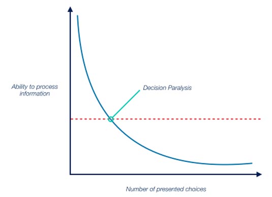
In 1951, British psychologist William Edmund Hick conducted the experiments that led to Hick's Law, which states that the time required to make a decision increases logarithmically based on the number of choices available.
Get the Creative Bloq Newsletter
Daily design news, reviews, how-tos and more, as picked by the editors.

Fast forward to the modern age, and Hick's Law is now a strong argument for clarity and simplicity in web and mobile design.
Traditionally, designers accept the most simplistic interpretation of Hick's Law: limit the amount of options you have in navigational menus, dropdowns, etc.
This isn't wrong – in fact, it's actually a good tip. Designers should always trim the amount of on-screen choices down to what's needed to accomplish immediate user goals.

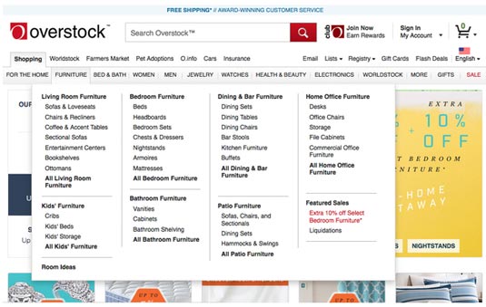
In the example above, the aptly named Overstock site suffers from a mess of options. As soon as you hover on a top-level category like Furniture, a submenu featuring a mess of secondary categories is instantly triggered.
Notice the lack of consistency in the information architecture: Men and Women are clustered together with specific product categories like "Watches" and Jewelry. As we described in Interaction Design Best Practices Vol. 1, interfaces must be consistent in order to be learnable (and therefore usable)
In this case, the transition of information is far too jarring.
Quenching desire
Unless the user knows precisely what they want, Overstock's interface quells any desire to browse freely, which is one of the most enjoyable elements of online shopping.
Following the three-click rule too literally can lead to these UX mistakes. Sure, users can technically find a kitchen table within 3 clicks, but the decision process is muddled with too much information parsing
Now, let's compare that to Amazon, which offers roughly the same breadth of products, perhaps more, but keeps it simpler:

The Search bar is free of competing visual elements, encouraging informed users to dive right in. But the option of navigating through a menu remains available, though as a simplified dropdown (that doesn't sprawl across the page). Instead, the interface incorporates a compartmentalized decisionmaking process
Users must choose their category first before seeing a more-involved submenu. The key lesson here is that Amazon keeps the options hidden until they're needed, creating a paced decision-making process. Ultimately, this simplifies both the interface and the process of shopping
This is Hick's Law applied well. The trouble is that most designers stop here. They fail to see the more far-reaching applications of the law, limiting their comprehension of interaction design
Next page: How to apply Hick's Law to web design

Thank you for reading 5 articles this month* Join now for unlimited access
Enjoy your first month for just £1 / $1 / €1
*Read 5 free articles per month without a subscription

Join now for unlimited access
Try first month for just £1 / $1 / €1

The Creative Bloq team is made up of a group of art and design enthusiasts, and has changed and evolved since Creative Bloq began back in 2012. The current website team consists of eight full-time members of staff: Editor Georgia Coggan, Deputy Editor Rosie Hilder, Ecommerce Editor Beren Neale, Senior News Editor Daniel Piper, Editor, Digital Art and 3D Ian Dean, Tech Reviews Editor Erlingur Einarsson, Ecommerce Writer Beth Nicholls and Staff Writer Natalie Fear, as well as a roster of freelancers from around the world. The ImagineFX magazine team also pitch in, ensuring that content from leading digital art publication ImagineFX is represented on Creative Bloq.
