Use CSS transitions for link effects
Bringing hovers back from the vaults, Jenn Lukas explains how to use CSS3 transitions to create fun link effects and enhance user experience
Download the support files for this CSS3 tutorial.
Steering clear of tacky Flash interactions, page corner flips and the MM_SwapImage hovers of past years, CSS transitions can add nifty and contemporary effects. CSS3 offers a variety of properties to transition. By applying these transitions to links, and changing the link properties on hover, we enhance the way users interact with designs.
If they’re thrown into page design without careful planning, transitions can end up simply distracting users. After all, for most sites, content remains the top priority. However, by adding neat responses to hover and focus (always remember to pair these together for keyboard users) we can introduce just the right amount of surprise and delight when the user initiates the sequence to enhance their experience without CSS tricks getting in the way.
Colour fades
The baseline for CSS declarations on links is a change of colour on hover/focus. Adding a global transition rule gives us the ability to create subtle link effects:
Article continues belowa {
color: #6dd4b1;
transition: all 0.2s linear;
}
a:hover, a:focus {
color: #357099;
}
Just by adding the transition property, in this case all, every transitional value that changes will be adjusted. Specify a colour change on hover and you’re done.

Add some movement
The next example is inspired by work completed for www.omusicawards.com/vote. Let’s say we have a bunch of images and text we want to be a link, such as a list of Twitter users. The link to the feed will include avatars and Twitter handles, but you also want to provide secondary information, such as the biography. Considering the bio could be missing and the content would still make sense, what if we showed that content to users on hover? It could provide additional information to help users decide whether to click the link:
<div class="user">
<a href="http://twitter.com/jennlukas">
<div class="user-info">
<h2>@jennlukas</h2>
<div class="bio-reveal">
<p>Interactive Development Director at Happy Cog, http://markhuot.com webmaster, http://thenerdary.net contributor, fun haver</p>
</div>
</div>
</a>
</div>
.user {
position: relative;
height: 240px;
}
a {
display: block;
width: 100%;
height: 100%;
background: transparent url(twitter-avatar.png) no-repeat;
}
.user-info {
position: absolute;
bottom: 0;
}
.bio-reveal {
overflow: hidden;
max-height: 0;
transition: all 0.7s linear;
}
a:hover .bio-reveal, a:focus .bio-reveal {
max-height: 240px;
}
Sign up to Creative Bloq's daily newsletter, which brings you the latest news and inspiration from the worlds of art, design and technology.
This pattern also works well for article links on hover to show meta information, such as tags, Likes or comment counts. You can see an example of this on a site like http://snapguide.com where the transitioning margin and top properties reveal more information. Displaying the number of tutorial comments on hover encourages users to click through.

Another interesting example is http://mammothbooth.com/faq.html. The layout of the frequently asked questions provides a grid of questions. The answers are revealed with JavaScript on hover. Recreate a similar effect with CSS:
<div>
<h2>How Much Does It cost?</h2>
<img src="http://placekitten.com/100/50" />
<p>The answer goes here!</p>
</div>
div {
width: 500px;
position: relative;
overflow: hidden;
}
h2 {
position: absolute;
left: 10px;
top: 0px;
transition: top 0.2s linear;
}
img {
position: absolute;
right: 20px;
bottom: 15px;
transition: bottom 0.2s linear;
}
p {
opacity: 0;
transition: opacity 0.5s linear;
}
Give the container a width and set the overflow to hidden. Position the heading and image absolute to that and set the opacity on the paragraph to 0. This maintains the required element height, allowing for variable content lengths, but remains invisible until hovered over. Set a transition so the moving elements will slide and fade instead of jumping and instantly appearing. Lastly, we change the positioning and opacity of the children elements when the div is hovered upon:
div:hover p {
opacity: 1;
}
div:hover img {
bottom: -100px;
}
div:hover h2 {
top: -100px;
}

Have some fun
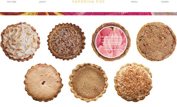
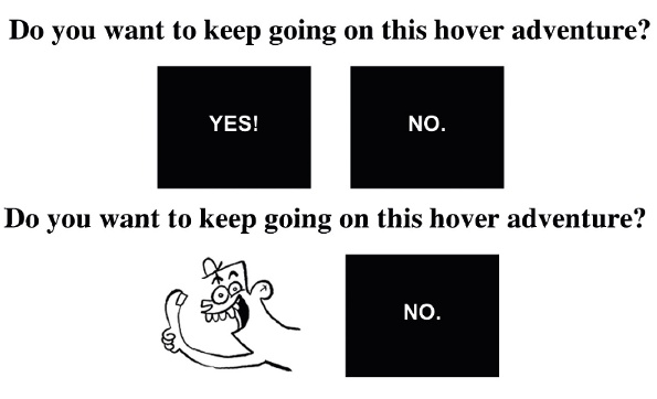
Adapt hovers to suit content. Pies provide a good example of fun content at Emporium Pies hovering over the pie flips an image of the topping over to reveal the pie name and ingredients. Here’s how to reveal an image on hover by flipping the top element:
<div class="wrap">
<a href="http://effyeahhovers.tumblr.com/">
<div class="front">Yes!</div>
<div class="back"><img src="http://jennlukas.com/jennlukas/flip/thumbsup.png" alt="thumbs up!" /></div>
</a>
<a href="http://knowyourmeme.com/memes/sad-panda">
<div class="front">No.</div>
<div class="back"><img src="http://jennlukas.com/jennlukas/flip/thumbsdown.png" alt="thumbs down." /></div>
</a>
</div>
We'll have two containers: one holding the “front” of our link and one holding the “back”.
Using the transform property, along with backface-visiblity, set the rotateY value to flip the back image over to hide it from the screen. On hover, flip the entire container to send the front text to the back and revealing the flipped back image:
a {
display: inline-block;
position: relative;
transform-style: preserve-3d;
transition: 0.4s;
}
a:hover, a:focus {
transform: rotateY(180deg);
}
a div {
position: absolute;
backface-visibility: hidden;
}
.back {
transform: rotateY(180deg);
}
There are endless possibilities for improving the user experience of hovers. From transitions and animations to transforms, there are a plethora of tools to use. Don’t forget to submit your hover examples at http://fuckyeahhovers.tumblr.com.

The Creative Bloq team is made up of a group of art and design enthusiasts, and has changed and evolved since Creative Bloq began back in 2012. The current website team consists of eight full-time members of staff: Editor Georgia Coggan, Deputy Editor Rosie Hilder, Ecommerce Editor Beren Neale, Senior News Editor Daniel Piper, Editor, Digital Art and 3D Ian Dean, Tech Reviews Editor Erlingur Einarsson, Ecommerce Writer Beth Nicholls and Staff Writer Natalie Fear, as well as a roster of freelancers from around the world. The ImagineFX magazine team also pitch in, ensuring that content from leading digital art publication ImagineFX is represented on Creative Bloq.
