12 great uses of typography in logos for TV shows
Clever use of typography can make a TV logo as memorable as the characters and story.
When we fall in love with a TV show, it's often the little things – the theme, the opening titles, a catchphrase – that provoke the biggest emotional response. And with a carefully considered approach to typography, the logo design may often join this pantheon of iconic show elements.
Here we've compiled 10 TV shows from the '90s and beyond that have made remarkable use of typography and font style. Whether you're creating a logo for an entertainment property or any other type of brand, you're sure to find inspiration here. If you'd like more on this subject, see our post on the best TV show logos.
01. Mr. Robot
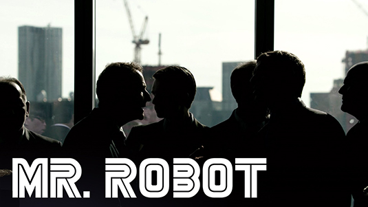
USA Network's unnerving hacker drama Mr. Robot has received plaudits for being the closest television and film has got to understanding what hacking is all about . The retro, original Battlestar Galactica-style font for the logo perfectly inbibes a techno feel to the programme while also adding a comic-book vibe.
02. Mad Men
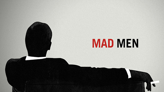
Produced by Imaginary Forces as part of a title sequence that owes much to Saul Bass without being at all retro, the Mad Men logo beautifully and effectively represents the duality that is a theme of the cult show.
03. The X Files
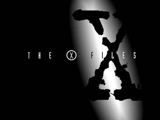
Alien investigation series The X Files not only revolutionised TV sci-fi in the '90s, it also brought us this amazing typography treatment, which soon became as recognisable as the show's characters. There was no need for photography or illustration to sell the series: this clever use of distressed typography was all that was needed to convey a sense of the murky and mysterious.
04. Gossip Girl
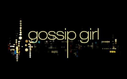
Based on Helevetica LT, Gossip Girl's logo is as classy and sophisticated as the youthful drama's upmarket characters. The extension of the 'p' shows how you only need one or two subtle changes to make the transformation from plain type to identifiable logo.
05. Game of Thrones
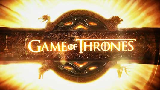
To up the fantasy element, the logo for this blockbuster HBO series slyly adds a Celtic triple-bar to the middle of the 'O's. Bringing the letters by fire shining through metal leaves you in no doubt what sort of show this is.
Get the Creative Bloq Newsletter
Daily design news, reviews, how-tos and more, as picked by the editors.
06. Breaking Bad
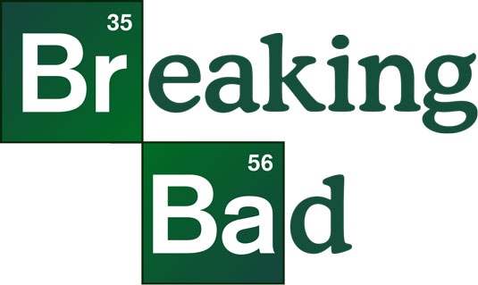
If you haven't seen Breaking Bad yet, where have you been? The intoxicating drama follows a guy who cooks up crystal meth - and the logo takes the chemistry theme and runs with it. Playing on the Periodic Table of Elements, the logo uses Helevetica Bold for the 'Br' and 'B', and Cooper Md BT for the remaining letters.
07. Friends

The classic sitcom about six New Yorkers has a logo design that's as familiar as the cast. The treatment may seem a little dated now, but it's undeniable it sums up the spirit of the '90s and comes across as, well, friendly.
08. That '70s show

Here's another typographic treatment that sums up an era without the need for any imagery beyond the shape of the lettering. Although don't be fooled: the font it's based on isn't actually from the '70s. It's Arnold Böcklin, probably the best-known Art Nouveau typeface, designed in 1904 by Schriftgiesserei Otto Weisert foundry.
09. Californication
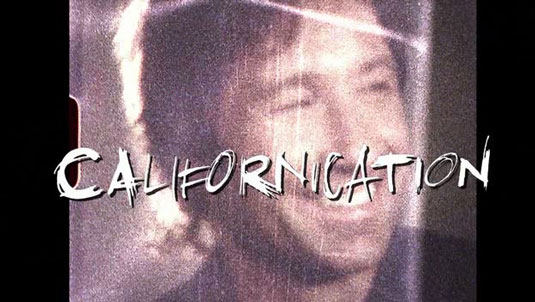
This 'dramadery' show about a troubled novelist is all about breaking boundaries. And its scrawled logo, based on a custom made font, has a curving effect that's quite arresting - and certainly attention-grabbing.
10. Teen Wolf
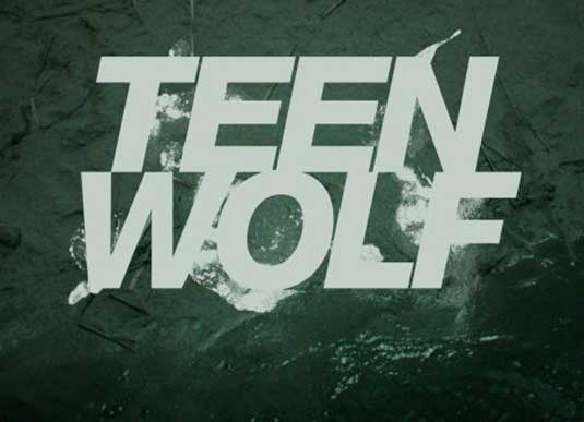
The recent TV reboot of the classic Michael J Fox werewolf movie needed a modern looking logotype to set it apart from memories of comedy-slanted '80s cheese - and this simple, hard-edged typographic treatment does the job admirably. The smoke slithering around the words, which are set in Helevetica Black Oblique, adds a cool and contemporary touch to the design.
11. Pimp My Ride
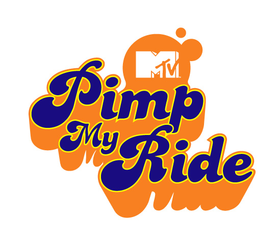
Groovy '70s typography, garish colours - the logo for this MTV show about customised cars creates an instant cartoon pimp feel that's perfect for Pimp My Ride.
12. Buffy the Vampire Slayer
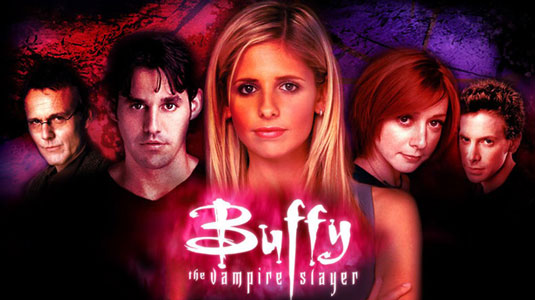
Gather round children and we'll tell you a secret. Back in the '90s – long before Byzantium, Twilight and Tru-Blood – sprang forth the original and best teen vampire drama, Buffy the Vampire Slayer. Its logo, like its lead character, had a deadly beauty about it, the central 'f' striking a dagger through the heart of the design. Classic.
Have we missed your favourite example of typography in TV logo design? Let us know in the comments below!
Words: Laura Brentley/Craig Stewart
Laura Brentley is a writer, blogger and manager at Cardprinting US, a company which offers rush card printing services. Craig Stewart is managing editor of Creative Bloq.
Liked this? Read these!
- Our favourite web fonts - and they don't cost a penny
- Useful and inspiring flyer templates
- The best 3D movies of 2013

Thank you for reading 5 articles this month* Join now for unlimited access
Enjoy your first month for just £1 / $1 / €1
*Read 5 free articles per month without a subscription

Join now for unlimited access
Try first month for just £1 / $1 / €1

The Creative Bloq team is made up of a group of art and design enthusiasts, and has changed and evolved since Creative Bloq began back in 2012. The current website team consists of eight full-time members of staff: Editor Georgia Coggan, Deputy Editor Rosie Hilder, Ecommerce Editor Beren Neale, Senior News Editor Daniel Piper, Editor, Digital Art and 3D Ian Dean, Tech Reviews Editor Erlingur Einarsson, Ecommerce Writer Beth Nicholls and Staff Writer Natalie Fear, as well as a roster of freelancers from around the world. The ImagineFX magazine team also pitch in, ensuring that content from leading digital art publication ImagineFX is represented on Creative Bloq.
