10 typography terms that every designer needs to know
Learning more about typography requires getting to grips with a whole heap of jargon. Here are some key terms that will be thrown your way, and what they mean.
If you want to become a professional designer, you need typography tutorials. But when you start to delve into the world of type, the number of unfamiliar terms that confront you can be a shock to the system. Let us ease you in gently with our guide to the most common terms, with input from some expert designers to lead your way.
- Read all our typography-related posts here
01. Contrast

This is a generally subjective feeling that certain different fonts work together well, giving an impression of variety without losing harmony in the overall piece. Within a particular font, contrast also refers to the variety of stroke thicknesses that make up the characters.
"Helvetica has low contrast and Bodoni has high contrast; two good fonts to learn about it," explains Darren Scott. "Tobias Frere-Jones at Font Bureau also does beautiful fonts that have lots of extreme contrast."
To compare fonts in your browser, check out the recently launched free tool Tiff. Also read: Typographical twins: 20 perfect font pairings.
02. Serif vs sans serif
Serifs are the semi-structural details on the ends of some strokes of letters and symbols; typefaces without these projections are known as sans serif.
In print, sans serif fonts were more typically used for headlines than for body text - with serif fonts known for better 'guiding' of readers through blocks of text - though that rule has long been broken. "Some might say this is as simple as traditional versus modern, but there are plenty of modern serifs and lots of traditional sans," Darren Scott clarifies. "I say love both and choose wisely."
03. Tracking
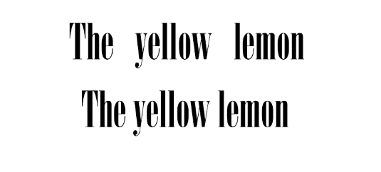
Tracking is the amount of space between letters in a complete word or sentence. It's more of a computer term that is traditionally known as letter-spacing. "This shouldn't be confused with kerning, which is the space between two individual letters in a word," Scott explains. "I find words set in capitals always benefit from increased letter-spacing, but never, ever, letter-space lowercase - it's generally frowned upon by purists."
Daily design news, reviews, how-tos and more, as picked by the editors.
04. Kerning

Kerning describes the act of adjusting the space between characters (including those beween the words) to create a harmonious pairing. For example, where an uppercase 'A' meets an uppercase 'V', their diagonal strokes are usually kerned so that the top left of the 'V' sits above the bottom right of the 'A'.
Kerning and tracking (see 03.) are sometimes used interchangeably by people who don't really understand typography. Tracking is different as it relates to the spacing of ALL characters and is applied evenly. For more details, read Kerning: 10 expert tips.
05. Leading
Leading describes the vertical space between each line of type. The term derives from the days when strips of lead were used to separate lines of type in the days of metal typesetting.
06. White space
Graphic designer Peter Crnokak describes this as "airiness" - the portions of blank space used in page layout to enable the text and other furniture to breathe. It's a crucial tool to consider in typeface design as well as graphic and layout design.
"I'm a strong believer in architect Ludwig Mies Van Der Rohe's 'less is more' approach," says creative director and typographer Darren Scott. "Say little, say it well. Good design is not so much about knowing what to put on the page, it's about knowing what to leave out."
07. Dingbat

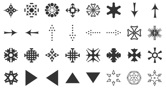
Once known as printer's flowers, dingbats are decorative elements that can vary from simple bullets to delicate fauna and flora often formed into themed collections. Most popular is Zapf Dingbats, but there are many alternatives. Dingbats are often referred to as 'symbol fonts' - we've collected the best free ones on the web in this article.
08. Justified
In a paragraph of justified text, the contents are arranged so that there is no white space at the end of a line: each begins flush left and finishes flush right.
09. Baseline grid
The baseline is the line upon which most letters sit and below which descenders (such as the lower loop of a 'g') extend. The baseline grid is a tool for graphic designers and web designers that helps them align all text so that it flows smoothly. The baseline grid ensures your text has the correct leading and is vital in any layout that uses columns.
"I never even attempted to align to the baseline grid on my website designs until I worked on a large-scale print project and realised what a wonderful tool it is," recalls Elliott Jay Stocks, creative director of Adobe Typekit. "It's derived completely from the typeface and so it keeps type as the central part of the layout design. It then informs virtually every other alignment decision, such as the incremental leading of larger type, the height of a thick border, the placement of images and so on."
10. @font-face

@font-face is the CSS3 rule that means web designers no longer have to use one of the traditional "web-safe" fonts. If you're unfamiliar with web fonts, then check out this primer, and you can discover the best free web fonts here.
- For more typographical terms, check out What is typography? Learn the basic rules and terms of type!
Also read:

Thank you for reading 5 articles this month* Join now for unlimited access
Enjoy your first month for just £1 / $1 / €1
*Read 5 free articles per month without a subscription

Join now for unlimited access
Try first month for just £1 / $1 / €1

The Creative Bloq team is made up of a group of art and design enthusiasts, and has changed and evolved since Creative Bloq began back in 2012. The current website team consists of eight full-time members of staff: Editor Georgia Coggan, Deputy Editor Rosie Hilder, Ecommerce Editor Beren Neale, Senior News Editor Daniel Piper, Editor, Digital Art and 3D Ian Dean, Tech Reviews Editor Erlingur Einarsson, Ecommerce Writer Beth Nicholls and Staff Writer Natalie Fear, as well as a roster of freelancers from around the world. The ImagineFX magazine team also pitch in, ensuring that content from leading digital art publication ImagineFX is represented on Creative Bloq.
