Typography is like a second language communicating on a subtler level beyond your actual words. The actual content is what you say, but typography is the first impression of how you say it.
Typography creates an experience before users have even read a single word or clicked a menu button. Typography doesn't just tell a story, it creates an atmosphere and emotional response in the same way as a tone of voice. If all visual elements of a web page design factor into the user experience, then of course typography will make a huge impact, especially on content-heavy sites. Poor or lacking typography will be just as repulsive to readers as glaring grammar errors.
There are lots of rules surrounding the best practice of using typography, see our typography design post for a full typographic A-Z.
In this article, we'll talk about how to use typography to its fullest extent. We'll begin by exploring the levels of typographic hierarchy, then dive into individual elements.
For more on the nitty gritty of creating and using type, see this list of typography tutorials. To learn more about using type within interaction design, download free ebook Interaction Design Best Practices.
Want to learn more about using type within user interfaces? Sign up to our UX Design Foundations course today.
Levels of typographic hierarchy
As we described in Web UI Best Practices, typographic hierarchy is a subset within visual hierarchy. Typographic hierarchy arranges lettering so that important words stand out easily to readers who are scanning for information.
Get the Creative Bloq Newsletter
Daily design news, reviews, how-tos and more, as picked by the editors.
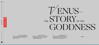
Without this hierarchy, every letter and word in a design would appear identical. Your design would be about as visually appealing as an MS DOS command prompt. As a general rule, designer Carrie Cousins recommends that your typography supports at least three levels of hierarchy.
Try to shape your typography into these levels:
01. Primary level
The most noticeable text on the page, usually bigger and a brighter colour than the other layers of text. Because it's so powerful, this level should be sparse – reserve it only for headlines and decks (known as 'furniture').
02. Secondary level
Less noticeable than the primary level, but more noticeable than the main content, the secondary level handles everything in between. This level features some minimal but distinct elements in size and colour, and typically includes subheads, captions, pull quotes, infographics, or supportive blocks of text separate from the main content.
03. Tertiary level
This is the main content, the most common, and the least noticeable. It should be simple and not flashy – the goal of the other layers is to attract attention; the goal of this layer is to encourage the reader to become immersed in the text, hence less distraction.
04. Other levels
Smaller levels of hierarchy can be created by sparingly applying italics, colour, bolding, underlining, and other effects to tertiary type. These levels might include underlined links, a few bolded words for emphasis within paragraphs, etc. Text that shows up in banners, logos, or other background graphics also fall in this category.
Visual hierarchy example
In order to illustrate the separation of layers utilised properly, let's look at the below example from Jon Tangerine.
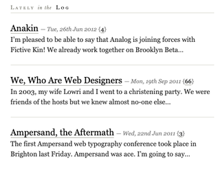
The typography here has three distinct layers to clearly explain the elements of each piece without explaining a thing. Let's look at the second entry:
- The title is obviously 'We, Who Are Web Designers', but why is it obvious? The text is bigger (size), bolder (weight), and is set at the top-left where the viewers eyes go first (position).
- The second level is the publication date, set in a different size and colour than the rest of the text, and also italicized to give more distinction.
- The third level, the article preview, is devoid of features. Compared to the other layers it may seem plain, but that is so readers aren't distracted when trying to appreciate the actual content.
Elements of hierarchy in typography
Like other design fields, typography follows its own structural hierarchy. Knowing typographic hierarchy is like knowing how to use typography, specifically knowing how to give certain words priority over others.
By manipulating the fields below, you'll better control your typography, and thus better control where your users' eyes go. For more on this, see Jeremy Lloyd's article on understanding typographic hierarchy.
01. Size
The basic unit of typographic hierarchy. Text of different sizes attract different levels of attention.
02. Weight
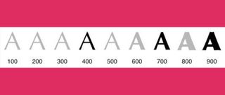
The thickness of the text, most easily increased through bolding. Although subtler than size, it's still a straightforward method of making your text stand out. Bolding is especially effective for adding weight to tertiary type.
03. Italics
Italicised letters draw attention is a less dramatic way than bolding. Because it's a subtle touch, this works well for tertiary type.
04. Capitalisation
Just like emails written in Caps lock sound like you're yelling, the same applies to web typography. Always be careful when capitalising letters, because they appear disproportionately larger and pop into the foreground.
05. Colour
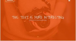
Now we're getting into the complex factors. Warm colours (red, orange, yellow) tend to attract more attention than cool colours (blue, purple), especially if warm-coloured text is set against a cool-coloured background. Colour contrast also matters, since saturated or bright colours jump out more than muted ones.
06. Contrast
Contrast between any of these factors – size, weight, or colour – will attract attention. Contrasting typefaces for headlines versus body copy helps create hierarchy.
07. Space
White space can make text appear larger (and therefore more readable). Lack of space makes text feel more cramped and smaller. Every space affects your hierarchy, from simple kerning to the relationship between words and the edge of the screen.
08. Position
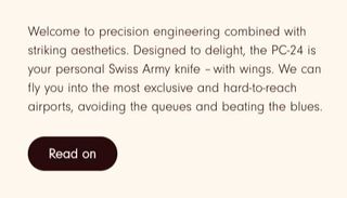
Proximity can be a fast and simple way to convey meaning.
09. Orientation
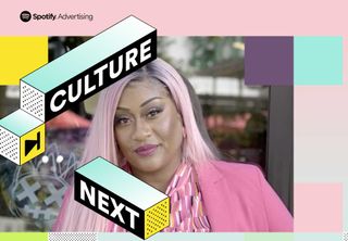
Turning letters and words sideways, diagonal, or upside down adds to visual appeal. The effect creates surprising eye candy for users. This works especially well for adding emphasis to short words/phrases within primary text. Tilting, rotating to vertical, and other methods immediately focus the user on the affected text.
10. Texture
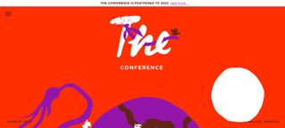
Texture is highly subjective, making it one of the hardest elements to master. This doesn't refer to the texture of the lettering itself, but of the texture created through the typographic patterns on the page. Each block of text produces its own pattern, so to create texture, break the pattern by changing any of the other elements. Apply sparingly, otherwise it becomes distracting.
To check out some of the best examples of web typography, take a look at this gallery from awwwards.
Read more:
- The best UI design tools
- 53 web design tools to help you work smarter
- Brand typography: A complete guide

Thank you for reading 5 articles this month* Join now for unlimited access
Enjoy your first month for just £1 / $1 / €1
*Read 5 free articles per month without a subscription

Join now for unlimited access
Try first month for just £1 / $1 / €1

