Fonts come to life in the best kinetic typography animations, from music videos, movie tributes and more.
(Image credit: Tina Touli)
Among the countless types of typographic design, kinetic typography is one of the most dynamic and visually engaging styles to captivate an audience. Also known as motion text, the genre of animation is widely used across branding and creative campaigns, weaving a story through clever motion design.
Kinetic typography isn't just for branding – it can also be a stunning technique to add colour and flair to your work, whether that's a homage to your favourite song or a showcase of your animation skills. If you're looking to boost your motion design skills, take a look at our collection of the best After Effects tutorials and check out our handy guide to font design to learn how to create your own custom typography.
What is kinetic typography?
Kinetic typography is essentially a technical term for moving text, using animation to bring typography to life. The style began gaining popularity in the 1960s when it was used in movie title sequences and has since developed to become a diverse genre of animation. Often used in campaigns and bold branding, it's an invaluable graphic technique for grabbing an audience's attention.
There are no strict rules to creating kinetic typography, as the examples below will demonstrate, although they can often be refined into the following categories: fluid typography and motion typography (split into the subcategories of scrolling typography and dynamic layout). From shifting colours to warped words, kinetic typography is a fluid technique that presents a world of creative opportunities.
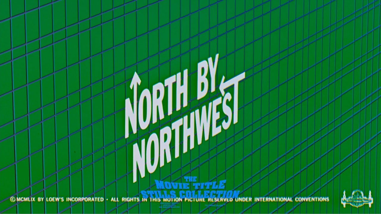
01. North by Northwest kinetic typography
Saul Bass: North by Northwest (1959) title sequence - YouTube
Let's start where it all began. Kinetic typography isn't something new; it's been around for decades. Alfred Hitchcock’s North by Northwest (1959) is often credited as being the first feature film to make extensive use of kinetic typography in its opening titles, and Saul Bass's work had a major influence on making kinetic typography part of movies – it became a way of keeping viewers' attentions.
02. The Office
Moving on to how kinetic typography is being developed by contemporary creatives, this piece by motion graphics artist, Stepdraw riffs on a classic moment from The Office (the US version). Including bears, beets and Battlestar Galactica, the timing is spot on as is the personality the sketchy typography lends to the audio.
03. Rick and Morty
The kinetic typography in this video was created by animator/director Gary Motion. Based on TV show Rick and Morty, it's a total contrast to the above example. It again adds visuals to a classic comedy TV moment, but is flashy and fast-moving. It's a super slick piece that has some great detail like the diagonally-sliding text, and the varied use of style and colour.
Get the Creative Bloq Newsletter
Daily design news, reviews, how-tos and more, as picked by the editors.
04. The Light in the Dark
Animated and directed by Eli Guillou, this animated typographic piece aims to encourage anyone who feels that they're lost in the darkness, and to help them find the light in the dark and to move forward.
No roundup of the best kinetic typography would be complete without mention of Tina Touli, and we could have included any number of her striking dynamic pieces. Shifting Symphonies is series of kinetic typography artworks on the theme of transition created for the main stage projections at the Videocittà festival in Rome. We love how she creates harmony through combinations of hard and soft forms. The piece above was inspired by DNA, but it also conjures up ideas of fluffy marshmallows, giving it a dreamy surreal feel.
06. From Paper to Screen
This masterpiece was, unbelievably, a graduation project by graphic designer Thibault de Fournas. The animation shows the evolution of typography from paper to screen in serious style. The first half of the video deals with the basic rules of typesetting, before moving on to the use of typography in cinema, with impressive effects running throughout – the tribute to Saul Bass (whose work we mentioned at the start) being our favourite.
07. Language
Stephen Fry Kinetic Typography - Language - YouTube
Designer Matthew Rogers is the man behind this kinetic typography animation of the words of British writer and actor Stephen Fry. A fan of this particular essay on language, Rogers decided to make it his first kinetic typography project using a combination of After Effects, Flash and Illustrator.
08. The 10 Commandments
In just under two minutes, this kinetic typography animation reveals the 10 Commandments. The man behind the piece is designer Vit Ryznar, who completed the project using After Effects.
09. Childline: First Step
Ad agency YCN Studio collaborated with LA-based production company Buck on this powerful animation, which encourages children to talk about and report sexual abuse.
The video promotes the services of UK-based, confidential, free, 24-hour counselling service for children, Childline. Following a conversation between child and advisor, the four-minute animation uses kinetic typography and abstract art to get its message across. It's by no means an easy issue, and we think YCN Studio and Buck have done a sterling job at covering it in a powerful yet sensitive way.
10. Procrastination
This trailer for David McRaney's international bestselling book You are Not So Smart uses cleverly animated typography to sum up its contents. Animated, designed and produced by Plus3 productions, the perfectly timed animation is all about procrastination, and it'll have you nodding in agreement and smiling all the way through.
11. The Edge
Hunter S Thompson has influenced a generation of film-makers, writers and designers. This homage to the author by Piotr Kabat combines an array of design disciplines to showcase some of his finest words.
12. Apocalypse Rhyme
This is an amazing piece of work considering it was all done by one person. Oliver Harrison wrote the poem, composed the music and organised it all into a splendid animated whole for Channel 4's Random Acts, and his reward was the Best Motion Graphics prize in the British Animation Awards 2014.
13. Bob
Oliver Smith is a 3D animator and compositor who can turn his hand at many aspects of the moving image. Inspired by 'Weird Al' Yankovic's Bob Dylan parody, Bob, the song features Yankovic's signature style and comical lyrics. Although the amusing tune is the main influence for the video, it's Oliver's stunning array of graphic titles and typography that really stand out.
14. Rolling Stones - Doom and Gloom
Celebrating their 50th anniversary with a series of gigs back in 2012, the old-time rock 'n' rollers released an accompanying new track that was pretty darned good. For the music video, Trunk Animation designed this great splatter style animation, which is reminiscent of Ralph Steadman's typographic artistry.
15. McDonalds Drive Thru kinetic type ad
This kinetic type ad from McDonald's was made during the COVID-19 pandemic to show that it was still taking Drive Thru orders. As in many of the best McDonald's ads the company made effective use of its corporate colors to evoke immediate associations with the brand. This is kinetic typography at its most simple and effective.
16. Mad as Hell
Peter Finch's iconic 'I'm mad as hell and I'm not going to take this any more' speech from Network is still relevant 40 years on, and while it doesn't necessarily need any extra weight lending to it, this kinetic typography treatment by Aaron Leming makes a pretty good job of it.
17. Alphabet
This alphabet in motion video is sublimely smooth. Former graffiti artist turned motion graphic artist Pavel Pavlov morphs simple but beautiful lines and graphics together to form a unique design for each letter of the alphabet.
18. ALQUIMIA Animated Type
Pavel Paratov has constructed a mesmerising piece of golden kinetic typography here. The letterforms reshuffle to the electro beat by Satoshi Yoshitake, integrating abstract shapes into the mix.
19. Hello Hola Hallo Bonjour Ciao Ola
This adorable kinetic typography animation was made by Spanish graphic and motion designer Daniel Moreno Cordero. Daniel created his animation using After Effects, Illustrator and some Photoshop, alongside a typeface entitled Granaina Limpia.
The Breast Cancer Alphabet was conceived by Amsterdam-based agency TBWA\Neboko for the Breast Care Foundation and Alexander Monro Hospital to coincide with Breast Cancer Awareness month in the Netherlands. As could be expected, the forms are visually arresting, especially in the animated typography, but they're also educational, since they each represent potential symptoms of breast cancer, showing that there's much more to checking than looking for lumps alone.
What are the types of kinetic typography
Barbara Brownie's kinetic typography categorisations are often the most cited when it comes to distinguishing the different styles of moving text. The main categories are fluid typography and motion typography (which can be subcategorised into two seperate concepts – scrolling and dynamic layout).
Fluid Typography – Fluid typography has a looser feel, with letters morphing and changing before our eyes without physically moving across the screen.
Scrolling Typography – A fairly simple motion typography concept, scrolling refers to any text that moves across a plane. This can be forward or backward, up or down, or even away and towards the screen.
Dynamic Layout – This concept refers to when the text elements' movements are informed by each other. This can be in a flat or 3D space, creating a deeper sense of visual immersion.
Thank you for reading 5 articles this month* Join now for unlimited access
Aaron Kitney is a freelance graphic designer and art director based in London and Vancouver. He specialises in branding, identity, web design, publication design, packaging and book design.