10 inspired alternatives to Helvetica
Love it or hate it, Helvetica is everywhere. But it doesn't have to be that way: here are 10 alternatives to the much-used font.
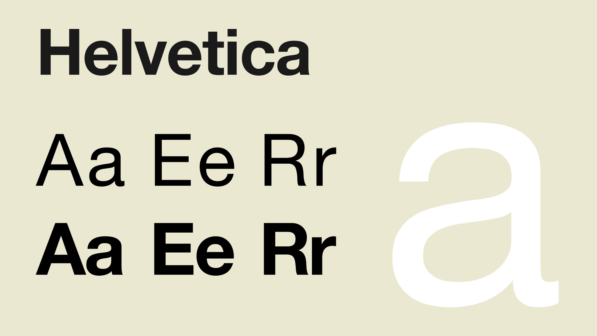
It's the eternal quest for graphic designers the world over: they want something like Helvetica, but not Helvetica.
Of course, the giant of Swiss typography – which started life as Neue Haas Grotesk, designed by Max Miedinger and Eduard Hoffmann in 1957 – is ubiquitous for a reason. It's clean, bold, legible – and safe, and is one of the world's best-known professional fonts.
In fact, it's so neutral that many designers default to it because of its lack of discernible personality. It can be used in countless contexts and soak up the emotion of the imagery, colours, shapes or other design elements around it, conveying that timeless Swiss style without ever dominating, and communicating a message without distraction.
There's no doubt that it's a versatile, well-designed typeface. But defaulting to it effectively ignores an enormous resource of potential choices that can deliver subtle twists of personality that Helvetica just can't. And it's not always suitable for every application.
The good news is that there are literally thousands of beautifully crafted sans serifs just waiting to add that something extra to your designs. Whether you're looking for more personality, warmth or versatility, here are 10 of the very best Helvetica alternatives.
01. Akzidenz Grotesk
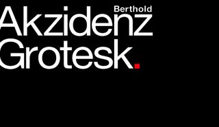
This is one for the real type purists. Released in 1898, over half a century before Helvetica was even thought of, Akzidenz Grotesk is one of the typefaces that helped kick-start the whole neo-grotesque movement of the early 20th century. It’s the grandfather of Helvetica, and inspired many other typefaces in the 'Swiss Style'.
Akzidenz is smaller, rounder and less dense than its 1950s successor, so although extremely clean and neutral, it's that little bit friendlier and more approachable.
Get the Creative Bloq Newsletter
Daily design news, reviews, how-tos and more, as picked by the editors.
02. Neue Haas Grotesk
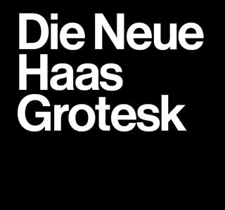
Released in 1957 in the footsteps of Akzidenz Grotesk, Neue Haas Grotesk is essentially Helvetica before the digital age: the two fonts share the same typographical DNA.
But compare it to Helvetica Neue – which, after decades of tweaks and expansions to the family to cater to different platforms and uses, is where we've ended up – and the softer, more graceful curves, varied letter widths and more natural italics give it that little bit more style and character than its boxier modern counterpart. It comes in a versatile family of 44 fonts.
03. Univers
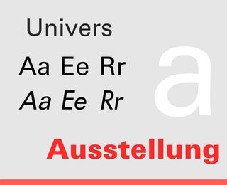
Like Neue Haas Grotesk, Adrian Frutiger's masterpiece was released in 1957 as a fresh take on Akzidenz Grotesk. While the modern-day Helvetica is famously dense – with tightly packed letterforms, a tall x-height and a bold, attention-grabbing outlook – Univers is smaller and more spaced out.
Subtle variations in stroke width add more interest and variety amongst the different letterforms, pulling it further out of the neutral zone that's proudly occupied by Helvetica. Different weights and variations within the family are defined by a numbered suffix, with Univers 55 the regular weight and width.
04. Aktiv Grotesk
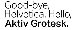
Whereas Helvetica (or rather its predecessor Neue Haas Grotesk) was styled in response to Akzidenz Grotesk, Aktiv Grotesk is the 21st century equivalent – positioned by its designer Bruno Maag specifically as an alternative to the ubiquitous typeface that he openly denounces as the 'vanilla ice cream' of a designer's type library.
A relative stranger to Helvetica until moving to the UK, Maag grew up using Univers as his go-to Swiss Style sans serif. Accordingly, his self-dubbed 'Helvetica killer' is pitched somewhere in the middle of the two – with a fractionally taller x-height than Helvetica, and slightly squarer edges than Univers.
05. FF Bau
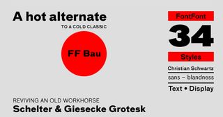
Designed by Christian Schwartz for FontShop International in 2002, this modern alternative to Helvetica has more in common with the Swiss giant's quirkier, warmer 19th century ancestors – such as Akzidenz Grotesk – than with its modern-day incarnation.
Designed to suit modern typographical needs, without ever sacrificing personality at the altar of practicality (a criticism all-too often levied at Helvetica), FF Bau sports a distinctive double-storey 'g' and a lowercase 'a' that keeps hold of its tail in all available weights.
06. ARS Maquette
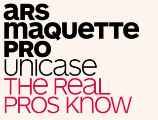
Designed in 1999 for public release in 2001, ARS Maquette has developed into one of ARS Type's flagship creations, renowned for its clean, stylish simplicity. It was described by its designer Angus R Shamal as "unpretentiously simple and universal in nature".
In response to feedback from users clamouring for more versatility from the typeface, Shamal expanded the basic five-weight family further in 2010, introducing true italics and wider language support while retaining the open, readable quality of the sans serif. It’s a worthy modern alternative to Helvetica.
07. Proxima Nova
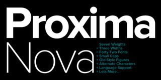
Mark Simonson's 2005 reimagining of his now-discontinued 1994 typeface Proxima Sans is intended to "straddle the gap between Futura and Akzidenz Grotesk", and combines modern proportions with a geometric look and feel.
Where Proxima Sans included just six fonts, its 21st century upgrade boasts a considerably more impressive and useful 48: eight weights in three widths, with true italics.
Within the character set it blends even, rational curves on letters such as the lowercase 'e' or uppercase 'G' with more playful, quirky stems on the 't' and 'f'. Its upward-aimed bowl on the lowercase 'a' is also completely unique – all details that combine to give it the kind of personality that Helvetica can only dream of.
08. National
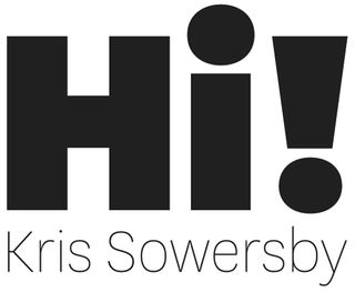
It may be deceptively simple, humble and quietly effective, but National – only the second commercial release from New Zealand-based type foundry Klim – also has its fair share of subtle, character-building details that pay homage to classic sans-serif typefaces from the days before even Akzidenz Grotesk.
It won designer Kris Sowesby the Certificate of Excellence from the Type Designers Club (TDC) in 2008, and boasts an extensive character set with a broad range of accents, numerals, alternate forms and small caps across all styles.
09. Brandon Grotesque

Sporting a perfectly balanced combination of sharp, pointed apexes and smooth, rounded stems, HVD Fonts' Brandon Grotesque is most often used at its thinner weights, although the bolder fonts in the family assert plenty of clout that make them more than a match for Helvetica in the display face stakes.
Brandon draws on the heritage of the geometric sans serifs of the 1920s and '30s, but never feels too overtly Art Deco in style, bringing its own style to the party. With just 12 fonts, the family may seem limited in scope, but it didn't hold it back from winning a TDC Award in 2011 – and its weights are perfectly considered and balanced.
10. Slate
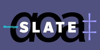
The work of award-winning type designer Rod McDonald, Slate is functional and legible, but also elegant and pleasing to the eye. It draws on his experiences developing two commissioned typefaces – a large sans serif family for Toronto Life magazine, and another family intended primarily for on-screen use for Nova Scotia College of Art and Design.
McDonald later set out to combine the "soft, quiet" magazine face with the more legibility-focused web font approach, and Slate is the end result: a humanist sans serif that's both beautiful and exceptionally legible, and feels consistent without ever looking overly engineered.
Related articles:

Thank you for reading 5 articles this month* Join now for unlimited access
Enjoy your first month for just £1 / $1 / €1
*Read 5 free articles per month without a subscription

Join now for unlimited access
Try first month for just £1 / $1 / €1

Nick has worked with world-class agencies including Wolff Olins, Taxi Studio and Vault49 on brand storytelling, tone of voice and verbal strategy for global brands such as Virgin, TikTok, and Bite Back 2030. Nick launched the Brand Impact Awards in 2013 while editor of Computer Arts, and remains chair of judges. He's written for Creative Bloq on design and branding matters since the site's launch.
