Create amazing geometric illustrations in Photoshop
3D artist Rob Redman reveals how to create polygon art in Photoshop.

There are thousands of brilliant Photoshop tutorials around to help you master the photo editing software. Today, I'm going to show you how you can take any image and use it as the basis for something cleaner and more minimalistic.
Fully rendered images, with realistic light, shadow and texture, are great and have their place but sometimes it's nice to get back to bare bones and treat an image more as a graphic than anything else.
Apart from being fun and therapeutic it can also aid understanding of form and structure. As much of my work is 3D in nature, I've come to love looking at polygons and the method I'm showing here has its basis in flat polygons, mostly three-sided shapes that are put together and coloured to define an underlying form. The technique is simple although care needs to be taken to ensure you get the most from your subject matter.
Here, we're going to recreate the iconic image from the Jaws movie poster in flat polygons using Photoshop.
01. Getting prepped
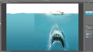
First up you need to decide what your subject matter is going to be. Something with a strong silhouette works well and preferably something with a limited colour palette. In this example, the classic Jaws poster has both.
Open Photoshop and create a new document. I've gone with 1920 x 1080px as I was possibly going to use the finished image as a wallpaper. I also like the widescreen proportions, with the focus to one side. Copy the original image into the document and place it where you want. If you find the text distracting use the lasso to select and then delete it.
To create the sea add a new layer behind your reference image and create a new gradient. Use the colour picker tools to select the top and bottom colours from the poster and drag out a new vertical gradient from the bottom of the image to the surface of the sea.
Use the polygon lasso to cut straight-edged waves from the top of the sea, roughly following the horizon.
02. Basic shapes
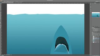
Press Ctrl+Alt+Shift+N to create a new layer and use the lasso to draw out the jaw shape. Don't add too many intermediate points here. You want to go for something geometrical. With the shape drawn hit B and ALT-click a mid toned area to select a colour from the reference image.
Note: if your reference has a noticeable compression artefacts, be careful about the colours you select. It can be worth running a posterize filter to lessen the amount of available colours.
Now hit Shift+F5 to fill the selection with your chosen colour.
Use the same process to block out the rest of the lower jaw. The trick is to stay quite loose. Keep to larger polygons and try to use just three and four-edged shapes, otherwise things can become messy fast. As you create each polygon pick a colour from the refs layer that fits the overall feel of the polygon you have created.
These shapes will soon build up and you will see a simplified graphical version of the shark taking form.
Create a new layer below the lower jaw and use the same technique to form the inner mouth. Putting this below the jaw layer means you don't need to be accurate about the borders between areas. Do the same for the overall shape of the shark.
03. Following on with the process
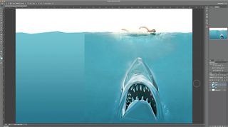
The technique behind the rest of the shark is pretty much the same from here on out. You will need to be sure to add layers in the appropriate order, so that you can switch visibility, to pick colours and to make life easier.
For example, if you put the teeth on a layer of their own you can turn off the mouth layer to pick suitable colours from the reference. If you select all the teeth at once you can speed up your workflow. This is a simple technique but it is repetitive, so any shortcuts are well worth using.
Follow on with this until your shark is complete. Try to shape the polygons around the natural flow of the shapes. This will help the forms appearance make the image more believable with less detail.
Creating keys areas first can be a good idea, as they will be focal points in the image and having other areas flow around them can be useful. Put things like eyes, nostrils and the upper teeth on their own layer. That helps stay organised too.
Once the shark is done add a new layer group and put all the shark layers into it.
04. The swimmer
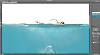
Adding the swimmer is done in exactly the same way as the shark. The only real difference here is that it is worth using less detail. This keeps the image clean (which is what this is all about), and leaves the shark as the main focus.
Use the polygon lasso to select the overall shape of the swimmer and then pick out key shadows and highlights. Take these colours from the area above the water, from the skin tones.
Add a new layer and draw out some waves on top of the swimmer. Pick the colours from surrounding waves in the reference avoiding any of the skin tones. You can then use the layer opacity sliders to merge this layer over the figure and help bed it into the image.
You could just raw out the forms and take the colours of both the figure and water, in one layer but keeping them separate gives you more control. As with the shark you can combine all the swimmer layers into a single group.
05. Bubbles
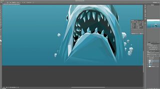
Create a new layer and draw a very rough circle with the lasso. Five or six sides works well. Now add a simple shadow and a simple highlight, picking all the colours from the shark and or water. Next up just cut and paste this bubble to create duplicates, using the transform tool (Cmd+T) to resize, rotate and reposition the copies.
You can either group all the bubble layers or merge them. Put them in front of the shark group but for more depth you could put some behind as well, partially showing around the edges.
06. Finish up and options

All that's left to do now is to create the wave tops using the same process and then make sure that everything is organised.
To the left you can see the final layers and groups that I ended up with (click on image to enlarge). This really is a very simple technique but it can produce some lovely crisp images which stand out from the crowd. If you are using existing imagery as a basis then you will create something instantly recognisable but original. Below, you'll find a time-lapse video so you can see how the image should build up over time!
07. Summary
Although this can be a time-consuming method, it really helps you pay attention to forms and light. So, even if you are a fan of more detailed work, I'd highly recommend trying this out a few times to help hone your skills.
Words: Rob Redman
Rob Redman is an artist and designer based in the UK and regularly works with clients such as The Who, Katy Perry, Ministry of Sound, national governments and secret ninja organisations.
Liked this? Read these!
- Read our guide to image resolution
- Photoshop tips, tricks and fixes to try today
- Free Photoshop brushes every creative must have
- Free Photoshop actions to create stunning effects
- The best Photoshop plugins

Thank you for reading 5 articles this month* Join now for unlimited access
Enjoy your first month for just £1 / $1 / €1
*Read 5 free articles per month without a subscription

Join now for unlimited access
Try first month for just £1 / $1 / €1
Get the Creative Bloq Newsletter
Daily design news, reviews, how-tos and more, as picked by the editors.
The Creative Bloq team is made up of a group of design fans, and has changed and evolved since Creative Bloq began back in 2012. The current website team consists of eight full-time members of staff: Editor Georgia Coggan, Deputy Editor Rosie Hilder, Ecommerce Editor Beren Neale, Senior News Editor Daniel Piper, Editor, Digital Art and 3D Ian Dean, Tech Reviews Editor Erlingur Einarsson, Ecommerce Writer Beth Nicholls and Staff Writer Natalie Fear, as well as a roster of freelancers from around the world. The ImagineFX magazine team also pitch in, ensuring that content from leading digital art publication ImagineFX is represented on Creative Bloq.
