WordPress websites: 14 awesome examples
These WordPress websites showcase exactly what this incredible CMS is capable of.
These amazing WordPress websites showcase the best of this popular CMS. When it first launched in 2003, WordPress was regarded as a basic blogging tool for amateurs. Very quickly it took off, becoming a fully fledged CMS that now powers millions of sites across the world. And creative professionals have been pushing the CMS' boundaries to create complex and beautiful WordPress websites ever since.
To show you exactly what this incredible CMS can do, we've picked some of the best WordPress websites around. If this article inspires you to build your own WordPress website, these Wordpress tutorials will help you get started, or if you want to build an awesome looking portfolio, check out our guide to the best WordPress portfolio themes.
01. Rafal Bojar
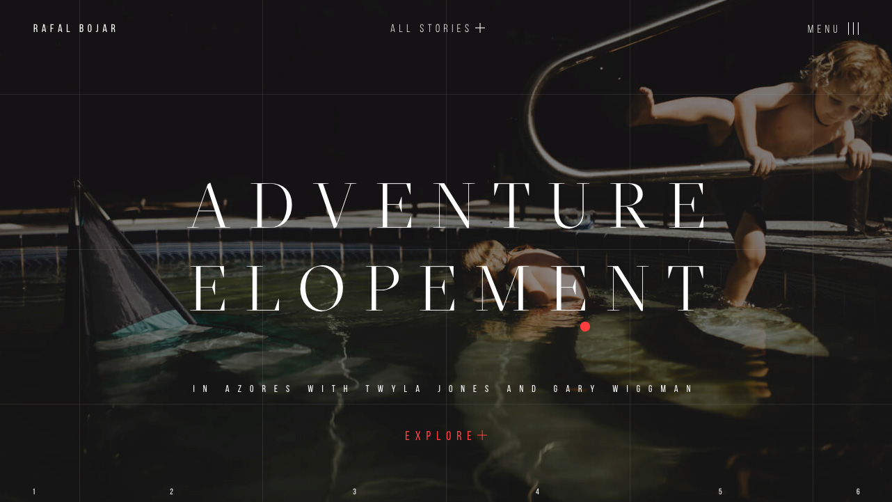
Designer Zhenya Rynzhuk used WordPress as a semi-headless CMS, with Vue.js for the front end, to create this engaging photography portfolio site for Rafal Bojar. It features a homepage that displays previews of selected stories, a slick grid to showcase all of Bojar's work, and an 'essence' page explaining the photographer's philosophy and approach.
"The goal was to provide visitors with the unique experience and showcase Rafal's amazing works," says Rynzhuk. The pair discussed a few different backend options, but decided on WordPress so that the site would be easy to manage and regularly update with new projects.
Alongside WordPress and Vue.js, the site uses an S3 bucket to store data, which is delivered through Cloudfront to ensure speedy loading times. Rynzhuk also made use of Bedrock and Hendrik-Jan de Harder's Vue skeleton, as well as GSAP for the animations.
02. Adel Vakula
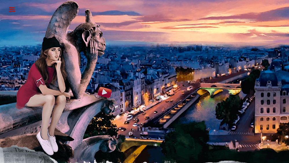
Adel Vakula is an internationally famous model from the Ukraine, and this promotional site for her arrives from fellow countrymen Yabloko ideas studio, who not only designed and coded it but created all the illustration work. The result is a gorgeously distinctive visual feast, spanning a number of painterly vignettes featuring our glamorous heroine.
From the opening cotton candy cloudscape that literally bubbles with subtle animations, Vakula stars in dreamy portraits designed to demonstrate a charismatic personality. She whimsically overlooks the Parisian night atop a gargoyle doubling as a YouTube play button, after catching a New York Subway train from a platform complete with busking cat. Visits to Venice and Ibiza provide equally eccentric backdrops to Instagram and email links, where even cocktail-sipping seals encourage a follow. It’s tongue in cheek stuff but done with such charm and technique that you can’t help but fall in love. Even the mouse pointer goes all heart shaped.
Get the Creative Bloq Newsletter
Daily design news, reviews, how-tos and more, as picked by the editors.
Built on WordPress CMS, a standout UI element is a fun section where you can drag and drop outfits onto a virtual Vakula to view real modelling snaps. As calling cards for possible castings go, this one strikes a more memorable pose than most.
Author: Mark Billen
03. Middle Child
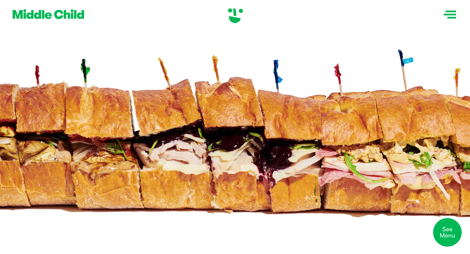
Award-winning, Philadelphia-based sandwich shop Middle Child needed a website that matched its quirky, unpretentious vibe. Full-service design and technology studio Self Aware rose to the challenge, creating a site based on a completely bespoke WordPress theme using Timber and ACF – a combination that studio partner Mike Wagz calls "a game-changer for serious WordPress theme developers".
Self Aware also made use of the latest web technologies in order to offer an optimal experience: the layout was created using CSS Grid, and a Service Worker caches static assets including CSS and JavaScript files in order to speed up initial load times.
"Middle Child oozes atmosphere from every nook and cranny," adds Wagz. "It warmly welcomes customers from all walks of life with just the right amount of fun, kitsch, and quirk. I think this design is successful because we were able to capture this spirit and translate it to the web."
To find your perfect tool, check out these top website builders. Plus, see below for the best prices.
04. Sea Harvest
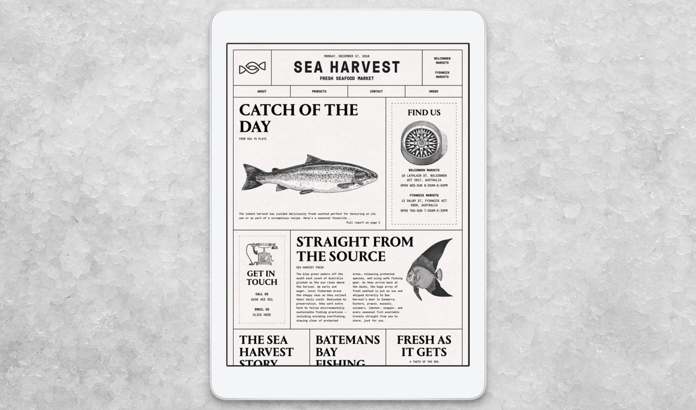
When Canberra-based seafood market Sea Harvest needed a new brand identity and smart digital presence to match, it turned to Australian web and branding agency ED. The WordPress website sports a striking newspaper-style layout with plenty of quirky touches to explore.
"When we think about seafood, many of us are taken back to a memory of eating fish and chips by the beach with friends and family," says designer Cam Tidy. "Often these takeaway joints would wrap your food in newspaper, so it felt natural to explore that as a visual idea."
Replicating a static, print layout on the web wasn't without its challenges, though. The team used CSS Flexbox to reposition content whilst maintaining consistent spacing, regardless of screen size. Nearly every measurement is based on a responsive scale using REM units, making it easier to maintain control over type and image proportions as the browser scales.
Developer Bryn Shanahan's favourite feature is the fact that users can 'draw' on the site, including via an interactive wordsearch. "We achieved this by covering the site with an HTML5 Canvas element, which was then used to draw the user's drawings onto," he explains.
ED uses WordPress for a lot of its website projects, finding it user-friendly and intuitive for clients. "[WordPress has] easy back end development, which allows more time to focus on front end to bring the design to life," adds developer Adam Forcucci. "The ability to make it headless, using the WP Rest API, allows us to use frameworks such as React, which is becoming the core of our future development on the platform."
05. Maxim Shkret
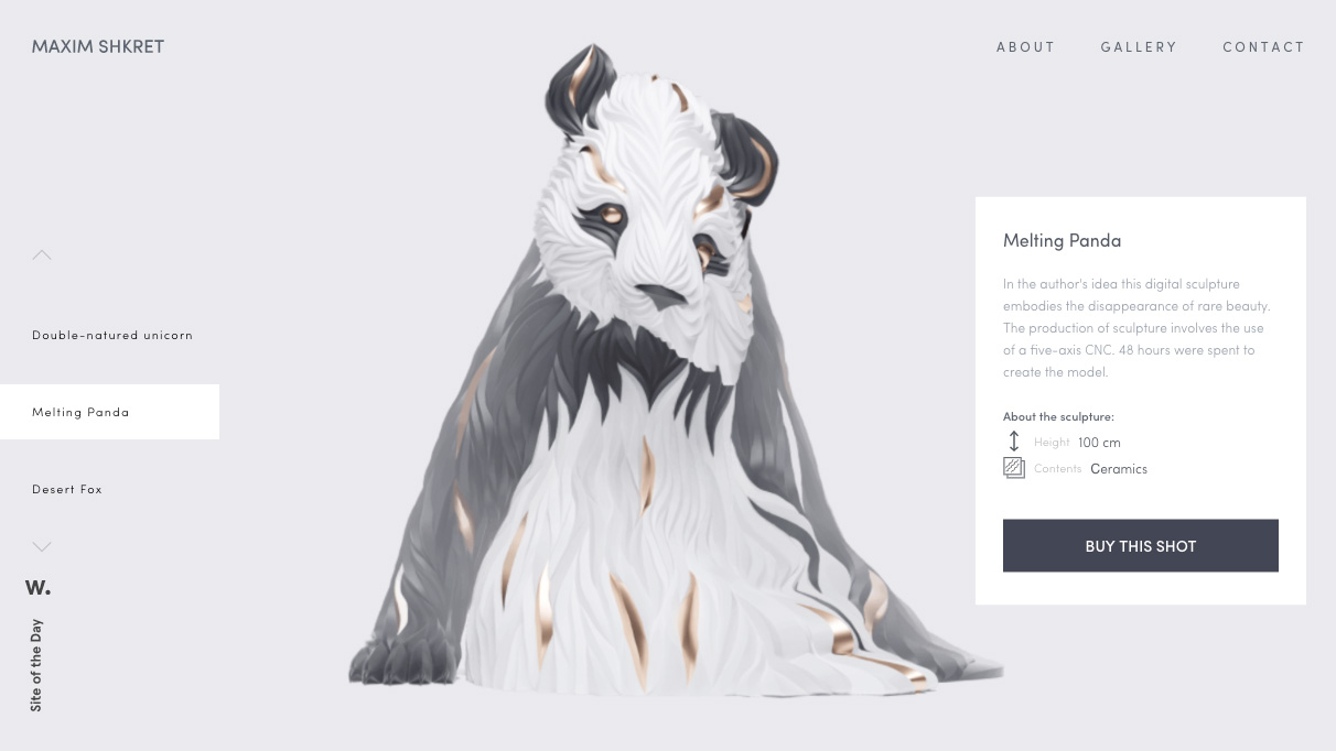
Based out of Saint Petersburg, Russia, Maxim Shkret is a freelance digital artist. His impressive WordPress website marries portfolio to ecommerce marketplace, launching a novel fundraising initiative.
The site opens on a series of four 3D models, or digital sculptures that can be dragged and rotated 360-degrees. Pig, Desert Fox, Double-natured Unicorn and Melting Panda can be spun left and right to achieve a favoured angle. By clicking the ‘Buy this shot’ button, visitors can purchase a digital image at various dimensions for various prices. The proceeds will be pooled back into transforming each digital model into real physical sculptures using a 3D printing five-axis CNC machining process. It’s a neat idea for inviting contributors and shows how a crowdfunding approach can be attached to a typically passive experience.
Site production credits include New York’s Sochnik Design Studio, but the slick UI efforts never overshadow Shkret’s talent. This includes a simple Gallery section of still sculpture shots that ripple and wave through a watery filter. It’s a subtle effect, but heightens the sense of texture Shkret intends to give each piece.
06. KOBU
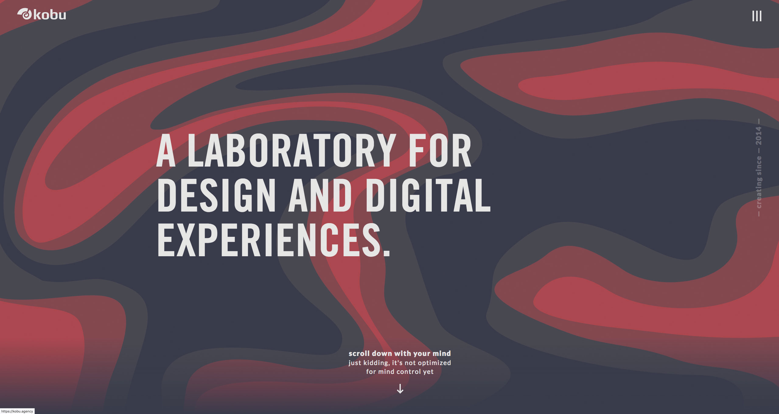
Portfolio sites, unsurprisingly, continue to provide some of the web’s most fertile ground for creative expression and inspiration. This online calling card for Portuguese agency KOBU follows that ethos with a tasteful, restrained WordPress website that still bubbles with character. Calling itself a 'brand laboratory' that is unafraid of experimentation, the technical work here demonstrates imagination over complexity.
Over a series of elements, we get a reminder of how CSS and SVG can be combined for maximum frontend character. Absolute positioning is used to overlay charming wireframe motifs, breaking up the lines between bold background colour blocks and linking sections together. A looped HTML5 video panel gets a unique wiggly edge using an SVG shape as a mask positioned above, before case study images have their border radius halved to go circular. The site makes neat use of the slick.js carousel library to ‘trot’ the KOBU team, with office horse, through the middle of the main page.
The zenith, though, is probably the bit we see first, opening on an undulating lava lamp-style header produced by manipulating SVG paths. Utilising the anime.js plugin, a polyvalent JavaScript animation engine, it’s an eye-catching trick for establishing colour palette, if nothing else.
Author: Mark Billen
07. noformat
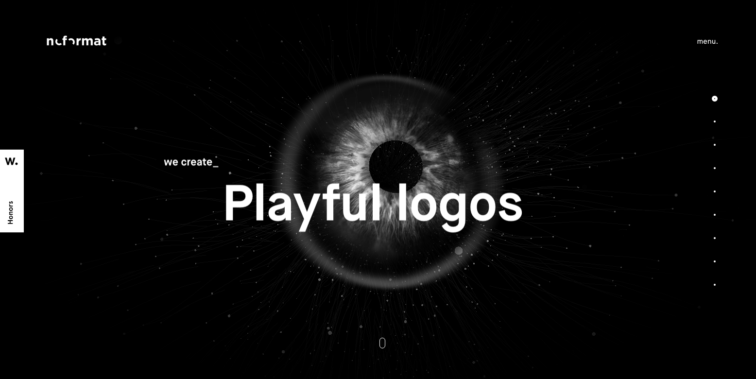
noformat is a strategic design studio based in New York. The homepage features an animated eyeball design that follows the visitor's cursor around the screen, while overlaid text cycles through all the things noformat can create. To create the eyeball, the team first explored the design in After Effects CC, before using three.js to build an interactive version, explains Ian Brewer, founder and creative director of noformat.
"We used vertex and fragment shaders to optimise for GPU rendering and made it pulsate and flash the noformat logo inside," continues Brewer. "We then applied post-processing effects to give it a more organic and less 3D look by blurring the edges and adding bloom to the highlights."
The rest of the site lives up to the impact of that first page, with slick on-scroll transitions and subtle parallax effects showing off tech skills without impacting usability.
"We chose WordPress for our site for speed to launch, and flexibility," explains Brewer. "Over the years we have built our own libraries and module-based editing systems that allow us to create or edit a site faster than any other CMS solution."
08. Femme and Fierce
Dutch experience design studio Wonderland has delivered ecommerce with sass for Femme and Fierce. The WordPress website's in-your-face, clash-tastic colour scheme delivers the online fashion retailer's brand message from the off. Animated 'stickers' – twirling lollipops, jabbing arrows, licking lips – create a cheeky feel and should resonate with the Snapchat/Instagram generation at which this range is aimed.
09. Puree Maison
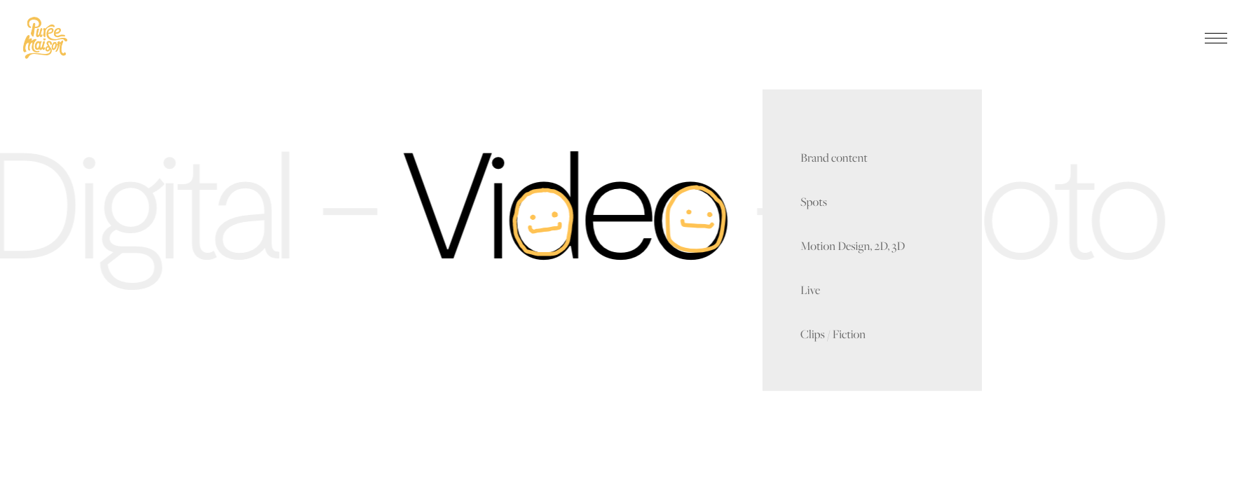
Purée Maison is a creative and strategic studio based in Paris. Its WordPress website stands out mainly thanks to the sunny yellow animated scribbles that appear on hover, inject personality into boring brand statements and liven up transitions. They also help the visitor find their way around, and encourage them to explore and interact with the site.
10. We Virtually Are
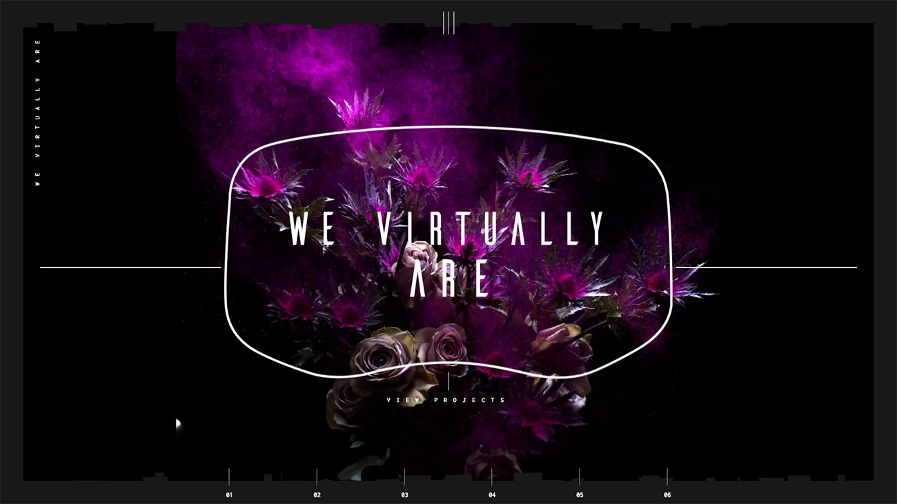
When your business is all about enthralling people using virtual reality to tell emotive stories, you need a site that draws people into your work. And boutique VR studio We Virtually Are has managed that and then some. Its site, built by Herdl on WordPress, uses plenty of cutting-edge techniques including WebGL and 360-degree video to give you an irresistible taste of its immersive services. Check out its VR test drives for Audi, complete with unexpected celebrity guests.
11. Asaro
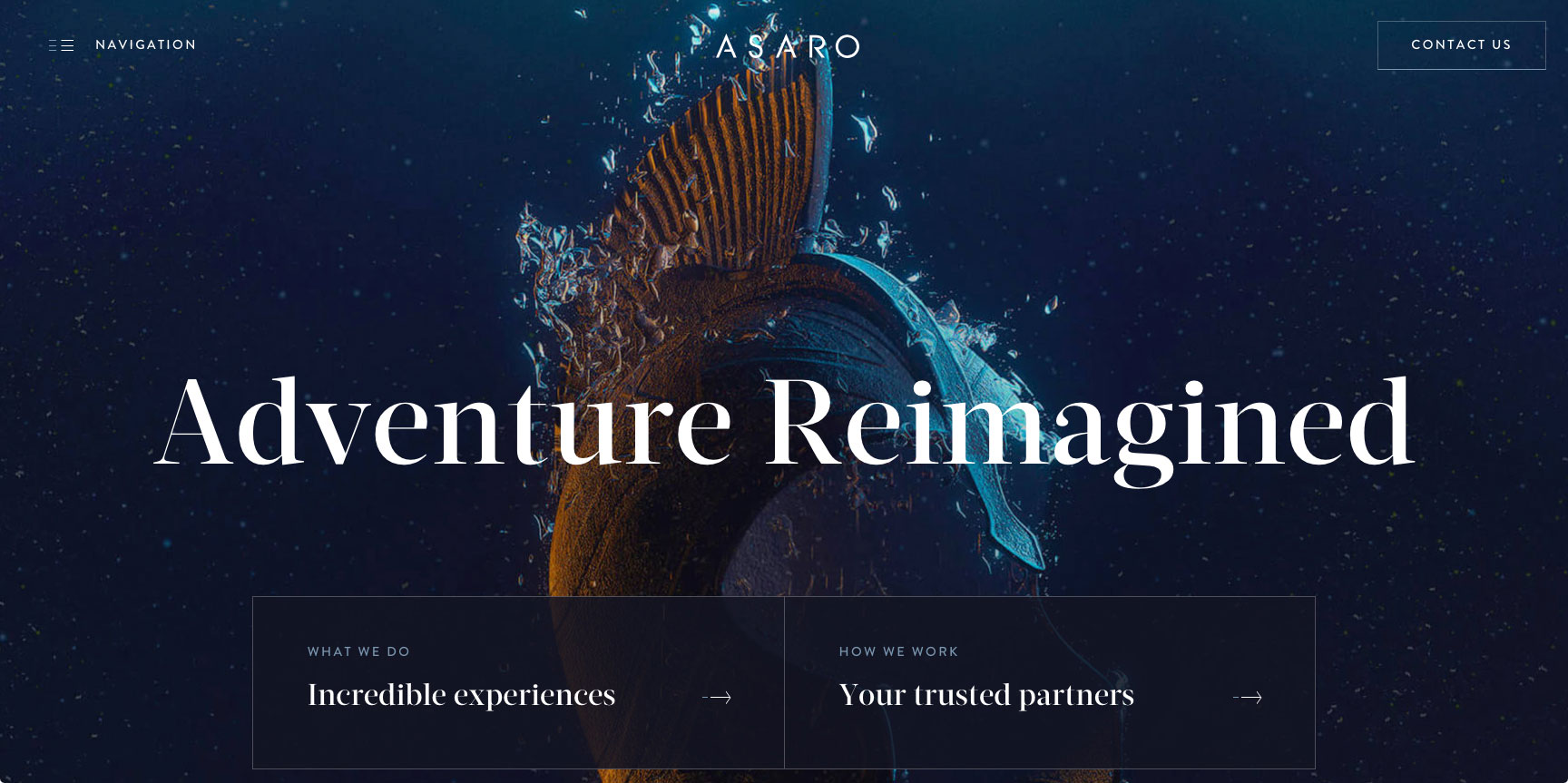
Asaro is a provider of unique adventure experiences and entertaining journeys for superyacht guests around the world. As part of a broader corporate rebrand, this slick website was designed and developed by Bristol-based agency Green Chameleon.
Built on a custom WordPress framework to keep ongoing content editing easy for the client, visitors are taken on a voyage of discovery packed with charm. Subtle scroll effects are linked neatly to an interactive dotted line, plotting navigational progress in the way a yacht captain might mark charts. Custom CGI renders have been utilised as a graphical device for representing Asaro’s exclusive service offerings, in light of a scarcity of photographic assets due to the private nature of the events.
“The art direction was inspired by a mixture of water drop photography and theatrical poster design,” explains creative director Tom Anderson. “We loved the aesthetic of the photography style and felt that it tied in nicely with the underlying nautical theme of the project.”
Responsive enough to not only look beautifully consistent on smaller screens, access speed was also a motivation for streamlining performance. With boat dwellers at the mercy of marine web connectivity, load times are more chipper than choppy across desktop, tablet and mobile.
Author: Mark Billen
12. Design Museum Denmark
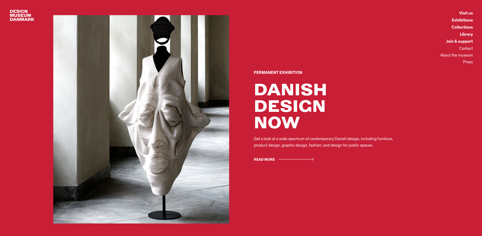
Built by Copenhagen-based design and branding agency Stupid Studios, the site for Denmark's Design Museum not only showcases the museum's archives, collections and research, but also presents it in a bang up-to-date style. From its opening SVG animation of the museum's logo, through to eye-catching parallax scrolling and mood-enhancing palette swaps as you scroll through the content, it's the perfect online presence for an essential design destination.
13. Katy Perry
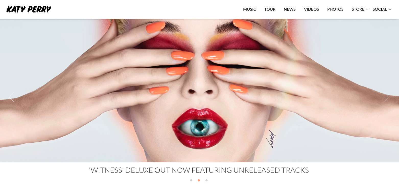
Pop princess Katy Perry uses none other than WordPress to host her official website. Focusing – understandably – on visuals and social media cues, the site utilises high spec portfolio shots of the artist to make a bold statement. Scroll down to see tour dates, merch and more, or use the icons to discover more.
It's a clean cut yet edgy site that manages to blend the artist's distinctive bubblegum pop personal image with a user-friendly, glossy mag style functionality. Gone are the days of busy band sites packed with too much animation and music you can't stop. Perry's website proves you can pack in plenty of personality using just a simple white background and easily navigable links, giving fans the option to listen, watch and learn easily and at their convenience.
14. The Ink Tank

Starting out in 1989 as Collins Inkjet, a one-man operation supplying ink for Kodak's continuous inkjet printer, today Kao Collins is one of the world's leading suppliers. And if you've never really thought about ink (beyond cursing when your printer runs out), Kao Collins' site, The Ink Tank, is about to change that.
Built by DBS Interactive, The Ink Tank is an eye-catching WordPress site that pulls out all the stops to bring you cutting-edge news from the ink industry and showcase some of the creative ways businesses and artists are currently using ink. The highlight, as far as we're concerned, is its History of Printing section: a gorgeous parallax single-pager packed with animation and effects, taking you all the way from clay tablets to today's high-speed single pass printing, and looking ahead at some of the future possibilities of printing.

Read more:

Thank you for reading 5 articles this month* Join now for unlimited access
Enjoy your first month for just £1 / $1 / €1
*Read 5 free articles per month without a subscription

Join now for unlimited access
Try first month for just £1 / $1 / €1

The Creative Bloq team is made up of a group of design fans, and has changed and evolved since Creative Bloq began back in 2012. The current website team consists of eight full-time members of staff: Editor Georgia Coggan, Deputy Editor Rosie Hilder, Ecommerce Editor Beren Neale, Senior News Editor Daniel Piper, Editor, Digital Art and 3D Ian Dean, Tech Reviews Editor Erlingur Einarsson, Ecommerce Writer Beth Nicholls and Staff Writer Natalie Fear, as well as a roster of freelancers from around the world. The ImagineFX magazine team also pitch in, ensuring that content from leading digital art publication ImagineFX is represented on Creative Bloq.
