8 RWD problems (and how to avoid them)
James Young reports on the results of his survey on responsive design – and offers his advice.
I created a survey asking fellow designers about the problems they faced when creating fully responsive sites. This article will list the most common problems they reported and offer possible solutions, along with suggestions to consider on your next projects.
The information contained here is based on hundreds of survey responses (if you'd like to add your own answers, the survey itself is still open) along with problems I've also come across in my own work at Offroadcode.
So without further ado, let's reveal what the most common responsive design problems are... and how you can avoid them.
Article continues belowFledgling methodology
Despite responsive design already having been around more than two years, it's still in many ways a fledgling methodology. Designers are faced with an ever-changing landscape of devices, code frameworks and scripts – and, of course, the need to work in a new way with clients to manage the process of creating responsive websites.
All of these feature in the most common problems reported by survey respondents, which were:
- Explaining RWD to clients
- The lack of a static design phase
- Navigation
- Images
- Tables
- Converting old fixed-width sites
- What to serve users of old versions of IE
- Testing time and cost
01. Explaining RWD to clients
The 'old' process of designing a website was a very linear one, which made it easy for clients to understand. They'd go through a briefing stage, then some sort of wireframing and structural planning stage, then they'd get a set of pixel-perfect visuals to pick apart. Only when were these signed off would the site itself be completed.
As I'm sure many of you have found, this process is simply not up to scratch any more. One of the things many designers are struggling with is how to explain to clients that there isn't really a 'visuals stage' any more.
Sign up to Creative Bloq's daily newsletter, which brings you the latest news and inspiration from the worlds of art, design and technology.
Responsive design is a much more fluid process and wireframing, sketching and prototyping are typically more powerful tools.
The solution: Demonstrate the power of responsive design
A better way to explain responsive design is to actually show a client what it can do. Don't just talk about breakpoints and media queries and multi-device functionality - it's easy to forget how meaningless these terms can be, even if some of them sound very obvious.

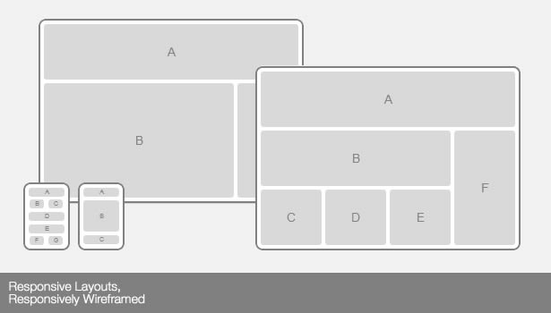
If you can't show a site on a range of devices, conside demoing one of the many sites that mimic typical responsive breakpoints, such as responsive.is or Responsive Layouts, Responsively Wireframed (pictured above).
02. The lack of a static design phase
As I mentioned earlier, one of the big problems designers reported was that a change in the 'old' design process is required to make the most of responsive design.
Rather than creating static screenshots, designers rely even more than ever on quick sketches, wireframing and making rapid HTML and CSS prototypes by 'designing' in the browser.
The solution: Design more elements and fewer layouts
Before we look at possible solutions, I should point out that processes and workflow can vary. I'm a big fan of using whatever gets results, so if you're happy with your process, stick with what works for your and your clients.
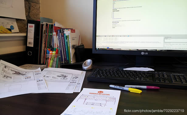
However, my own personal preference is for making as much use as possible of paper as normal, but using it to test ideas at different sizes. It's quick and easy if you follow Sam Hardacre's great suggestion for responsive sketching.
I also recommend designing in the browser and working with HTML as early as possible, then using Fireworks/Photoshop for creating assets rather than full layouts.

In bigger projects, you may struggle to even wireframe everything. A good idea here is to take a tip from Dan Mall's case study on the redesign of Crayola.com and create paper/wireframe widgets that you can move around. It gives you a great deal of flexibility and enables clients to provide solid input.
For some useful information on other people's personal workflows, you can also check out Stephen Hay's responsive design workflow slides or a very detailed overview from Yellow Pencil on responsiveprocess.com.
03. Navigation
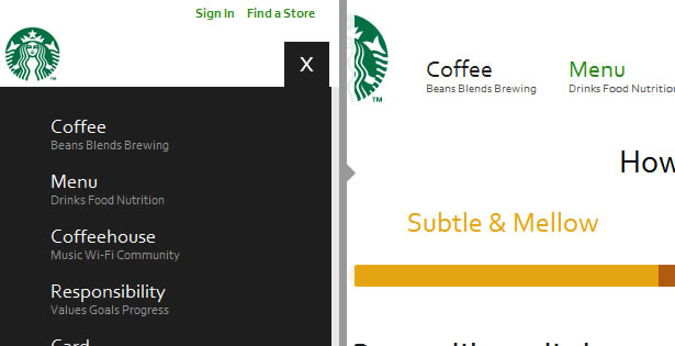
In the past, navigation on sites tended to be horizontal along the top of the page, or sometimes down the left of a page. It now needs a more considered approach.
The number of responses to the survey that mention navigation reflect just what a tricky problem this is to solve – and not one that has a simple canned solution.
The solution: Use good, consistent design
Choice of navigation strategy is is a wide-reaching decision, and should be based on your site's content and information architecture, along with a number of design considerations.
Rather than simply downloading a script or demo, I'd encourage you first to evaluate how it works, why does what it does – and most importantly, how it works for the site you're building.
The following articles may be useful here:
- Responsive navigation patterns, by Brad Frost
- We need a standard show navigation icon for navigation, by Andy Clarke
- Don't let your menu take over, by Stu Robson
- Scalable navigation patterns in responsive web design, by Palantir's Michael Mesker

And remember: test how your navigation works on as many devices as possible, and in as many cases as possible. It's amazing how often I come across sites where the navigation just doesn't work in any sensible way. Don't be responsible for creating one of them.
04. Images
Much like navigation, the set of options available for handling images in responsive designs is incredibly fragmented. As yet, the W3C community group hasn't backed a specification, so we're left with what amounts to a personal choice of a wide range of scripts to fill in for this missing functionality, and deliver appropriate assets to devices.
To further complicate things, designers must also consider the next generation of devices with high-pixel-density displays such as the new iPad and Macbook Pro, along with a range of non-Apple hardware.
Like code, images and icons should be as flexible as possible to ensure that graphics on high-pixel-density devices don't look blurry because they've been scaled up poorly.
The solution: Scripts, SVG and icon fonts
While there may not be an 'official' solution for responsive images, there are some really great solutions out there that are good to use right now, and give us positive results without resorting to too many hacks or code workarounds.

Here is a selection of techniques and resources to consider on your projects to cover adaptive images and differing pixel-density displays and devices:
- Adaptive Images by Matt Wilcox
- Using SVG graphics today, by Josh Emerson
- Resolution independence with SVG, by David Bushell
- Using CSS sprites to optimize your website for Retina displays, by Maykel Loomans
- Flowchart: how to retinafy your website, by Thomas Fuchs
- Symbolset icon fonts, by Oak Studios
Next page: four more responsive web design problems

The Creative Bloq team is made up of a group of art and design enthusiasts, and has changed and evolved since Creative Bloq began back in 2012. The current website team consists of eight full-time members of staff: Editor Georgia Coggan, Deputy Editor Rosie Hilder, Ecommerce Editor Beren Neale, Senior News Editor Daniel Piper, Editor, Digital Art and 3D Ian Dean, Tech Reviews Editor Erlingur Einarsson, Ecommerce Writer Beth Nicholls and Staff Writer Natalie Fear, as well as a roster of freelancers from around the world. The ImagineFX magazine team also pitch in, ensuring that content from leading digital art publication ImagineFX is represented on Creative Bloq.
