A new responsive design process
Steve Fisher and Alaine Mackenzie set out their vision for responsive web design as it approaches maturity.
Let’s be clear: design is the solution only if it focuses on the deeper issues at hand, the why behind everything. A solid process should always guide our work, but we need to embrace something more flexible. Our medium has finally proven itself to be fluid, so shouldn’t our process? Think about system design: you need to see both the whole picture and the tiny details. Impossible? Far from it!
Frank Chimero puts it beautifully in his book The Shape of Design: “There is a part where the artist steps back from the easel to gain a new perspective on the work. Painting is equal parts near and far: when near, the artist works hard to make his mark; when far, he assesses the work in order to analyse its qualities. He steps back to let the work speak to him.”
We need to let our work, our medium, speak to us. With the rise of responsive design, we are finally embracing our medium as it was meant to be: fluid. It is a brilliant time to step back and assess the work, analyse, and embrace a new way of doing things, a new process. Gone are the days of static mock-ups and web designers who don’t understand code. It is time for a responsive process.
A responsive methodology
We’re going to give away the big secret for a solid process right at the beginning of this article. Because we’re crazy like that. Ready? A responsive process is a responsible process. Vague? Maybe. Silly? No. Like the web standards movement before it, responsive design is pushing the web forward with future-friendly methods.
Like any design process, it ought to focus on the ‘why’ behind it all. So why do websites exist? To deliver content. That could be task-based, social, informational … it doesn’t matter. It all comes down to this: start with the why, well-structured content, and interactions that matter.
Here are the questions we hear most often about our responsive design process.
How do I keep content first?
We’re all so optimistic at the start of a project. “Content first!” we say. “User goals! Remember what’s important!” It’s true. But what does it mean? How do you implement a content-first process?
Even if you know (or think you know), it’s easy to forget as a project progresses. Long-term projects have a tendency to drag on and on (and on … and on…). We stop thinking about the why, and start focusing on the how. We fool ourselves into thinking that our projects can be split up into separate ‘discovery’ and ‘development’ phases that can exist independently.
The truth is, we have to keep asking why, all the time. No matter how much you think you know, no matter how much planning you’ve done – every time you make a decision, every time you design a button or write a headline, you have to ask …

Why?
Why am I doing this? Who is it for? What business goal will it help my client achieve? What need will it help my users address? Don’t just keep content first. Keep the why first.
This makes it sound easy. But to do it well, you’re going to have to push. Push your clients and your team to define their whys first. No Lorem Ipsum, no ‘we’ll get to that later’. Do your homework! All of your hows need to start with a solid why. At Yellow Pencil, this has meant big changes to the way we pitch, estimate, budget, and plan projects. We’ve had to push for budget and time to do solid research, strategy, and planning. You might too. But once your clients and your teams see the enormous benefits of defining content needs up front, they’ll never look back.
And it’s our job to educate them. (Read Mike Monteiro’s excellent book Design is a Job if you want to learn more about dealing with clients.) Clients can have a hard time understanding the value of doing all that research and work up front. And why should they? They don’t get anything ‘finished’ at the end – and all too often they just get an invoice and a big ol’ Word document.
That’s not their fault – it’s our fault. It’s our responsibility to do a better job of demonstrating that value. Every step of the way, we need to bring it all back to the all-important why.

This is especially important for responsive design. A responsive website doesn’t require much more development effort, but it does mean a lot more planning. Really though, it’s planning that we should have been doing all along. Witness the current redesign-every-three-ish-years project cycle. Do you want to keep doing that? We sure don’t.
So here are three steps to keeping content first in your project process.
01. Define your business and user goals
Establish a prioritised list of business and user goals for your project. What do your users most want to know or do? Do your research. Make informed inferences, not wild guesses. Get all your stakeholders to agree.
02. Reference them every chance you get
Every time you make a decision, every time someone proposes a new feature or design element, or page of content, get them to map the request to a business and user goal. What real need will this feature meet? What’s the real reason? (Hint: ‘Because I want to’ or ‘I really like blue’ or ‘everyone’s on Facebook’ don’t count.)
Get the Creative Bloq Newsletter
Daily design news, reviews, how-tos and more, as picked by the editors.
03. Don’t be afraid to push back
This can be a tough one. Client relationships can be delicate, and it can be tempting to give up the battle to win the war. But remember, we’re all in this together! It’s not business vs user; us vs them.
Meeting user needs is the best way to meet business needs. Because without our users, we don’t have a business! Clients (good clients) aren’t hiring you to say ‘yes’ to everything. So if your client asks for something that won’t meet their goals or their users’ needs, don’t be afraid to challenge them. It’s not about ego. It’s about creating the best possible solution.
04. Push your own team too
This can also be a challenge when working within a creative team. Separation of roles – visual design, user experience, information architecture, content strategy, content production – can lead to miscommunication. We get busy, we get overwhelmed with emails. It’s hard to stay with a project from start to finish, especially once ‘your’ work is done.
Your team’s relationship is at least as important as your client relationship. We have to remind ourselves of the why, just as we do our clients. Collaboration is key. You can’t simply ‘hand off’ a content plan, or wireframes, or designs. As much as possible, we have to work hand in hand. It’s easy to ‘finish’ a deliverable and move on to something else. It’s much more difficult to stay with a project when the going gets tough.
A waterfall approach to creative work just doesn’t work. Agile, collaborative work between team members makes for better results.
05. Define all your content needs up front
Here’s the thing: responsive websites take longer to plan. We’re not just planning for a single context anymore. We’re planning for all the contexts that we know about now, and some that don’t exist yet.
But it takes much less time to plan for all those complexities up front than it does to go back and retrofit features and functions that you didn’t account for. So spend the time/effort/budget. Force your clients and your team to define (and commit to!) all their content before you get into design. Use page tables. Use structured content. Future-proof your content now! Or cry later.
How do I abstract content from presentation?
You hear this a lot around the internet-o-sphere. But wait, what? And wait – why?
Because presentation can (and will) change. The way we designed websites 15 years ago is almost unrecognisable from how we present them now. But you know what hasn’t changed? Words. We still use ‘em. The internet exists primarily for (text-based) content. We still use it to solve information problems; to accomplish tasks. But if your content depends on a means of presentation (Flash intro pages, anyone?) there’s a real likelihood it won’t be usable in a few years. And that sucks.

We need to stop thinking of content in terms of layout
We (as an industry) have trained our clients to think of content in terms of layout. “Put it in the sidebar,” we say. “That should go in the footer.” Stop! Stop it. Stop. It’s not about location. It’s about priority. What is the most important content for your users? Because guess what: layout changes across contexts. There (probably) isn’t going to be a sidebar on your small-screen design.
The giant super-menu your client wants? Not gonna fly on an iPhone.
Force your clients to plan their content independent of design
Okay, you don’t have to force them. Encourage them. Strongly encourage. Page tables are great for this. If you haven’t already read it, proceed immediately to Kristina Halvorson and Melissa Rach’s Content Strategy for the Web for more information on how to create them. Organise them in priority order. Don’t reference location or layout. This will help your clients think about their content in a more productive way, and will also get the content creation process moving, before finalised wireframes or design.
Finalise your content before design
Okay, this isn’t always possible. But the more uncertainty you can eliminate before you start designing, the less you’ll have to go back and change things later on.
Use real content – every time
If possible, use edge case content – show your clients the most complicated pages, images and menus. This will avoid surprises later on in the process, when they see their messiest content in the finished product.
Functional, in-browser wireframes make a world of difference. Allow your clients to observe their content moving and changing across a range of screen sizes. Point it out as you present your wireframes (you are doing in-person presentations, right?) Demonstrate to them how the priority of their information remains the same across screen sizes, while the layout changes.
So how do wireframes work for responsive design projects?

We’re firm believers that interaction design for RWD must get into the browser quickly and often. It’s pretty much impossible to create a static document that will describe everything. Sure, we could create a document that demonstrates three, four or five break points, but that’s only a fraction of the story. What about all the moments between the breakpoints? That happens in the browser.
Sketching
Still, it is good to be able to quickly sketch out your ideas collaboratively. This doesn’t need to happen in any particular medium, but there is just something about pencil on paper. The whole point here is to get ideas out quickly and iteratively. We love to sketchboard whenever possible, and there’s even an app for that: UI Sketcher.
In-browser framework
Here’s the real ticket for us. We love to reuse patterns and systems when demonstrating RWD in the browser. Of course, we could create our own system from scratch each time, but that’s not helping us or our clients.
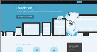
We also like to use rapid responsive prototyping frameworks such as Twitter’s Bootstrap or Zurb’s Foundation. We personally lean towards Foundation because it fits our workflow. It’d be great if either one would take a small-screen, low-bandwidth-first approach, but that’s just how we roll.
Annotations
Annotations for RWD wireframes are essential but, we find, are often overlooked. Say it out loud: documentation, documentation, documentation! We’ve seen a few examples of this from friends and think the jury is still out on the ‘best’ way to properly annotate in-browser responsive wireframes. As mentioned above, we regularly use Foundation by Zurb and like to use its Reveal add-on to display our annotations. These annotations only appear for larger screens and ideally can be turned on and off.
Use real content in wireframes
There has been a lot of debate around Lorem Ipsum in wireframes and design mock-ups, but if you don’t have real content in your wireframes, you’re doing it wrong. The content informs the interaction decisions and tells you when a design will break. How can Lorem Ipsum do that?
How do I design for small screens first?
For years we designed with a specific resolution in mind. It was a default setting. Whether sketching in notebooks, wireframing in OmniGraffle, working in Photoshop or designing in the browser, we knew what our canvas size was going to be. Those days are gone. We’re huge believers in designing for the small screen first and progressively enhancing. So how does a designer change his or her workflow from a fixed canvas size to a fluid one?
Abstract designs from devices at the start
Unless we are designing for a specific device, it is essential that we stop thinking about devices and start thinking about experiences. All of the following techniques help designers to craft their experiences while being able to remain device agnostic (up to a point).
Use Style Tiles
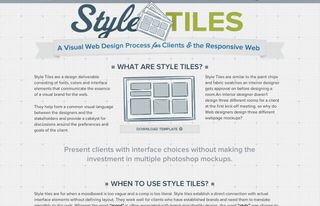
Use Style Tiles to establish direction and rapidly iterate. Style Tiles enable a designer to set out the direction of a design system without getting too specific. Their creator, Samantha Warren, describes them this way:
“Style Tiles are for when a moodboard is too vague and a comp is too literal. Style Tiles establish a direct connection with actual interface elements without defining layout.”

Create interface harmony
Imagine a canvas with all the visual and interactive elements brought together. Not to see a particular UI layout, but to see how all the elements work together. This is an interface harmony canvas. An interface harmony canvas enables a designer to keep ideas together, but not focused on any one screen size. Plus, it is a great way to efficiently communicate and document designed elements rather than producing a full style guide.
If you’re interested in reading further, two excellent articles on the subject of interface harmony can be found here and here.
View everything in the browser
Everything needs to be brought together in the browser. This is where the UI design really comes to life. Seeing how the real content interacts with the visual elements is crucial. There’s no way to do this properly in a static environment. You need to see how it will respond in the native medium.
Strike a balance with static programs
There is a flow between the browser and static programs such as Photoshop. There should be a balance that allows the design system to be created in a fluid and natural way. Sure, this will happen in Photoshop, but a designer that is designing responsively needs to learn how to think creatively in the browser as well.
Conclusion
Once more, with feeling: start with the why, with well-structured content and interactions that matter. Focus on the small screen and low bandwidth first, and progressively enhance your responsive concepts. Our medium is coming of age. We have the chance to do things right and change the world, one web project at a time.
Discover the best 20 wireframing tools for designers
Steve Fisher co-ordinates research, analysis, design and strategy at Yellow Pencil in Canada, and speaks on topics such as RWD, UX and open source. Alaine Mackenzie is a content strategist at Yellow Pencil.

Thank you for reading 5 articles this month* Join now for unlimited access
Enjoy your first month for just £1 / $1 / €1
*Read 5 free articles per month without a subscription

Join now for unlimited access
Try first month for just £1 / $1 / €1
The Creative Bloq team is made up of a group of design fans, and has changed and evolved since Creative Bloq began back in 2012. The current website team consists of eight full-time members of staff: Editor Georgia Coggan, Deputy Editor Rosie Hilder, Ecommerce Editor Beren Neale, Senior News Editor Daniel Piper, Editor, Digital Art and 3D Ian Dean, Tech Reviews Editor Erlingur Einarsson and Ecommerce Writer Beth Nicholls and Staff Writer Natalie Fear, as well as a roster of freelancers from around the world. The 3D World and ImagineFX magazine teams also pitch in, ensuring that content from 3D World and ImagineFX is represented on Creative Bloq.
