Make your website printable with CSS
Responsive design isn’t just about screen size; it also means adapting to different media – including print. Adrian Roselli shares some techniques.
- Knowledge needed: Intermediate CSS, basic HTML
- Requires: Text editor, web browser, printer or PDF-generator-as-printer
- Project Time: 2-4 hours
- Support file
Many eons ago, in the long-forgotten time of table-based web page layouts, web developers had access to a feature of Cascading Style Sheets (CSS) that enabled authors to specify a media type. This media type told the browser when to apply styles to the page – whether for screen, handheld, or even print.
This was back in 1998: browsers adopted some of these features (such as print) and as time moved on, forward-thinking developers began to make their table-based layouts printable. Some of the page elements were removed in order to save paper and ink, even making adjustments to layouts to better fit a piece of paper at a fixed size.
Today table-based layouts have been nearly replaced with div-based constructs and, for those using the HTML5 specifications, other structural and semantic elements. One of the key benefits of this approach is that CSS is generally being used to define the layout of web pages, enabling more latitude for reflowing and reformatting already-coded pages with only CSS changes.
This flexibility has also led to the rise of responsive web design (RWD), which makes it easier for a web page to adapt to different screen sizes based on CSS using conditional logic. Over the last three years we have seen the development of frameworks, templates, tutorials – and even parodies – that mean developers of nearly any skill level are able to create pages that can adapt themselves to just about any screen size a developer wants to support. Content can reflow; navigation can adjust; elements can shift in size and position; typography tweaks itself – and so on.
This method of building is perfect for enabling a developer to support the printed page with little additional effort. Except for some reason you don’t see many of these resources including or even considering the printed page.
Hopefully this tutorial will give you enough comfort with making print styles that you’ll be able to add them to any project without blowing up your budget.
Step 01. Getting started
First of all, let’s consider how printed pages from a site compare with their source web pages:

We all know web pages can scroll indefinitely, but a printed page is limited by the paper size, and potentially by how much paper a user is willing to expend. Printed pages are also a strictly visual medium, whereas a web page can have video, audio, and even accessibility features facilitating tactile feedback. Web pages can represent both bitmap data (photos, graphics) and vector data (typography, SVG), but once it is printed it’s all just bitmap data on paper. A web page is interactive, allowing for elements on the screen to change, whereas a printed page won’t be doing much changing short of the use of water or fire. It’s handy to keep all this in mind, because these points inform the decisions you make about the content on the printed page (Do I need to show audio controls? How do I address image cyclers? Is my footer too massive to even fit on a sheet of paper?).
For this demonstration I am going to use my personal website as an example (it rewards my ego and keeps me from pitching my company to you). I know from experience that the pages most likely to be printed from my site are the articles and my bio. I’ll keep my ego somewhat in check by using an old article page to start.
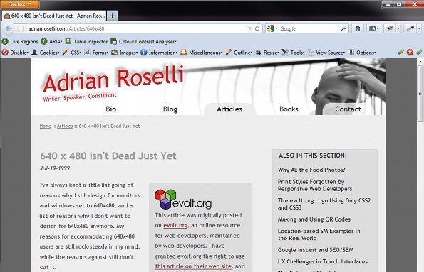
When looking at the page, there is one thing I know the user will expect to see: the content. Since it’s my site, I want to make sure I maintain elements on the page when a user prints:
- Branding
- A way for a reader to find the page on my site
- A copyright statement
- Any cross-branding (such as to my company’s content management system)
- Addresses of links in my content (maybe)
Against this, there are other items that most print users will have neither need nor desire of seeing:
- Primary navigation
- Secondary navigation
- Site search
- Social media icons and links
And finally there are some things that, whether or not the user or I want them to be printed, probably won’t be:
- Colours (especially for one-colour printers)
- Background images (and colours)
- Parts of timed/interactive elements (such as the photos in an image cycler).
- White images such as logos (they will print, but without background colours may not show other than an anti-aliasing halo)
As my site stems from my RWD efforts, I’ve also got an idea of how to reflow content, stack elements, adjust sizing, reposition bits, and so on. Pretend your web page is on a black-and-white, fixed-width screen and you’re partway home.
Get the Creative Bloq Newsletter
Daily design news, reviews, how-tos and more, as picked by the editors.
Step 02. Make a home for print styles
The first thing to do is set up your CSS to hold and call the print styles. If you’ve done any RWD coding, this should look familiar to you:
@media print {
/* insert your style declarations here */
}
You’re not restricted to this approach. You can still call your print stylesheet from a <link> in the document <head>:
<link rel="stylesheet" type="text/css" href="/css/print.css" media="print">
This method involves an extra HTTP request. A browser doesn’t need the print styles to render a page, but most won’t render the page until all CSS files are pulled down; Opera is the exception. In addition, none of today’s browsers will fire any onload events until all the files are downloaded. Since a print stylesheet can contain so few declarations, it’s often not worth the extra HTTP overhead and delay in rendering or event firing to break out print styles as a separate file.
Step 03. Applying the styles
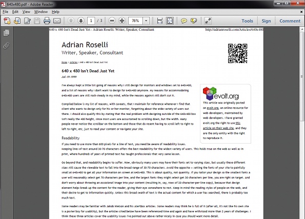
My logo is text, and while it isn’t black on white I’ll change it to black text so a user with a colour printer doesn’t have to deal with red on white paper. This addresses my branding goal.
Copy code
#Banner p#Title {
font-size: 24pt;
}
#Banner p#Title a, #Banner p#Title a:link, #Banner p#Title a:visited {
color: #000; /* change link to black text */
}
I know the browser can include the page address on the printed page, but some users override it and some page addresses are just too long to fit. Since I have breadcrumb navigation on my page I opt to leave that in place. Even if a user cannot read the address that may be printed in the footer, the user can at least see the path to get to that page on my site. This addresses my second goal of enabling a reader to find this page on my site later.
#Bread a:link, #Bread a:visited {
text-decoration: underline; /* leave a clue that it’s a link */
color: #000;
}
#Bread {
color: #000;
font-size: 6pt; /* make the text small */
}
#Bread > a:after {
content: ""; /* disable URL display if in #Content */
}
My copyright statement lives in my footer, so if I do nothing more than allow my footer to print then it will address my second goal. But I don’t want everything in the footer to print, so I’ll make sure I disable the search box, for example.
#Footer {
font-size: 6pt; /* make the text small */
color: #000;
}
#SearchForm {
display: none;
}
I leave the logo for my CMS in the footer. I don’t need to display a URL (the reader may not care) but I still keep the branding in place. That addresses my fourth goal of cross-branding.
#Footer img {
float: right; /* defined elsewhere, included for completeness */
}
My fifth goal of displaying the full URL of links is dependent on context. I used to include the address after every link; however, problems can crop up owing to some link addresses being incredibly long – much too long for a user to easily retype them.
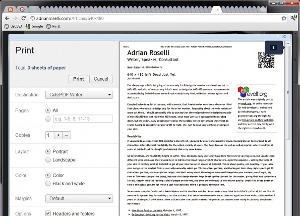
If I do choose to display the hyperlinks, it’s important that I remember to limit it to the content (so my breadcrumb and footer don’t draw URLs after each item) and possibly exclude it from images.
#Content a:after { /* select links in the content area only */
content: " [" attr(href) "] ";
text-decoration: none;
display: inline;
}
Now I can walk through and hide the elements I don’t want to print. Unlike hiding elements from small screens, which is not a great idea in RWD, we can hide elements in print because the page has already downloaded in full and the elements you hide should add no value to the printed page.
In this example I’m going to remove the navigation, search, social media icons and anything else that doesn’t make sense on paper.
#Nav, #FlyOutNav, #SubNav, .NoPrint, p.CodeAlert, #SMLinks, #SearchForm {
display: none;
}
This doesn’t address all of my needs just yet. Before we get to the layout I will need to address some standard styles you may want to have in place. For example, you may have noticed that I size the text in points. I do this because it’s more familiar to me. As long as you are testing in different browsers you can use whatever units you prefer in your print styles.
I have a default set of styles I apply to nearly all my print stylesheets to make sure I am not forgetting the important stuff. I tweak it regularly per site, but here is a good starting point for my needs:
body {
background: #fff;
color: #000;
font-size: 8pt;
line-height: 150%;
margin: 0px;
}
hr {
color: #ccc;
background-color: #ccc;
}
h1, h2, h3, h4, h5, h6, code, pre {
color: #000;
text-transform: none; /* because sometimes I set all-caps */
}
h1 {
font-size: 11pt;
margin-top: 1em;
}
h2 {
font-size: 10pt;
}
h3 {
font-size: 9pt;
}
h4, h5, h6 {
font-size: 8pt;
}
code, pre {
font-size: 8pt;
background-color: transparent;
/* just in case the user configured browser to print backgrounds */
}
blockquote {
background-image: none;
/* though they may not print, I’d rather be sure */
}
a:link, a:visited {
text-decoration: underline;
color: #000;
}
abbr:after, acronym:after { /* some HTML4 love */
content: " (" attr(title) ") ";
/* I suspect I am one of the few who still use these elements */
}
These styles accomplish a number of basic things:
- They clear out whitespace around the content (the user’s print settings will handle page margins for you).
- They also reset type sizes to points and set the text to black (because it’s possible your neat, light grey text won’t trigger the browser’s own overrides to convert white text to black when printing).
- They even write the value of your <abbr> and <acronym> title attributes into the page (which you can do with any attribute on any element, such as alt text on images, although this probably isn’t a good fit).
Step 04. Further tweaks
If your site already adapts to a mobile layout, then you’ve probably already got styles in place to account for linearising the layout. If you do nothing else, you can use your mobile-friendly layout as your starting point and just turn off the navigation and other elements you don’t want to retain.
At this point you need to start considering what other styles you have in place to account for layouts at different screen sizes. A good example is the reliance on scaling image sizes based on viewport size.
I see many sites that might scale an image to 100% width in some media queries. This can be a problem for the printed page because that can inadvertently scale the image to the width of the paper, sometimes taking a whole sheet of paper for itself. Consider whether the image can be scaled down to conserve a user’s paper and ink, and in some cases consider if it’s even necessary to scale it up at all.
Think about the elements of your layout that don’t even belong on paper. For example, do you have Flash, embedded YouTube or interactive widgets in play?
You may want to consider removing them altogether from the printed page. If you don’t, your embedded YouTube video (for example) may still take up lots of space (and paper) but appear blank or offer no value at all.
Step 05. Testing
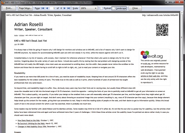
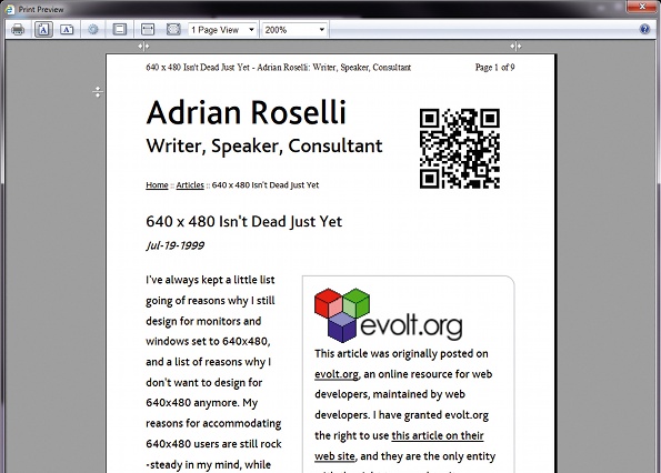
Once you have all your styles in place, test. There are two techniques I use that don’t require me to print the page. First I lean on the browser’s print preview features – a quick way to see how your styles are being interpreted. Second, when I want to see how a page gets processed I print to a PDF and then review it.
Neither of these replicates the experience of holding a piece of paper in your hands (and realising you need to scale your text differently, or your images are too big), but they enable you to do the bulk of your testing at no cost to you or the trees.
One thing I cannot stress enough is cross-browser testing. Fire up every browser you have and take a pass. You may find that Chrome chokes on your embedded typefaces, Firefox has different default margins than you expect, or Opera just really likes to wrap your logo in a way you did not expect.
This article first appeared in issue 231 of .net magazine – the world's best-selling magazine for web designers and developers.
Adrian Roselli Adrian is a founder, partner, and senior usability engineer at Algonquin Studios and specialises in HTML, CSS, JavaScript and CMSes. adrianroselli.com
Liked this? Read these!
- The ultimate guide to logo design
- Our favourite web fonts - and they don't cost a penny
- Discover what's next for Augmented Reality
- Download free textures: high resolution and ready to use now

Thank you for reading 5 articles this month* Join now for unlimited access
Enjoy your first month for just £1 / $1 / €1
*Read 5 free articles per month without a subscription

Join now for unlimited access
Try first month for just £1 / $1 / €1

The Creative Bloq team is made up of a group of art and design enthusiasts, and has changed and evolved since Creative Bloq began back in 2012. The current website team consists of eight full-time members of staff: Editor Georgia Coggan, Deputy Editor Rosie Hilder, Ecommerce Editor Beren Neale, Senior News Editor Daniel Piper, Editor, Digital Art and 3D Ian Dean, Tech Reviews Editor Erlingur Einarsson, Ecommerce Writer Beth Nicholls and Staff Writer Natalie Fear, as well as a roster of freelancers from around the world. The ImagineFX magazine team also pitch in, ensuring that content from leading digital art publication ImagineFX is represented on Creative Bloq.
